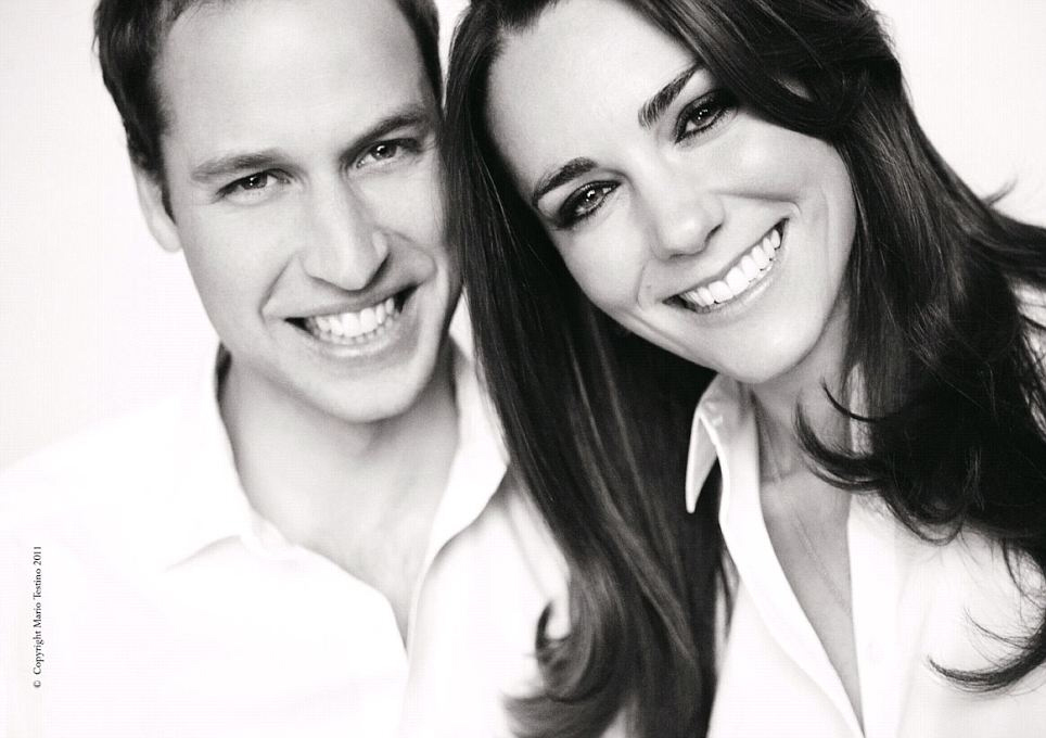
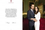
Above is the latest Mario Testino photo of Kate Middleton and Prince William. This image will appear on the official royal wedding programs, which were just released to the public. Testino took their official engagement photos, and he has a long history with the William, Harry and with their late mother (Testino was the last portrait photographer to shoot Diana). What do you think of the image? I’m surprised with how wonderful Kate looks in black-and-white. It really suits her. As for William…well, the Photoshop is heavy on this one. Plus, they “somehow” managed to crop the photo around William’s hairline. It’s like a royal decree: the prince’s hairline must not be shown in official royal portraiture!
Also – it feels like Kate is leaning in, trying to get closer to the camera. Like she pushing William out of frame… or is it just me? Body language reading aside, I will give them props – this is a lovely image for the wedding program.
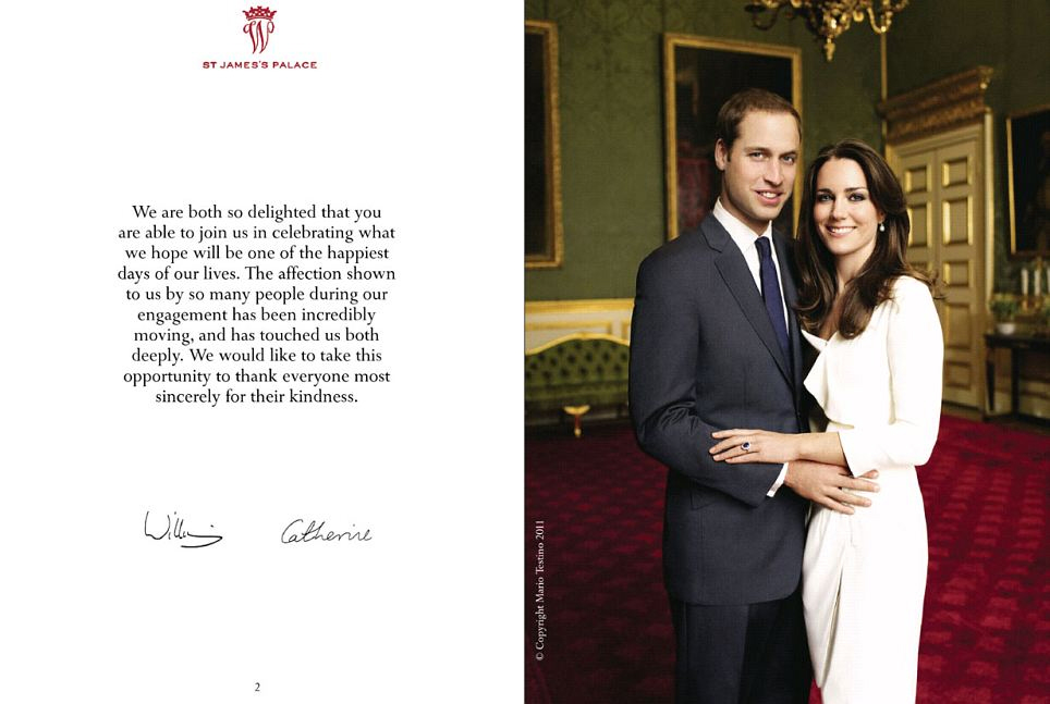
If you’d like to see more of the program, you can go to The Mail – they’ve got hi-res copies of all of it. Here are a few pages, including another Testino portrait.
Testino photos courtesy of The Mail.




It is lovely & kinda informal and updated for the Royals.
I will be awake watching it all unfold and wishin them the best.
It’s a wonderful photo. But I am sick to death of the whole dang event.
i think it’s all that hair – kate has moar moar hair, and her hair is compensating for his lack thereof; the more they shoot around his hairline, the more you only see her, because she appears more fully complete than he… he, like his vanishing hair is vanishing into the background…
ok, i was mean 🙂
these two are beautiful and boring and bland like white bread… sigh.
Love them! I’ll be watching with a glass of champagne tomorrow night (airing about 7pm in Aus – perfect start to the weekend!)
Its quite lovely!
(Though if it were up to me, Id have cropped out MORE of William’s hairline! 😛 )
Kate looks gorgeous! 🙂
Yeah I think it totally looks like she is the focal point of the pic- though maybe that was an accident because of the weird angle? Their engagement photos certainly look more balanced.
ok I just saw the high res pic from the link and it doesn’t look as skewed/ off kilter as the header
Their smiles are nice, but the composition is off. It looks like she is trying to push him out of the photo to get in front of him and he is leaning away from her, not towards her, which would have looked nicer. Her head also looks much larger than his, which is rather odd. Both their noses look unfortunate.
Question: What does “KG” stand for after Prince William’s name? Cheers!
Very nice. i wish them much more happiness than his parents had.
Her smile looks like she’s stretching her lips too far and doesn’t seem natural somehow.
Usually, you don’t see as many teeth in a more natural looking smile.
Yeah the balance is off in that one. She is forward in the photo but it is also because your eyes are first drawn to her anyway.
And why does the quote in the programme read weird to me? “what we hope will be one of the happiest days of our lives”….it’s like they’re not sure.
Bah…My mother is so excited for this marriage, that she’s trying to make me feel guilty because I couldn’t care less (except the dress. I’m sure it’s horrible, but sshhhh, don’t say that to my mom!). Tomorrow I will be surrounded by middle-aged women crying like it will be their own daughters’.
And everytime I hear about this, I always think about the quote in “Il Gattopardo”, a book from my highschool years about Sicilian nobility:
– If we want things to stay as they are, things will have to change. –
It suits every single thing about this event.
It looks like an ad of Gap jeans. If they think it helps looking updated…..
Kiki: KG=Knight of the Garter
cute photo!
I love it.
I also love her smile. I have huge teeth and a wide mouth. When I smile, it’s ALL TEETH.
She’s been looking prettier to me every day closer to the wedding. I think it’s the royal goggles. But she has been photographing a lot better since she lost a ton of weight. It’s unfortunate that when she’s at her normal weight, her face tends to photograph as puffy. Her weight loss has really defined her face in photographs.
The angle is a bit too weird. It’s not about body language but it feels like it’s a thinly veiled attempt to cut out Will’s hairline. Just me but for their informal picture it would be been better if they were photographed out in nature in a relaxing pose rather than this weird angle.
With all this hype, I can’t wait to see her dress! I’m guessing something with long fitted lace sleeves.
His facial features are more feminine than hers.
oh my gosh, i can’t wait.
They look relaxed and happy. LESS eyeliner, Kate, for Pete’s sake! Leave that for night-time events.
My girlfriends and I are waking early (we’re EST) to drink mimosas out of my grandmother’s fine china, eat scones and watch before work.
And, considering my lovely grandmother was a Brit and a bit of a lush, I’m sure she would have been pleased.
Look at this link girls (second pic)
http://www.dailymail.co.uk/news/article-1381407/Royal-Wedding-Kate-Middleton-arrives-Westminster-Abbey-final-rehearsal.html
Looks like Harry might be starting to lose hair too? but maybe I’m wrong
For everybody who is going to get up early and watch it: CB & I are going to be up and live-blogging too! We’ve got our fingers crossed that we’ll get photos really early too. And we’ll have a live feed/open post.
k I was exriencing royal wedding over load sickness, but now I am actually starting to feel excited about it!
That wording in the programme struck me too: “what we hope will be one of the happiest days of our lives”… Maybe there is strong fear of a terrorist attack?
just got home from walking from Westminster Abbey to the palace. Its crazy up there….
Ugh, I couldn’t care less. Really, what is the big deal anyway? I hope someone does her make up professionally, she always looks like crap.
I think it’s a great photo-they both look so happy and relaxed. I know CB thinks Kate is so boring-but William seems like a low key guy-they seem like a great match. I’m on the west coast-so I’m going to have to be setting the dvr for this one!
All I see when I look at this picture are raccoon eyes.
One day Kate will realize how bad it looks.
Also, girl needs to work on that signature… Is she six?
I think Kate is beautiful! She is extremely photogenic and I love the way she dresses!
William – well, lately, all I ever see are his teeth and his hairline.
But I must say that when Kate is looking at him she always seems to be looking into his eyes and she always looks like she is in love.
I hope he is also in love with her but I just cant get past the teeth and hairline! ha ha aaa
I’m not a fan of this photo at all. Her black heavy eyeliner and head at an angle with her hair blocking William. I can’t believe this pic was selected to go in the program. There are so many better pics of them!!
She obviously IS the focus of this pic. As should be the bride, IMO.
I like it.
I don’t like that head tilting pose. Ridic.
Ditto what stephanie said!
She better be working on that signature! Her’s is ugly…if I were here I would have been practicing my royal signature in all my “down time”
I’ll be glad when the wedding is over. It’s taken over all the papers and magazines and it’s boring me to tears. I like them both and wish them happiness, but I’m certainly not going to watch the wedding of people I’ve never even met. I’m super glad my hubby gets a 4 day weekend because of this, though.
They look nice and all, but they seemed kida cramped in the picture. Kinda like it was taken in a photo booth.
She did photograph very well in black and white. Most people, with the exception of raccoon mcpantless, do. I also got the impression that she was leaning in closer to the lens, drawing the eye and making her more the focus of the picture. Still, a picture I would be proud of.
i actually like KM but she needs to work on the eyeliner.
did anybody else see the vows, she vows to be faithful and Will vows to love her or something like that. is that significant, seems too obvious.
It’s pretty. It looks a lot like most modern engagement photos. Really, I just don’t get a famewhore vibe off of her. I guess we’ll see.
So over them.
The angle is weird. I agree that the body language totally looks like she’s pushing ahead of him, which is suitable, as she is getting more and more to look like a gold-digger.
They both look nice in the picture but I agree with some of the other statements. It looks like she’s popping into the picture. Her face shouldn’t be closer to the camera than his (even if she is better looking 😀 )
The signature is bad…she needs to work on that.
Aw, they look really cute and genuinely happy. You can’t fake smiles like that. Lovely pic, I can’t wait til tonight! On the west coast so it’s 3am us. Going to have some champagne, scones, shortbread, break out my fascinator. Good times!
I can’t believe that I’m getting interested in this event. Shame on me.
Both William and Kate are cute, but as “You don’t say” sad the picture is unbalanced, she’s in close-up, pushing him out of the pic.
It’s a nice picture, but her head looks huge next to his. Maybe it’s because she seems so much closer to the lens. Oh, well…1 more day & it’ll be over.
Her eyeliner needs to go.
I never realized how old he looks.
I’ll be up early…my mother dragged me awake at 4 am when I was 10 years old to watch HIS mother and father getting married and I was mesmerized, so I feel like I need to watch this one in real time, too.
A palace aid needs to hide that damn black eyeliner. Enough already. Otherwise, lovely photo. She’s clearly the focus of the photo and the hairline cropping is obvious and hilarious. Her joy at no longer being Waity is palpable. Hope she knows what she’s getting herself into.
@meglet – I am jealous of you Australians not having to get up at crazy 4 am like us on the East coast have to do. I guess the Californians won’t be going to bed. Anyway, I was going to take the whole day off but I am weddinged out since watching hours of footage this past weekend and they showed Diana’s wedding again and it was boring so all I care about is the dress and the kiss on the balcony and I will be able to see that a bunch I am sure later. I will get up but I must go to work. I love my Brits though.
Quote: – “It’s like a royal decree: the prince’s hairline must not be shown in official royal portraiture!”
It’s so awful, I can actually hear some snooty high-class English accent saying those very words. Poor Will, I guess this is the price he’s paid for having been considered ‘the hot prince’ all his youth. I’m crossing my fingers this degernative-hairline disease won’t hit Harry this hard. xD
I really like the pictures. I mean, the contrasting makes their teeth look BLINDINGLY white, but hey, I guess it’s better than the alternative. I was going to make a bad ‘English dental’ reference, but as someone born with almost *no* natural tooth enamel, living in consistant dental hell my whole life, I really shouldn’t be casting stones on that one. xD
@JulieM: Thanks!!!
They both have undistinguished signatures. Kind of disappointing after all the image hoopla.
And I am blaming Testino for these mediocre pics – he did a wonderful job with Diana, but his Photoshopping is ridiculous.
OMG her signature is identical to my sisters signature, whose name is also Catherine! Wtf…
And EVERYBODY looks great in BW, with strong definition, increased contrast, high luminance, photoshop and directed lighting. Even me LOL
But yeah the photo puts more emphasis on her and he is almost blured in teh background; mayeb this is true to their personalities, maybe they picked it out; but it does stand out of the typical “on level” photos they usually have to have. Shows what a difference a generation makes.
He was such a beautiful boy. What happened? It’s like his nose kept growing after his face was done.
Marie Claire UK has a great article about upper crusty British women buying the same outfits as Kate M. It’s like her simple, slightly fusty style is the new gold standard for upper class messaging.
I don’t mean this in a mean way, just re: the way she’s gonna be perceived in our modern culture, that Kate M is really the new numero uno WAG, basically.
big YAWN!
@ladybert ur tottaly right these days all i see about wills is his teeth he probably proposed bcos he knows he’s grown ugly and she’s the only woman he knows who can take that so poor waity 🙁
@ladybert ur tottaly these days all i see about wills is his teeth he probably proposed bcos he knows he’s grown ugly and she’s the only woman he knows who can take that so poor waity 🙁
Here on the west coast of the US, coverage starts at 1:00am, so I’ll be up all night drinking tea out of my William and Kate mug that my mother got me. She even has a flag she’s going to hang outside her house. No, I’m not that bad . . . really. We are British, though, so there’s high neighbourhood expectations of us getting all googly over it.
Body language speaks huge wonders ….
K.G. stands for Knight of the Garter
Truly not trying to be mean because I think they’re both attractive but all I think about when I see this picture is photos of dogs when the get up close to the lens.
Kate is so plain :*((
I like that they look natural and happy but something’s off about it. Someone mentioned composition, maybe that’s it. Kate’s got so much hair it dominates the image, plus again with the black eyeliner? It ages her, hopefully they’ll lighten it up come tomorrow.
Their signatures need work. Maybe it’s a sign of the times that people don’t write enough (as I sit here typing) but both names look like mine as a kid when I was practising my signature for my first bank book. Hate to make yet another comparison (but I will)… Diana’s handwriting was lovely.
@Feebee – “Their signatures need work. Maybe it’s a sign of the times that people don’t write enough (as I sit here typing) but both names look like mine as a kid when I was practising my signature for my first bank book. Hate to make yet another comparison (but I will)… Diana’s handwriting was lovely.”
As an artist, I’ve always wanted my signature to be ‘pretty’ & unique/interesting. It’s frustrating, as for some reason, I can never get it to look the way I want it to. (Which I don’t understand. I can draw quite well, but can’t get the signature right?) So I tend to give others a break when it comes to things like that, granted I guess Will (as royalty) should be expected to be especially good at it.
But it still really pisses me off that some brainless ‘starlets’ have better signatures than I do.
I think they look happy, but she really needs to eat. She looked a lot better with about five more pounds on her. Looking kind of harsh lately.
When did Wills go from super-hot to not? And it’s not just the hairline. He used to have a beautiful strong face and now just looks dorky all of the time. I’m snoozing through this one.
Am I the only one who doesn’t think she looks good in this pic?
this to me says ‘HEY LOOK AT ME, I AM AN ADVERTISEMENT.’
they should have been looking into eachothers eyes.
she’s gorgeous – he’s fug.
@ hakura, now I mean this is a funny way but I’m surprised Kate’s is not better as I imagine her having doodled it (in many forms, Princess Catherine, Catherine of Wales, Catherine and William….) for many years 🙂
I like it but they should be more side to side. Katie sort of in front of William looks odd. Like he jumped in pic at last minute.
The wedding program photo (her in white dress & him in suit) is the best ive ever seen of them.
Testino probably captured the truth.
How unfortunate that “modern” means looking like a Colgate advertisement 😀
Also the wording absolutely bothers me. “What we hope will be…” like, seriously?! If your madly in love, how could it NOT be? Ridiculous. O and did I mention all of this fanfare is boring as hell? Cause it is. It really really is 🙁
Its a fantastic photo and its POSED guys…its difficult to do body language reading in a posed photo (I’m a sociologist so this stuff is kinda my thing). The whole ‘science’ behind body language is what we do with our bodies in an unaware fashion…this photo is anything but….always amazes me how nasty and miserable people can be. I work in disaster research and know first hand how hard and nasty life can be for people. This occasion is an event which is both happy and joyous. I vote for celebrate rather than hate.
He is so ugly, he needs a nose job and he should get a hair transplant too!
Lovely portrait! 🙂
They are certainly trying to hide his baldness, but they look nice.
the black & white picture is really beautiful
@sam:
I skimmed your comment and read it like this:
“Very nice. i wish them as much happiness as his parents had.”
Then I giggled considerably.
Then I felt a little guilty about the giggling.
Then I read your comment properly and LOL’d.
I feel like I haven’t been smoking the same herbs most people have been while reading about this subject. I’m mildly glad for the two of them, in an apathetic sort of way. But I really don’t care enough to watch it and drool over it and speculate about it for months on end. No offense to those who do. I hope it goes well tomorrow for all of you.
Somewhat-Regretfully-Apathetically,
Me.
“It’s like a royal decree: the prince’s hairline must not be shown in official royal portraiture”
LOL! Awesome.
I can’t believe that I’m even reading about this, let alone commenting on it… but I’ve yet to see a single picture from any time surrounding this wedding where she looks less than radiantly happy, and I’ve yet to see a single picture where he looked even remotely happy. It’s in the eyes.
Just sayin’.