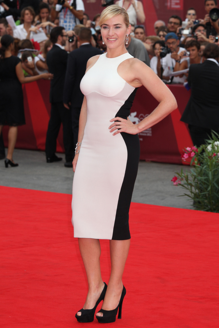
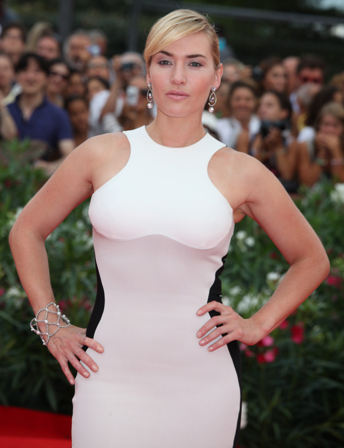
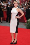
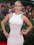
Most of you absolutely hated Kate Winslet’s beige-y Victoria Beckham dress at the Venice Film Festival premiere of Carnage. I don’t know, I kind of liked it then and I kind of liked it now. Kate usually doesn’t wear very “modern” dresses… or, I guess I should say it this way, she usually doesn’t pull off very clean, modern styles. I personally don’t think she really knows what looks good on her figure, and I won’t even get into how she styles herself. Anyway, these are even more photos of Kate from Venice – she’s also there to promote Mildred Pierce, I guess because the miniseries hasn’t aired internationally yet? Kate wore this odd Stella McCartney dress for the red carpet. Now, THIS I hate. Michael K calls it a titty-bib dress, but it’s worse than that. The way the panels are cut to specifically “fool the eye” into thinking Kate has a smaller figure, it’s just tacky. It’s like the dress equivalent of a tuxedo t-shirt. And Kate needs to stop pouring herself into these too-tight dresses too.
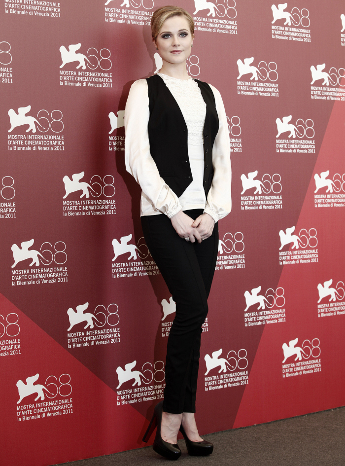
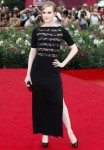
I disliked Evan Rachel Wood’s red carpet dress too – she wore this black Alessandra Rich. I think it looks cheap, like something on the discount rack at Belk’s. ERW tries to upgrade it with her styling, but it’s just kind of meh.
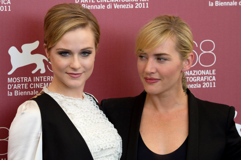
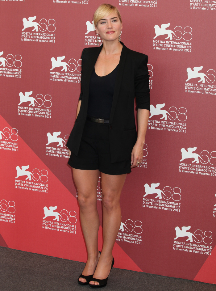
Both Kate and ERW looked cute for the earlier photo call though – I like that Evan is trying to bring back the vest. It’s so 1993.
Photos courtesy of WENN.






No. No, no, nonono.
It looks trashy. Like something you’d see at a dive club.
And when did Adele start doing ERW’s hair and makeup?
The Niki “swish” across her “titty-bib” would have made a nice accessory.
The slimming affect does work when viewed from a distance until you realize it’s an illusion and think, “Yep, baby’s got back”.
Kate Winslet looks like she is wearing a sports bra on top of a dress or wearing on of those t-shirts with the picture of a hot body.
wow, Kate Winslet looked perfect for the photo call.
Instead of giving her a more streamlined look, the dress made Kate Winslet look uncomfortably squeezed.
So, can winslet be criticized now, or is she still off limits?
That dress is just plain awful. She has a lovely figure with curves, but she does not wear the right clothing to complement those curves. Mostly the stuff is just too tight. The shorts–well she does not have C. Diaz’s long, slender legs, so that does not work either.
That dress is awful. Don’t you think her face looks puffy ?
Horrid dress. Her Venice dresses have been too tight, terribly unflattering. The shorts ensemble skimming her curves is elegant and figure flattering by comparison.
Killer dress, love it.
It doesn’t quite work, not awful, but not great. Hate her hair. I don’t know why stylists go for that hairdo; it looks like something you ‘d see on Renee Zellweger, whose been styled very poorly many, many times.
The breast part looks like shit. It would have been better if it seam of that breast area were all the way UNDERNEATH her breast.
call me crazy but i like the dress!
Yeah, the “slimming panels” didn’t quite work…she does look like she’s about to pop out of that dress. I hate that for Kate, too, because she really is naturally beautiful. Just needs to throw on another dress…and be realistic for once.
I think she has great legs- they are rounder for sure but toned and smooth…
The first dress reminds me of a Neapolitan ice cream sandwich…
Kate – Whats with the poses now.
It’s like she’s got her hands on the Katface book of posing.
GROSS.
ERW – Love her….but didn’t like the dress look at all, loved the more casual look though.
Poor Kate – she hasn’t really figured out her personal style yet and is at the whim of some pretty strange or lame designers. Sometimes it does take a while.
She really needs to check with her mom before she leaves the house. I would never let her wear that fug dress with the black zipper down the back and these outfits today — major UGLY, “Sweetie, do you really want to wear a dress that looks like something made on Project Runway because they couldn’t use more than 3/4 yards of the same kind of fabric?”
She needs a nice black crepe pencil skirt that flirts with her knees which would look better than the shorts or the too short skirt from the Carnage premier.
Alas, such a sweet girl too…
Ridiculous!
Yet another dress that tries to make her look slimmer through optical illusion
Yet another sausage-peel dress from Winslet that looks like not even a matchstick would fit between her and the dress
Yet another dress that seems to be 2 sizes too small and looks totally tacky that way
Yet another dress that clearly indicates how hardworking her spanx underwear must be to keep it all together.
Yet another desperate attempt, that screams “I AM SEXXXYYY!” and forgets about elegance.
… and it must be the 100th version of the same desaster by now
What’s going on is that she’s meeting some friends to play tennis directly afterwards. All she has to do is change her shoes. Something that wasn’t mentioned about the dress is that the fabric is dri-fit.
Actually, I think it flatters her figure.
I l-o-o-o-v-e that dress, and Kate looks good in it. I don’t appreciate Stella McCartney’s designs at all but that dress is fabulous, even the colours are great.
That dress looks like it belongs to a stripper.
She has a nice body and she doesn’t need those type of dresses. I do love the shorts outfit though.
The top of the dress makes her look like an Olympic swimmer.
I feel like she is one of those formerly overweight people who is now somewhat thin and is going overboard with the tight dresses that do not flatter her still curvy body. This is a dress that a naturally thin person with a flat chest like Keira Knightley or Emma Watson MIGHT be able to pull off. At least the “titty bib” area would accentuate their flat chest and it would be more understandable. The design is tacky and it would be hard for almost anyone to look good in it.
I loved the Beckham dress…except for that feckin zip…and think this is a designer Miss Winslet should work with. (As you said yesterday, so refreshing to see a cocktail dress rather than an over the top evening gown!) As for this McCartney frock….nah, Kate should do elegant rather than overt.
“Titty bib” is right — the dress is hideous. And nobody will ever get me to believe that she hasn’t done something to her eyes.
kibbles – you’re bang on there.
More and more I think that Kate struggles with her size. Not maintaining it per se, but coming to the realization that she will never, ever be in a 0-4 range. She’s insecure – commenting about the size of her feet, weight, etc. There are some things that you can’t change, so you might as well learn to love it because this is who you are.
Stella is known only for her last name. Her clothes are hideous. And for all of the complaints Winslet does about plastic surgery, why does she look like she’s had it? She has had that frozen look for a couple of years now.
Titty Bib is not flattering. She has a fantastis body I don’t understand why she wears some of these dresses that do her no justice
Stella isn’t a talented designer and never was. She’s the Gwyneth Paltrow of fashion. Pure nepotism is responsible for her position.
Do so agree re Stella…I just do not get her at all. Never seen anything remotely wantable by her, nothing suffused with this genius about women’s real wardrobe wants that she’s credited with. *snarl*
I would love the dress if it was all one color. She looked cute in the shorts.
It shouldnt be two colours. White and beige just do not work well together, especially when the line which is obviously supposed to run below her bust just.. doesnt. Wear something more free-flowing, less clingy and more expesive looking maybe?
I dont really like Kates dress and it is too tight, but ERW’s dress is really beautiful.
So check out the dress on a stick thin model:
http://www.elle.com/Runway/Ready-to-Wear/Fall-2011-RTW/STELLA-MCCARTNEY/STELLA-MCCARTNEY/(imageIndex)/26/(mode)/fullscreen
It’s not bad….Kate is too busty for it. The seam that sits kind of mid-boob lies flatter on the boobless model and I think that where that seam sits on Kate is a huge problem. I’m busty too — you have to watch how things sit on your boobs, particularly a contrasting color with a seam.
Also, she is not toned enough to have those kind of arm holes. Sorry, sweetie, it looks like as soon as you put your arms down there’s going to be a gurgle of skin & bulge. Again, blame the boobs — sucking up all the leftover material so that the armholes are too tight.
Kate is gorgeous and I love her just because she’s not some skinny twit but she needs to dress to her figure and stop trying to fit into things that don’t work with her figure.
Those of us with the busty + small waist combo sometimes ask ourselves, “Why not emphasize it?!” And here’s the answer.
Kate is too beautiful not to wear things that flatter her. This hideous dress shows off her… arms? They’re perfectly nice arms, but she does have better features.
The side panels would be fine if the bib didn’t kill the whole thing.
Shorts seem too casual for the event.
Loved the Beckham dress on her. Kate has a great figure & bold facial structure. She can carry off very dramatic styles. She should lose any clothes from Stella.
She something like miranda kerr
I can’t find anything nice to say about the first dress, except that I would rather see someone try and fail, then play it safe. She did try, I can give her that.
I agree with Kaiser,ERW’s dress does look cheap.Then again, I hate black lace. It reminds me of high school goth, or my mother’s lingerie that has snags all through it from sitting in the wooden drawer *shutter*. Not attractive IMO
on a sidenote, when I saw the pic of EWR I was like “Who’s the new girl?” looks soooo different.
Kate Winslet, OMG. First off, her face – just problematic. The eye makeup is weird, and makes her eyes look smaller. There is something strange around the lips. The dress – what more is there to say? It’s 80s – neoprene combined with blocks of modern neutral colors. Like Linda Evangelista in 1989.
In conclusion, she looks like a lady wrestler.
Evan Rachel Wood, what’s with HER makeup? What is it with these stars and makeup? Every single one is totally overdone. The heavy eye makeup makes ERW look tired and older. Like a waitress at a diner along the highway, after second shift.
Tacky, looks like something a prostitute would wear.
Looks like a cheap dress.
Maybe she thinks that if she directs our attention to her breasts, that we won’t notice that she’s had work done on her face? I know that she puts her hand on the bible and swears she would never have plastic surgery, but that face is simply not the same. Eyes and lips are all jacked up.
I liked the Victoria Beckam dress and I like the black short suit here. Her make-up and earrings are wonderful, but I have to agree with Michael K’s description of the Stella McCartney dress.
ERW was doing so well, but both of these outfits missed the mark.
Kate’s facial expression is what turns me off of the whole set actually. She looks like she practiced that face in front of the mirror. She goes on and on about anti-plastic surgery leagues but still manages to make a face phony enough to question her “untouched” face.
The dress makes her body look ill-formed and makes her look constipated. It’s something I would expect to see at a 40+ retro themed single’s club.
Love Kate Winslet but have never been a fan of Stella McCartney’s designs. Haven’t seen one yet that did the wearer any favors.
I like the dress titty bib in all.
Whatever Kate is doing to her face she needs to stop!! Her legs look great in the bottom pic, though.
@lakemom, I’m with you – I have no idea what people see in Stella McCartney’s designs.
Her face! Yeah, SURE, she didn’t mess with it. Umm hmmm.
Forget the dress, her eyebrows are so dark and harsh looking that it’s completely distracting!
Oh now i know she doing plastic s.
Blech.
She has great legs (well, her body for that matter). Much rather see her than any of the other starlets as physically, she reminds me of any of the 50’s womanly stars (Jane Russell comes to mind). Toned and tanned. Like the dress too with the simple black and white.
Kate Winslet’s black and white number is far too long for this style on her figure. It should be just above or on the knee. Also the line supposedly below the boobs starts almost halway up the boobs! Looks ill fitting there. I personally don’t like that cutaway neckline for a dress. Looks like the top of a swimming costume. Also those shoes are to heavy for a summer dress.
She usually dresses for her figure so I’m surprised she chose something quite tight. Unless she had picked out this dress a while ago and gained some weight since, but just said to hell with it and wore the dress anyway. She does look like she filled out recently… judging from all the Venice pictures her face is fuller, her arms are fuller, she has more of a tummy. She got it wrong at the premiere but boy did she get it right for the photo call. I love the blazer paired with the shorts. She didn’t over do anything. Classy in all the right places.
By the way, totally not surprised you left out all the pictures from the premiere where you can see all her wrinkles & crow’s feet. [eyeroll] As I said many times, if you compare two pictures from the same event and she looks like herself in one but different in the other, you know you can’t blame her.
http://i53.tinypic.com/30kerg9.jpg
She’s natural.
In that dress she looks like a member of the KarTrasion Family not an Oscar winning actress…though the last outfit is cute.
She seems too narrow, like she wears two sizes under her real one!
That’s why her poses are so roboto!
@ Turtle Dove – I think Kate does struggle with her size. She’s somewhat thin for her body frame (in terms of body fat% at least) yet because of the way she’s built she’ll always look sturdy rather than waifish and delicate unless she goes anorexic. In hollywood land than probably translates into HUGE.
awwww….really????
I would so f’ing wear that dress!!!!
I would wear it as a pant suit, bathing suit, pajamas….
anything that helps!
Kate Winslow’s new plastic surgery has been bugging me and reminding me of someone, and I couldn’t put my finger on it ’til now.
She looks like the female version of the pulled and plastic Shane Warne (Elizabeth Hurley’s boyfriend)! Especially in the 2nd picture.
Celebitchy should do a post showing these two mask faces side by side!
I love Kate, I think she’s beautiful and I don’t get all the hatred towards her. Whatever…whether I like the dress personally or not, all together she looks good. Could be much better, but this isn’t the worst she has ever looked!
Kate’s super rich. She can afford to get her eyebrows tinted. The dark eyebrows look tacky.
looks like winslet is gaining again and the first dress doesn’t help her. such dresses never serve any purpose other than making people look fatter than they are, i don’t get why anybody would still design that, it’s stupid. btw if she is denying botox she thinks we are all delusional as she is, her brows now have the -i’m constantly angry- look that other botox victims have!
Great figure. Fugly dress.
loved the beige dress, a big thumbs down to this white spanx swimsuit thingy.
I like the black shorts outfit. The ridiculous posing looks naff. Can’t make my mind whether I like her…comes across haughty and superior in photos yet she interviews well and of course can act very well. her face looks much more refined…with you all suspecting she’s had tweaking done, not full-on work.
Super-Duper web site! I’m loving it!! Can return back again – taking your feeds additionally, Thanks.
Awful! Don’t care for either of their dresses.
I do like their more casual looks though.
THIS DRESS IS STUNNING! stella mcartney is genius! it really brings out the curves in a woman and especially kate! its so futuristic and different, soething that we need alot more of, different styles! not all the same crap we so now and again.
kate could wear a potatoe sack and still look beautiful