*Click the photo to enlarge.
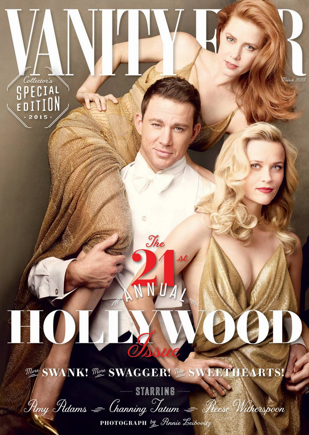
Usually, I look forward to Vanity Fair’s annual Hollywood Issue for months. But not this year. I guess it’s because VF has really been phoning in their Hollywood Issues for the past few years. I remember when their portfolios were amaze-balls. That hasn’t happened in a while. Anyway, this year’s VF Hollywood Issue cover is pretty #OscarsSoWhite. They threw in David Oyelowo and Oscar Isaac, but neither of those men are nominated for Oscars.
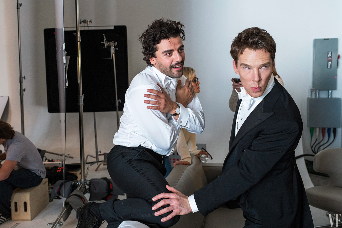
This year’s pull-out cover includes Channing Tatum, Amy Adams, Reese Witherspoon, Eddie Redmayne, Benedict Cumberbatch, David Oyelowo, Oscar Isaac, Felicity Jones, Sienna Miller and Miles Teller. You can see the cover preview here at VF. You can also see the slideshow for the behind-the-scenes photos here. Lots of Bendy!!! In one photo, he’s touching Oscar Isaac’s leg tenderly, and in another, Bendy and Oscar are playing ping-pong.
I’m glad Bendy was included, ditto for Redmayne, but I’m kind of mystified for why Vanity Fair chose the combo of Channing, Amy and Reese for the newsstand cover. Is it because they’re Americans?
And here it is, VF's 21st Annual Hollywood Issue, photographed by Annie Leibovitz! http://t.co/lWaXnqCsag pic.twitter.com/eH6eRDSjx4
— VANITY FAIR (@VanityFair) February 3, 2015
Photos courtesy of Vanity Fair.


Were the people at Vanity Fair trying to screw over Amy Adams? She looks awkward on the cover.
Awkwardly lucky to be all draped over the charming potato!
Bless the commenter who wrote here about him once, “one of our finest Potato-American actors”. Sorry I forgot your ID, but it still makes me laugh.
Also, in answer to Kaiser’s question, “Is it because they’re Americans?” Yes.
Yes – she looks really awkward! It’s horrible! And if you look at just the cover, it looks like it could be her hand over Reese’s! Inspector Gadget arms!!
She is gloriously glamorous in the slide show though. THAT is the dress she should wear to events.
Yeaaaah, I really don’t understand why they had to have the Tater hoist Amy Adams up in the air like that. And don’t get me started on Reese Witherspoon’s chest. Yikes!
Seconded.
With her over his shoulder, they get ass and cleavage in the same shot. I think that’s whthey chose this shot for the cover.
I know! She looks gorgeous, but the pose is incredibly awkward.
Came here to say the same thing — the hoisted over the shoulder yet crouched down to fit into the shot pose looks F-ing weird.
Odd.they used to have some sort of theme but this seems random.while a lot of them are “up and coming” , reese and amy are established stars. I will probably buy it anyway.
Maybe I’m alone on this but I think Amy looks sexy in that pose. Miles Teller and Oscar Issacs are American too but out of the group Amy, Reese and Channing Tatum are the more recognizable faces out of the group so they got the cover. I know we see Cumberbatch everyday on CB but could the average person really pick him out of a crowd? Probably not. Sorry Cumberbitches just being honest.
what did they do to reese? Look at her arms and tits. Especially the tits. Uhm….
What’s wrong with them?
They’re not hers.
Thought the same thing about her bust! Since the dress has no support, that’s some major airbrushing or really uncomfortable taping.
I don’t really like this photo. Sienna and David are the only ones who look good, IMO, and I like most of the people in the shot! Poor Amy and Oscar, it’s like they were thrown into the shot at the last minute.
@ lilacflowers *snort* 😀
Look at her side as well, under her arm. She looks so broad, almost bodybuilderish. And she’s a petite woman. Have they been staring at the photos so long while photoshopping that they don’t see it looks insane? Or is it just the angle?
I noticed the Reese breast inflation right away. Inflatergate.
i love the way everyone looks, like the style, but boy does amy adams look odd on the cover like she’s going to fall or something
You know, except for the first 5yrs of this issue, the Hollywood VF cover has covered non entities. It was becoming embarrassing really. I like this year’s cover if only because everyone, bar Sienna Miller, has a proven record.
Why is Channing Tater wearing Amy Adams like a shawl?! Just plain wrong
… the woman has been nominated for numerous Oscars, girl should be wearing him!
Amy no longer has to walk any more. She can just demand that actors carry her about and she gets to choose the actor. She chose Channing for this picture then had Oscar carry her to her car.
Imagining Amy Adams being carried around by big hot men bc she’s so good at her job is actually a way I can like this cover.
Now I’m picturing Henry Cavill carrying her to get coffee bc he’s hot but an average actor and she’s out of his talent league.
This explanation makes the most sense to me.
I support this.
BIG TUFF MAN, HUHHH!
Agreed! He looks like a Neanderthal carrying his conquest.
I find that hot. Hot Potato.
I’m calling Oscar Isaac, Back OFF.
You can call..I will answer the door in his shirt!!!
Bazinga!
Dueling potato guns at dawn.
two BC post? is this revenge for the cucumber crop failure yesterday? is this the Bus Company?
that being said: either Oscar Isaac’s curls or Oyelowo’s gaze are more fitting for the front cover than Tatum (nothing against him).
Reese has definitely had something done to her face. Her pronounced little chin looks much less, well, pronounced. Her eyes look different too. Of course VF does airbrush like crazy.
She looks like someone out of Twilight.
ROFL – best comment!
Why is Sienna Miller there? this smacks of a glorfied prom photo. But Oscar s gorgeous.
She is in an Oscar nominated film.
Because Sienna is EVERYWHERE.
The bigger question is why Miles is there.
Dangerous putting Sienna with Oscar Isaac. Just the kind of smart hunk she usually goes for.
Everyone looks like the Hulk came in and threw them all on top of each other into a dog pile. Wtf?
Oscar Isaac is hawt.
Oscar my love, I know acting role and all but I am begging you; SHAVE!!
I don’t know, I liked him best with the beard in Llewelyn.
Without the beard he looks like David Krumholtz. Not that there’s anything wrong with that, except that there’s already a David Krumholtz.
Can we discuss the Pacino-Pfeiffer thing they were going for with Isaac-Chastain? These attempts at classic 70s genre movies always have a Bugsy Malone vibe to them… little kids playing dress-up, rather than believable adults.
Pffff, of course Gugu Mbatha-Raw is not included in Vanity Fair, but Sienna is in it….
Exactly! Gugu should’ve made the cover.
Sienna is the female lead in what will be the highest grossing movie of the ear in the US (American Sniper) and also had a role in Foxcatcher which got several Oscar nominations. She’s having several movies coming out this year, too.
While she has been getting way more publicity that her career deserved, her inclusion is actually justified (and I’m not even a fan of hers).
Gugu would have been nice addition to the cover and they’ve had more people before but American Sniper made more money in its third weekend than both of Gugu’s movies made combined through their run so it’s not as Gugu is anymore ‘deserving’.
Everyone looks constipated.
I was hoping their Hollywood issue would be TV stars this year since that’s where it’s at.
Very weird poses and very white indeed. However I sure do wish I was draped all over Mr. Charming Potato.
Horribly unimaginative and Reese can go away now.
Not only has Vanity Fair been phoning it in, but Annie L just plain sucks these days. Her or her retouchers Photoshop skills are appalling for a supposed professional, expert photographer. If you can’t actually physically get everyone in a picture together then don’t fake it. It looks awful. Get creative and compensate! The styling is boring and the poses are dumb.
YL/dr: it sucks. Don’t understand how AL keeps getting headline jobs.
It’s sad, Her earlier work was so much better. Now, I think it’s an uninspired paycheck, she had a lot of debt. But I do like the candids in the slide show.
I agree her work has been terrible lately. I’ve been side eyeing her extra hard ever since she photographed Kim Kardashian for vogue.
Sienna Miller? Lame. VF and Annie Lebowitz phone it in again.
Am I the only one looking at this and thinking Random?
No. No you are not. Where are the prohibitive bets for Oscar winners? Granted, Redmayne is there. But where is Julianne Moore? J.K. Simmons probably doesn’t fit with their definition of pretty Hollywood. No one over 40.
I agree and Keaton -why have an Oscar issue if you miss the key players and only go for clickbait
Amy Adams perched on him like a bird! Haha..
Look at Bendy’s face in the sea of faces on the cover, longest of all, weird and funny.
Miles Teller?
this looks like an intensely ackward prom photo.
He looks like Beavis when he’s doing that Blue Steel pose.
Am so loving Sienna’s hair – she really suits it, it give her anold Hollywood glam.
Oh Bendy – even in the photo shoot you’re trying to hard to, your practically falling off the chair. Makes you look like your trying to get away from Eddie.
Dear. God. Once all put together like that, those photos reek of cheese… On the left, the buff guy is surrounded by women, literally; in the middle, the classic beauty is in the center of well-dressed gentlemen; on the left, the enchantress has a guy’s head on her lap. #facepalm #notsopictureperfect
Why are the women draped over the men like props? So aggravating. They’re terrific actors. Let their work speak for them, not their sex appeal.
I’m glad to see Cumby in a couple of pics with Oscar Isaac, as that is the only Oscar he is likely to get this season.
Touché! Lmao XD
BOOM! EsCon’s back y’all… with SNARK!
Hahahaha!! Hi, MtnRunner! I just couldn’t resist!
The Cumby/Oscar jokes are writing themselves now. ..
Is Benedict’s head really that big, or is this some Michael Scott level photoshop?
it is a symbolic representation of it’s recent expansion.
LOL! That’s a valid explanation.
But it certainly looks more like he’s photoshopped in.
I have no idea, but I will say he looks younger in these pictures, IMO.
I’m both annoyed that they treated Amy Adams–who has more oscar noms than anyone there—like a sexy doll prop and turned on with the spin that she’s so good that hot men just carry her now from place to place.
Hmm I think Amy and Reese are fine for the cover, the are the most known and proficient and Channing is popular as well but I wish David would’ve been on the cover as well, he has that presence.
And how have I not given attention to Oscar Isaac before, my eyes went straight to him in the spread (and Reese oddly) he’s very very charismatic. Hope he becomes massive because he deserves in and one his way to become one of the best actors IMO.
I don’t think I’ve seen any of Oscar’s films. Which ones do you recommend?
Most Violent Year and Inside Llewelyn Davis are the only ones I’ve seen. Dying to watch Two Faces of January as well, not just for Oscar but Viggo as well.
I like Oscar’s post in the photo, glad he occupied the lower half so I can just cut the top half and throw that away.
Miles is handsome. Sienna looks good. Otherwise is NAH.
I know everyone is pointing out the awkwardness that is Amy Adams being Tarzaned by Channing Tatum, but I find the positioning of Felicity Jones on Benedict Cumberbatch’s lap just as awkward. Maybe it is me, but I am reading a disconnect in their body language.
Maybe he’s afraid if she sits his lap she’ll get pregnant, too.
How dare VF not include the #1 Snubbed Jennifer Aniston!
And this is why Parker and Stone created the character “Token Black” on South Park.
I think Reese, along with Eddie, Felicity, Benedict were chosen because it was pretty much known they were locks for noms. Amy Adams was in the running, possibly Sienna Miler for supporting (had AS been released earlier to these huge numbers, she may well have been as she got good reviews), same with David Oyelowo. Miles Teller (barf) and Oscar Isaacs are both rising stars. Channing is a good looking big name. I would have LOVED to have seen Reese (or even Amy, who I LOVE but who has been on the cover before) replaced by Gugu Mbatha-Raw (GORGEOUS and her performance in Belle was really overlooked). Reese, Channing and Amy are all really established while the others, even with long careers, are just really hitting it big now. Gugu would’ve fit in there. I would’ve replaced Teller with Jack O’Connell. Replaced Channing with someone like Michael B Jordan. It’s almost 1 am here so I’m too sleepy to think more but I’m sure there are some other up and coming Hispanic and Asian actors. Then they could’ve been more representative AND kept to a theme of rising stars. Love the styling though–they’ve done it before but it always looks good.
Awkward cover, completely meh group shot. Annie just takes the same dang picture every year. Where is Julianne? Or Rosamund? The women on this cover, aside from Adams, are all pretty basic. I like Jones but both she and Miller played “the wife” in their roles, not the most interesting performances to make the cover imo. Why no Keaton, or even Carrrell? Why must I Iook at potato head?
Vanity Fair posted really cute shorts of British actors reenacting famous lines. Anyway to add this to the news?
“https://www.youtube.com/channel/UCIsbLox_y9dCIMLd8tdC6qg”
I was going to say that they probably are all on the front cover because they’re American (afterall the second column people are all Brits). But, I also think its just because they are most recognizable out of the bunch. Are there enough people out there who know Eddie Redmayne is to sell a magazine? Is there enough people who know David Oyelowo is to sell a magazine? Etc.