Last month, it was announced that Angelina Jolie had taken a new modeling gig. She had previously modeled for St. John’s, Shiseido and for Louis Vuitton, but Jolie has always been a bit picky about advertising campaigns, and she’s never represented anything in the American markets of beauty/fragrance (the Shiseido ads only appeared in Japan). I imagine that in her heyday – say, a decade ago – she got lots of offers to become a face of one of the big beauty companies but nothing ever came of it.
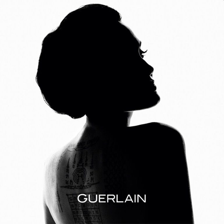
So, she decided to become the face of Guerlain perfume, and she has already donated her salary to charity. When the gig was announced, Guerlain released the first image from the campaign, the half-silhouette shot of Angelina with old-lady hair (the header image). Guerlain has just released this second image:
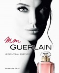
Which is pretty, but not necessarily what I was expecting? They made her look like the Ghost of Perfume Past. It’s too… something. I can’t put my finger on it. So, this made me wonder if the whole ad campaign was going to be like this. Hopefully no, because this image is making it’s way across the interwebs this week:
Angelina Jolie's new pic for @Guerlain pic.twitter.com/YTwoyUn4ER
— Angelina Jolie (@joliestweet) February 22, 2017
I hope this is from the real ad campaign because THIS IS WHY YOU HIRE ANGELINA JOLIE. You don’t hire her to stand in shadows with a mum-bun. You hire her to enigmatically stare down the camera in a naturalistic setting.
Ads courtesy of Guerlain.


I LOVE LOVE LOVE the second black&white image. To me that’s why you’d hire Angelina Jolie – to have her impossibly symmetrical and beautiful face draw in the customers!
I like the focus on her Tattoo in the first one.
I love the contrast with the tattoos, and I agree with you, the second is stunning too, she is crazy beautiful.
It looks a little art house, maybe? I kind of see where kaiser is coming from with all the black and white and high contrast.
My favorite is the first image. The aesthetics of the stark contrast between black and white, the elegant lines of the silhouette and then the focus on her tattoos. it is a beautiful image.
The second is a bit bland even though her face is exquisite. It is just that it looks like so many other images.
The last one is lovely. She comes across as natural and unguarded.
However, my vote goes to picture no. 1 because of the aesthetic effort that has been put into it. I don’t understand the complaint about the hair – it is an elegant updo and it highlights the contrast with her tattoos. I like the implied message – that tattoos can go together with beauty and elegance.
I’m with Art on this. I love that first picture. (If I ever actually was offended by anything, I would be offended by the mom-bun comment. When you have long heavy hair, it often looks like this in a bun. Mine does it all the time, that’s just the way it is.) The silhouette is absolutely fantastic. The neck, the tat’s, the lashes. Wow.
The other photos are also amazing. The woman is so photogenic, it’s almost inhuman. I would love to have poster sized copies of the two black and whites for my vanity room.
LOVE the first shot. It took my breath away.
Incredibly stunning, love the natural lighting outdoorsy one and the more glam signature b&w shot. I can’t wait to buy this. I used to love Champs Elysee buy Guerlain, if this smells anything like it they have me.
If it’s for charity then I am in even if I smell like dirt.
@Maya Jolie might have donated HER salary to charity, but everything you spend on this perfume will line the pockets of LVMH, which owns Guerlain.
Not your money will go to charity, Angelina donated her salary to charity.
@Almondmilk Question has Pitt ever donated his AD proceeds to charities?
funny, that’s the one I like the least because the pic looks like a very beautiful woman who resembles Jolie, but isn’t actually her. it looks like they narrowed her face and altered her nose. could be just that you can’t see the cheekbones because of the shadow/wash-out effect, but me no likey.
I like the other two much better, esp the one with her looking over her shoulder.
ITAWY!
Especially after Kaiser called it a mum-bun. That killed it. I like the full face B&W picture but not the actual ad. It would appeal to my great auntie maybe?
I think they photoshopped her face in that, though. She doesn’t have such big eyes, does she? They are unusually large, like bug eyes. Weird.
There is something amiss with her upper lip in this second image. Looks like wack photoshop because I haven’t seen a single photo where her upper lip & mouth looks this way.
I like the b&w pic too. She looks tweaked to me in the third pic.
The second one is gorgeous. What a beauty
Slay me. Take me. I’m yours.
She is so f*cking beautiful. She was my first girl crush and she’s my forever girl crush.
Angie or Rih? No bothsies.
I’m selfish. Angie is my forever and always and Rih is my always and forever 😉
Lol, you are the worst at no bothsies. I feel you though. the two of them are perfect in different ways.
Those pics are beautiful. Cindy Crawford was my first girl crush and then AJ. Now I’m all over the lead actress from Quantico.
Priyanka Chopra from Quantico is beautifully but check out Deepika Padukone who is in the new xxx movie. That woman is breathtakingly beautiful.
Lol at always and forever. Forever and always. You have excellent taste Shambles. Thanks for putting a big smile on my face.
The Unsinkable Angelina Jolie! Hollywood be dammed.
THIIIIIIIISSSSSS
+1000000000.
damn this is out of this world. i so much love the black and white.
The Jolie is back People! shes back like she never left
She is a stunning beauty.
All the pics are gorgeous. She’s stunning.
While the two b&w shots are incredibly beautiful, I barely recognize her in the 2nd one. I can’t tell why though. Maybe viewing it on my phone distorts it?
said the same above. looks like someone who looks like Jolie but isn’t Jolie.
one of my major pet peeves when it comes to photoshopping. I understand eliminating wrinkles, blemishes, stray hair, etc….but to alter someone’s face to the point that they simply resemble the person they’re supposed to be?…drives me nuts. so many times I’ve been in a supermarket looking at mag covers and said “wow, that woman looks a LOT like Reese Witherspoon” only to realize that it IS Witherspoon and she’s just been photoshopped to hell.
Because most of her face is on the shadow and the rest is too white also she bulled back her hair.
Exactly! It looks like they did something to her nose? Kind of like the “pretty” filter on Snapchat that elongates your features.
yeah, it’s the tip that looks weird. if you compare the tip of her nose in the b/w face shot to the tip in the color photo, you can see it’s almost like they “pressed” the tip downward in the b/w one.
sort of like how malin akerman’s nose tip is. jolie’s tip isn’t turned UP, but it’s also not as “mushed” as it is in that pic.
Agreed. It looks like a woman who LOOKS like her.
I like the first one with the tattoo focus.
Even though I am a heterosexual woman, I would marry Angelina with zero hesitation…she is the epitome of perfection – inside and out.
That second image is gorgeous. If they just took away that awful, dated ‘mon’ font it would be minimalist perfection.
What is a “mon” look?
‘Mon’. As is ‘Mon Guerlain’. My issue is with the font and colour used as it makes the whole image seems a bit dated and fussy.
The colour pic she is posing at the window is from the commercial, she’s stunning.
It’s nice to see a woman with grace, charity and strength after too much of a lot of women as blow-up dolls and in-my-panties on instagram for the wrong reasons coverage. Her choices are impeccable. I wish they’d rub off on the young ladies out there who are making questionable decisions in Hwood and taking selfies in the toilets.
This looks straight up from the 80’s super model era book with Halle Berry and Jerry Hall doing Revlon or Isabella Rosselini doing Lancôme…
Super duper beautiful !
I want to see her face always.
She looks beautiful in the second one of course, but it’s just an exceptionally ugly ad. That high contrast black and white thing paired with HD colour photography appears incredibly cheap and crappy if not done perfectly, and it’s very far from perfect here. It looks like something someone would mock up after playing around with a graphics program for 20 minutes.
It would be gorgeous as a silhouette illustration, or decent enough if it was just that photograph but in colour, but as it is it’s one of the worst print ads I’ve seen from a high end cosmetics company in quite a while.
+100000. I actually gasped when I saw it. It looks like something a first year photography student would consider “artsy”.
Yep, many people on the Internet complained about that second pic.
I like the 2nd b&w photo, but not the color one so much.
The second photo doesn’t look like her. In the third photo she looks gorgeous. What does her tattoo say? Brad has a lot of tattoos to scrub off. lol
I think she looks beautiful!!! I love the black and white, she has such beautiful eyes.
I agree!!
Angelina is truly beautiful, but I can’t believe these are perfume adverts. I’m not familiar with Guerlain– is that a high end brand? These images look embarrassingly budget, like Lifetime TV prop ads.
Do better, Guerlain!
When was the last time Angelina did budget?
well, these pics look VERY budget. So to answer your question – she just did.
The House of Guerlain is very old, from the 1800’s and was kept in the family for more than a century. It’s now owned by Louis Vuitton group. So no, not budget.
The first black and white reminds me of how old the company is, it also makes me think of their first perfume that smells of band-aids, or at least to me it does. I never understood why people wore it. I hope these ads are for a new, more modern, non-band-aid smelling, perfume.
Have you ever heard of Shalimar perfume? That’s one of Guerlain’s fragrances. Very high-end.
Unbelievable stunning – only need her face and nothing else to mesmerise both men and women of all ages.
So far Angelina’s commercials haven’t disappointed me. I especially loved the LV one based in Cambodia – that was shot with a very unique theme.
I have faith in Angelina and Terrence Malick who is directing these commercials. Terrence is known for his unique direction so pretty excited about this.
We already know the main theme is being a woman. That everyone woman is unique and special whether they are daughters, sisters, wives, mothers, friends, mother in laws, grandmothers etc.
The second photo looks like Kelly Lebrock(sp?) from her “Weird Science” days. Love the very last one- that’s AJ.
Guerlain is very High end Perfume in France. Angelina absolutely beautiful! Angelina’s proceeds will go Charity.
I really like the 1st photo. The 2nd one is too photoshopped – except for the lips and eyes, it doesn’t even look like her.
The second pic looks strange, probably because they got rid of the outlines and the way she looks over her shoulder doesn’t really help at all.
Someone told me yesterday that it costs €140, way too expensive for me. Well at least she donated her salary to charity.
I don’t know but I like the second picture is perfect her nose is the same if you compare the second and the third pictures, they did nothing with it no photoshop. That white and black is her if someone see on display anyone can tell those eyes and lips is Angelina.
The last photo is from the commercial. They released a sneak peak at it earlier.
This whole thing must be a complete surprise for the Hollywood reporter – they said she had no endorsements 🤔
@YepIsaidit They know the low information people will buy into the article.
….”You hire her to enigmatically stare down the camera in a naturalistic setting. ”
Has been done already by Cate Blanchett.
I like both Images. She has the face for black/white ad.
Her face. I literally could get lost in her beauty.
Good lord, she’s not that special, pretty yes but not amazingly so.
**stares**
Honestly, she’s one of the most gorgeous women living. Maybe she’s just not to your taste?
Jolie is beautiful but she had a weird hunched posture.
Shoot me, but I like the first one: very retro.
Me toooo, I LOVE the fact that it is still unmistakably Jolie despite only a shadow, how is THAT for being a super star? You can hate her but you can’t deny her face is all that jazz and more.
I love the second b & w picture!
I do too. Modelling is her strength. Camera loves her face.
Okay, I utterly love the mum-bun and the shadows.
That is a stunning photo, especially with her tattoos showing to give an otherwise flat image some unexpected texture.
Totally disagree. The 2nd B&W pic is stunning, this is the Jolie we know as one of the beautiful women on film.
Disagree that people want to see her in a ‘naturalistic’ setting, although she looks fine there. She’s like Elizabeth Taylor at her peak: you want to see her smoldering, ravishing the camera with perfectly made up eyes and lips. I want to buy this perfume.
Thank you for making the Taylor remark, it finally clicked in my head about these photos.
Google “Richard Avedon Elizabeth Taylor 1958”. BOTH shots (1 and 2) appear to be very heavily borrowed/inspired/copied from shots he did of Liz. Which might explain the “old ladyish” vibe these give out.
Hot daaang! She’s gorgeous!
also, i d like to thank guerlain and la jolie for giving me literally the sole news or “news-ish” item i can stand today. everything else seems so awful.
Angelina will go down in history as one of the Beautiful ICONIC Figure.
She will never not be gorgeous to me. Just stunning.
I agree. She will never not be gorgeous. Watch her face in the cooking bugs video.
I think she photographs beautifully but there are times where I don’t find her all that attractive. She’s not aging all that well and there are up and coming models that are far prettier to me. Weird body! JMO
Dame Angelina is simply beautiful , epecially on the inside where it really counts..
She is truly beautiful
She is beautiful to look at in print ads or fashion editorials but I find her a bit nauseating with everything else.
With Angelina as MON Guerlain Muse this will be their most successful campaign.