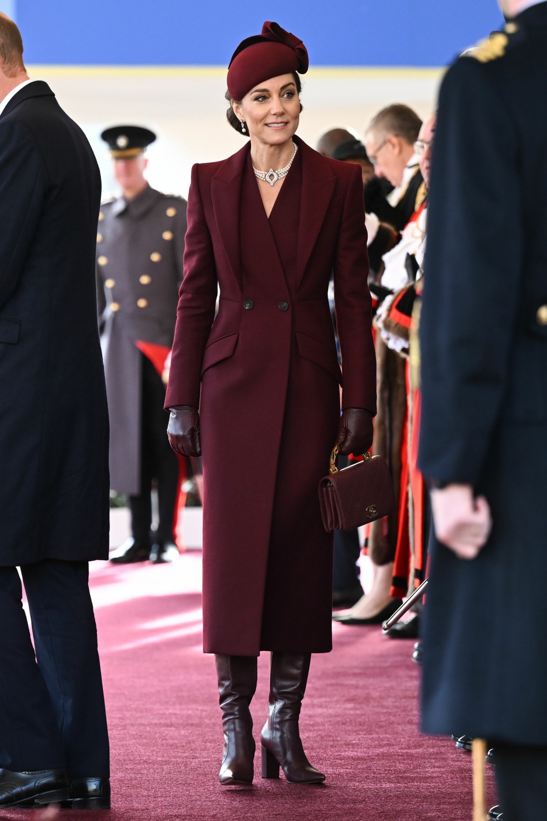
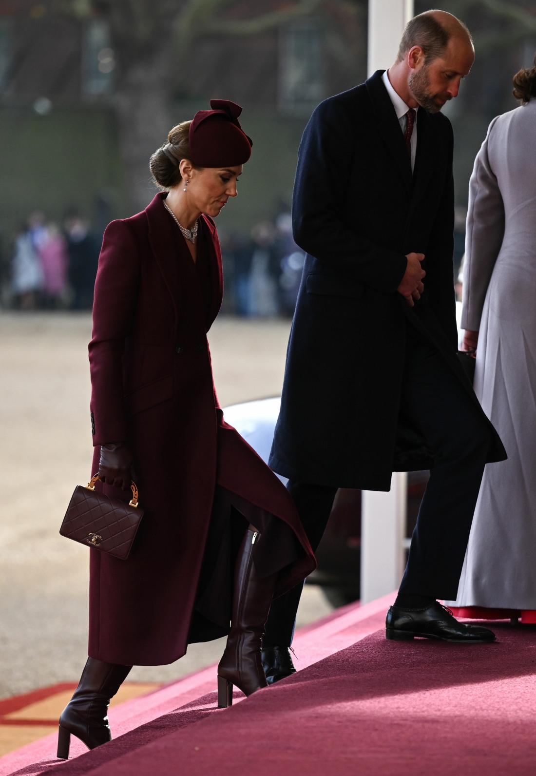
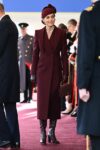
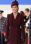
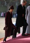
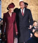
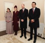
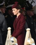
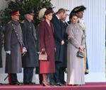
Are we still talking about the Princess of Wales’ appearance on Tuesday? Kate joined Prince William at the welcome ceremony for the Qatari royals. From what I’ve seen, Kate did not flash anyone, nor did she make an ass out of herself. Did she sort of look zonked out, like maybe she slipped herself a valium to get through the day? For sure. Beyond her general valium-haze vibe, people are still talking about her ensemble for some reason. I found the burgundy McQueen coat to be pretty typical Kate-wear: fussy, Edwardian, the wrong proportions. But the goal was clearly to dress like Qatar’s flag and to avoid flashing people. And she succeeded.
British Vogue called this shade of burgundy “the key color of the moment” – darker shades of maroon and burgundy in the Christmas season? Groundbreaking. The Telegraph also worked extra hard to make Kate’s ensemble sound like the height of fashion in the year of our lord Beyonce 2024.
Her coat, by Sarah Burton for Alexander McQueen, and hat, from Sahar Millinery, came in the perfect shade of “Qatar Maroon”, a colour which features on the flag of the Middle Eastern state and nods to the nation’s history creating purple dyes from shellfish. The Princess has form when it comes to planning her outfits around the flags of countries she is visiting or hosting – in the past, we’ve seen her sport red and white in Canada, deep green in Pakistan and orange in Germany.
But it was appropriate that the colours of Qatar also chime with one of the key hues of the current fashion season, meaning Kate appeared elegantly on-point as well as deftly diplomatic.
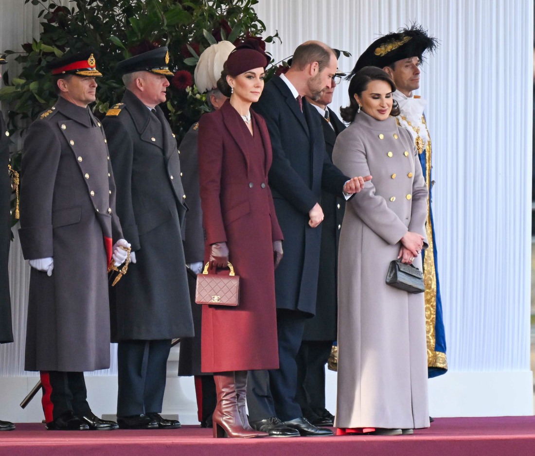
She emphasised this by doing a “colour drench”, wearing berry red from head-to-toe – besides her hat and coat, she wore leather gloves, Gianvito Rossi boots and carried a Chanel handbag, all in the same colour – a style tip anyone could try for a festive occasion where you need to be warm but feel dressed-up and polished, too.“Red is strengthening and fortifying in this deep, rich shade, which doesn’t stand out like the brighter reds but is a sophisticated and elegant colour,” comments Jules Standish, a colour consultant and author of the book A Colourful Dose of Optimism. “Kate is leading the way with this trending fashion colour of berry/burgundy, with a nod to the festive season and to the Qatar national flag. Together with William, wearing a similar shade of red in his tie, presenting an image of unity and harmony aligned with the Emir.”
I saw some of you compare this “color drench” style to the Duchess of Sussex’s style. While Meghan does color-drench (usually in beige, sadly), I don’t see this ensemble as Kate trying to emulate Meghan at all. I would love it if Meghan turned up in burgundy or berry, alas, she seems to have forgotten about those colors completely. And Meghan wouldn’t wear this style of coat, nor would she tie everything together to look so prim and pinched. If only the coat had more buttons, this would be a purely “Kate” look, flag-dressing and all.
Photos courtesy of Avalon Red, Cover Images.
- Prince and Princess of Wales arrives at the Ceremonial Welcome at Buckingham Palace for The Amir of Qatar. Buckingham Palace, London. December 3 2024.,Image: 942417415, License: Rights-managed, Restrictions: Editorial use, commercial use may require additional licenses. We don’t use AI to make images which could be mistaken for news photos. AI use will be clearly indicated. Supplied on condition you ensure personal data is processed in compliance with DPA2018, *** NO UK USE FOR 48 HRS ***, Model Release: no, Credit line: SWNS/Avalon/Avalon
- Catherine Princess of Wales at Horse Guards parade for the Ceremonial Welcome Emir of Qatar, Sheikh Tamim bin Hamad Al Thani State Visit to London, UK – 03 Dec 2024,Image: 942419738, License: Rights-managed, Restrictions: *** NO UK USE FOR 48 HRS ***, Model Release: no, Credit line: Victoria Jones/Shutterstock/Avalon/Avalon
- Catherine Princess of Wales at Horse Guards parade for the Ceremonial Welcome Emir of Qatar, Sheikh Tamim bin Hamad Al Thani State Visit to London, UK – 03 Dec 2024,Image: 942419816, License: Rights-managed, Restrictions: *** NO UK USE FOR 48 HRS ***, Model Release: no, Credit line: Victoria Jones/Shutterstock/Avalon/Avalon
- Catherine Princess of Wales and Prince William at Horse Guards parade for the Ceremonial Welcome Emir of Qatar, Sheikh Tamim bin Hamad Al Thani State Visit to London, UK – 03 Dec 2024,Image: 942429185, License: Rights-managed, Restrictions: *** NO UK USE FOR 48 HRS ***, Model Release: no, Credit line: Victoria Jones/Shutterstock/Avalon/Avalon
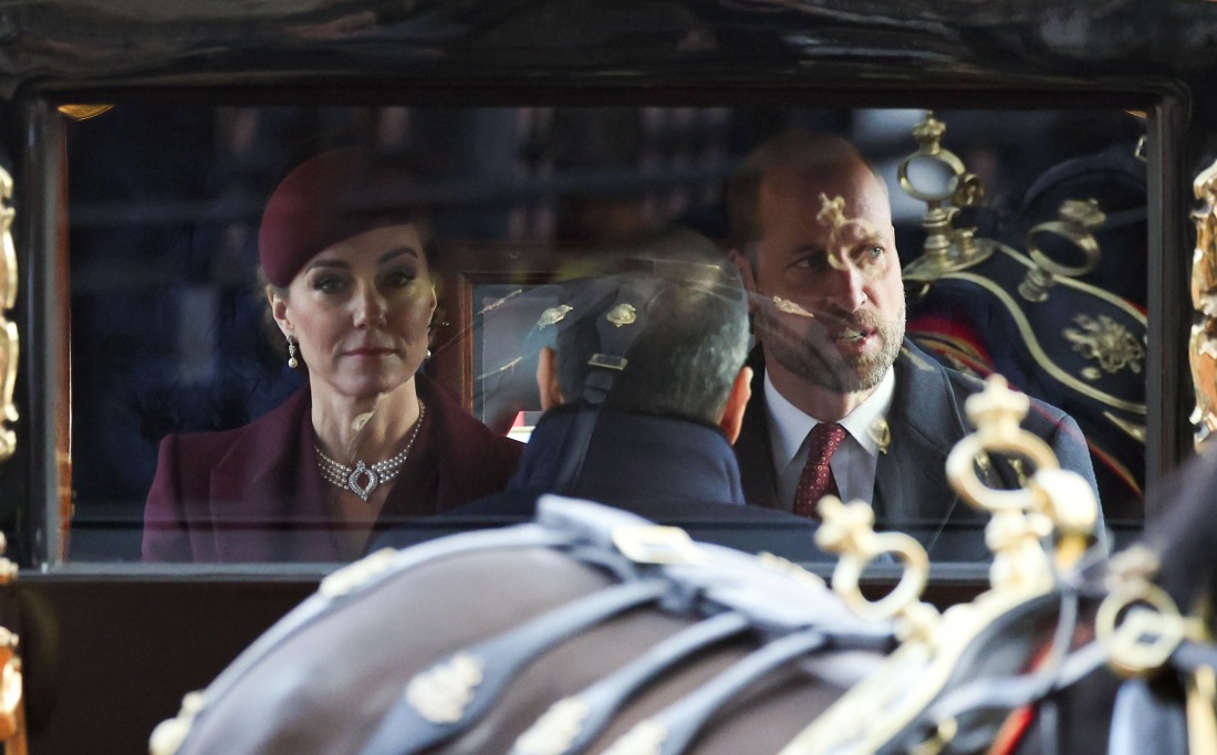
- LONDON, ENGLAND – DECEMBER 03: Catherine, Princess of Wales and Prince William, Prince of Wales arrive in a carriage at Buckingham Palace during day one of The Amir of the State of Qatar’s visit to the United Kingdom on December 03, 2024 in London, England. His Highness Sheikh Tamim bin Hamad Al Thani, Amir of the State of Qatar, accompanied by Her Highness Sheikha Jawaher bint Hamad bin Suhaim Al Thani, will hold several engagements with The Prince and Princess of Wales, The King and Queen as well as political figures.,Image: 942433347, License: Rights-managed, Restrictions: *** NO UK USE FOR 48 HRS ***, Model Release: no, Credit line: Chris Jackson/Avalon/Avalon
- LONDON, ENGLAND – DECEMBER 03: Catherine, Princess of Wales and Prince William, Prince of Wales arrive in a carriage at Buckingham Palace during day one of The Amir of the State of Qatar’s visit to the United Kingdom on December 03, 2024 in London, England. His Highness Sheikh Tamim bin Hamad Al Thani, Amir of the State of Qatar, accompanied by Her Highness Sheikha Jawaher bint Hamad bin Suhaim Al Thani, will hold several engagements with The Prince and Princess of Wales, The King and Queen as well as political figures.,Image: 942433353, License: Rights-managed, Restrictions: *** NO UK USE FOR 48 HRS ***, Model Release: no, Credit line: Chris Jackson/Avalon/Avalon
- Catherine Princess of Wales and Prince William at Horse Guards parade for the Ceremonial Welcome Emir of Qatar, Sheikh Tamim bin Hamad Al Thani State Visit to London, UK – 03 Dec 2024,Image: 942436540, License: Rights-managed, Restrictions: *** NO UK USE FOR 48 HRS ***, Model Release: no, Credit line: Victoria Jones/Shutterstock/Avalon/Avalon
- Catherine Princess of Wales and Prince William seen at the State visit by the Amir of the State of Qatar, Ceremonial Welcome on Tuesday 3 December 2024 at Horse Guards Parade, London. .,Image: 942443878, License: Rights-managed, Restrictions: World Rights – Julie Edwards/Avalon.Red, Model Release: no, Credit line: Julie Edwards/Avalon/Avalon
- The Mall, London, UK. 3rd December 2024. TRHs, Catherine, Princess of Wales and Prince William, ride a horse drawn carriage along The Mall on the first full day of the The Amir of the State of Qatar, His Highness Sheikh Tamim bin Hamad Al Thani, accompanied by Her Highness Sheikha Jawaher bint Hamad bin Suhaim Al Thani State Visit to the United Kingdom.,Image: 942446088, License: Rights-managed, Restrictions: Supplied by AVALON – Fee Payable Upon Reproduction – For queries contact Avalon – sales@avalon.red London: +44 (0) 20 7421 6000 Los Angeles: +1 (310) 822 0419 Madrid: +34 91 533 4289, Model Release: no, Credit line: Photo by Amanda Rose/Avalon/Avalon
- The Prince and Princess of Wales greet the Emir of Qatar Sheikh Tamim bin Hamad Al Thani (right) and his wife Sheikha Jawaher (left) in, London, on behalf of the King, before the ceremonial welcome at Horse Guards Parade, for their state visit to the UK. Featuring: William, Prince of Wales and Catherine, Princess Of Wales with Emir of Qatar Sheikh Tamim bin Hamad Al Thani (right) and his wife Sheikha Jawaher (left) Where: London, United Kingdom When: 03 Dec 2024 Credit: PA Images/INSTARimages **NORTH AMERICA RIGHTS ONLY**
- The Prince and Princess of Wales greet Emir of Qatar Sheikh Tamim bin Hamad Al Thani and his wife Sheikha Jawaher in London on behalf of the King for their state visit to the UK Featuring: Catherine, Princess of Wales Where: London, United Kingdom When: 03 Dec 2024 Credit: Cover Images
- The Prince and Princess of Wales greet Emir of Qatar Sheikh Tamim bin Hamad Al Thani and his wife Sheikha Jawaher in London on behalf of the King for their state visit to the UK Featuring: Catherine, Princess of Wales, Prince William, Prince of Wales Where: London, United Kingdom When: 03 Dec 2024 Credit: Cover Images







Going monochromatic is what the queen used to do, although her thing was neons. Also lol when you’re reduced to praising someone just for having gotten dressed.
I know right !! Breaking news Can’t got dressed and as per her usual she themed dressed.
I really miss the queen’s looks, she absolutely knew how to do it.
The monochromatic look is hardly new, innovative, or exclusive to royalty.
I myself am wearing all black, with only a bit of baby snot on the sleeves to break up the monochromacity.
I’m wearing a dark grey nightshirt and a pale grey housecoat. My grey cat is on my lap to compete the look. I feel very fash this morning.
@EmmyRae and Jaded
LOL! Unlike Kate, you should both be on the cover of Vogue next month – the New Look for 2025!
Emmy Rae:
Lolz!🤣 🤣🤣💕
I think Kate looks good in this ensemble. It is her comfort level and she needs something to get her through all of this.
I do think burgundy is one of her better colors. And sure, it’s a lovely color for the holidays. Is it on trend right now though? Maybe I haven’t been paying attention but I feel like it was on trend a few years ago. I mean it’s a nice color whether it’s on trend or not. Or maybe they mean ”color drenching” is the trend regardless of the color. It’s fine and appropriate and In her wheelhouse. Shrug.
Maroon, Burgandy, Bordeaux……..all very much on-trend this fall/winter. I love it but am getting sick of it!
Money is wasted on people with no imagination or taste. Imagine what Billy Porter could do with her budget.
According to YouTube fashion (haha) burgundy is a big color this year and she does look very nice. But hard afeee on why is she being parasites for getting dressed?
So she’s hardly leading the way, she’s following a trend? Natch. And she wore TWO of these stupid burgundy coat dresses yesterday. One for the meet & greet, one for the ‘look at all the Qatari stuff we stole’ event.
Yep lol burgundy has been all the rage for months. I myself and wearing burgundy yoga pants 😂
The ensemble is nothing special, but good enough for the occasion. It’s a nice color too.
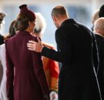
My god, she looks like her face is numb. The Fail got breathless that Slumlord put his hand on her shoulder once (omg pda). They didn’t factor in that he was making sure Kate stays upright.
Brace yourself for the breathless over excited coverage of “festive glances”
The colour is fine but it’s unfortunate her ensemble looks a lot like what the flight attendants for Qatar Airways wear. The hat is really what should have been changed to avoid that comparison.
Kate just wanted to honor her mother Carole the booze hound air hostes
Ah, the ‘sweet nod’ to her mother.
😂😂😂
I thought that! Quatari stewardess….
Qatar airways..what an idiot she is .
And once again embellished on the top half to give her a bust. She’s way too thin.
The Emir’s wife basically maroon color drenched for the banquet that night.
Burgundy is one of my go to colors in fall and winter so I’m always happy to see outfits in the shade. I didn’t like Kate’s hat (it’s like a half hat which is weird imo) or the necklace (clashed and not right for day) but I loved everything else. Boots, purse, gloves, long wool coat with no shiny buttons. I liked her hair too.
Burgundy looks nice on Kate and is a good color this time of year.
The praise she gets for dressing appropriately……Lordy.
I like burgundy myself and I’m also brunette. I also like this tone for leather furniture. Unfortunately, IMO Kate looks quite dull, but I think that was the intention after the Korean state visit fire engine red debacle last year.
Kate has always been matchy-matchy, hasn’t she? I’ve read that color drenching is a thing for interior design in 2025 – not so much for clothing. The last I heard about daring wardrobe choices was Katie Holmes choosing to wear brown boots instead of black. Still, trends in one market follow in another.
Yeah, interior design for sure. I thought Kate’s boots were brown.
Kate has worn this colour, or variations of it, at least five times in the past 12 months. The first time (I think) was at last year’s carol concert when she dressed her children in almost identical colours. She next wore it in trouser suit form on October 2 this year when hugging the young girl with cancer who was photographing an investiture at Windsor Castle. She also wore it a week later when meeting the first responders to the Southport stabbings. Now she wears it again to greet the Emir of Qatar and his wife. Additionally, in the few photos available of her inside Buckingham Palace mingling with the Qataris, she is wearing yet another burgundy outfit, this time paired with high-heeled shoes – and she was still wearing the hat! You can expect the clothes shops in the UK to be full of burgundy and “berry” garments from now on. I last wore that colour in the 1990s. It was drab then and it is now.
I seem to recall it was my first day at school color back in 9th grade. It’s a standard fall color.
Say what you want about her as a person, I think this is a good look and the best she’s looked in quite a while.
Does anyone else think this is actually a backhanded compliment given that she wore that ridiculous red bow dress when the S Korean president visited?
No.
Why is Kate the only wearing a hat or even a fascinator??
Oh my god this is hideous.
I wonder if she was mad that everyone out-buttoned her? Looking at that group shot, she was very out-buttoned.
Is “colour drenching” a new term? I agree that the color looks good on Kate and a really appropriate colour for formal occasions. The look for greeting the Qatari visitors is very much what Kate has made her “signature” look, whatever one may think of it. If you were not aware of the McQueen fashion house before, you would get the impression that McQueen is associated with conservative tailoring and vintage looks. That is what Kate seems to have single-handedly done for the label.
She looks like a giant wine stain.
She looks like a Qatar airways flight attendant. But more haggard.
Is my sight bad? The boots, gloves and purse do not look the same color as the coat to me?
No, it’s not juts you. One of the problems with coordinating everything in the same colour is this very problem. It looks sloppy with variations of the same colour.