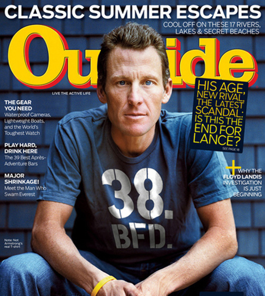
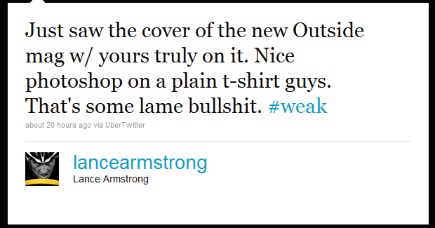
Here is Lance Armstrong on the new cover of Outside Magazine. According to CoverAwards, “It seems the editors fired up the Photoshop and not to smooth out those pensive eyebrow lines. Instead, they added the “38 BFD” to what was originally a plain blue T-shirt. The “38″ part is easy, that’s Lance Armstrong’s age, but BFD? What does that even mean? Some have speculated “Big Freakin’ Deal” which I guess makes sense.” When Lance saw the ‘Shopped cover, he tweeted: “Just saw the cover of the new Outside mag w/ yours truly on it. Nice photoshop on a plain t-shirt guys. That’s some lame bullsh-t.”
[From Lance’s Twitter feed]
Here’s more:
Cyclist Lance Armstrong is peeved at his latest appearance on Outside magazine’s cover. The latest issue of Outside features the seven-time Tour de France champ in a blue shirt that reads “38. BFD.” in large letters. The number is his age and the acronym stands for “big [expletive] deal.”
There’s just one catch. Armstrong apparently never wore the t-shirt.
“Just saw the cover of the new Outside mag w/ yours truly on it,” Armstrong tweeted . “Nice photoshop on a plain t-shirt guys. That’s some lame bullshit. #weak”
The magazine cover does note in small text that the shirt is “not Armstrong’s real T-shirt.”
Yahoo! sports blogger Chris Chase questioned the cover, saying Armstrong had every right to be upset.
“… so what was the point of the profane acronym in the first place? This wouldn’t be kosher in any circumstance, but it’s especially lame given how, well, lame the slogan is,” Chase wrote in the blog . He said it was Armstrong’s eighth appearance on the cover.
“Why the magazine would choose to alter a cover photo for a cheap gag and risk aggravating its favorite athlete is baffling,” he wrote.
Not all of Chase’s readers were in agreement.
“I think they overinflated his ego … ,” one wrote. Another replied, “BFD.”
[From Fox News]
Is it just me, or does everyone seem to be overreacting? Sure, ‘Shopping the t-shirt to read “38 B.F.D.” is dumb and they shouldn’t have done it – just because it’s not really hip and cool. Is that what Lance is bothered by? That he looks old and uncool? Because he does look old in the cover shot. Maybe he was irritated they didn’t ‘Shop his face, only his t-shirt? Eh. I look at too many fashion magazine, and I’ve gotten to the point where Photoshop only bothers me when they do it to make the person look like an alien.
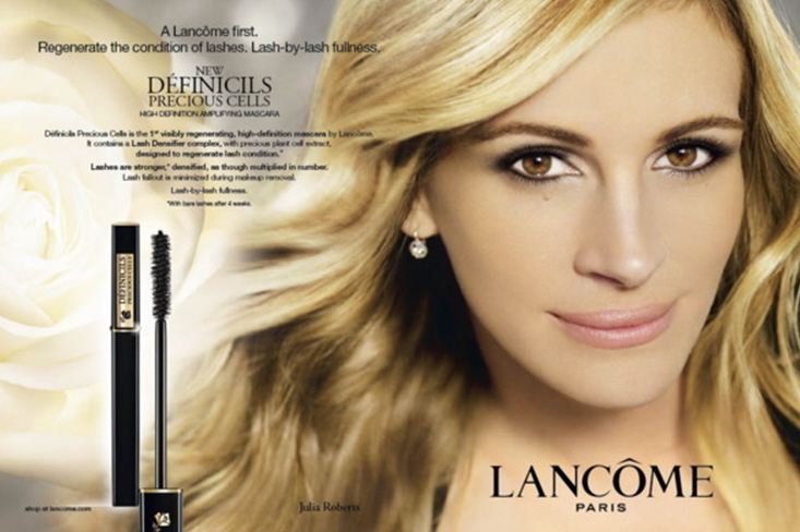
CoughcoughJuliaRobertscough.
Magazine cover courtesy of Fox News. Lancome ad courtesy of HuffPo.


He’s right. I think it stinks.
julia already looks like an alien even before photoshop
He looks old and really scrawny – like I’m wondering if he’s healthy kinda scrawny….
I don’t get why they did it. Thats stupid. Whatever, it’s no BFD. lol.
The real photoshopping scandal – can you imagine any magazine cover leaving those wrinkles on a 38 year old woman?
I don’t get it either. Why make it look like it’s on his t-shirt, why not just have the letters on the page like all the other wording about the articles? Stupid.
It is well done photoshop, but really pointless and stupid. He seems to easily get his feathers ruffled though. And yeah, he does look pretty old on the cover.
he looks 45 at least.
not to mention the CRAZY eyes…
Photoshop his hair red and Lance Armstrong could be Bobby Flay!
hes just bitching about it to get attention. not like anyone noticed his cover to begin with, so he had to make some stink.
It’s not even that good of a PhotoShop edit. I can spot almost exactly what they did (and didn’t) do to the photo.
I dont blame him, I think these mags should let them know if they’re going to alter their pics.
aside from that..wth is going on with Julia’s lips? It looks like they either p-shopped it to look hideous or she’s doing the obvious lip filler in the upper lip and it looks hideous.
I can see why he has a problem with this. If they had put those words on the cover it would have been a statement the magazine was making, but by putting it on his shirt it makes it look like a statement he is making, which makes it a lie.
what’s the big deal?? Is his age a secret?? It’s just a marketing thing. I guess he’s mad cuz he wasn’t really wearing it. He needs to chill out..
the first thing i saw was that he looks really sickly and has no eyebrows
He looks manarexic…
Lance Armstrong strikes me as a horrible,maniacal, ego-centric, masochist douche’ bag.
He also looks like he’s around 70 in this cover and it’s a joke that at 38 he looks so god awful.
Frankly, he is no BFD.
he looks sick, agreed
He looks absolutely terrible. Maybe he is mad because he looks so much older than 38…try 58?
I think it was stupid of them put it on there without at least asking. Anytime you’re on a cover or even inside the magazine, you approve the wardrobe along with the director of the photo shoot. Its almost like they put words in his mouth since when people wear writing on clothing its usually a statement you support or like.
Of course he’s mad.
Everyone knows what BFD really stands for….
Big F—ing Doper
😉
So what if he has wrinkles and looks older than some of you think he should! Jesus!
As for the tshirt, he’s right, it is lame!
…he is just plain ugly to me…
oh i long for just one day without photoshop……it’s especially bad for women and girls who have such unreal expectations of what “pretty” is supposed to be now thanks to computer generated humans on magazine covers…
BS that he looks that scrawney. I’ve seen the guy on HD for the last few years, and he in no way that frail looking.
They have TOTALLY photoshopped his face to look thinner. The way his left cheek scoops in just looks like a bad PS job. Plus, notice how his left shoulder goes into his cheek? But it’s higher than the one on the right. The one on the left is up by his ear, and the right one is a good inch or two lower. I’d say it was the angle, but he’s clearly sitting straight. It’s bizarre looking.
he’s 38??? Looks much MUCH older in that picture.
Altering the shirt was dumb.
Ive never gotten the appeal of Lance Armstrong! EVER
Holy crap he looks bad.
if he were a woman those lines on his face would have been photoshopped to oblivion. but i guess it’s ok for a man to look his age.
side light brings out texture so the lighting isn’t flattering. plus, resting his elbows on his knees makes him slouched (which implies old).
not good.
However I feel about the man, that was totally disrespectful of the magazine.
He’s 38?!? Damn, not lookin good in that picture at all. He looks sick & needs to be fed.
Does not look healthy.
@L- You’re right! There’s something really strange happening with his shoulders. What is up with that??
24.L:
“…
They have TOTALLY photoshopped his face to look thinner. The way his left cheek scoops in just looks like a bad PS job. Plus, notice how his left shoulder goes into his cheek? But it’s higher than the one on the right. The one on the left is up by his ear, and the right one is a good inch or two lower. I’d say it was the angle, but he’s clearly sitting straight. It’s bizarre looking.”
But Lance Armstrong IS old and uncool. He’s like the epitome of uncool.
I have to agree with Lance Armstrong on this one. They didnt ask his permission to add this.