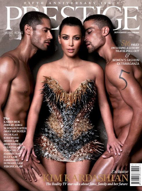
This magazine is cracking me up. Oh, sometimes I kind of love Kat-Face Kardashian, I really do. She’s pretty harmless in general, and she provides so much hilarious material. Where to even start with this? Kim put this scan up on her website for the Hong Kong Magazine, calling it “one of my most risqué covers to date!” Risqué. Lovely word for “her dress is going to maim one of those poor gentlemen, in an area where they will really feel it.” Also: her waxy cat-face is simply out of control at this point. And yet, with all of that working against her, I have to admit that this cover is a little fierce. I would like to see this dress, pose and concept with another girl, please. Oooh, Anne Hathaway! She could work this cover.
In other Kat-Face news, she and her sisters are about to launch a clothing line for plus-sized women called K-Dash. I’m not going to yell at them for that at all – I think it’s nice to see a “celebrity” clothing line for plus-sized women, and it’s an interesting message to send while other “celebrity” clothing lines seem stuck in Juniors. Let’s hope the line isn’t just a series of muumuus. Although, knowing the Kardashian women as I do, it’s probably just the same old slutty clothing, just in XXL. Hey, don’t hate! Plus-sized sluts need nice clothes too!
Since I’m being so nice to Kim in this post, I thought I’d show these new photos of her stuffing her face with… ice cream? Yogurt? Whatever it is, I love that looks like she’s enjoying the hell out of it. Good for her.
Prestige cover courtesy of Kim’s website.


She is gross!
She is eating yogurt. This site gives Kim and her family a lot coverage. It doesn’t matter if it is good or bad coverage. I hope she is paying this site for the coverage.
Obviously their shows do well enough to warrant the coverage. Someone out there in the universe is watching.
Yawn…I hope they paid here in yogurt.
Prestige = Kim K?
Does not compute.
Let’s see Kim K on the cover of Steppin’ Out, that’s much more appropriate!
That photo reminds me of the episode of “Sex & the City” where the two gay guys invite Samantha to join them in bed, then they end up ignoring her and just doing each other. Looks like that’s about to happen here, lol!
I HATE this cover. She looks…heavy, I guess. The dress is NOT flattering, and the hair sucks.
The cover is okay but as usual Kim brings zero to the party other than her ever-evolving face; look into her eyes, there’s nothing there folks. I hold no ill-will towards her, but it disturbs me that even in the (mostly) empty-headed celeb world she emerges like a vapid plastic doll. It’s cliche to say, but when she stood next to her wax figure it really was a toss up as to who had the better personality.
Her “like” interviews are “like” rubbish, and even on DWTS she couldn’t drum up any feeling, rhythm or presence because she was too worried about messing up her hair to actually move.
How is it that a large number of people tune in to watch her do anything? She bores me to dry tears.
I totally agree with Samigirl.. this cover is HIDEOUS, and she looks dead. I can’t believe you think it looks even kind of “fierce.” The dress makes her look like she has the top half of a linebacker, Her hair looks like a pixie cut gone bad, and her pose and face are just totally lifeless… she looks awful! And it kinda looks like those guys are twins… awkward.
She is beautiful, successful, and comes off as sweet. I dont get why people call her heavy. I think she totally pulled that cover off.
OMG! She is so gorgeous! She is so fashionable! Nice person. Love her.
photoshop much?
this kaiser chick always sounds so bitter. I don’t even care for half the people she writes about, but wow she needs to lighten up! It all just comes out hateful and perez hilton-like. at least on d-listed the guy is funny.
she looked better with her original nose.
@Rose
MTE.
It looks like she was photoshopped into the picture with the two dudes.
Rose, there are plently of other posts for which you could have called Kiaser out, but this really isn’t one of them. Plus, while she can be hilariously bitchy (hence the name of the cite), she’s also very thoughtful and thus light years away from Perez.
@rose.. Website is called celeBITCHy.com… durrr
I think she looks pretty on the cover and less ‘cat-like’ in the face than she has looked recently on the red carpets.
The guy on the left looks like he either just got his junk pierced by one of the spines on her dress or like he’s about to barf all over her. 🙂
She has that “deer in the headlights” look–like I can’t beleive I am doing this, ME!!!
I can’t imagine what that face and ass will look like in 10 yrs..
she had more “feeling” in her porn, and that was minimal! LOL
Mmmmm, pinkberry. Yummy, yummy frozen yogurt of SoCal.
will the thorns on her dress poke the male models?