
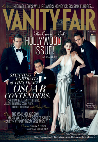
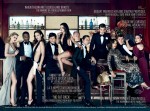
*Click the image to see the enlarged cover.
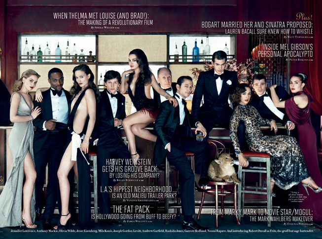
After last year’s “pretty white girl” cover for Vanity Fair’s annual “Hollywood Issue”, the editors must have decided they needed some diversity. Thus, they made sure to put two actors of color on their fold-out cover. Well… one actor of color, and one mixed-race actress. It’s like VF is just placating their haters! Honestly, though, what pisses me off more than the consistent lack of diversity is the simple fact that Ryan Reynolds (ugh) and Jake Gyllenhaal (UGH) both made it to the front section of the fold-out. Seriously? Are those two considered the brightest of youngish actors? For real? Anne Hathaway and James Franco, I don’t have a problem with. Beyond those four, here are the rest of the people on the cover: Jennifer Lawrence, Anthony Mackie (yay!), Olivia Wilde, Jesse Eisenberg, Mila Kunis, Joseph Gordon Levitt, Andrew Garfield, Rashida Jones, Garrett Hedlund, and Noomi Rapace (YAY!)… with Robert Duvall in the back. I completely cosign Mila, Anthony Mackie, JGL, Andrew Garfield, Noomi, Jennifer Lawrence and Jesse Eisenberg (the last two are Oscar-nominated, after all). But Olivia Wilde? Rashida Jones? Garrett Hedlund? Ugh.
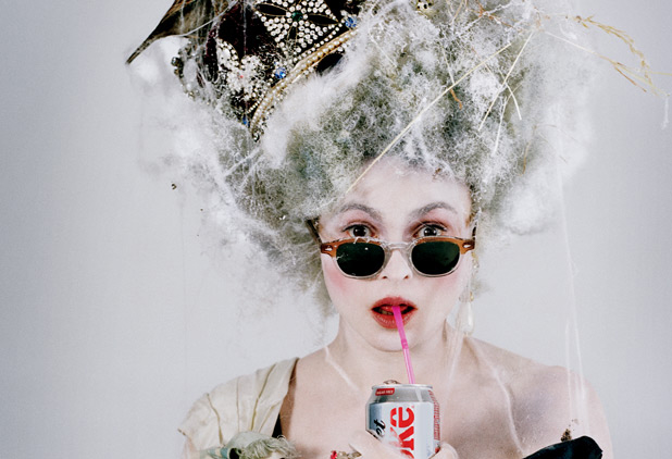
Anyway, VF hasn’t put up much of a preview, and there aren’t any good-quality photos from the portfolio hanging around, although there is this bad-quality image of Helena Bonham Carter as “The Changeling”.
Photos courtesy of Vanity Fair.





I dunno, I thought that mixed and biracial people are people of colour…but I do agree that it seems that they just stuck two racialized folks on the cover so that (in their minds) no one could accuse them of not being “diverse”…I am also scratching my head over a lot of the actors on the cover. Like really, you couldn’t find people who are more notable or are doing more interesting work??? Like why is Jakey G up there? He is a boring as f*ck and I haven’t heard about him being in anything laudable lately.
At first glance I thought that that picture of HBC was Lady Gaga.
This is what Lawrence should wear to the Oscars!!
If these people were my personal Barbie dolls I’d totally be putting Mila Kunis & Joseph Gordon Levitt together.
Looks, style, & substance.
It would have been nice of VF to actually put AM on the front section instead of e.g. RR who’s quite overrated, much more than Jakey will ever be.
Oh JGL, you beautiful, beautiful boy.
He’s all, “I’ll just sit here sippin’ mah whisky, while Rashida Jones bottlefeeds my kitteh. No Mila, that is NOT a euphemism, you filthy minx.”
mmm, i’m still looking for the second one.
And Olivia went to the bathroom and got toilet paper stuck in her undies.
I like Anne and Jennifer, they look classy, the rest a bit ugh.
Helena BC said in Craig Ferguson that she aproaches fashion like a five year old, and that she wears anything because they’re not gonna like it anyway… she’s awesome
I wish I could not see it but there are several PSD’s there. Kunis’ legs are too small. And she was not leaning on JGL when the picture was taken (so need telling her to step off). James Franco is recovering very well from that bout with polio as well. Oliva needs to put some clothes on and go away. And yeah, the cover choices are meh.
Is it just me or is the Photoshop work on Anne Hathaway’s leg utterly ridiculous? Look at where her knee is compared to her hip. If she straightened that leg she’d be about 13 feet tall, right?
ROBERT DUVALL FOR THE WIN
Is it just me or Jennifer Lawrence looks like Nikki Reed in this photo?
Ha, PSD, I’ve not heard that one before but I bet I can guess what it stands for. And YES. I mean, we know that these people are not really in the same room at the same time, but COME ON. At least make a token effort to get the lighting right.
The Pussy should have made the front fold-out section with Anne and Franco. The poor cat looks scared.
yep, photoshopin legs must be hard, some are too short, some are too long and some vanished along the way. I guess they didn’t consider leaving them the way they naturally are
Noomi and HBC?? YESSSSS.
Then JGL and Andrew Garfield?? Even more yes.
Throw in a baby leopard (What?) and you’re done.
padiddle, sorry for this but I can’t resist, partly because it’s true:
JESUS CHRIST ITS A LION
GET IN THE CAR
Poor Rashida Jones. Stuck wearing that Tom Ford gown that Nicole Kidman AND Gwyneth Paltrow have worn in magazines already.
Jesse Eisenberg has really bad posture. He always looks like a vulture.
Did they just photoshop Robert Duvall into the picture?
Just glad there’s no Boobs lively. I like everyone on the cover (more or less) except Olivia Wilde. How’d she get on there?
I disagree with the term ‘people of colour’ because it implies that white people are somewhat a ‘pure’ color, which is completely untrue -unless they suffer from albinism. Not only this, but the term ‘people of color’ harks back to the era of segregation. Such an outdated term.
Anyway, I see VF and Vogue as magazines that tend to prefer white caucasian models/celebrities based on the frequency on covers alone, let’s not forget magazine spreads. Is their unspoken policy racist? It’s open to question. But in terms of VF’s cover, it’s focusing on a specific group (nominees), so it’s not really discriminative, but still, during other times of the year, it is rare to even read articles about black celebrities, or celebrities from other ethnic groups. It’s as though they have a silent policy that relates to social hierarchies. I’m still surprised they had Miley Cyrus in their mag. But they’d prefer having Cyrus in Vanity Fair over Will Smith’s kids.
WTF is Robert Duvall doing there that’s totally random???
boring! looks like the same horrible “group” shot irving penn could only make happen.
i like rashida’s dress because she looks sexy but not slutty. didn’t recognize it but if it has been worn before there was a stylist not doing their job. except for noomi and rashida, everyone else lady wise is trying too hard. just put them in their panties and have them hold their boobkins.
and wtf, why not have some of the men be at least shirtless? not even one button undone.
i agree with shay @ people of color phrasing. just shut up, put a real mix up there, and call it a day. fatties too!
sexist, racist, and BORING.
@reality, when I saw this photo, I thought the same exact thing, they would make for an awesome couple.
What a weird, random group. I think only about half of them actually belong on the cover – why is Ryan Reynold’s there? Why not highlight some of the actual “Oscar Contenders” the headline is blaring?
I love Rashida Jones – for a while I didn’t, I didn’t care much for her on the Office, but then I saw a very funny interview with her, she seems really cool and down to earth. And she is SO GOOD on Parks & Rec now!
It seems like they started out with a list of the hot young actors they wanted for the cover (Anne, James, Noomi, Jennifer, Andrew, Jesse, Anthony, Mila, etc.) and then as some of the people on that list couldn’t/wouldn’t do the shoot, they had to replace them with the randoms (Olivia Wilde, Rashida Jones, Garrett Hedlund, even Ryan Reynolds and Jake Gyllenhaal). I would bet the first potential lay-out included Michelle Williams, Carey Mulligan, Ryan Gosling, Natalie Portman (+baby), and more…
Wow, I really want to read the Lauren Bacall article!!
And, for the most part, the cover looks fine to me. I really like the high class, super dressed up look. Except for Olivia, whoever styled her missed the memo
agree with those that think Olivia Wilde is a fail here. Don’t dislike her in general, but she’s trying way too hard here.
That’s not people of color on the cover that’s a damn insert lol [or might as well be]
Middle-of-the-road. Safe. Boring.
Nothing to see here.
They need to pass on Liebowitz next time or she needs to step it up.
Even the “photoslop” is substandard and obvious. Duvall looks like he photo bombed! Like Lurk McGurk.
“People of color” doesn’t offend me because to me it doesn’t imply that whites are a pure color-it implies that “white” is absent of coloration. My skin is always brown i.e. has a definitive coloration all the time.
This cover is still too white for my tastes but the majority of people who read the magazine are white so what’s the point in whining about it?
EDIT: Olivia Wilde does seem like an odd choice. She must have a great agent/manager/whatever because she managed to squeeze her big weird square head into Cowboys and Aliens as well.
People of color doesn’t offend me either I find it more offensive than misidentifying someone as something they aren’t because you aren’t sure exactly where they are from or what their ethnicity is.
Bleh, I stay away from the race issue. It always gets messy. And yes, I am mixed (mother is native american and dad is caucasian) but you wouldn’t know if you saw me in person. So the “people of color” thing is kinda, I don’t know…it leaves people out. You know, people who LOOK like the majority but really are minority.
On a fun note, these are conversations I have with my dad:
Me: Dad, it’s cold.
Dad: I can get you a blanket?
Me: Um no thanks white man, I know what your people did with blankets back in the old days…I’m not falling for it this time.
Dad: Guess I have to put the small pox in your spaghettio’s then.
@ gradstudent: BWAH! you & your dad obviously share a snarky sense of humor. love it.
as for VF: are they on crack? seriously – anne hathaway (who may be challenging goop as the most boring actress EVER), olivia wilde (who?), and ryan “gerbil-face” reynolds?
*yawn*
Bizarre, outdated choices for the cover. And the non-Caucasians still went behind the fold. Ryan Reynolds’ agent must know where bodies are buried all over Hollywood.
VF actually has good articles, but their covers have been off-putting in their eye-rolling lameness for about a decade.
And really, Robert Duvall, WTF? He’s like 4 times the age of everyone else on the cover. Based on the drinkeasy setting, is he supposed to be, like, the undead bartender in The Shining?
I used to think Ryan Reynolds was amazingly hot, but now I look at pictures of him and I can’t figure out why…. I think it’s because he’s wearing a shirt.
Yay to Joseph Gordon Levitt! I love how he wears a suit. Seriously, that was the best part of Inception.
Yay to the cover (can take or leave Franco and Hathaway though..) :p and also YES to: Mila, JGL and Noomi Rapace.
The rest ugh to who?
2 black people and one of them so light skinned she looks white or more Hispanic than black. Pleeeaaasssee! This is NOT a diverse cover.
Ally – Ryan Reynolds agent comment is HILARIOUS!! I could not figure out how this guy gets any roles – you figured it out-hahaha!
And I love Robert Duvall but he is out of place on this cover – total Mr Grady (Brady?) from the Shining!
I only see one!!!
JGL! Sigh, swoon. Oh and I agree, he and Mila would make a smokin’ couple.
OK, anyone see the video of the making of this on Lainey? They actually WERE all in the room at the same time! WTF! Even less excuse for terrible Photoshop.
I agree with everything except the “UGH” for Rashida Jones. Watch Parks and Rec, or I Love You Man. Shes great! Not gonna win an oscar ever but she’ll be a consistent comedienne actress.
Anyways, Jake, Ryan, Olivia, Garrett need to GTFO. They don’t deserve the cover this year.
I would have put Jennifer Lawrence, Anthony Mackie, Mila Kunis, and JGL on the front. New and different people. Andrew Garfield should be there. It was his breakthrough year along with Jesse. Anne and James I get, but we are so sick of seeing them all the time everywehre. Predictable boring choices.
Hee. I find it amusing that 2/15 are black and that’s 13%, and the US is 12.8% black.. sounds about right.