Here is the photo shoot Kate Bosworth did for Nylon’s March issue. She’s the cover girl, for some reason. Okay… I’m stuck on that, actually. Why does Kate Bosworth get a magazine cover? She’s not promoting a movie. I just checked. So I guess she’s just promoting… her too-skinny body? Her relationship with Alex Skarsgard? Her own famewhoring?
Am I being too harsh? Well, it’s no secret that I don’t really care for Kate Bosworth. I find her to be useless, talentless, and much, much too resilient. At this stage of her lack of career, The Bos should be a big “Who?” We should never be forced to see weekly paparazzi shots, or The Bos on various red carpets – because she goes to the opening of an envelope. But somehow, without much talent and despite being one of the most boring, tedious and smug “celebrities” out there, The Bos still clings to her small shred of fame. She’s barely an actress anymore – she’s The Girlfriend to Alex Skarsgard, and she’s a Fashion Girl (although that one is seriously questionable).
Anyway… enjoy. The Bos shoving her bones into our faces. Seriously, what’s with her mouth? Ugh.
Photos courtesy of Superior Pics Forum.

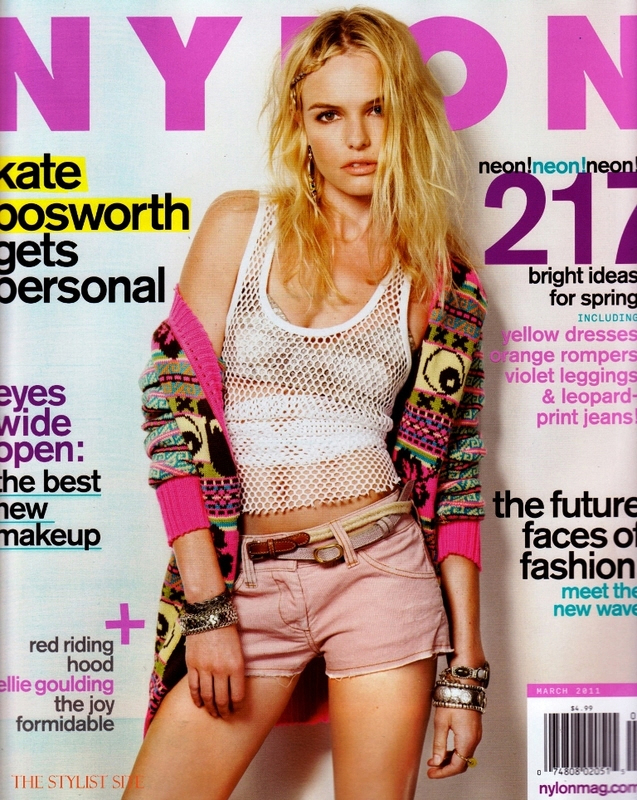
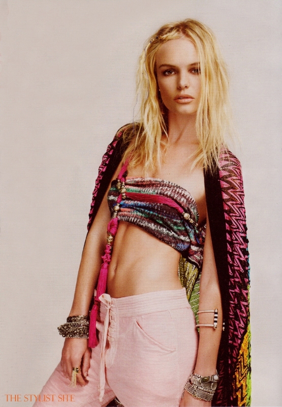

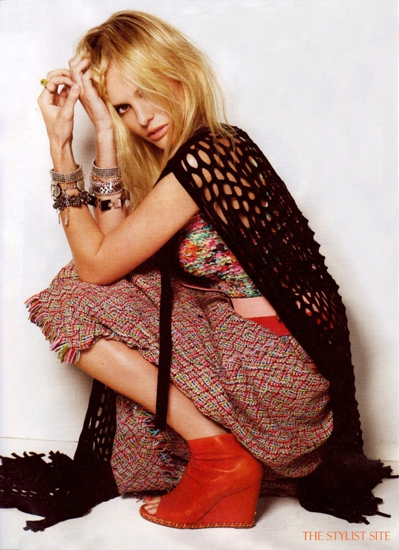








What’s with her hair? For a sec in the last pic I thought it was Jessica Simpson..lol!
the one face expression on all the pics is going to haunt me in my dreams tonight…
The only half-decent picture of her was the last one. I can’t stand the bad posture she tries to pass off as high fashion. I, too, would love to know who she has on her side that keeps her in the public eye, but whatever. The Kardashians and Bilson have shown us that a little bit of limelight is all it takes.
You hate her, yet you post about her all the time and there’s always tons of comments. Mission accomplished. She wins.
Boring. Already forgot about her…
Kate aka pro-girlfriend is a such terrible model and looks like she could use a bath.
They are trying to make her look all hippie chick, but she just looks ridiculous. That second pic looks like she has a rag rug tied around her hooters.
she looks sad and constipated…
She looks like a drgged out crackwh*re as always.
omg she looks ILL.
Malnourished daytime hooker.
@ brin – I thought the last one was Jessica Simpson, too. Not a good look.
she’s pretty but the clothes look really cheap.
mouth breather
This shoot is ugly. The styling is awful, the posing far too much, the cover overkill.. just go away Kate!
Every last one of these pics is aggressively unattractive. She’s scrawny with abysmal posture, lank hair and no discernible facial expressions. Also, nothing EVER fits her right (probably because she’s the size of a nine year old) and so she tends to make her ugly, saggy clothes look even worse than they were to begin with. And I really wish she’d stop trying to pull of clunky booties. She wears them constantly but she’s got wee chicken legs, so big shoes that hide her ankles are such a terrible idea.
She always looks dirty/white trashy no matter what she wears.
me too brin…@ first glance. jessica from back in the day.
They did some liberal photoshopping on her breasts in those last two pictures. No way are her breats that big in real life.
That being said, what’s up with these clothes? They suck.
What is this? Anorexic Bum chic?
She looks hideously ill. Does she even WORK anymore?
I have serious second hand embarrassment for her. Her desperate attempt to appeal to a younger audience is a big FAIL. These pictures are laugable.
Ugh. I’m going with gross, and I don’t really have any hate for Kate.
The styling is horrible. Bad clothes and bad hair. I don’t think it’s her fault these photos look bad. The styling looks really.. outdated or something.
eating disorder HAIR aside (seriously, that frizz needs some nutrition), I don’t hate it. It works with what she’s got – plays up the sloppy and expressionless vibe – and I actually dig the lace up pants.
Hey, if she’s gonna continue her smug hunger strike, may as well stick her in fun clothes that only bony girls can pull off….
She tries too hard to be boho-chic. I still cant beleive that Alexander fell for her game
If they were going for boho-chic, they failed.
Thats the best they could come up with for a cover photo? Really? Her facial expression is awful! Its like she is trying (& failing) to make a sexy GRRR face.
The lace-up pants aren’t too bad, but she looks like she has no bones, all slouched over like that.
Bad photo shoot all around, but it IS Nylon, so I don’t know what we’re to expect. They are usually pretty awful
This does not make me want to purchase either Nylon magazine or any of the pieces K-Bo is wearing. I will however take her boyfrind off her hands while Kate eats a cheeseburger, milkshake, and fries x 3.
grey gardens.
Olsen twin reject shoot. Does Kate ever close her mouth for photos?
STUPID. She looks downright stupid on the cover shot. She looks stupid in those shots with a little bit of tooth showing.
She looks like a skeleton with hair. Like one of those shipwreck victims’ bodies in the movies when someone goes scubadiving.
I thought the people at nylon were hippier than this – what is cool, hip, or fashionable about her. How does she score mag covers – yes Aria she’s a terrible model – use a real model and real styling. This chick is an overexposed zero.
She looks utterly demented in the cover shot. What gives with the snaggle tooth peeping out? These pics could pass for a spoof shoot. Its hard to believe they are for real.
1. close your mouth;
2. eat something;
3. brush your hair..when was this “I just woke up, and had to go outside like this” look ever okay unless you’re doing the “walk of shame”…which in this case, maybe Kate is??
4. Alex…come on. WTF?
It’s Nylon, so regardless of the subject it’s going to be an abysmal shoot. Styling. poses, makeup, hair, attire are always unflattering to the nth degree, as if they’re trying to prove their credentials by being ‘anti-fashion’, but the worst is alwyas the lighting, which reminds me of the bus pass photos I had to take in high school and university, wherein half your face and body were tickled by an old fake plant, making human expressions impossible, or the health card photo that resulted when the recipient was forced into a darkened pit in an already grey room.
Her poses look forced and unnatural and if you cover her face in the top one she resembles a crack addled hooker. Harsh but true.
I’ll bet you all good money that the jewellery that she is wearing in the shoot is from the company that she started with her stylist. And THAT was probably the whole reason she is on the cover (likely for free).
@Canuck, well, yes. Part of having a business is promoting it, so that would make sense and all…
I think Kate is a beautiful girl, but they sure did make her look greasy in this shoot, and the clothes are nothing to get excited about.
Some of the comments on here are so vicious you would think Ms Bosworth had lit someone on fire. And all of you making nasty remarks about her weight should be ashamed of yourselves. I’m sure you wouldn’t want anyone to comment about yours.
Who does she think she is? Kate Moss? Looks like they were going for the strung out ‘model’ look
I’m pretty sure she just did some ninja movie and she does have one movie coming out…
but who cares, she is dating the hottie from True Blood! she already won…
What is this? Better question, why is this?
She looks like one of the teenage junkie prostitutes that roam downtown in the wee hours of the night!
Like someone else said a skeleton with hair! Is anybody else starving after looking at these photos? (goes to get plateful of spaghetti and meatballs with garlic bread)
I guess she finally starved herself so much, she lost weight on her lips — hence the collagen injections. Really, I’d rather be not-famous and not-malnourished.
Her face just does not move…
I don’t know what to think of Kate Bosworth. I don’t really have anything against her – though am wondering why she got a cover, kind of doubt there is anything profound about her that would warrant her a cover between movies (the 2010 not doing well in the least).
And though she is thinner than she has been, she doesn’t look really unhealthy (at least, in these pictures…though that may have been because of Photoshop). That also may be because she seems to have tanned up a bit in recent times, though.
As for these pictures, some are a bit trashy (the cover is probably the worst for me…), but a couple are alright. Though, as I stated earlier, her face does not move. At first I though the crouched down one was a bit different, but no. Just the angle is different for the same facial expression. Needless to say, these pictures could have been shot with any model.
There is absolutely nothing going on behind her eyes, is there?
Not a fan of the photoshoot, but I think her face is beautiful. I’m not her #1 fan but I don’t hate her either. Is all this animosity over who she’s dating?
omg i need the shoes in the next to last picture.
I think she looks great-the theme of the shoot is boho/hippie chic so I can understand them putting her into baggy clothes etc that only skinny girls can pull off. She does look a little bit too skinny in real life, but then so do a lot of Hollywood actresses. Dont understand the hate tbh
Don’t much care for this bag of bones but LOVE those red shoes!
empty ojos.
oh god, was the phorographer blind or an amateur?? and why on earth is she on the cover of a magazine??
So White Trash Gritter looking! Her personal style is not all that outstanding. So what she gets free designer clothes. They hang off her unwashed body like something from goodwill. her creepy eyes and scary twig legs. Put the meth down kate.
these are the most photoshopped and disgusting photos i have ever seen. the magazine made sure to state that she picked the clothing and insisted on wearing certain things, they did not pick the clothes, they covered themselves that way. she was given the cover because of her crapmint jewlery line, and they probably thought she would talk about the very different relationship with AS, to bad this was done 2 to 3 weeks ago before things really started to change. she has done nothing with this cover shoot, except look like an underage hooker on the streets of NY, i thought Nylon had better taste. she truly is an embrassment to all woman who try so hard to make it in this world. let us hope that AS has finally woken up, because since they have been apart he has never looked happier, with that great sparkle in his eyes.
Canuck #39: I saw in a clip of the shoot, that the jewelry is that Jewelmint crap. I think Kate picked the clothes too. Basically the only thing that Nylon did to make this shoot horrible is to pick Kate for the cover and let her run wild.