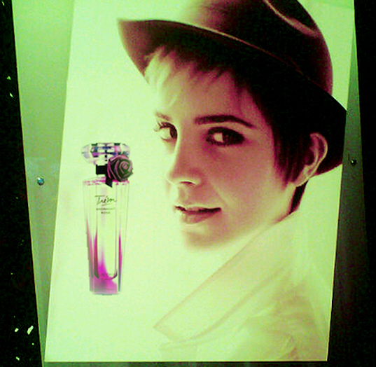
Above is a preview of why Emma Watson dropped out of college. Her Lancome contract! This is the first print ad for Emma Watson’s campaign for Lancome’s “Tresor Midnight Rose” Fragrance. Isn’t it just awful? While I’ve never gotten on the “Emma Watson is Beautiful” bandwagon – I find her cute, not stunning – she is so much prettier than this image. Honestly, the paparazzi got better, more attractive photos of Emma WHILE SHE WAS SHOOTING THE AD. Maybe she’ll look great for the Lancome commercials. Maybe Lancome should have chosen some styling that didn’t make Emma look like Justin Bieber.
At the perfume launch yesterday (you can see photos of Emma’s Carmen Miranda style here), Emma said: “I didn’t really like perfumes before because I thought they were heavy, but this one is really light and playful. I feel lucky to embody a fragrance I am so crazy in love with.”
Meanwhile, Mario Testino must be smoking crack, because he was the one to shoot Emma for this campaign, and here he is puffing Emma (and himself) up: “I’ve watched Emma grow up. She was a little girl when I first worked with her, then I shot her for Burberry, then British Vogue, then Lancome. The great thing about Emma is that she’s a chameleon; she can communicate anything you ask.” Testino must have asked for “The Bieber” then?
Ad preview courtesy of Hollywood Life, additional pics courtesy of Fame.


wtf?!?
Horrible. She looks like she’s glowing from extreme radiation exposure.
It’s terrible…why that sickly green color?
She looks cross eyed. That is really awful. And the name of the perfume is awful too. Somebody fire the creative directors over there.
Those ads make me want to give Trésor Midnight Rose a wide berth.
How uninspired!
I don’t do Lancôme, but rose scents make me curious.
That’s it? A 5 year old can shoot a picture like that! I’m disappointed.
…well… if she is going for looking like Samantha Ronson or if that’s what the marketers are going for, Bravo!
If they are going for the Samantha Ronson look, Bravo!!
I loathe the hat.
She is boring and let’s face it not so pretty. Bad choice.
She’s so much prettier than that.
I thought you were exaggerating but hahahaha, what a horrible ad!!
I think she looks cute in the hat, but they did completely mess that up for all the hype around it. Very disappointing.
how did they make such a pretty girl look so fug? and why?
College isn’t for everyone. It’s her choice. When I was in hs, I heard the valedictorian in prior years dropped out of college because it wasn’t something they wanted to do. We all have our reasons, I mean, at least
the girl is business smart. She isn’t going around spending her money away like lindsay or out partying. To each their own.
College isn’t for everyone.
Horrible ad, but in 20 years, she’ll look like she’s in her 20s.. for now, it’s her adolescent stage. I’ll be envious come 2030..
Thought this was Justin Bieber at first.
I’m thinking “Clockwork Orange”. Can she do “Singing in the Rain”?
@Bobster, get the boilersuit out.
Seriously, she may come across prettier in person or on film than in stills. Sort of the reverse of Anniston.
I don’t understand the choice of chartreuse-of-doom lighting. Strangely though, it does look sort of young and ravey. Still it doesn’t seem like what they’d choose to do with someone like her. You take a genuinely fresh, pretty face and do that to it? No.
Everyone knows cosmetic ads from the 80s/90s were so much better; more creative colorful and they used real models supers remember CIndy,Naomi, Paulina, Christy, etc. anyone of which shuts down this 12 yr old. THe fashion industry has ruined itself with its infatuation with celebutards; and for those that say models are insipid; are most of today’s young female celebs really any better, or do they get an unwarranted pass because they are actresses? and you don’t need to understand physics to be an actress.
That’s a snapshot of an out-door ad. Am I correct? I can’t say “yea” or “nay” to it because I can’t tell what it actually looks like.
That is really terrible. Someone at Lancôme must hate Emma something fierce to make her look that bad. Sad. 🙁
i think the girl is very pretty and this was just some bad makeup/styling.
But i do see a Ronsonesque look here. Only Emma is much younger and prettier.
it’s like.. ok..
Emma Watson + many years of smoking like a chimney + dating a crazy person + getting stalked by same crazy person + getting stalked by equally psycho fans of said crazy person + old age = Samantha Ronson.
If you can find old pics of Ronson, like pre-1998, she and Emma do look alike. Similar face shape and both girls have very dark eyes.
Horrible. I think she’s cute, but not a beauty. Lancome has gone off the rails.
Agree with jovers comment, well said.
honestly i was looking the first pic for 20 seconds thinking wow justin bieber now sells lancome perfume?lol
Agree with the posters above who said it looks like Samantha Ronson is the inspiration for this ad campaign.
I still miss Isabella Rossellini. She was by far the most beautiful Lancome model.
Congratulations, Lancome, you managed to make one of most naturally pretty young starlets out there look almost unattractive.
Look I think Emma is cute AND pretty, but that ad is not good. At all.
I am also over her short hair. A cute bob would look great on her.
I don’t hate it, but I think that’s a reaction to the illogic of this. I find myself thinking, Testino has good taste, Lancome is tasteful, Emma Watson is tasteful, so… I’ve gotta be missing something.
I’m really a little mystified by stuff like this. People who otherwise do good art producing something that elicits a reaction like this picture. I’ve just got to be missing something here.
i didn’t know pete doherty was doing ads for Lancome – how’d he find the time between all the cocaine binges?