I didn’t know that Anne Hathaway was named the newest face of Tod’s. Usually, the handbag and leather goods company tries to associate itself with blondes – recently, Gwyneth Paltrow and Sienna Miller were the faces of the company. I’m glad Tod’s decided to give a brunette a test-drive, although Anne might not be the best brand-ambassador. Look, I like Anne. I think she’s one of the best young actresses working today and I think she can be very, very pretty (when she’s styled correctly). But Tod’s a luxury leather goods label, and one of their most famous associations was with Princess Diana. Surely Anne is simply too dorky and not enough of a “bombshell” to make this work? Tod’s is trying to reach a different market, though:
It Girl, meet It Bag. Anne Hathaway works her magic in new ads for TOD’s Signature Collection, a soon-to-launch line of bags and small leather goods hitting TOD’s boutiques in October.
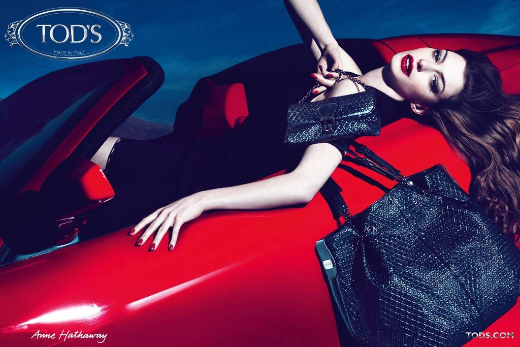
Shot in London by photographers Mert Alas and Marcus Piggott, the ads will also bow in October, appearing in fashion magazines worldwide. “The campaign for TOD’s Signature reaches out to a new and younger clientele,” creative director Fabien Baron said in a release, adding that Hathaway was the right woman for the job. “We see a stunningly exquisite Anne as a classic beauty with a modern Italian edge — feminine and strong.”
Hathaway, for her part, is honored to be associated with the brand. “I have been a longtime fan of TOD’s and was very excited to be a part of exploring a new side of their identity with the launch of their Signature Collection,” she added. “The designs are classic and the materials are of the highest quality.”
The handbags themselves — a shoulder bag, portfolio clutch, shopper, pochette and more — feature a pebble motif and come in colors like deep red, fuchsia, lavender and beige. Made in Italy, they’re crafted from a variety of materials, including soft patent leather, a metalized leather, shiny calfskin and semi-opaque nappa leather.
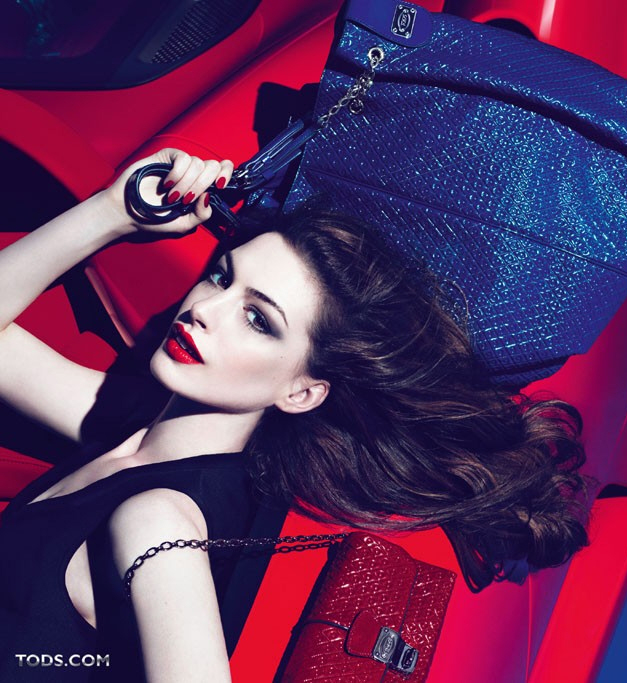
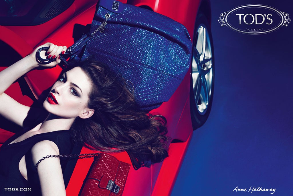
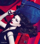
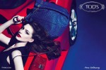
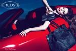
So… for the new ad campaign, Tod’s got Anne to vamp it up with old Hollywood curls and glossy red lips. They stretched her out on a red sports car and placed their gorgeous purse in her hand. Are we supposed to think this is sexy? Are we supposed to think Anne looks amazing, and that we could look that amazing if only we bought that purse (which probably cost more than $2000)? Mostly, I just think Anne looks uncomfortable. She’s contorted into a weird position, and her face says “OMG, MY BACK” more than “Sexy. Purse. Sexy. Young.”
So… ad fail. But good effort. Maybe next time, go for a more natural, subdued campaign with Anne.
Ads courtesy of Tod’s.




I actually quite like it. I think she looks really good, not dorky at all.
It’s pretty. I’m not sure it’s sexy.
I don’t get the car. But at least her facial features are under control and she doesn’t look like a clown.
I just don’t get her appeal.
I actually like the ads. I like the big purse too.
I think the ones where Anne’s eyes are more open and you can see them look the least convincing. Anne isn’t feeling it in the eyes but the ones where you cant really see her eyes and they are half closed, those shots are stunning and believable.
well look what photoshop and bold make up can do!!she looks good!
BHAHAHAHA @ i.want.shoes.
totes agree – she usually manages to come across as Mia Thermopolis pre-makeover to me.
That being said, I think that if we didn’t know Anne’s body of work, this ad campaign would be well-received.
I love that second shot of her – orgasmic abundance – the hair! the face! the purses!
Love all of the contrasting shades as well – skin tone, navy background, glossy reds, shades of the purses fanned in her hands. BELLISSIMA!!
wow. I don’t even like her that much. must be the coffee’s extra strong this morning.
I don’t mind the ads, she looks good in them. I might not realize it’s her at first glance though.
She looks fine. Even a dork can have an orgasm.
I disagree with the assessment -I think she looks friggin’ fantastic here! In fact, it’s honestly the first time since she was cast as Catwoman/Selina that I’ve looked at her and thought she looked sexy enough for the role. Though, truth be told, she looks so hot that I didn’t realize it was AH at first…lol
I think she looks good. I don’t find her particularly attractive but with the help of 30 people, she looks great. She is a great actress though and I like. She’s just not, as stated above, a “bombshell”.
looks better than those ads with blake lively. I’m not an anne fan, she kind of annoys me and she can’t pull off a british accent to save her life, but the girl is very photogenic and knows how to work a cover or an ad. I think she does a better job modeling than acting to be honest.
maybe when i have an extra 2000.00 laying around to spend on a bag i will care… or wait did this add want me to put it on the old discover and end up paying for it over the next 2 years? is that what this add is supposed to be saying?
I’m not that impressed with her as an actor but she looks good here.
They made her look fantastic here, and the Photoshop is used as it should be — smooth things out, make them more artistic, not change the model’s face till it’s unrecognizable and alien-like.
Purses are ugly, though. Look like cheap plastic tat from TJ Maxx.
ITAW/ those who concur that *for her*, this is a good photoshoot. Under a very controlled environment and skilled hands, she can be very attractive.
But being sexy in an ad is not the same as carrying it on screen. I’m not seeing Selina Kyle/bombshell sexy, but I do realize these are not set stills, so…their fine.
Hopefully the (arguably) skilled hands of Nolan will wring the sexy out of her in the controlled environment that is the TDKR set (IF that’s even the direction he’s taking her).
That picture with her rubbing the bags against her chest is kind of silly, but the rest are really nice
usually this process goes the other way around-but with Hathaway the eyes and lips were made smaller via photoshop.
If anything fails, it’s the photos aren’t nearly as overexposured as is Anne Hathaway. Option 1: Consider the blowout, Option 2: Leave us alone for one frigging nanosecond! I know your parents must be totally enamoured of themselves for naming you after Shakespeare’s shotgun wife, but that’s not enough to make you less than irritating. Please, take a nap let us both recharge. Follow with a film that doesn’t look unbearable and proceed to your fun. Nice work if you can get it with this gig, she’ll be able to get her high-priced name brand trinkets with a huge discount. Maybe she’ll even pay for it herself? Ha, funnin’ ya, nail that stuff to the walls.
Wow. Not understanding the bitterness on this one. She looks amazing, and though her skin has been airbrushed (and what for, I might add? Her skin is flawless as is), she’s totally recognizable here. IMO, these ads are hella sexy…yet still classy. I think she’s an amazing actress as of late. Could do without the british accents, like most of hollywood that isn’t british, but still amazing. I’m hoping she pulls off her role in the new Batman movie. She deserves it.