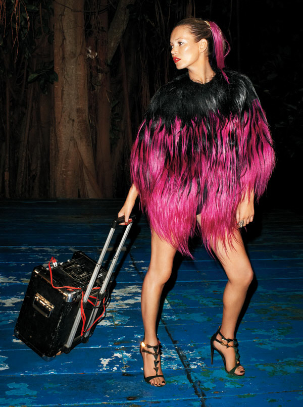
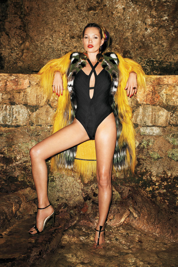
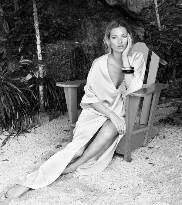
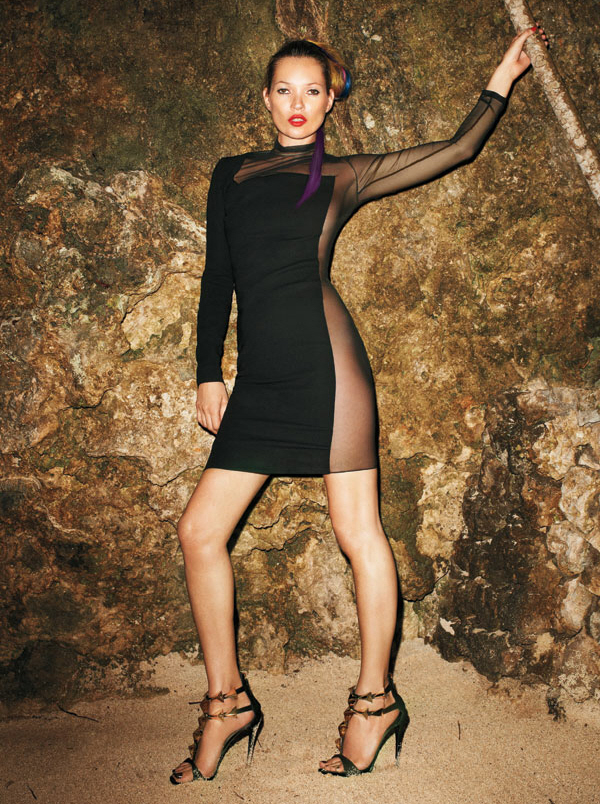
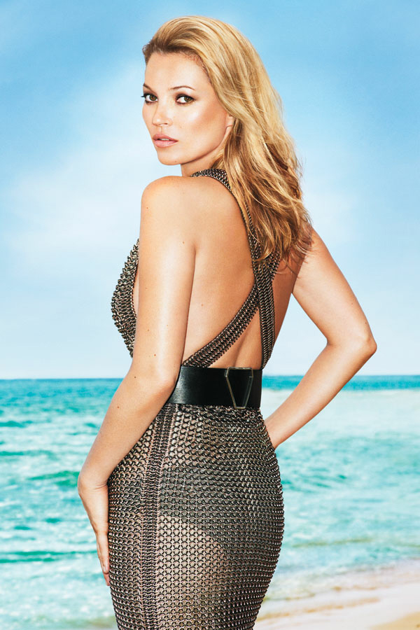
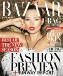
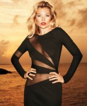
What is going on with Harper’s Bazaar lately? I remember, I had a subscription to Bazaar… maybe in the early years of the aughts, like 2001 and 2002. It was a good magazine back then, with interesting writers and sometimes moody, evocative, beautiful black-and-white pictorials. I guess they have new editors and I guess those editors are bored out of their skulls, because they keep hiring Terry Richardson for seemingly ALL of their photo shoots, and they all look the same, and they are all so budget and boring. With that in mind, here’s their June cover and cover shoot with Kate Moss.
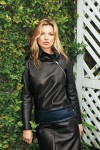
Bazaar says that Kate is “modeling the best of the collections on location in Jamaica.” You can see the full photo shoot here. I was going to grab even more images from the shoot, but it’s like Terry and Kate both decided to completely phone it in. I swear, she only uses two “model-faces” throughout the whole shoot. Her two looks: “Wow, I did too much coke last night” and “OMG, I shouldn’t have just done all that coke.” You know that’s exactly what Kate and Terry did “on location in Jamaica.” They did lines and wandered around on the beach.
Incidentally, CB and I were talking about possibly covering this story about Kate’s claw-toes yesterday, but we decided against it. Because, honestly, her feet aren’t all that bad or good. She just has long toes, too-small shoes and no pedicure – you can see the photos here.
Photos courtesy of Harper’s Bazaar.











Why do women continue to see this perv??? I’m never impressed with his work.
+ 1
+2
I see LiLo in all his shoots. The poses, the cheesy mouth positions, the bad clothing, it’s all tainted.
Kate is so much better than this but it’s like LiLo’s awfulness and Terry’s pervi-ness have combined and now ooze over everything he touches.
He’s gross. She’s gross. I feel gross. I’m going to go disinfect.
OMG!!! He made Kate look bad!! How did he do that??
He didn’t need any help. Kate needs a lot of photo shopping to get by in a photo shoot these days! Soon that won’t be enough!
Likely she’ll always get covers until she’s 65. Just too many friends in the business. The UKs Marlena Dietrich. Before photoshopping there was vaseline. But the budget look is where she’s heading.
love the pictures !! she looks sexy !!
Her body and face are incredible, but yeah- they phoned it in. That picture of Kate in the water wearing black is so blah. She’s gorgeous, wearing expensive designer clothes in an incredibly beautiful setting…and she’s just looking at the camera. Not staring with intensity or showing some sort of emotion. And that’s the best Terry Richardson could do in JAMAICA?! Shoot- Tyra Banks shows more imagination in her inane photography sections on America’s Next Top Model.
One of the dresses in the link looks like that black zipper dress Jennifer Lawrence wore.
It’s Terry Richardson, 50% of the shoot budget is spent on hand sanitizer and body condoms for the crew.
He’s talentless, disgusting and ugly, essentially a triple threat
JFC. Love Kate, this looks budget and it makes her look budget, too. He is a perv, and an uncreative one. Stick to LiLo, Terry, she’s more your level. Ick.
She looks wall-eyed on the cover and those first few pics. Boo on Harper’s – who thought these were fit to print??
Love that last picture!
She looks like she’s phoning it in.
Ms Moss please close your mouth/lips, the flies will get in!
Wow. Awful. I could have taken these pictures with a cheap digital camera.
Love “BAG OF THE YEAR” written right next to her face (on the cover).
Why do people think Terry Richardson is talent, i mean really all of his photo shoots look the same no matter who he photographing or the location.
Am I the only one who doesn’t get this chicks appeal? She looks busted imho.
She is not attractive in any way imo. Just look at those dead eyes lol. nah, not my cup of tea i guess.
She’s very photogenic, yet a plain jane at the same time if that makes sense.
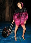
Aside from the 1st pic in the black/pink feathers – the rest is a yawn.
her eyes are sooo far apart, lol. i cant believe mags are still hiring that creeper richardson after everything that has been exposed, its disgusting. im sure they have gotten mail from readers complaining about their photographer choice…i wouldnt buy anything with his work in it.
All I can see is eyes looking in opposite directions and the inability to close her mouth in every single picture. Next!
He is a terrible photographer. Only he could make Kate look meh.
Please stop supporting Terry Richardson. This guy is a renowned sexual manipulator of young girls.
Unfortunately the Kate Upton bisniss has likely sky-rocketed his status.
The cover shot is so harsh looking…not pleasant at all… “Hi, I’m Kate Moss and my eyes are too far apart.”
uncle terry is always phoning it in. he sucks.
i’m glad to see more people complaining about him.
I actually thought some of Richardson’s shoots – the one with Mischa Barton I thought were interesting. This is an incredibly boring shoot – with Kate Moss as a model you’d think he’d be able to come up with something less bland.
I think Kate is overrated. She took great pictures back in the day but her face is samey.
Bad clothes, bad shoot.
W annoys me now too.
Vogue is hanging in there. Grace Coddington should just do all styling for all magazines.
Love the Moss 🙂
I love how every time I see a new set of this guys photos the person he’s ‘focused’ on looks worse than the last. Never been a fan of Moss but this is just disgusting. She looks slimy and dirty, not in a sexy way. =/
TR looks like a lester the molester and his photo shoots are really budget. The only person he’s should be photographing is Lindsay Lohan. .