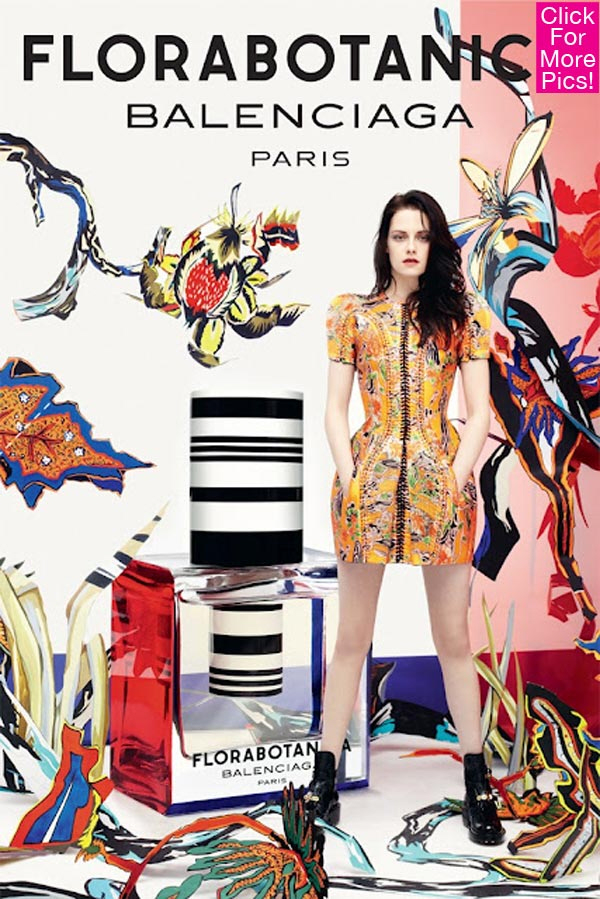
Here it is, at long last – Kristen Stewart’s first Balenciaga ad. She’s become the face of Balenciaga’s newest perfume, Florabotanica. Which sounds like the same of a vampire, right? Or am I just imagining that? “I’d like you meet my vampire friends, Angelgrace and Florabotanica. They come from the 18th century.” As for the actual ad – it’s awful too. It’s like they morphed Kristen’s face with.. Marilyn Manson? Or someone with a giant jaw. Like, Rumer Willis. The whole thing is pretty disappointing, actually. Let’s see how good Kristen is at the shill, though – she did an interview with Women’s Wear Daily about the scent – full piece here, and here are some highlights:
Kristen on what perfume is “about”: “On a base level, the reason you want to wear a fragrance is because you want to smell attractive,” said Stewart, sitting in a suite of Le Bristol hotel here, wearing a Balenciaga T-shirt, shorts and heels. “That in itself is a pretty mature idea, especially considering the teenager I was. I was never the one wearing my mom’s perfume and trying to be sexy. I was like hanging out with my brothers and doing the opposite of that.”
Kristen actually likes the way it smells: “I’m very lucky that I like the fragrance, because I would have done anything with [Balenciaga designer Nicolas Ghesquière],” continued the 22-year-old. “And I’m a terrible liar.” Stewart said she was relieved the first time she smelled Florabotanica. “There is something natural about it,” explained Stewart. “It’s very alive. I think that as a young person wearing it — considering that I’ve never worn a scent — it kind of puts you on this level of, like, ‘Whoa, check me out.’ ”
Kristen thinks it’s ART: “Even though, yes, it’s an ad and we’re selling a fragrance — I don’t want to sound pretentious — but I want to be part of this art project,” she said. “I want to be around Nicolas when he gets excited about fabric. I want to see the look on his face when he sees me put on a dress.”
What she thinks of the ad: “I think that’s kind of perfect for this particular ad. Usually, a fragrance ad would definitely be like,” said Stewart, striking an exaggerated, sexy lounge pose on the couch. “When I first stood there, I was like, ‘OK, do you want me to show the curves of the dress? Do you want me to stand like this? Like that?’ And they were like, ‘Just be comfortable.’ I find when you do a really good photo shoot, you’ve unlocked something that you didn’t necessarily know you had in you,” said Stewart. “There are qualities that certain clothes, or certain environments and certain people, bring to the surface that can be surprising. But that doesn’t mean that they’re not authentic.”
She digs Brigitte Bardot: “I think the hottest chick that’s ever walked the earth is Brigitte Bardot, and I couldn’t be more different from her,” said Stewart. “So my style icons and stuff, even if I look up to them and think they’re really cool, I don’t think [they find their] way into my own sense of fashion.”
Kristen on her new role: Up next, actingwise, is a leading role in “Cali,” directed by Nick Cassavetes. She explained it’s about a couple “in the valley that gets involved with really strange people, really screw themselves over and become alienated, reinsert themselves into that world and try to survive. It’s really ‘Grindhouse’-y — extreme in every way.” To physically prepare for the part, Stewart will become tan and make her hair blonde. “I’m going to get into the best shape of my life,” she said. “I’m going to look like a stripper. I’m going to look like a p0rn star.”
She’s not a liar: “If you don’t know why someone is the way that they are, then you’re just playing a caricature of a girl,” she explained. “So if an emotional scene comes up or something, I never want to lie. I don’t want to think about my cat dying when I was younger. A lot of times, you’ll read a script and you can identify with things that are very surprising, things that kind of shock you about yourself. And the process of making the movie is finding out why those feelings occurred,” said Stewart. “Sometimes they’re not always easy to define.”
I eye-rolled a bit at several parts. I mean, obviously Bruce Weber is a talented photographer and Nicholas Ghesquière is an artist of design, but let’s not climb over each other to claim that a print ad for a vampiric perfume is somehow “ART”. Maybe it is to some. But it really did sound pretentious, caveat or not.
Photos courtesy of WENN.

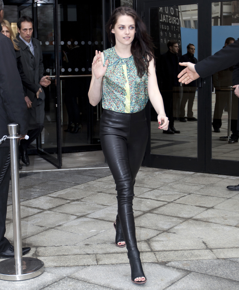
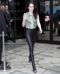


Kristen looks tons better in the ‘candid’ photo than in the ‘arty’ perfume ad, which lets face it, it a total fail.
Oh my-that’s look terrible! She looks so out of place. Who The F#ck approved that ad?
Yup, it looks horrible. This is supposed to make me buy the perfume?? I can’t identify with her, she looks miserable.
I don’t want to identify with Dakota Fanning and her ridiculous ad either – what’s wrong there? I just want to see a woman who’s comfortable and happy and attractive. Not a miserable actress or a teen putting the perfume bottle between her legs. Seriously, there are a lot of people who are just crazy.
She looks like a female version of Michael Jackson.Only this one has a harsh face with a dead fish expression
I’m not a big fan of KStew but I’m starting to think that Balenciaga designer Nicolas Ghesquière is trying to ruin her. From the horrible outfit at Paris Fashion Week, to the Met Ball fiasco, to the horrible casual Cannes look, to this walking dead of a perfume ad. I wouldn’t was to presume for anyone else but I won’t be buying perfume from a company that highlights a none too fresh looking zombie girl.
Not a flattering picture at all. I’ve seen that dress before – can’t remember who wore it.
Bey? Maybe cartashian
Jennifer Connelly.
I was just coming back to say it was Jennifer Connelly when I saw your comment. Good recall, Crystal.
Agee. Looks like a down-cycled Jennifer Connelly.
The ad is incredibly similar to one they did five years ago with Jennifer Connelly, down to the grunge styling and weird stance. They even have Kristen Stewart in the same dress. It’s just a different background. The weird thing is, the ad from a while ago got criticized quite a bit. Now they are basically rehashing it? Stupid in my opinion.
Wow, that’s kind of awful.
She’s really not selling it to me in that photo. She looks half out of it and wanting to be anywhere but there.
And the dress looks like someone stitched loads of candy wrappers together. Is it corseted? Because the shape of the shirt is so odd.
I agree with Sloane, she looks ten times better in the bottom photo.
Looks like Brian Molko (Placebo) in the ad.
Brian Molko is a beautiful, talented, intelligent, articulate(“the reason you want to wear a fragrance is because you want to smell attractive”, REALLY?!) angelic creature who shouldn´t be put in the same sentence like KStew or this horrid ad.
She´s trying to channel Brian Molko in real life but she´s as successful as la Cracken at channeling Liz Taylor.
amazing. she can stand in a straightish and non-wonky way in a photoshoot!
anyway, snark aside, i really like the composition of this ad. a lot of perfume ads tend to be subdued, monochromatic, BORING stuff (see the other perfume ad just posted today).
at least this one, there’s a lot of colors and vibrancy, except the serious non-smily face at the corner there.
edit: the dress is nice, but i have quibbles with the black severe huge zipper at the front. it makes her look like a summer flower fairy who has just undergone an autopsy.
with all the photoshop skills in their employ,they can’t soften that black zipper any?
Hi lower-case deb! Loved your comment about the zipper!!!!
I love the dress! It’s the contrast between the pretty floral pattern and the harsh black zipper and stitching that does it for me, along with the structure. It’s absolutely divine. I agree about the autopsy reference, I thought it too but it’s one of the reasons why I love it.
Blake Lively plastic nose is faar way better than this mess.
It looks cheap.
I’m amused that Kristen “I’m so edgy and real” basically has the same career plan as Blake Lively. They are so similar except Kristen otherwise.
Well at least Blake knows how to pose.
Edward Scissorhands in drag
After I read your post, I laughed and thought “that is too funny”, then I read your name. Lol.
An insult to Edward Scissorhands, honestly.
Perfect!
Ummm…hmmm…It’s entirely too arty for the likes of me so I won’t comment.
One of the ugliest perfume ad poster I have ever seen. She is not haute couture, she is not even pret-a-porter. She is like walmart. So why Balenciaga? Why?
I don’t get why she does stuff like this given that she never appears to enjoy the fame or even the acting. Why accept the money and then half @ss it with the lack of enthusiasm or even trying. She should just act and do her own thing.
This was my first thought too. She’s one of the richest celebs in Hollywood-why is she doing fragrance endorsements?
I’m not gonna lie-I would find it hard to do promotional work for a perfume.
“So what do you hope to accomplish with your recent ad campaign for (insert fragrance name here)?”
“Well, I hope that it helps to make the world smell better.”
I mean, there’s only so much you can say about perfume.
Anyway, she’s clearly uncomfortable in this interview (not unusual for her) so why do this?
I truly do not understand the appeal of this girl.
Welcome to the club.
An ever expanding club.
I cannot stand her. Annoys me on so many levels.
I could not agree more. Jeez, would it KILL this girl to freakin’ smile once in a while?
What kind of marketing guru thought a sulky, sullen looking twit like that would inspire people to buy that perfume? So they, too, could look miserable???
I’ll take Blake Lively’s boring, beige ad over this try-hard mess.
Kristen is so damn stunning. An understated beauty who shits all over basic bitches like Blake Lively, but they have her looking like a corpse with unwashed hair. Ugh.
I swear signing with Balenciaga was a huge mistake. They’ve been trolling her so hard with the wack outfits they put her in. I’m convinced that Nicholas is a Harry Potter fan that secretly hates Twilight and has decided to ruin Kristen’s life tbh. Her and Balmain would be good. She always looked good in Balmain. Or Proenza Schouler. Anything but Balenciaga.
Why have they got her in a dress from 2008 ??
Why have they photoshopped her legs so much ??
What the fuck is that name for the perfume???
Why do people still like that racist hag Bridgitte Bardot ??
So many questions …
On the other hand, I just saw Ashley Greene’s ads for DKNY and that bitch is working it. She’s a good model and those are some of the best DKNY ads I’ve ever seen. Her nose may be jacked but she knows how to work the camera. Kristen take note.
This ad has too much going on and would look silly even without K-bitch. Never again. Balenciaga have been such a mess lately. So sad.
The Twilight vs. Harry Potter conspiracy theory made me chuckle 🙂 Since HP ended I completely forgot that their respective stans were close to all out war.
I *thought* her legs were photoshopped. My screen is cracked so I didn’t know whether to trust it or not.
Negra luna
“I’m convinced that Nicholas is a Harry Potter fan that secretly hates Twilight and has decided to ruin Kristen’s life tbh.”…How I wish this was true because it would be the funniest thing in the world…LOL!
I really clicked on this article prepared to like the ad. Just – didn’t happen. No way José.
Sweet effing jeebus!
The dress is ugly.
The layout is terrible.
The bitchface is repulsive.
Whoever approved that ad should be fired immediately. It’s a total effed-up mess.
Her legs a bit wonky, they look a bit same to obese’s legs which knees go inwards when they stand.
Bahaha. Who approved of that hot mess?
ORLY!!!! My love. You’re back. Kristen posts haven’t been the same without you. It was pretty lonely trolling the fans all by myself.
*wink*
Hi bb – I’ve been super busy lately. But yes, I’m back!
Oh hello beautiful Orly and Chrystal! Orly, I was already panicking having not seen you for so long…
How did I manage to miss this feast of f@ckery here? Anyway, enough about stew, on the positive side, it’s now easy to distinguish her stans just by smell…
“on the positive side, it’s now easy to distinguish her stans just by smell…”
And this is one of the many reasons you make my day brighter, Nina! HAAAAA
I don’t love it but I respect what they are going for. This was approved by the design house so it’s not like Kristen did by herself.
I think Balenciaga is going for a trend that won’t be understood or appreciated for a while.
Plus I really like the presentation of the perfume by it’s self.
If anything this stands out from all the other ads.
also it’s amazing how Kisten stirs the pot without even triing.
Oh, she tries. She tries HARD.
It’s a fail. I actually like Kristen Stewart a lot, so I was hoping this ad would be good. The issue is that this is nearly identical to one of the first Balenciaga ads they did with Jennifer Connelly four or five years ago. Same dress, same weird, messy hair, even having the actresses pose in a weird stance. They basically more or less copied that ad and then superimposed it on a college student’s graphic design experiment. It’s dumb. Why on earth did they do the same thing and put her in a five year old dress? Especially when they were criticized for the ad five years ago.
Hey A. How’ve you been ???
Balenciaga have been flopping so hard lately. They’re starting to look as tacky as Versace and Roberto Cavali. It would be funny if it wasn’t so sad. I’m not even that much of a fan of Kristen (though I prefer her to Footface) but I wanted this ad to be good. She’s so pretty. It’s just a hot mess. I’ll never forgive Balenciaga for that mess of an outfit they put her in at the Met Gala, the shoes still give me nightmares.
Hey! I’m good, you? Enjoying all this gossip about CO$. Balenciaga has been hit or miss for several years imo, and lately has been on a decline. He’s on this weird space/grunge/90s thing, and it’s not working. The Jennifer Connelly ads were terrible, so I don’t know why I’m so surprised that this one turned out just as bad if not worse. Maybe because the Charlotte Gainsbourg ad was good, but that perfume ad was basic and pretty tame. When it comes to edgy, it’s Balmain FTW in my opinion.
@A
I’m good thanks bb.
You have flawless taste, not surprised. You’re practically my spirit animal on CB. *wink*
Balmain is very edgy and just bloody amazing tbh. I couldn’t pull of a lot of their stuff but they’re a perfect match for someone like Kristen. I’m really into Raf Simons and Dior this season though (nothing on his last collection with Jil Sander but still good)
That Balmain dress that Kristen wore to the MMA’s last year was absolute perfection. It was edgy but not try hard or tacky. I think on paper Balenciaga and Kristen Stewart sound like a good idea but in practise it’s a hot mess. Have you seen Ashley Greene’s DKNY ads?? They are pretty awesome. She’s a good model. She’s lost a lot of weight recently though 🙁
Kristen is 1000 times prettier than Charlotte in my opinion but Charlotte is very alluring and that’s something that Kristen can’t really pull off. She needs someone to work with her quirks instead of trying to make her something she isn’t.
Oh look, it’s KStew’s only posing face she can do.
Seriously, it looks like they cropped her head on that body. It’s not even properly aligned with the neck.
You think Kristen chose the photo, the dress, or the art direction for the shoot? She’s just a model, like any other, doing what she’s asked to do. Why make it so personal against her?
Eh, out of all these posts there are like two that blame Kristen Stewart. Some people are saying they don’t like her, but aren’t blaming her. I like Kristen, but I think this ad is a fail. Said it before, but it’s a rehash of an old Jennifer Connelly ad (same dress and everything) with a slightly different layout. Balenciaga is VERY hit or miss, and for some reason they decided to rehash a big miss from five years ago.
To be fair, there’s also an interview with her in this post. Those are her words, not Balenciaga’s so I think it’s fine to be personal about it.
I actually like the dress. Is that a Mary Pauvywhatsherface design?
The picture and he outfit and facial expressions are awful.
I stopped reading the interview when she once again claims how honest she is and it is practically impossible for her to tell a lie since she has to be true to herself – BARF!!!
Well said. This trying so hard to ‘show’ she is this honest person and being true to herself etc renders me speechless. Also that interview , was it VF?, where she has that book store as the interview venue was a bit too contrived. Working hard to show she is this intelligent bookworm who has read many interesting books! Bitch please.
She definitely needs interview lessons by watching that BF of hers. He is adorable.
I thought the same thing. I think her handlers were trying to play up the fact that she’s in On the Road with the bookstore setting, but it just came across as…surprise, pretentious!
You know what always gets me? Its that people who are constantly saying how “honest” and “real” they are usually aren’t. So what does that say about the so called new “it” girl. She ain’t real at all. But her and her PR people are really selling that angle.
“And I’m a terrible liar.”
Ahhh…that’s why she can’t act. ; )
And I agree with the resounding no for this ad. I know actors want to do different things. But the only thing this ad does is affirms that yes, she could play a zombie-corpse if she wanted to.
was I the only one who thought ‘EDWARD SCISSORHANDS!’?
It’s not that bad…
Okay, she is being forced down our throats as the next ‘it’ girl-she is not a great actress, barely mediocre, actually. and she is cute, but NOT beautiful by any means.
Another hollywood act of fakery-let’s package someone and market her so much that people have no choice but to accept her. And no doubt this is all due to twilight-she and pattison will sell millions b/c of their popularity from that franchise. So we have no choice but to expect them to be hoisted upon us, even while talented and/or more attractive actors are routinely struggling for work.
I’m so tired of seeing her face and hearing about her-I have nothing against her personally. I just find her bland and not worthy of an ad series like this-she is not glamorous, iconic or even old-school. cate, angelina, and others are the faces who belong with such types of ads, IMO.
She is misplaced and miscast.
but whatever-noone cares what i think.
she looks pale and unhealthy is these pics, btw.
If it’s any consolation, I care and I think you’re 100% right. I loathe being force-fed a product I’m neither interested in or impressed with.
Force fed? No one is taping your eyelids open and making you stare at this ad. Funny, whenever there is any Kristen Stewart story on this site, you are always front and center bitching about how overrated she is and how much you can’t stand her. Simple solution…don’t click onto any Kristen Stewart stories unless you enjoy bitching about her which I think you do.
Applauds!
Well said Irm.
the ad is different, I guess thats what they were going for, the actual packaging and the picture inside is much better, but they color her eyes black, I don’t get it, she has gorgeous green eyes, why not use that. And the picture with Nicholas she looks so beautiful, they’re not using her well, but the perfume will probably sell a lot
I like the dress very much but her face…jesus, that’s screwed up, really.
On the other hand I’m waiting to see her tanned and blonde, it will be fun.
She looks good as a blonde. She’s one of those few women who can rock any hair colour. I think darker hair flatters get features more though.
This movie sounds… Meh.
when someone says “I dont’t want to sound pretenious” you know the next crap that spews forth from their lips is exactly that.. I rolled my eyes so hard that I may have given myself a headache..
She can be a pretty girl but that is a fugly picture.. Almost looks like Lara Flynn Boyle before all the surgeries..
… or when they say “I’m an honest person” or “I’m a terrible liar”. One shouldn’t have to qualify those things, they just are.
I can’t wait either, she looks god as a blonde, makes her features softer
She looks freshly dug out of a grave.
Well, regardless of if she likes the perfume, she certainly looks miserable standing next to a gigantic bottle of it.
Wait, that’s how she looks when she’s comfortable? That’s how I look when I need to eat lots more fiber and spend some quiet time with an issue of W in the loo.
Ugh, nothing like saying “I don’t mean to be pretentious” to make you sound like a pretentious ass. Just ONCE, I’d like to read an interview or article on this person and not be extremely annoyed at the end of it.
Horrible ad, looks like an awkward, cheap, plain mannequin photoshopped to hell. Stewart got the job because the advertisers are trying to reach the Twilight crowd, end of story.
100% pure drivel
Uhhh No. The full body shot is a no go. Her legs are awkward and spread apart is just……no. And the shoes do not go with the outfit. Basically IDGI (I don’t get it).
I think Kristen is a pretty girl, but my lord that is one fug ad. Yikes.
Eye roll, eye roll, eye roll and…
O_o
This ad is suppose to sell perfume? I’ve seen more looks of desire from a mug shot. And it’s a recycled ad from 5 yrs ago with another actress. Balenciaga wants to cash in on the last vestiges of the Twilight frenzy and they probably know the Twi-fans wouldn’t know about the other ad.
That ad is terrible! The graphic designers should be taken outside and smacked! There is no flow to the ad–it’s too busy & distracting.
Don Draper would not be pleased.
Kristen is beautiful, but that particular shot is also a little weird, with the hands in the pockets making a kind-of pouch?
EPIC FAIL!
I don’t like this girl’s acting or her looks.
From vampire to zombie. For KStew not much of a progression. Kind of like her acting from one movie to the next.
This is such a FAIL. Especially from the neck up. Scratch that, the legs are shit too. Even Lilo can manage to actually model, so it can’t be that hard.
She looks horrible. Her face is ghostly, her hair looks unwashed, her head looks like it was photoshopped on to the body. It looks like a bad acid trip. She doesn’t look the least bit happy. WHO approved this?
Wow, she looks so much better in random candid photo’s I’ve seen of her then in that print. She doesn’t look bad in it but she looks like she was kidnapped and forced to take a picture in some seedy hotel.
The ad is awful. It makes a pretty girl look terrible. As for KS’s comments. The one I find interesting is (I’m a terrible liar). That explains her and her line readings in Twilight. We all know the Twilight scripts are terrible. What saves all those movies are her and Robert’s chemistry.
Terrible. And they shopped her legs into oblivion. She wouldn’t be able to stand with legs that thin.
This looks terrible – they somehow made her look like she’s ill with the fl and bloated in the hips.
This girl looks so unpleasant and detestable really, I don’t see the fascination. Her best role is one that does nothing for women. Her attitude generally sucks. She’s stuck in a phase of permanently sulking at everyone, even those that don’t know her. Why is she even in the public eye if she has zero people skills? A total brat with no personality. And yea, the ad sucks. That’s what Balenciaga deserves for prostituting itself.
Here is pic of stew’s mom. kstew’s future look. and if you read the interview want to be unique different and indie is a family thing.
http://www.hollywoodreporter.com/news/cannes-kristen-stewart-on-the-road-jules-mom-twilight-k-11-327000
If it’s all about florals, why is the top of the bottle simply black and white stripes? The ad is all about color and then you stick black and white stripes in the middle of it.
Florabotanica makes me think of microbiology class. Name this organism…right up there with pseudomonas and staph aureus.
Love the MRSA reference :p
“And I’m a terrible liar.” So she admits herself that she’s a terrible actress!
This ad is horrendous.
I think she looks like a zombie. I don’t know who took that photo but he had his zombie lens working.
Her interview I was eye rolling too.
I think her Mom is pretty though. Kristen is usually stunning when she cleans up.
Don’t like this young lady as an actress but she can be photographed much better than this. Sometimes she really does look stunning. The whole “let’s be edgy by making pretty girls look awful” approach to fashion photography got old about five weeks after it was started back in 1974. For some reason no one has stopped doing it after all these years and they all still think it’s edgy?
I think ya’ll are harsh. I think her interview sounds sincere- like she’s just sincerely interested in Ghesquiere’s stuff, and wants to work with him- not pretentious at all. She’s growing on me.
The only thing truly hateable bout the ad, to me, are the silly so-90’s combat boots.
Such a bright ad for someone whose personality is so colourless.
She looks like Edward Scissorhands!!!
Great comments everyone I agree originalkitten; I’m from the old school actors/actresses should act, musicians should do music and models should sell things like perfume; go on youtube and look at all the great ads featuring the supermodels of that era Paulina Porizkova anyone – for all her faux hipster bullshit this drip has no problem taking easy money – she’s no beatnik, she’s shilling like everyone else – how original can’t wait till her career tanks.
she looks awkward in everything she wears except jeans and a tee shirt. her legs have no shape and although she doesnt have surgery now, she will eventually
This ad looks so budget, so amateur, it’s actually funny. She looks like a paper doll cut out on one of those picture boards/collages you make in 9th grade. As someone said earlier, the graphic artists should be shot. Not a fan of Kristen at all, but in this case Balenciaga dropped the ball from the moment they signed her on. I feel like this is something that would be sold at CVS for $16.99
Her jaw in the ad is, indeed, ~very~ strange. Also the dress color makes her look consumptive; she’s always been quite fair-skinned (I am that fair, and I’ve tried being brunette and would not do it again). I like the overall composition of the ad in a really basic way, but – and I hate to admit this because I’m totally biased toward her – she herself looks bad.