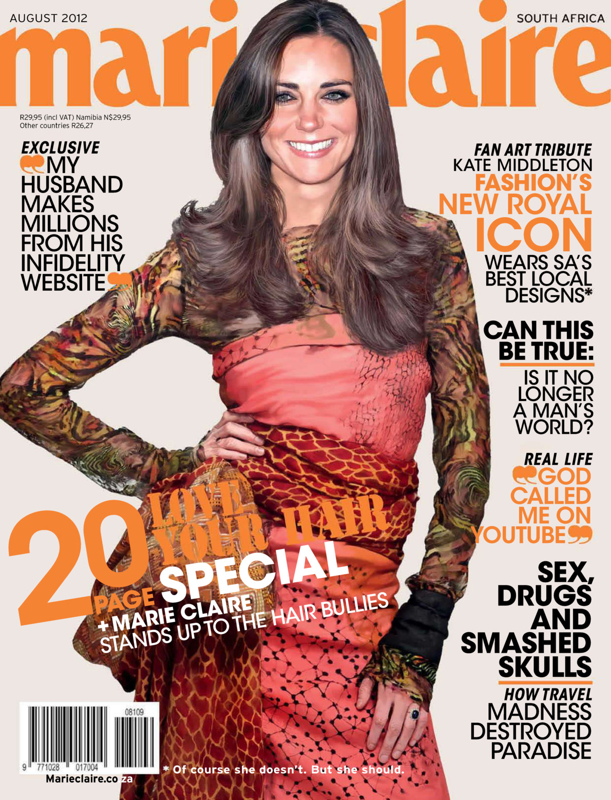
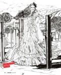
Duchess Kate posed for the South African edition of Marie Claire magazine! Except she didn’t, obviously. Because if Kate was ever going to do a fashion magazine cover, it would be Vogue UK or Vogue American, or at the very least, maybe Elle or Bazaar. It would not be Marie Claire South Africa. So how to explain the cover? Well, if you read the fine print, the cover explains:
Fashion’s new royal icon wears SA’s best local designers*
*Of course she doesn’t. But she should.
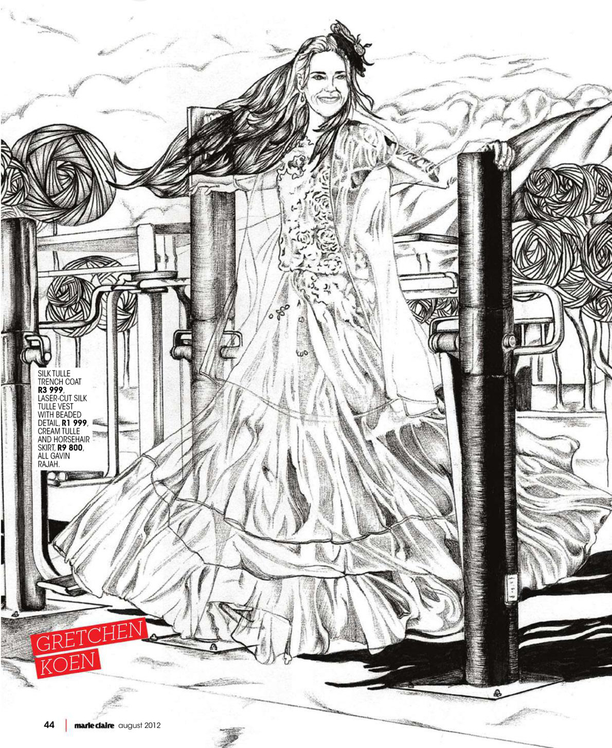
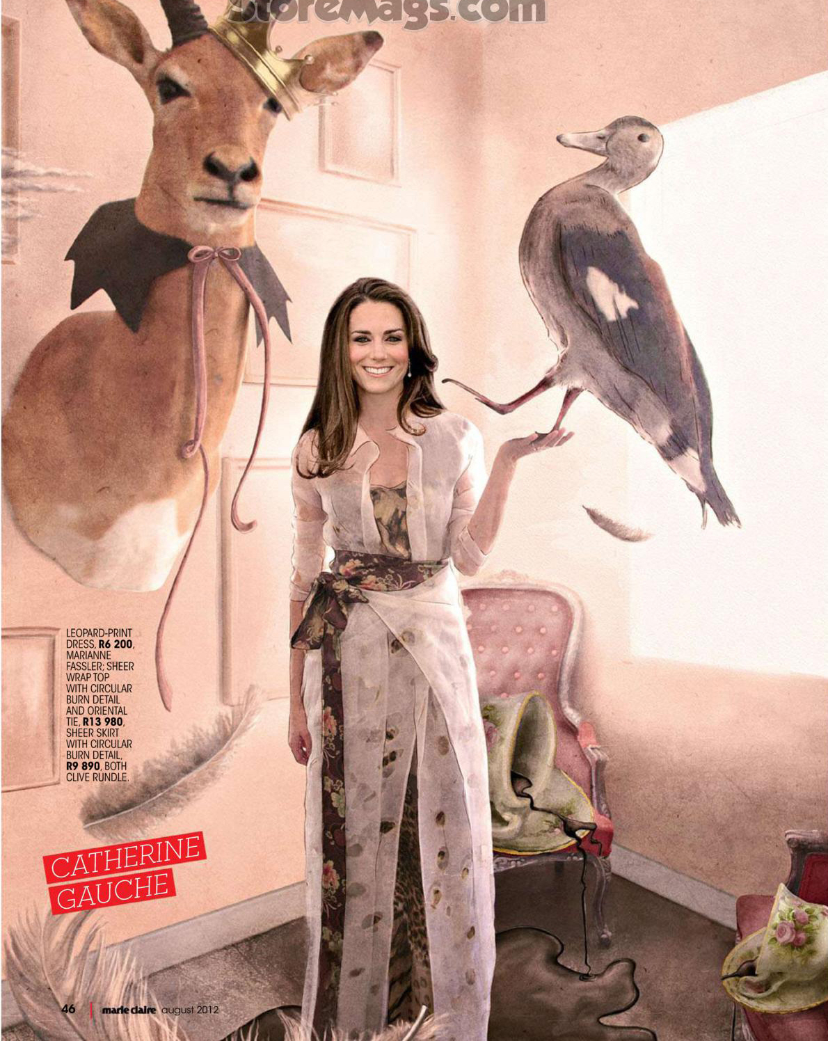
On the cover, Marie Claire used another model’s body (wearing a dress by South African designer Clive Rundle) and then just ‘Shopped Kate’s head on there. But the inside “images” are even worse – Marie Claire used “fan-made images” of the Duchess. MC editor Aspasia Karras tells The Telegraph, “We were so inspired by her fairytale wedding and her life as a modern-day princess, which is why we elected Kate Middleton as our cover star for the August issue. The cover is actually a hyper-real illustration of Kate, meant to be a fan art tribute to fashion’s new royal icon.” You know what? As long as the magazine isn’t lying and claiming that Kate actually posed for them, I don’t have a huge problem with this. It IS sort of postmodern artwork, and if you look at it from a “They were doing a tribute to her and they’re being honest about how she didn’t pose for them” way, it’s kind of a cool concept. Unfortunately, the concept is ruined by some awful execution. Some of the inside images:
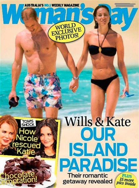
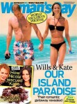
Awful, right? This is actually the second non-British publication that Kate’s been on in a week’s time – an Australian magazine got their hands on exclusive beach photos from Kate and William’s honeymoon last year! The Palace was super-pissed.
Marie Claire South Africa photos courtesy of The Fashion Spot.







I think the whole concept of the magazine spread is kinda creepy and misleading, even with the disclosure that the images aren’t real. That said, I love the cover dress.
As for the honeymoon shots, I imagine they’re pissed that the world has now seen William’s fugly swim trunks. Looks like he borrowed an old pair from his dad!
i agree and love the cover art and dress but the rest looks poorly done.
They’re trying to make it look like she really came in and did a photoshoot, but it’s soooo terribly noticeable that she didn’t LOL.
Wow. This is just bad bad bad.
How in the world do you get that from these pics? They are so clearly ‘fan art’. Nothing even remotely real about them.
She looks like she has an eating disorder in the beach picture. There was some talk that Will and Kate leaked the pictures to distract from all of the other negative press about them recently (not doing it, flirting with Harry), but why would they leak such an awful picture?!
eh I really do not think Will is into her, I think he was over her a long time before they even got married. I wonder why he still followed through. It is almost the same with his dad and princess Di kind of thing, I get the same vibe.
The beach shot of her will haunt by dreams tonight. I’m hoping its just bad photoshoping by whoever released it – because Kate’s figure is scary…
This particular shot is complimentary to her overall figure. There are more pictures of them walking on the beach which show that the cover pic appears to have been photoshopped to give her some hips!!!
I don’t believe the 2 people holding hands on the beach are Will and Kate. They look nothing like them!
….except the Palace confirmed that it is them.
Meh, I like the dress on the cover, but the photoshop kind of makes her look like she’s a caricature on the cover of MADD magazine.. do they still make those?
Ha, you’re right. And yes they still make those. My son is totally into Mad and I admit I laughed at a spoof they did of Modern Family. It was spot on.
Yeah, her face does not look natural at all. Very “off.”
OMG! that’s exactly it! i couldn’t decide what that cover picture reminded me of.
this woman is very underweight, either due to stress or a full blown eating disorder.
no wonder they are pissed the pics have gotten out. to close a reminder of diana mess.
Kate actually looks nicer in those photoshoped pictures than in candids from honeymoon.
i bet she regrets that nose now.
What are you talking about? Nose job?
Yes she’s clearly had a nose job done. But this was a few years back. There are websites where you can view before and after. Not a big difference, just a tweak to the tip.
nope the bridge of that nose has bee practically removed which is why i think it looks bad now
Her body is just an odd shape.
The broad shoulders and the narrow hips aren’t helped by the fact that she has a really long torso. She needs to put on some weight. She doesn’t look healthy even though she has good tone to her body.
she’s a big boned girl. Losing weight only emphasised her problem areas instead of making her look delicate. I think that’s also why she appears to have an eating disorder. When you lose weight with such a frame and big bones, you look sick rather than thinner.
Charlene of Monaco has the shame shape and big bones, but as she isn’t so skinny, it isn’t noticeable.
That’s actually really interesting, LAK. So if you have fine/small bones and lose weight, you look dinky and delicate? But if you have big bones, you end up looking sick?
How do you actually define what is ‘big boned’?
@Amelia – Big bones is in reference to her frame. As humans we come in big, medium or small frames [of course there is overlap, it’s not as black and white as that.
It takes a huge amount of weight gain for a big boned person to look fat. They tend to be bigger before they are fatter. Any weight loss lower than their optimum weight makes them look gaunt, frail rather than the desired ‘thin’ look – see Kelly Osbourne. It’s easy to accuse them of having an eating disorder because the weight loss has such an immediate, dramatic visual impact.
On the other end of the scale, it takes a small amount of weight gain for a ‘small boned’ person to look fat. They tend to look better thinner. And it takes a huge weight loss for them to look gaunt, frail. It’s harder to spot an eating disorder on a small framed person. By the time you do, it is usually at an extreme point eg Nicole Richie.
Lak and Katie are correct. I have her body type long torso, broad shoulders and no hips to speak of, Im also 5’9. If I go just a pound under 130 I look totally sickly to the point everyone asks me if Im feeling okay even tho it may be only a lb or 2 loss. On the plus side of it, I can gain 10 lbs without anyone but me knowing it. It can be a blessing and a curse but Id give anything to trade my broad shoulders in for petite ones.
@Macie – i am 5 9 too. Similar shape and no boobs. It took a long time to be ok with my shoulders. Now, it’s just a matter of knowing what looks good for them and avoiding all other styles.
I winced when i saw Charlene of Monaco’s wedding dress. Talk about emphasising her bad points.
I’m also a “big-boned” person and it’s true that weight loss works in funny ways for us. I’m 5’9″ and the thinnest I have EVER been in my life is 140 and although I definitely still had plenty of body fat, was a healthy weight, etc. etc. I got people telling me I was “too thin” all the time. Part of my deal is that I actually have pretty prominent cheekbones and so my face starts to look thin pretty quickly.
All that said, Kate clearly IS too thin, regardless of her bone structure. I have a hard time believing she weighs more than maybe 120. Given the muscle on her, I’m inclined to think it’s a case of exercise bulimia/addiction combined with a “healthy” diet, rather than a total starvation diet. Really hope she gets it sorted out–I’m not her hugest fan but I just can’t imagine she is happy having to maintain that figure.
The dress in the first picture is pretty. Those other pictures are awful though. Whoever did the photoshop on those pictures needs to go back and take somemore classes on it.
she went HAM on her midsection. looks overworked a bit. i dunno 🙁
Yikes to all those photos.
The worst is, of course, the last one.
Horrible in every sense of the word. So disappointed.
When even I could whip up a picture in an image editing program in about 15 minutes, you should not be putting it on the front cover of your magazine. Awful. They could have paid a couple cheap commissions at DeviantArt and gotten much higher quality.
What is that duck (?) in the last Marie Claire picture doing and why is it there?
What’s wrong with Marie Claire stuff? This mess looks like a school project!
Who ever thought this is a good idea should receive a week off without pay. These are horrible.
cheap!!!!!!!
Ugh. If a magazine is going to do this they should at least do it well. And at least have the model pretending to be Kate pose how Kate would have posed. The cover dress is lovely though.
I mean, it’s kind of like fanfic? I guess? But a strange approach for a mainstream magazine.
Her hair on the cover looks like it’s made from the tails of a hundred squirrels. So awful.
And the eyeliner is always present! LOL.
The clothes are gorgeous, though. 😀
Does anyone have a link to a website where we can view ALL of the Honeymoon photos, and not just the cover of the magazine? I’ve been searching, and the only thing that keeps popping up is the cover of the magazine. Thanks!
Photos from the website Royal Dish: http://24.media.tumblr.com/tumblr_m6wlzb5EMF1rno4lgo1_500.jpg
http://24.media.tumblr.com/tumblr_m6wlzb5EMF1rno4lgo2_500.jpg
Magazine scans:
http://www.princess-diana-remembered.com/4/post/2012/07/womans-day-magazine-william-and-kate-honeymoon-pictures.html – you can click on the photos to see the bigger versions.
In the 2nd photo, with Kate holding her hair, she doesn’t look very thin. But it’s also because of her body frame. She’d never look “skeletal”, but her thinness really looks unnatural from the front view, like in the 1st photo, IMO.
Her body in the 1st photo shows that she’s lost a lot of weight and she’s too “ripped”. Her body looks kind of dried up, like she has no body fat left but she keeps on exercising anyway.
Thanks so much for posting those, Sachi! I agree, in some of those photos she doesn’t look overly thing. I have her body type, wider shoulders, no hips, but I am shorter, 5’4″. It doesn’t take much for us to “muscle up”. I would say though that she has definitely lost more weight since the honeymoon. She looks rail thin in a lot of the most recent photos of her!
@ littlestar – You’re welcome!
I have a similar shape to Kate. I’m 5’3″ only, but I have wide shoulders (which wasn’t helped by Phys Ed aerobics class in high school which included weight training once a week and I used to do a lot of shoulder/chest exercises) and small hips.
But I am also built ’rounder’ and curvier with a short torso, like my Mum’s side of the family. If I were a little taller, the weight distribution would be a bit better. 😀
I gain weight quite easily so I have to watch what I eat, although losing weight isn’t that difficult either, as long as I commit to it. When I gain/lose weight, it’s very noticeable, because I’m a bit on the short side and I’m not really “big-boned”.
So Kate, who is reported to be 5’10” and has a bigger body frame, must have lost a lot of weight to look like she does now, because even though she doesn’t look ‘stick thin’, her face looked really gaunt the past few months, and there was the dried up quality on her face, like the skin was stretched so thin, especially in the photos last year. She doesn’t have any softness left to her looks.
Weird. And the beach pic doesn’t look like her.
Well…..she’s not wearing any make-up and her hair is pulled back.
The palace has confirmed that it is them.
If that isn’t Kate, then William has some explaining to do, because that is him on that magazine cover holding hands with someone who must be Kate, but for some people doesn’t look like Kate.
3 layers of foundation, 2 layers of blush, 3 coats of liquid eyeliner, scouse brows, and fully blown-out hair make a lot of difference.
You can see in the link I posted above that there’s another photo of them swimming, and it IS William and Kate.
On that Woman’s Day cover, Duchess Dude really does look like a dude.
Wow … the images are really bad. They could have, at least, photoshopped the face to make it more attractive … yikes.
Eh…I doubt it would have made much difference if they blurred Kate’s features a bit and used more lighting. Kate’s face doesn’t suit because she is hard-faced and looks old, while the outfits are delicate and dainty. The clothes call for someone whose type of beauty is softer, refined, and sophisticated to go with the theme of the photo shoot.
Someone with a fresher face would have looked better.
Kate’s head on the clothes just looked off, like the effect of the clothes was ruined. Her face looked pretty in the 4th photo, but her makeup and hair ruined the outfit. The editors should have chosen to Photoshop the updo that Kate had paired with that teal Jenny Packham evening gown.
Are they making fun of her because this is just not flattering . Kate is not a fashion icon , is defiantly not a MODERN princess and will never wear such amazing and interesting clothes . this is the best dress that I have seen with her head on it and it is not even real . I would love to know the number of copies they sell of this edition .
I keep staring at Waity’s bizarre body in that bikini shot, and I’ve figured out what’s wrong with it. If you cover the bottom half of her body with your hand, the top half looks normal. If you cover the top half with your hand, the bottom looks normal, sort of, on a very tiny petite person. The problem is, the two halves don’t go together! The top half of her body is bigger and way out of proportion to the bottom half.
Waity needs to put on some weight, especially around her middle and hips. There is no question in my mind that she has an eating disorder. An eating disorder does not have to be anorexia or bulimia; it can simply be an obsession with how few calories she’s putting into her body day every day, a disordered relationship with food. In order to maintain that degree of skinniness, she can’t be eating more than 1,000 calories a day. And with that few calories, I’ll bet any money that she’s a slave to calorie-counting — and obsessed with it. Yep, eating disorder.
I think it’s funny that it’s driving the fashion mags crazy that she’s not a latest-thing-off-the-runway clotheshorse. So now they’re resorting to this paper doll “tribute”.
She had her own staid style that doesn’t cost a ridiculous amount and that suits her function and the functions she attends. Settle for Gaga and the Olsens for the freaky outfit choices, fashion nuts!