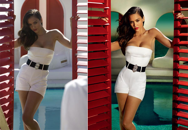
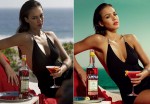
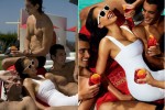
Jessica Alba is gorgeous and super-fit on an average day, but she’s far from all natural on the pages of the upcoming Campari calendar. As the Daily Mail points out, you can tell that there’s some substantial airbrushing going on when you compare photos from the shoot that day with the final product. Alba’s hips were made even more slender, her waist and stomach were smoothed and her boobs were made more buoyant. We all know it happens, but it’s still interesting to see perfectly gorgeous photos get enhanced to the point of Disney level perfection.
Here are the photos, shot by Mario Testino via Superior pics.


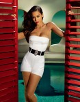
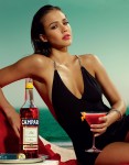
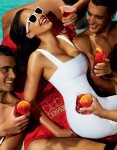
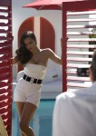
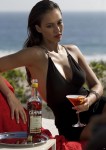
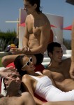
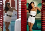



At least I can still tell it’s Jessica. Not like certain pictures of Kate Winslet. Yes, there is airbrushing but it’s not over the top. Show me one cover of any celebrity that is not airbrushed.
Shocking. 8) It seems like the bulk of the air-brushing is on her wrinkled clothes. Perhaps a steamer would have been cheaper?
God if Jessica Alba needs airbrushing, what hope is there for the rest of us?
They’re test shots – in some cases two different poses. Most of the photoshopping on her is really taking out the creases and folds in her clothes. If anything she looks the tiniest bit broader in the “improved” shots.
She got away lightly in comparison to the background though. Why bother photographing outside if you’re just going to make it look like a studio anyway?
I’m going to show my age here, but who else thinks that the tagline “No, Luton Airport” should be there somewher? 😆 (it’s a joke from an iconic Campari ad from the 70s – aorry if this joke was made elsewhere, I didn’t bother to read the original thread)
http://www.visit4info.com/advert/Campari-Luton-Airport-Campari/14583
Well, she looks great in both, so this isn’t very damning.
seems like the photographer didn’t do a good job because of all the airbrushing, right ?
Perhaps those who think there isn’t much airbrushing should check out the post on Jezebel. Their post zooms in closer on the header shot of Jessica and it’s kind of startling.
This is not a large girl but her hips and legs have been slimmed, clavicle bones were highlighted and her underarm/ribcage hollow deepened. The shape of her lips was drastically altered.
What I find shocking is that whoever produced this shoot thought she needed this degree of airbrushing. She’s gorgeous already.
I like the originals better. Never got the appeal of airbrushed pictures – you can always tell that they are airbrushed, so what am I supposed to find gorgeous about them, the graphic designer’s talent? It’s just like fake boobs or cosmetic surgery in general – most of the time you can tell, so where’s the appeal? I might be a natural snob, though.
Not much airbrushing? Uhhh. You may want to click on those photos and take another look. In the first one, the white jumper, her thighs have been slimmed, her waist has been taken in, and her breasts plumped up to look bigger.
I actually liked the behind the scenes pictures more. The photoshop just made the entire thing look unreal to the point of being on the verge of surreal.
She’s gorgeous no matter.
Wow. She looks WAY different, especially in the header. In the original, she looks just like some average girl I’d see walking around on any given day. In the airbrushed version, her beauty looks so unrealistic and unattainable. No wonder women have so many body issues; not even the best looking people look like the “standard.”
ok, if jessica alba has to be airbrushed what does that say about the rest of us?
Uh, guys – if you’re going to show a side by side comparison, make sure its the exact same shot and not another one from the set that just looks similar.
I know– men are actually thinking this is real, too– so no wonder we feel bad about what we have to offer given our “competition”
I might be crazy but to me she looks way hotter on the “before” pictures. 😛
I saw the same thing 2 days ago, they had one more picture with shocking differences.
Click on my name to see it.
SallyK, the additional pic is even crazier than the rest 😀
If they wanted someone thin with no meat on their bones, couldn’t they just have hired a model to do it? This is stupid.
not airbrushed much? are you kidding? in the header pic, the airbrushing makes her look almost superhuman and unnaturally perfect…
im always so glad when these pictures come out.
what really interests me though, is how washed out and low quality the before pictures look. wtf? don’t they have expensive cameras? my little $300 digital takes clearer more vibrant pictures than that…
Once upon a time “childbearing hips” were a good thing.
I mourn those days.
It looks to me like they’re mostly smoothing her wrinkled clothes. She still looks mighty fine in the un-airbrushed photos.
I think the doctored pics are great. Love the enhanced colours and contrast. Very Italian and very in tune with the brand. Campari is kind of disgusting though, very sweet and sickly.
I’m not bothered by the airbrushing actually I think it looks good.
i really like the airbrushed ones, if only because they remind me of those fabulous ads from back in the day that were done with art instead of photos. however the extent of her drunkface is unfortunate. mostly i’m confused why the test shots had such crap lighting. thhey do one ad campaign every year, you’d think campari would try to get it right
The ads look great, but they look photoshopped. It’s weird to me to think that people didn’t think these were doctored to the max since she looks like a Barbie in these pictures. She’s got a great body and all, but Campari isn’t trying to be realistic in their portrayal.
Beside that, as SallyK pointed out on her blog, look at her knee in the first picture. It’s a totally different knee. Like it’s from another person. Bizarro.
What they’ve done to her waist is disgusting! I don’t think the photoshopped waist would support her upper body if it were real!
As everyone noted, you’re got a number of shots side by side that aren’t the same shot.
Plus, eh, it’s a calendar. It’s obviously meant to be a kind of hyper-reality thing, brighter colors, and the like. The whittled waist is a little crazy, but it’s not like the original ads were presented as REALLY GRITTY REAL. So, yes, I think, it’s overboard, but anyone who saw the original shots from the calendar and thought, that’s so REALLY REALLLY REAL, well, a little crazy.
I almost always prefer candids versus photoshoots, anyway. For any star, except Cameron Diaz or the others who have horrible skin.
Neither Kaiser nor I ever said that there wasn’t much photoshopping, just that the most dramatic difference is in her clothes. And in the standing what appears to be a different background.
The lighting was tidied up, and polarising and warm amber filters used to add to the stylised feel which was amped up by heightening the contrast, which is why some of her curves stand out more in the afters than in the more monotone test/behind-the-scenes shots.
Obviously she’s had a little done – if you’re doing that much alterations to the clothes and background it’s unavoidable even if you tried to leave her alone. There is a some whittling done on her waist and a little on her legs – but not much. And some of the angles are different between the two, and some of the poses, which could also have a knock-on effect.
Again, I can see that there is airbrushing going on – I just don’t see the spectacular difference in her features some of you do.
@pissoff: Right? I’m looking at these photos and thinking.. airbrushed? They’re not even the same image! Jeez Louise, the girl looks fabulous in every shot..
(Hmm, wondering if I’ll get slammed into moderation for responding to a post with a sweary word for a moniker) 😆
I noticed it in the first post because the lines of the clothes seemed fake and almost digital. I dont think there was ever any doubt there were touch ups were there?
Regarding the header image, if those shots are in fact before and after:
Smoothing out the camel toe was a good choice. They murdered her face and hair, though. She looks like an oily-haired baby-faced cyborg in the after. They’re both perfect in the before.
And I’d agree, they made her too thin.
I have so much trouble believing the poor lighting, though. And notice all the business in the foreground that they cut out? That’s not realistic.
They mostly look like the colors have been saturated. They don’t look too bad. The colors are very vibrant and beautiful and it makes me feel better seeing the colors having to be altered because a lot of my photos come out dull like the originals on here.
These pictures arent even of the same shots… same scene but not the same shot
she’s been totally slimmed down! It’s true: look at her waist and thighs in the before and afters . . . wow. Do they ALWAYS do this? I mean, the girl already has a fantastic figure…so it gives you an indication of how unrealistic it is to meet these “standards” — it’s infuriating, actually – these pictures hardly needed it. Maybe punchier colors and better contrasting, but this is extreme.
I know Kristin – I like to bump up the saturation on my photos too. I’ve always found digital photos to have some sort of greyish cast, some cameras more than others.
It’s so easy nowadays… God be with the days where you had to get a rake of filters and the right combination of film and photographic paper and processing centre. 😆
who cares about a little photoshopping here and there? old news and no big deal. the sadder story is how jessica is embracing being portrayed as a sex OBJECT in order to sell ALCOHOL.
sex object is not the same as “sex symbol” BTW. sex symbols are sexiest with an interesting mind attached plus some inner and outer strength. i miss her Dark Angel persona!
They ALWAYS make the breasts look larger and rounder by highlighting the top areas and putting a shadow in between the two breasts.
Big breasts sell products!
Lizbeth I looked at Jezebel and I don’t see what you are talking about. They didn’t alter her lips and if you think they did, you have failed to notice that the before / after pics they are comparing aren’t even the same picture. play spot the difference!
I like the way the colors have been altered. It stands out and even though jessica doesn’t look BAD in the pics, she looks better airbrushed! She looks kinda bulky and short in the originals!
I love Campari! Nothing better than a Campari and soda w/a twist of lime on a hot summer’s day.
ok guys, I think the major difference here is that the originals are predominately ambient lighting, and no attempts to fix them up in post prod cos they’re just test shots….V’s the final result which looks much better because of the use of flash/controlled lighting and photoshop. They really haven’t done that much post production on her, but to compare the two pic like this is crazy because the effort and quality of image is so vastly different. Even irrelevant.
Campari should find a proper photographer. The lighting in the initial raw shoot is just hopeless if that much photoshop was required to get the lighting right.
Campari should find a proper photographer. The lighting in the initial raw shoot was just hopeless if that much photoshop was required to get the lighting right.
Alba is sooo pretty & respectable
First time I’ve heard of Mario Testino being accused of not being a proper photographer.
I’m looking at them again. The photos aren’t test shots, they’re taken by someone else on the shoot as they’re consistenly at a different angle and in some cases people are in front of the camera. They’re probably taken with a standard compact digital instead of a properly set SLR and don’t have the benefit of the reflector to throw light back up onto the face. In the standing up one the real shot even used a wind machine as her hair is moving. It’s absolutely static in the untouched one.
I’m not saying the final ones weren’t photoshopped, but just reasoning in the huge difference in quality.
Clearly, the before shots were taken by an amateur, on-looker, or someone else on the set. The lighting and angles are totally different than the after photos.
Definitely agree with Mairead, the comparison shots should be similar in quality. With the final shots, being slightly Photoshopped.
Overnice blog, but it does not really presented good in Tango Multilingual.