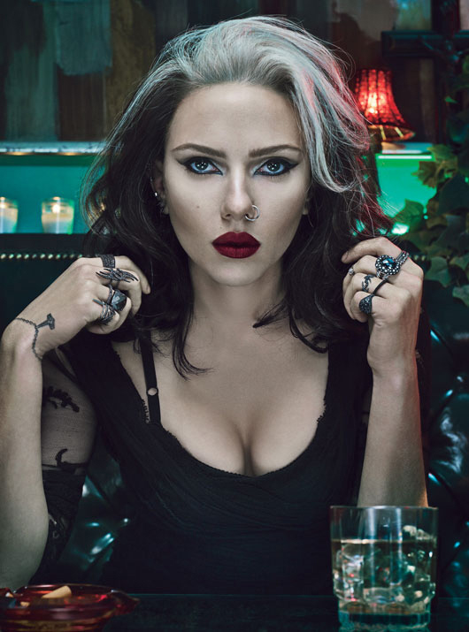
To celebrate W Magazine’s 40th anniversary (“Meh!” says nearly everyone), they decided to do four different covers featuring four different “hot” young actresses representing every decade of W’s 40 years. This Scarlett Johansson cover – representing the 1990s – is getting a lot of attention, mostly because of the wig, I suppose. I hate to admit it, but I do remember when this whole look was in style. RIOT GRRRL! Ani DiFranco! Linda Perry! Etc! You know who I idolized in the 90s? I’ve said it before – Winona Ryder. She was my beauty/body/fashion/career/coolness icon/touchstone.
You can read ScarJo’s short little interview with W Mag here – she doesn’t say anything important. She named Chris Farley as her favorite person from the 1990s, and when asked about her least favorite ‘90s style trend, she says, “Turtlenecks—they’re horrible. I tried to get into them because they are so practical, but they’re just so unfortunate… Men don’t like turtlenecks. I’ve never met a man who likes anything around his neck other than my hands.” George Clooney just came. HA! Oh, one last ScarJo thing – as I said yesterday, Scar is done with Nate Naylor, officially now – it’s been confirmed to Us Weekly & People Mag. On Twitter, some of you are suggesting Scarlett try for Russell Crowe. That would be a delicious mess. I LOVE IT!
I’m including the other cover images below, and you can read all of the short profiles here at W Mag. Keira Knightley is representing the aughts (2000s) – she’s giving me Annie Lennox vibes with the platinum hair.
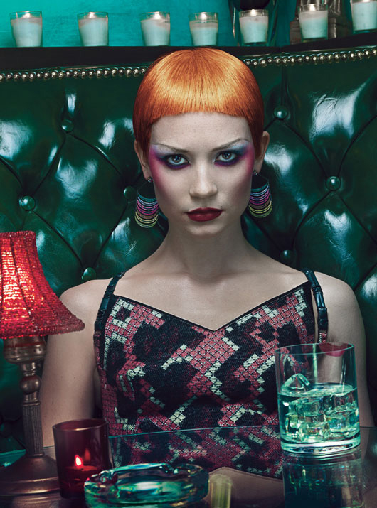
Mia Wasikowska represents the 1980s – it’s decent. Honestly, I think she looks a lot like January Jones in that photo. Right?!?
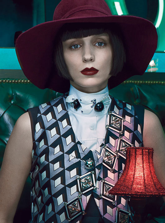
And then Rooney Mara represents the 1970s. Um, I didn’t even recognize Rooney. Does anyone else think she’s a dead ringer for Frances McDormand in that wig?
Photos courtesy of W Magazine.







Rooney Mara looks like Johnny Depp in the Charlie and the Chocolate Factory Remake.
I love Scarlet’s look minus the nose ring and the Rogue hair. I seriously love her top and lipstick.
“Rooney Mara looks like Johnny Depp in the Charlie and the Chocolate Factory”—–>LOL. I could see why….
^^This. Rooney is SO unfortunate looking IMO
Her hair reminded me more of Emmylou Harris or Della Reese, but I can totally see Rogue from the X-men.
Honestly I thought Scar was supposed to be a witch and that this was a Halloween inspired cover.
I think she looks like Morticia Addams with a nose ring.
YES! Exactly, Bellaluna! I can just imagine the Thing coming around the corner…
I was having some of the same thoughts you ladies were having. ScarJo was channeling Rogue or Storm from XMen and Mara is really an unattractive girl.
But I do like ScarJo’s eyes.
Rooney-I have never ever gotten this chick. Unfortunate-looking is by far the nicest, least-offensive way of describing her. Ugh.
Without the nose ring, ScarJo could almost be said to resemble Debbie Harry….
They all look terrible Wtf? Looks like some strange halloween edition
+2
Yeah. This could have been awesome but it turned out dumb and uncomfortable. They look like old hookers.
+ 4. They wanted something edgy but all they did was to transform four pretty ladies into some awful halloween characters.
Zombie ATTAAAAAAAACCCCCKKKK!!!
I don’t know why, but something about the cleavage is saying, ‘Remember me, Remember me? I can sing, I can sing! Oh, Herc, Oh Herc?’
Freaking Caledon, amirite?
Worst. Halloween. Spread. Ever!
LOL! Yes it’s a Halloween spread, that’s the best way to describe it. I was going to say SJ looks AWFUL! But in light of Halloween I’ll just say horrific. For only the 2nd time EVER I think Keira looks stunning. I don’t know Mia and thought she was Catherine Z-J. Rooney looks ‘meh’ which is STILL better than SJ. But if this is a Halloween spread then SJ at least looks appropriate.
Scarlet looks like Debbie Harry.
+ 1
+2 I thought DH had her lips done!
I think it’s pretty cool. Even though I can’t stand Scarlett, I think this is a neat cover.
(and what’s with awaiting moderation every time I make a comment about scar jo? I didn’t even say anything bad)
+3. Overall, I think she looks great (although a little over-accessorized). Deborah Harry was shockingly pretty – I just saw a photo retrospective of which she was a part. I am considering doing a grey streak in my hair so I will read the comments for opinions on that.
I think Keira Knightley looks amazing here.
So sorry – didn’t see your comment – I agree. Problem is Deb was the real deal with that nasty stank-eye squint. ScarJo is faking it!
I love Keira Knightley’s look, even though she looks like a gran and i must have missed this part of the last decade!!
Gah, I can’t stand Rooney Mara.. None of them look horrible but I like Keira’s pic the best..
And Scarlett doesn’t want to be known as a sex symbol or whatever yet every interview has a reference to a guy or her boobs..
ITA. Scarlett is BEYOND overrated. Best talk about your boobs or your boyfriends when you can’t act for sh*t.
Since when does 90’s equal slutty goth? They aren’t mainstream now and they certainly weren’t back then..
that’s not the 90s; that’s Malicia from the xmen :/
Keira’s clavicles are frightening me. Ewwwww!
yes, beautiful face but painfully thin
Tell me she doesn’t look like Caitlin Moran (very funny Brit author):
http://www.guardian.co.uk/books/2012/sep/16/caitlin-moran-life-on-a-plate
They all look scary bad. The two collar bones poking out of Keira’s upper body looks straight out of a Sci-fi horror flick. Rooney Mara looks like Johhny Depp and Mia W. girlfriend fire whoever made you do this shoot.
Ugh, Rooney. Go away. Preferably ad infinitum!
I agree. I can’t stand her.
I hate Rooney Mara her constant sourpuss face.
I adore Mia!
Kiera looks.. Interesting..
I’ve said it before & I’ll say it again. Scarlett looks like Gaga
NONE of these generalized decade looks are pulled off well.
I agree. Even Photoshop can’t save this.
Plus, compared to Mia (or Kristen Stewart), Scarlett’s face can’t handle a ton of makeup.
Exactly-I’ve been around for 3 of these decades and they all look awful. (can’t speak for the 70’s)
the shoot looks somehow incredibly cheap… as if someone who knew nothing much about putting on makeup went on the parade to clown makeup store. I can imagine what kind of color scheme they were after but it’s a total fail.
I love that look on Scarlett!! Oh, how I miss the fashions of the 90s…
If they were going hard 80’s punk rock vibe, then they did good with Mia (she’s my favorite among the younger actress today; can’t wait to see Stroker). Mia in her natural look is much more delicate. I still love the W shoot with her and M Fassbender.
They are too… I don’t know what to call it. The lens/filter whatever used makes them look like they’re suspended in polymer or something. But! This dropping of Nate Naylor lines right up with an enty and BG blind wherein a B+ actress has dumped her non famous boyfriend because ‘she is not into BDSM as she thought she was’.
Rooney kinda looks like Willy Wonka in here…
http://24.media.tumblr.com/tumblr_mbzk9l3SHy1rhsokto1_500.jpg
Right?
Awful photos and styling. I bet, no I’m sure, there were better clothes and hair/make-up to represent those years.
I think just ScarJo look okay, but she seems to be out of an Halloween pic. LOL
I don’t like it at all, it doesn’t take me back to the past 70’s to 00’s vibe, I look at it and all I see is another edgy/goth photoshoot with another cold colour tone.
I can’t help it but Keira Knightley reminds me of Spike in Buffy The Vampire Slayer.
I totally thought the same, re: Buffy. Now THAT’s 90’s!
The styling for the 80s is weak.
I completely agree. Maybe it was a twenty something’s idea of the eighties.
Maybe this is how Cruella de Vil looked like when she was younger? 😉
Rooney’s is just so… weird. But I think that word can describe the whole photoshoot.
I see Deborah Harry.
They all look bloody awful! Especially the always emaciated kiera. She just needs to eat something other than salad.
They all look like they’re from the same decade.
Exactly, and that decade is trying to be the 80’s. It’s actually some off decade like 82-92 lol
Also…I have no basis for this but I just don’t like Rooney Mara. I just kind of hate her face, without reason.
A mess. All of them.
Keira Knightley looks like a man in that picture. They all look awful.
Keira looks like Kate Moss in that photo.
Go away, Rooney.
Clearly(according to this)lipstick colors haven’t changed in four decades. Even the 80’s when everything else was neon except the lipstick. Fail! None of these look even remotely like those decades.
That was my first thought: “So W Mag just ran out of ALL OTHER SHADES of lipstick and the art director was all, ‘meh, let’s go with it. Nobody will notice!’ …FAIL.”
I think Scarlett has the 90’s look bang on. I was a teen in the 90’s and dressed just like that (I still do when I go out to my metal clubs). I got my nose pierced when I was 14 (I still wear it now. I’m 36). Maybe not everybody did dress like that but everyone I knew did. Rock and metal were huge in the 90’s and dark eyes, dyed hair and strong lips were the look we went for.
I can’t say I like any of the others but I like the 90’s.
This!!!!
I remember this 90’s. This was me, minus the nose ring. Glad I’m not the only one who saw this side of the era.
Rooney is talented, Scarlett is meh…
I thought Scarlett was playing up Debbie Harry and Keira was trying on Brigette Neilson.
The photo of Scarjo is actually from her audition for “The Girl with the Dragon Tattoo.” The role she lost to Looney Mara I believe. It’s evident from the photo why she lost, I mean, just because you wear goth makeup and a wig doesn’t make you a bad ass. Nice try Scarlett. I have my own theory though, and I believe that she is trying to one up Sean Penn and his new movie:
http://www.firstshowing.net/2011/watch-first-trailer-for-sean-penns-new-indie-this-must-be-the-place/
Disregard my comment- Lol I see someone already made a Debbie Harry comparison
Rooney has a fug face.
Rooney looks just like Anne Rice. I swear, thats what Anne’s facebook photo looks like.
i didn’t even know what scarlett’s insipiration from the 90’s was! (i was like does it have something to do with dracula, lol?)i think she looks the best of everyone. the top they put keira in, is beyond atrocious for her body type. why are they trying to highlight that she has absolutely no breasts?
My fav pic is the Scarlett pic except that FUG thingy on her nose, It’s true Rooney looks like Willy Wonka, Scarlett looks like Lady Gaga À La Born this way, Keira looks terrible :/ and Mia looks ok.
Ahh, jeez, she finally had a great hairstyle and hair colour…would have been nice to see pictures of her like that.
I expect a boatload of YT makeup tutorials on these “looks” and of course they’d pick all white actresses…of course. Ugh.
Are you suggesting that other types of women exist? Alack the day! Go tell it on the eugenicist!
Of course there are those moments when you wish they’d get back to the business of ignoring when casting and creative throw out yet another insulting, ‘Will that shut you up?’ visibility bone.
That Bounce ‘I put ’em’ ad makes me want to bring Hell to that campaign’s doorstep. Oh, I should translate that into ‘You People’-speak to reach out to my melanin-enhanced brethren and defendants?
I can’t f’king STAND that commercial.
The plethora of amazing models out there, and they waste a cover on Scarjo. That dark magenta lipstick looks terrible – draws attention to her over sized upper lip.
idk i actually like ScarHo’s pic, I’m a 90s kid totally grew up in that era and still listen to the music. The 80s were awful, I don’t know why we must wear the stupid clothes and look ridiculous still.
I don’t get the Mia whatever her name is pic, she looks awful. Rooney, needs to be an heiress and stop trying to be “method”. Just take your granddaddy’s money and go away! i’ll be a giants/steelers trustfund baby, dammit. Rantover.
ScarJo can’t handle that much makeup. The eyeliner creates this weird effect of making her eyes look like they’re going in opposite directions.
I don’t think Kiera looks good at ALL, the hair is hideous to me, way too masculine with the harsh angles of her face/body.
This could’ve been done SO much better…All the pics are a mess of bad choices.