Blake Lively launched her Goop-esque blog/shopping/lifestyle site Preserve yesterday. I only got a chance to look at it later in the evening, which was actually a nice was to acquaint myself with it. At the end of the day, it’s just a fancy online shop. She actually did make an effort to put items in Preserve’s online shop that are not fancy, big-name designer. They are “artisanal” and “hipster”. These are items you would most likely see in one or two boutiques in Martha’s Vineyard or Charleston or Key West or whatever. You can see the shop here. I’ll admit it: I like a few pieces of jewelry (especially this $55 lapis necklace) I really want this $400 map-light-art piece.
So, on the level of Goop (the worst, most elitist) to a really nice online shop, where does Preserve fall? I’d say it’s closer to the “really nice online shop.” Some of the stuff is overpriced, but not to Goop-levels. And Blake isn’t such a label-whore either, she really did select stuff that is “artisanal” I guess. The write-ups of the designers/artisans/artists aren’t even that eye-rolly. Plus, as she notes in another section, she’s contributing some of the profits to charity – go here to read about it. My biggest complaint? The shop could be better organized. She needs to add a way to sort the products by jewelry, clothing, food and home accessories.
Blake also wrote an “editor’s letter” which is the worst part of my Preserve experience. A highlighted section:
Sitting down to write this editor’s letter has been the hardest thing I’ve done yet on my Preserve journey. I’m more intimidated than I should probably admit. I’m no editor, no artisan, no expert. And certainly no arbiter of what you should buy, wear, or eat.
I am hungry, though… not just for enchiladas.
I’m hungry for experience.
I’m comfortable with the knowledge that I’m not a teacher, but rather, a student. I don’t do any one thing perfectly. I do a lot of things though. Some well, some not-so-well.
… So here at Preserve there are people, stories, essays, videos and goods which hopefully inspire your home, your style and your tongue. There’s expensive stuff. Inexpensive stuff. And everything in between. But their value, is up to you. We may romanticize it, calling it treasure. What we’re really saying is, we see worth on every level.
The function of Preserve is part magazine, part e-commerce hub, part philanthropic endeavor and above all, a place to showcase the power of imagination, ingenuity, quality, and above all, people.
… As I wrap up, I have to recognize who Preserve really is now, before we’ve met you. “Preserve” isn’t me. It’s a handful of the most dedicated, soulful, wise, patient people I’ve ever had the honor of working alongside. People who’ve filled the pages of this site with a force of passion, talent and integrity. I’m grateful for our countless late nights building a home out of pixels, light and imagination.
We have a true team at Preserve, one that I acknowledge and thank my lucky stars for more often than I tell them. Although we may be tight knit, there will be no one more influential to the direction of Preserve, than you.
We’ve created this space to multiply our experiences. So Preserve.us isn’t just the U.S. It’s all of us.
With excitement and sincerity,
Blake
I guess we were supposed to think “enchiladas” was the laugh line? Ugh, Blake. I can’t believe we went through all of this drama for what turned out to be a rather mundane online shop.
Photos courtesy of WENN, Fame/Flynet.


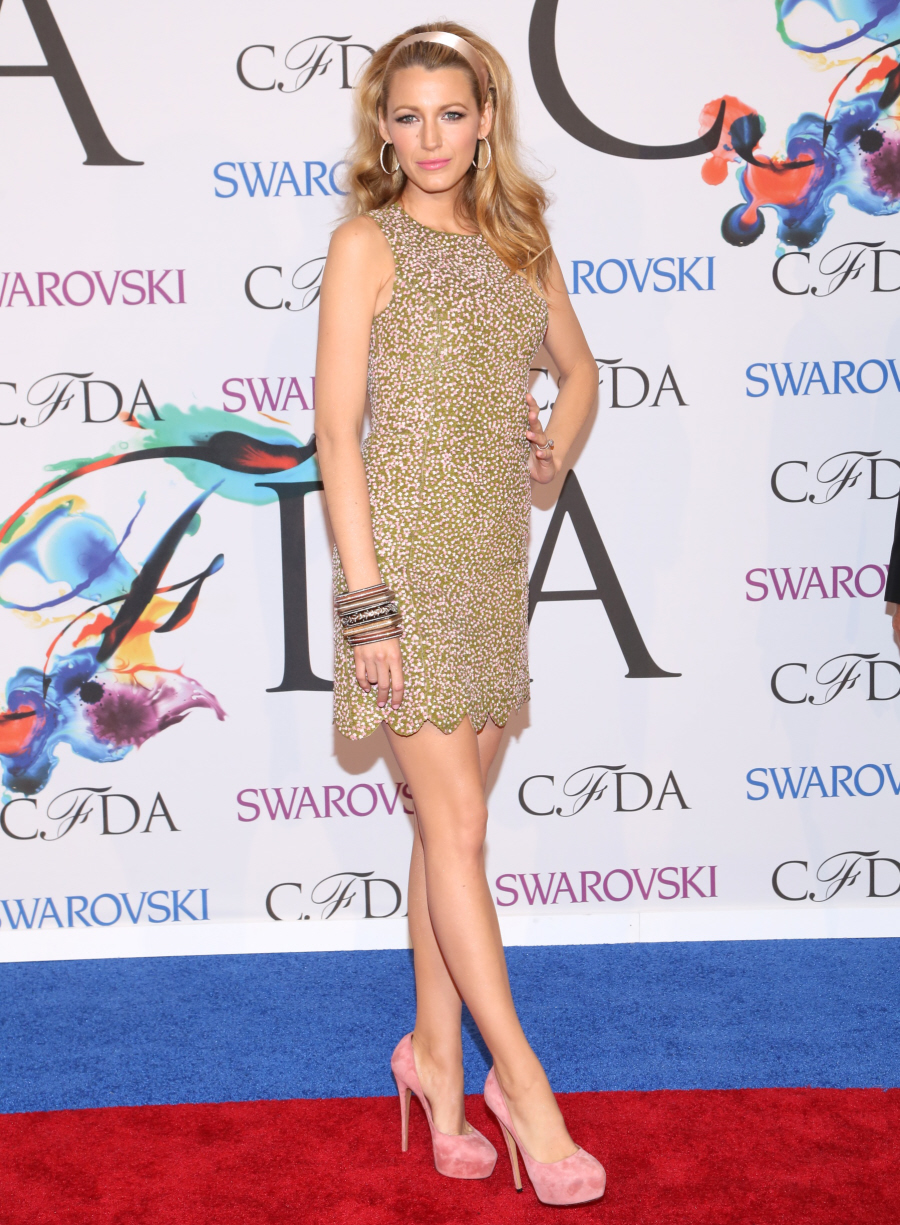









Yeah, I’m too distracted by her ridiculously perfect legs to read anything. Those legs are fame-worthy.
gorgeous.
they look so smooth! How does she get them so slim? WHAT IS THIS SORCERY
She’s 5’9″ with long legs. That tends to really help when it comes to the slim legs department. As does having to keep yourself Hollywood/fashion slender. And high heels AWLAYS help make your legs look good.
Moisturizer.
Many rub some on before the red carpet.
I think she is so pretty.
I wouldn’t bother looking for her workout regiment. She’s had her nose and boobs done. I imagine the legs are just as natural. 😉
I was watching the sisterhood of traveling pants (where she was underage and probably couldnt get cosmetic procedures back then) the other day and i’m sorry to disappoint you but her boobs looked just as perky and big as they do nowadays. It is possible to have nice perky “perfect looking” boobs without getting work done you know? I know quite a few people who have them without any surgery. I can’t say the same about the nose but in hollywood who doesn’t get a nose job? Lea Michele, that’s who.
I think she is gorgeous, with limited talent yes but gorgeous to look at.
I caught that terrible movie she was in, The Savages, on HBO. She does nude scenes and she has had work done on the boobs, trust.
That’s not a judgment (she’s welcome to do that and her nose). It’s just like most people in Hollywood her so-called natural gifts are highly augmented and subsidized.
Um yeah, if you look back at old pics of her she’s had her boobs and nose done plus vaneers.
I have to agree. I can see why Anna Wintour is so fond of using her for covers. That dress in the first pic is epic.
They’re pretty much perfect.
I agree. That first photo made me so leg-jealous that I couldn’t concentrate on anything else. They are absolute perfection – skin, shape, tone. Not fair.
I was going to post pretty much the same comment, so I’ll just +1 you.
The whole site looks like Zooey Deschanel’s dream book was sent through a Pumpkin Spice Lattee filter.
Hahaha! It is a bit autumn-y, isn’t it?
LMAO, Abbott. Talk about badly written. Blah ( so not) Lively wants to inspire my tongue? WTF? No. Not unless she starts curating “artisanal” nudes of Tom Hardy. Otherwise, I can patronize the artists/craftspeople in my own community.Or ETSY.
I came here to say the exact same thing. Nothing that you can’t find elsewhere. I would prefer Etsy as well, as you know you are supporting someone who probably made whatever it is in their hard-fought workshop (or living room).
@Abbott – LOL, awesome description.
Just spit coffee everywhere!
Best description ever. She seems genuine and genuinely scared that people will take her site as they have GOOP. It’s a lot more down to earth and far less condescending. But still I won’t buy some cute spoons because she has it on her site. Those who succeed at lifestyle stuff (Martha Stewart, for example) aren’t all eager to have their personality over everything, or they have a blandish, down-home thing going on.
Hm. Not awful. I loathe a black background, though. I’m not sure why it took a team and a lot of work to launch this… it looks like a very basic shopping cart site. Good photography. But it’s dark. Idk. Not as insufferable as I thought it’d be, but also not as lovely.
The black background IS AWFUL!!!!
Yes. Shoppers won’t stay on a black background for too long – it is really stressful on the eyes. I can’t believe no one mentioned that… I really thought it would be a clean/borderline ethereal look. This is too heavy. I like the variety of prices, but it’s just kind of meh all the way around.
Agree. Start your stopwatches now. Black backgrounds are NEVER good in e-commerce. Or anywhere in the blogosphere, for that matter. I always think I’ve landed on one of those paranormal investigator’s websites when I arrive on a black background.
Yes totally agree. Like, it’s fine. But with all of the promotion it is slightly underwhelming.
I’m the opposite; white backgrounds assault my eyes. I love dark backgrounds; I find them intriguing and even comforting. I’m not a Blake Lively fan nor interested in any celebrity lifestyle website, but I don’t loathe her web design at all.
I work in the IT field… while most of our clients sites are white, we do have a good handful of black/dark background ecomm sites.
It’s not about the color alone – it’s about your target market. If you’re aiming to people in their later years, you want really clean, lighter shades. If you’re aiming for a younger crowd, the darker colors will go over better with that demo than with the older crowd.
I came here to say that I actually liked her introduction. Is that weird? It felt sincere and it was nice.
And I like the dark background. White backgrounds always feel so bleak and unwelcoming to me. Guess that makes me part of the younger crowd?? Wooooo!
I am in the minority but I like Blake and hope her site does well.
There are 2 of us!
Me too.
I hope her site does well, too. I don’t think she’s a good actress, but there’s something about her that’s very likeable.
And she’s got a KILLER pair of legs.
I agree with everything you said GeeMoney.
Same here. I like her for some reason. She has a smokin’ hot body and always appears gracious and kind.
Don’t like her husband though. I believe the rumours that he’s controlling of her.
And I agree, I checked the site out last night and it needs a better layout or at least organized into shopping categories. Overall though, it was much better than I expected it would be.
That’s an issue I had with Goop’s site. It was poorly set up.
Blake doesn’t seem so bad. No one disliked her until Lainey made it a crusade to make her seem awful.
She’s pretty, has loads of randoms acts of kindness that aren’t publicity driven (just word of mouth), and aside from her saying she barely works out or drinks water I like her. There are worse out there and her site is one i’ll visit.
Me too! I thought the site was nice. I’ve only ever seen her act in Greenlantern, but I enjoy her style and I like what she’s trying to do with Preserve. If that makes me “basic” so be it.
Mmm, not bad.
Bonus points for the charity ventures. She’s already beating Goop by a country mile, but then again, that’s no great surprise.
The site is too dark, it’s not comfortable to browse through. I looked at it on my ipad. Boxes pop up all over. Small typeset. Too dark, I think I said that once. Websites should first and foremost be clean, bright and easy to read and navigate……
It looks like a more pretentious Urban Outfitters. Nope.
We’ve seen tons of sites like this already. It’s like Blake Lively’s souped-up pinterest.
I live in Austin and can find better stuff downtown.
Yes, it’s not awful, but nothing special. At all. Sort of a small version of Sundance catalog with food.
I think you’re very generous in saying the descriptions aren’t that eye rolly. From the necklace:
“As if mined directly from a deep blue dream state, lapis lazuli’s intensity is only heightened by its shimmering golden inclusions…rest regally at the crook of your collarbone.”
That prose is so purple it went ultraviolet. I read some of the others…ack.
“The well-crafted chapeau has since receded into the clutches of the impossibly cool” <<< One of my favorites (outside of the enchilada quip).
I’m not particularly impressed with the quality of the necklace at all. I design is so easy but not in a less-is-more way, more in an amateurish way. I find I am not impressed with 98% of the jewelry on the site. I know she’s looking for things that are simple and elegant but all I’m seeing is lazy design and mediocre execution on a lot of these pieces.
I love your comment about the prose being so purple it went ultraviolet. LOL!
Did anyone else notice this about the intro:
“The function of Preserve is part magazine, part e-commerce hub, part philanthropic endeavor and above all, a place to showcase the power of imagination, ingenuity, quality, and above all, people.”
Using “above all” twice in ONE SENTANCE? Grammar isn’t my thing (as I am sure you’ve all figured out by now), but that was a bit much! Did she have anyone review it for her? Proofread?
Won’t go near that site. Have never visited GOOP either.
but….
Damn girl … This Lady sure knows how to walk a up step. Blakes Legs are too die for Gorgeous.
Stunning lady.
Beginning to see why she’s so popular with some fashion people. She wears their clothes well. Legs for days…
I’ve always like Blaked and wish her well also. I like finding things that aren’t in the big box stores so I will check the site out when I have time. I love that she made it clear she wasn’t an expert, a teacher, etc,, LOL.
Yes but she went a bit overboard in clarifying that, I think. I get why, though. She’s trying to set an unpretentious tone and ward off the kind of criticism that gets sent Goop’s way. Still…if you have to spell it out like that…doesn’t it inevitably come across as a protesting too much kind of thing?
Maybe watching Goopy being eviscerated scared the bejeezus out of her and she’s making it clear. The internet is vicious. I don’t blame her. On the internet it seems you can never do anything right. You say too little, say too much, too pretentious, too humble, too this, too that. LOL
True, Jayna, very true. And she erred on the side of humility, as it were, so I have to give her points for that.
I love sites like this, so I wanted to love it, but OMG… the design is terrible! It looks so amateur and why is it so dark!
The best thing is the video — great quality. Other than that… sites like this demand a light, airy feel. Why do you think The Line, Goop, Net-a-Porter, Everlane, etc. all exist in white space? It’s because people like a minimalist feeling when they shop. It makes the products look better as well.
I think you hit the nail on the head: these are the sites they’re trying NOT to be.
I agree that the dark background wasn’t the way to go about it, but I’m almost certain that the layout was 100% derivative… in that they picked sites they didn’t want to be copy, and did the exact opposite (at least in key areas: the look, the prices, etc.).
I just find it all a bit disappointing. I was kind of excited about it after the Vogue article — I thought it would be something interesting. But it looks quite budget. The writing isn’t even good!
I am always on the lookout for a good bloody mary mix or recipe. I am also a condiment and
spice whore so it has that going for it. So I went in expecting the worse and did not receive it.
Same, it was better than I expected.
Hopefully there’s more to become, because I agree: I can’t figure out the hype or the effort it took. Maybe it was mostly a PR team, carefully maneuvering around all hints of Goop:
“We are aware that a lot of what we are selling is outlandish in a world where people are starving and have nowhere to sleep. This is a real problem. One that even on our high horse we can’t ignore.”
Giving meals, blankets, and hoodies to American kids is absolutely better than nothing, though, and the perspective is refreshing… even if it’s quite controlled. I hope she can do good things with this concept.
I wish her well. Like her or not, she is one of the most famous fashion girls in Hollywood so there are many teenagers/young women who will geniunely consider her advices about fashion.
Meh. I went to the site & my 15-year old daughter said, “What is that? Hipster Etsy?” I think she pretty much nailed it.
clever girl. 🙂
She was raised right!
I had the exact same thought when I opened. I’m 25 though, haha. It’s true though.
she called what she sells STUFF. 🙄
disorganized artisanal stuff with flowery descriptions sounds like older sundance.
black website sounds like amateur.
at least she isn’t pretending she did this on her own. cough *goop* cough
That “enchiladas” line, combined with the mess in Vogue, makes me think that she views herself as a super HILARIOUS person. Like….everyone should laugh at all her shitty jokes, and we’re just lame if we don’t.
She lost me at $95 for a wooden crate.
Not bad. It’s not intimidating although I think she only has a small part in the creative process of this site. I can’t see her personality. I think the “hungry for enchiladas” line wasn’t even her output. Love or hate Goop, you know it’s Gwyneth’s handiwork – bland, elitist, boring.
It took her two years to creat this site? 😳
Her site looks like a knock off of the Sundance Catalog.
That’s what I thought.
I just google Sundance Catalog and your right maybe that’s why she did a dark background so it won’t be a complete knock off .
I’m not too fond of the layout of the site. I like sites that have a nice clean uncluttered look with a white background. I scoped it out yesterday and honestly won’t be headed back.
I actually liked her editor’s letter.
So I wanted to dislike it…but it’s totally affordable goods and I love the completely impractical cutting boards. Some girls may dream of a wedding I dream of the house I want to get myself one day and fill it with cutesy impractical things 😉
Black backgrounds irritate my eyes. So… there’s a section marked CAREERS which let’s you know there aren’t any available at Preserve. Just in case you were looking for employment.
I like the letter, it’s sweet and humble. Her legs are to die for.
the dlisted write-up of this site is hilarious. 🙂
“The gathering involves communal seating, shared plates, festive music and fire-prepared victuals shoved into food-messed face-holes sans cutlery.”
“The crunch of corn flakes, the nuttiness of granola, the warmth of oatmeal. Everyone has a favorite cereal to top off with the creamy goodness of milk, be it soy, nut, hemp, or moo cow. The spoon is key for scooping just the right amount of liquid with each bite. After many bowls on many mornings, you’ve earned the right to possess a utensil that kills breakfast – stylishly.”
“We were immediately Beliebers of Caleb Owens”
“There is hardly a more fitting place for a subtly suggestive hint than the bowl of a vintage silver plated spoon. A request for the very love act named for its curvature is hand engraved here in an innocent old-time typewriter font. In case there was any question, a tiny heart seals the deal. Food useable, this special bit of flatware is a constant reminder to cuddle up.”
WTF?!!!!!!!!!!!!!!!!
My non english brain is BLEEDING!
oh, this is some j.peterman-level $hit. pretty sure elaine wrote that.
“When eating cereal and milk, use a spoon for scooping just the right amount of liquid with each bite.” #pippatips
The site is taking a really long time to load and is coming up all wonky. I don’t see the black background y’all are talking about. It’s white and the pop up thing in “wood” is covering the banner and menu.
Also, couldn’t she have found a name to have a .com?
“I’m no editor, no artisan, no expert.” So like a goop version of Brian fellows
SO MANY COMMAS.
Not the topic at hand, but I absolutely love the dress in the top pic, the ivory with lilac beading. If she puts that on her site I will buy it!
“Preserve”???
What the hell is that supposed to mean?
makes me think of jam.
tons of buzz on this site for this launch, eh?
I don’t get it ether and found they site to be bland with a side of pretentious.
I need that lapis necklace in my life!
Will this turn out to be PippaTips/Celebrate 2.0? Time will tell!
Blake’s endeavour to re-write her own narrative as not just another forgettable mocktress is admirable though it feels like the project tries too hard. It sounds so self-righteous at times for an alternative Etsy! Yeah, we get it, it has a soul, it’s dedicated to craftsmen, it would neeeever pretend to be pretentious, and it partners up with an organization benefitting from Ryan R.’s long-time support. Where’s the unique-without-a-genre storytelling about curated things? 🙂
Pretentious + elitist = Preserve
HA!
perfect.
I really, really, really, want this: http://preserve.us/canary-crossbody-bag.html
So tempted!
$300 for a handcrafted leather purse really isn’t that bad! Her prices are so much better than Goop.
wow what a beautiful bag! and yes 300 is a good price.
PS. When I was in New Orleans this past April, i bought some beautiful jewelry from one of her” artisans”. It was for alot less than advertised on her website!
I recommend y’all check out Restrung Jewelry when in NOLA. Either the French Market or Frenchman St. Art Market. Their prices are very fair and all jewelry is made from recycled guitar strings! I believe proceeds help support music classes for youngsters.
I don’t see the amazing body, where I come from an amazing body is a small waist and large hips, butt and thick legs, she seems to have a very manly body and manly face.
And her letter is the worst thing I’ve read in my life I can’t believe they let her show that, that letter should be removed, I’m not even trying to make fun of her. Does she ever read something????? It’s so embarrassing, so, so embarrassing. If she writes like that I will never take her seriously.
I don’t find her relatable, she seems very spoiled and dumb, no offense, like she has never been through anything difficult in her life.
Excuse me while I yawn. I took a look at the Shop section, and there wasn’t anything special or “Must Have.” It just looked like a bunch of artsy pictures of things I wouldn’t even take a second look at in Target or on Etsy. Boring.
The only remarkable thing was there was an adorable piglet in one of the pictures. The item was a wall decoration (???), but that piglet was freaking cute. It just goes to show how memorable those products were.
So bland and forgettable? Just like Blake.
Preserve is such a dull ordinary name. At least Goop is distinctive and sounds a little catchy. It’s going to be very interesting to see how her site does. Very curious about Reese’s too. I’ve only visited the Goop site a couple times but never purchased anything.
300 dollars for a leather purse is overpriced. Sometimes I feel shows like Sex and the City drove up the price of luxury goods, but maybe it was the euro.
Agree. Preserve is boring much like Blake.
I scrolled through.
A teensy candle votive for $180 and a white t-shirt for $132.
Yeah, really relatable, Blake.
“I’m hungry…for enchiladas and experience.”
Not exactly Hemingway, is she?
Except for using the trusty thesaurus to find 30 different words for ‘hat’, the article wasn’t half bad. However, there was no indication of price point for the hand made hats. However, after growing up in the South, and living in England, I’m assuming the cost runs about $Astronomical.
I like Blake and I think her site is ok. It definitely has potential and I’ll check back now and then to see what’s there. I’ll be interested to see how it comes along after a year or two, she’ll probably make improvements and what not. I think Blake has good taste so I’m interested to see the products that she curates 🙂 Also want to add: I just read the ‘greater good’ section and I think it’s beautiful. I’m pretty conscious that celebs often say things they don’t mean, but I believe Blake when she says she wants to help… I just think she’s a good soul.
I dunno, I definitely like it a lot better than GOOP. I disagree with another assessment here though, it’s not nearly twee enough to be Zooey Deschanel-ish.
I think she does too much explaining. She should have just launched it and kept to her instincts. If an item is quality, you don’t need to oversell it over-the-top prose / sales copy. Pare down the writing. She should just stick to her guns because whatever she does she’ll going to attract criticism – like anyone in anything.
Looked at it, was bored. *yawn*
Hmmm…I don’t really know much about her and so I could prove to be totally wrong.. BUT to me, she does seem genuinely excited about it and as if it means something to her in rather a sweet way to share with others. Time will tell I guess. And yes she is absolutely lovely. Trust me, though there are TONS of little tips and tricks (for those of us who can’t afford all the professional hardcore things – gazillions – that glam squads, personal trainers and dermatologists, plastic surgeons, etc. can do) for making much mentioned above 🙂 legs look a lot better. So if you aren’t happy with yours or just want to glam it out for a special occasion etc. you can! Just do a little research, check reviews, talk to sales clerks etc. and you can find some very affordable lotions, potions and even homemade exfoliating and tanning, color evening, simple exercises if want, type of shoes, color shade, sheen etc. – whatever you want for yourself (or another 🙂 And no big bucks/surgery,drama required so if it will really make you happy go for it for yourself! Hey – just got an idea…we could see how “real” and nice she really is (plus serious and sincere about providing a site for us) – we could ask her what HER “leg” secrets are, and what she does, her advice AND less expensive alternatives would be and see if she comes through with some honest and thoughtful solutions for us or some BS answer!
Looks like a glorified Instagram account. Zzzzzzzzz