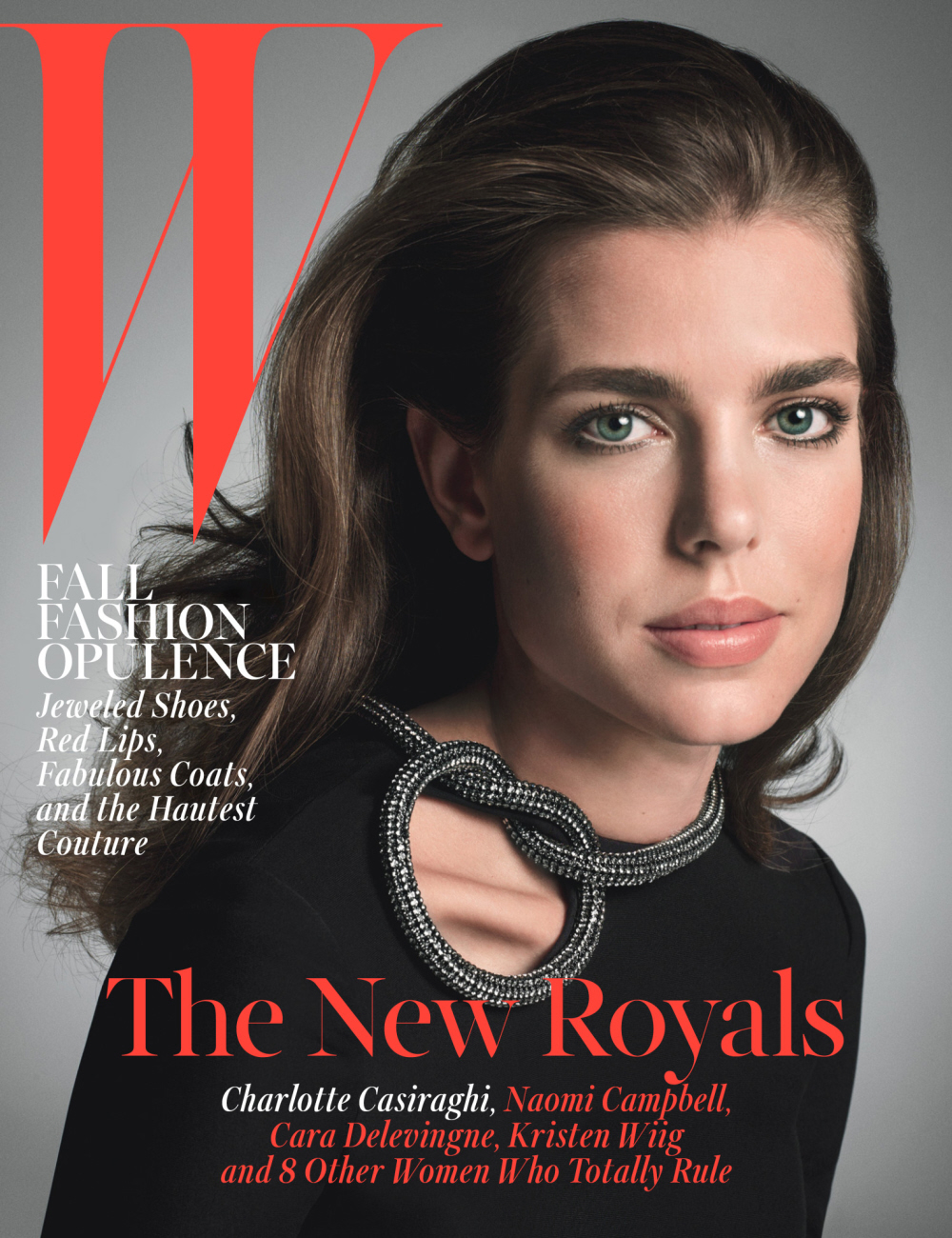
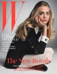
I have no idea what’s going on with W Magazine these days. I think they’re trying to do these high-minded cover editorials, but for the most part, it’s like they’re throwing darts at a board. What do Ellen Page, Naomi Campbell, Charlotte Casiraghi, Kristen Wiig and Cara Delevingne have in common? Absolutely nothing. Nothing except that they are all part of W Magazine’s “New Royals.” That’s the theme of W’s October cover editorial, complete with five covers. It reminds me a little bit of the recent Interview Magazine multiple-cover issue, but that was to highlight diverse photography. Not so much in this case.
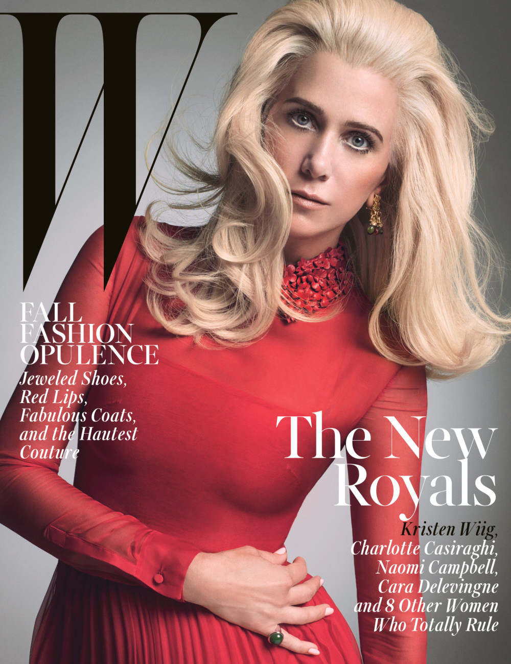
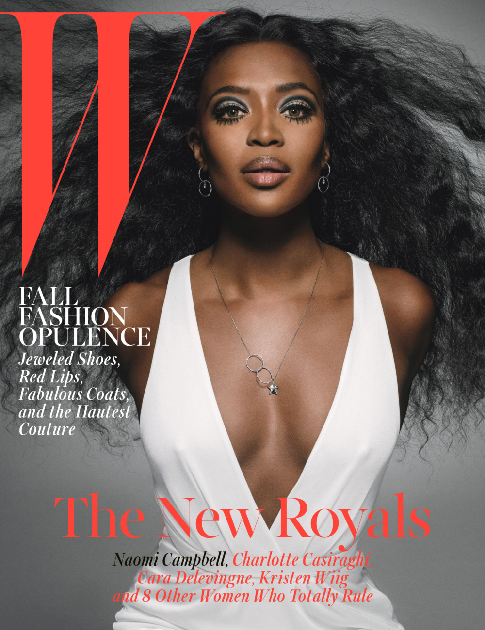
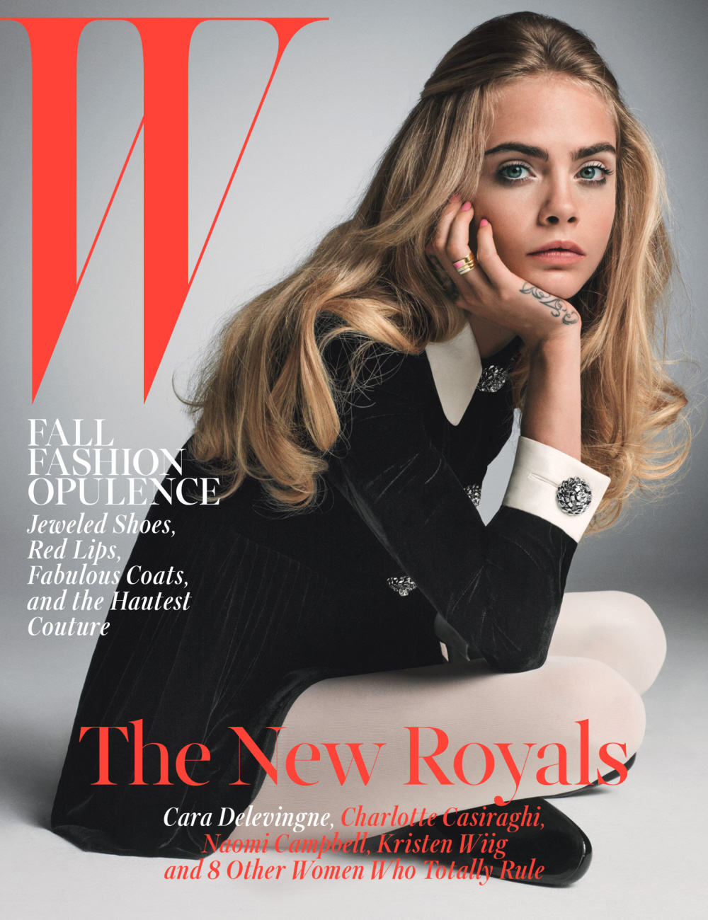
Anyway, the covers are pretty for the most part. I’m not sure what the hell Kristen Wiig is doing with that blonde hair, but sure. I’m also not sure what’s going on with Naomi’s makeup (yikes!). My favorite covers are Ellen’s and Cara’s, surprisingly enough. Charlotte is such a gorgeous, striking young woman, so it’s kind of easy to take a nice photo of her. You can read Lynn Hirschberg’s write-up of the cover subjects here – I read it and I still don’t know what’s going on. You can also see additional photos, plus some other “New Royals” at this slideshow. Anjelica Huston, Kiernan Shipka, you get the idea. I haven’t seen any highlights from any actual interviews yet.
What’s your favorite cover?
Covers courtesy of W Magazine.



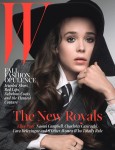


gah, Ellen is so understated in her beauty, her makeup just looks fantastic here.
I love her. I was watching some old Trailer Park Boys, and even when she was that young she was just so sweet and adorable.
I loved her in TPB. I love how sweet she was to Ricky
I love her and I love her menswear style. I just wish she would fit her menswear a little better. She’s so petite and often wears these enormous suit coats and ties, she looks like a little girl playing dress up. Her look could be so powerful and striking with a little better tailoring.
QUEEN NAOMI … YAASS!!
YES!
Naomi, obviously. It’s almost like she’s a proper model and all the others just pretenders.
I do like Kristen Wiig’s styling, but the PhotoShop makes her look too vacuous.
I did not recognize Kristin but I guess that’s the point? Maybe they like her for taking “fashion risks”? She has awful taste but I still think she’s cool.
Yes, Naomi go on youtube and watch her and all the other supers from the 90s on the runway for Versace, etc. Still one of the best, despite everything.
Gosh, those were the days, huh?
IMO, the 90’s fiercest runway supermodels were:
1. Naomi
2. Linda Evangelista
3. Nadja Auermann (but since I love Nadja’s editorial stuff SO much, I may be biased about her runway work.)
Modeling well, print or runway, is actually WORK and talent. I wish people appreciated it more, what it takes to get to that level.
What makes her the “proper ” model… The 2 pounds of contouring make up , the fake green eye contacts or the ridiculous wig….. Cause to me she looks like female impersonator .
Uhm… Naomi looks like she is in trouble at the next Kanye concert. It looks like she’s not able to clap anymore.
Haha yeah, what’s up with that? Were are her arms?
Ellen, Charlotte look beautiful. Confused baby – Cara I don’t know she looks like she is in preschool sitting on the carpet waiting for the story to be read. Naomi I don’t know about the make up.. Kristin NO
+100
Cara always looks like a teenage brat to be so dressing her up in primary school uniform is perfect. I usually like Naomi Campbell’s pic but this one make her look so unnatural with pounds of makeup that she doesn’t need. Heading into clown country. Kristin is just total fail with that wig and makeup. She looks like another person completely.
Charlotte’s clavical is freaking me out!
thank you!!!
I’m sure they put it there on purpose
Protruding Clavicle = the New Thigh Gap ???
The more I look, the more bizarre it becomes. Plus the angle of her body makes her look like a bobblehead. Way to go to ruin a beautiful shot W.
That’s my issue too. The eyes are drawn to the knot and clavicle. Like it’s spotlighted.
Elle looks… wrong somehow. The eyeliner? Brushed out curls? glazed over doe-eyed pose? She can do better.
I can’t believe Cara is my favorite! Like old british/mod fashion.
That was the first thing I noticed!
I have a pronounced collar bone too, so I feel for her, but that ring around it and the placement just makes it the focus. Very odd choice.
I don’t think it pronounced. Bad posture, lighting, photo edits of light/shadow, and the dress cut out all make it look worse than it is.
I think it looks pronounced here, but I agree it probably doesn’t look just like that in her normal life. With mine, if I round my shoulders forward, it pops out more than if I am standing up straight. There are incredibly deep shadows on the top and bottom, but especially on the bottom. I am thinking that it was photoshopped or lighted to stand out even more.
Yes! It really freaked me out. It just looks so strange there
Naomi wins! No matter how hot-headed & mean she is as a person she’s still an amazing model
She channels Diana Ross! I like it 🙂
Naomi hands down!
I think she is a great model, but even with her skills, she isn’t overcoming that horrible make up they put on her face.
Yayyyy!!! I cannot handle all these Naomi covers!!!! hee hee
What did they do to Kristin Wiig and Naomi Campbell?!?!
right!? and i’m usually a naomi stan BUT no. at least there is a cohesive theme with everyone’s make-up. Charlotte’s colar bone bugs.
Ellen Page FTW.
Copy that.
+2
+3
– but for her hands. They didn’t make them as “glowy” as her face. Cara’s photoshop had better results.
I was going to say Naomi’s but I hate that spidery eyelash look and the fact that she looks like a carved bust with that armless pose. So I’m gonna have to go with Cara’s cover. I like her hair and makeup and the relaxed pose.
So the new royals are bored (and boring), underwhelming and poorly made up. Got it.
Cara has the best cover. What’s with the wig on Kristen?
I would not have guessed that was Kristen Wiig even if you had told me her initials were KW and she used to be on SNL.
Naomi or Cara. Kristen Wiig looks really bad…so does the other person who I don’t know…
Oh yeah and Ellen Page doesn’t look terrible but it’s far from good.
Domestic Bliss – Brad and Angelina. One of the best photo shoots of all time anywhere IMHO.
They’re both highly photogenic. Not a bad angle between them. Bit off topic though. http://www.wmagazine.com/people/celebrities/2005/07/brad_pitt_angelina_jolie/photos/slide/all
Charlottes face is gorgeous but that cutout right on her protruding collar bone is distracting and the first thing I saw.
I didn’t see it at first, but then people start commenting about it and now it’s all I can look at.
Charlottte is beautiful. And Naomi is gorgeous as usual. I’m not sure what look Kristen Wiig was going for. She looks like one of those blonde robots from the Austin Powers movie. Angelica Huston looks fabulous. And Joan Rivers (R.I.P.), always knew how to work it.
Maybe Kristen is supposed to be styled in the vein of Catherine Deneuve, which is beyond random.
Oh dear. Kristin looks like her character from SNL with the small arms! Not a good look.
After having met her once, even the most flawless snapshot of Charlotte Casiraghi can’t make me find her beautiful.
oooo details please!
Do tell
Spill that tea, Kat!
W issues highlighting health problems?
Ellen Page’s Non-Grande Affliction
Charlotte’s Protrudis Clavicis Maximus
Kristen’s classic case of hip pain
Naomi’s Loökma Nohandsitis
Cara’s Boredom-triggered dermis stains presenting on one’s palm
Lmao “Non-Grande Affliction”, you win.
I was just reading Mindy Kaling post earlier and was surprised to see how many people didn’t understand why she’d be a thing. But then I realized I have the same problem with Kristen Wiig. I don’t understand her humor; actually I find it sad, especially after Bridesmaids. I felt so embarrassed for them but not in a good way. This new film she’s in looks interesting though.
co-sign. I was so disappointed with “Bridesmaids”–I thought it was extremely petty & humorless (except for Maya desperately trying–and failing–to find a bathroom). Also, last week at a dinner party two ladies came up to me and remarked how much they thought I looked like K Wiig, and though I am sure they meant it as a compliment, all I could think was: “NOOOOOOOOOOOO.”
Bridesmaids was fun to watch. Better than a comedy with Ashton kutcher, or similar. Didn’t make me interested in Kristen or maya though. Rose Byrne and Melissa were the interesting ones there.
People who don’t understand mindy must not wAtch the office. She’s perfect. So glad I finally watched tmp. She’s in Tina fey’s league.
Charlotte is gorg… like a young Brook Shields.
Kristen Wiig looks ridiculous, Naomi has no arms and Charlotte looks stunning. Who is the only real royal here!
Kristen looks like she’s in character as Doonese the other sister in that SNL skit.
My thoughts exactly. I can’t even take her cover seriously.
I like Cara, and I think she’s a good model but she looks sooooo young there.
Kristen Wiig kinda looks like Jake Gyllenhaal with a wig on that cover…
NAOMI is the baddest b*tch. That is all.
YES
Yes! Genuine Fierceness at all times.
LOVE Cara’s cover. I don’t understand people who think she’s a bad model, I think she’s mesmerizing!
Mama Naomi and then Charlotte.. WOW is that girl STUNNING or what?!! ( i Hope she doesnt Age like her Ma)
miss naomi!!
In order: Ellen, Naomi, Cara, Charlotte, Kristen wtf?
Ellen Page by far is the best cover.
Cara for the WIN!!
I love you Kristen. But no. Just no.
New royals? Seriously? says who?
i hate naomi’s makeup here so i have to go with charlotte, ellen 2nd
Is Wiig supposed to be Catherine Deneuve, and Campbell Diana Ross?
Naomi. Flawless, as usual. Age doesn’t mean a thing.
i dont love any of them
These kind of suck, IMO. Naomi’s got bad makeup and apparently lost her arms in a tragic phone-tossing accident. I don’t “get” Cara D. to begin with, but I’m getting an extra-strong dose of her upturned piggy nostrils from this shot. Kristen, I don’t even know what to say. Charlotte and Ellen, kind of boring.
For me- it’s a tough tie between Ellen and Charlotte….both look amazing!
Naomi, of course. She was born to be photographed. Ellen second. A lovely face, but it’s the shape of her eyes I am in love with.
Ellen and Cara win for me, they look the most natural. Cara looks a lot like Susan Dey/60’s mod girl. Ellen more fierce 70’s Faye Dunaway. Naomi’s makeup is simply awful and her expression is dazed. Kristen is just being washed out by that bleached bouffant hair, though I like the dress. Um sorry for ignorance but I can only guess the Charlotte girl is Priness Stephanie’s relation/daughter? Very pretty, she looks a bit like young Brooke Shields -agree the shot is awkward though with the clavicle situation.
I think I like Ellen’s the most. I found it to be the most striking. Naomi’s would be a second, but I have find the eye make-up too much. That color of blonde doesn’t really suit Kristen.
it’s been bugging me all day, i finally sorted out who naomi’s awful make up reminds me of – that girl from i love new york
Charlotte! Simply beautiful.
Ellen is a little too Mia Farrow circa Annie Hall for my liking.
As for the rest? Nah.
Naomi, she is such a legend.
Naomi & Cara
Cara’s cover is by far my favorite. It has a 60’s feel but a modern edge. The others are so random no connection for any of them.
I hope these random pics mean they well have someone interesting on the next cover. They have only had 2 covers I have bought.