Kim Kardashian covers the new issue of Elle UK. She actually got three covers, all shot by Jean Baptiste Mondino. This is for Elle UK’s “Confidence Issue,” and I guess we can safely say that Kim is super-confident. Or something. You can see Elle UK’s cover announcement here. So far, there aren’t any excerpts from Kim’s profile.
While I’m grateful that Kim didn’t pose nude again, I did have to spend a minute looking at her body on these covers. I think the cupcake cover is probably the closest to how her body really looks, but much like Beyonce and her obsession with un-thickening her thighs through Photoshop, the cover of Kim in the white sleeveless blouse has been Photoshopped into oblivion. I mean, I’m sure that was Elle’s call, not Kim’s, but still. Those are not Kim’s legs. At all. They also Photoshopped her hips in the leather jacket cover. Much confident. So skinny.
Something nice – Kim is rereleasing her iOS game with new content, and the in-app purchases will go towards (RED) and the Global Fund, in honor of World AIDS Day.
covers courtesy of Jean Baptiste Mondino/ELLE UK.

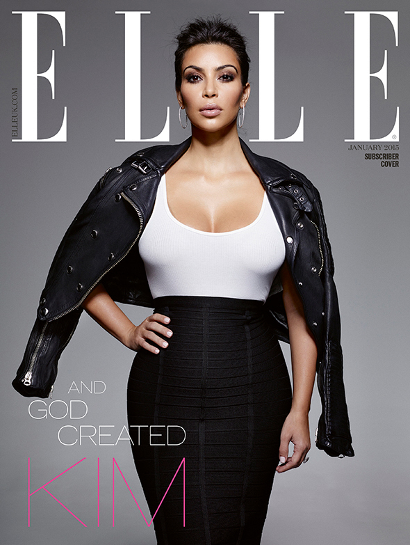
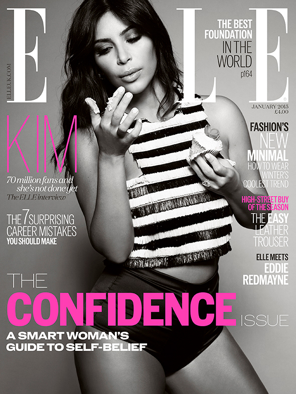
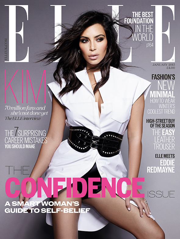




WOW she’s really starting to look like Kris, especially in that leather jacket photo
She has the blank, staring “thoughtfully into nothingness” look going for her, I’ll give her that.
These pictures just exacerbate the differences in her face from 10 years ago. She basically has an entire new face. She looks very off in the black/white photo.
ITA, these photos really showcase the surgery.
Her face has gotten SO long.
is that just part photoshop, though, the elongated face? (on top of her massive plastic surgeries, of course.)
yes, that’s it! I think it’s because she’s altered and “shortened” her nose too much. the space between her nose and upper lip looks WEIRD…like there’s too much space there.
And they still didn’t get rid of the fish face…..
She’s looking at the cupcake frosting like she’s not entirely sure what it is. Very odd.
I’m pretty sure Kim™ was created in an operating room.
LOL, I was just going to say “And God created Plastic Surgery”
My first thought, too.
I don’t hate any of these covers. She looks really good. In the jacket photo, in particular, I love the way they styled her hair, her face looks less cat-like and a bit more like the “old” Kim (which was actually Kim 2.0, but whatevs). And also in the jacket photo, although it is airbrushed, her waist has somewhat natural proportions and you can see a hint of a belly under that bandage-style skirt. In fact, she looks like what I look like in Spanx.
Much better than those disgusting PAPER mag photos.
she’s a beautiful woman
hahaha
I’m so tired of looking at her body – a bit like a dude who has tired of the current issue and is waiting for the new playmate to view. This cultural obsession with her is too weird, and it’s only the ladies who are looking. Dudes will look at anyone who will show them their sexual markers – *anyone* – a free for all. Honestly, it’s better to let them beg for a see.
I really wish Kim stayed naturally beautiful.. because she WAS naturally beautiful and had a real spark in her eyes… I personally think she looked so happy during her Reggie years.. or at least she looked a lot more natural (even though she’d had work done by then).
i always thought Kim was beautiful but now I just feel.. meh… natural beauty has gone out the Window.
I think that she is still attractive but nowhere near as good looking as she was 7 years ago. She has ruined her face, and body, with plastic surgery. You are right that her natural beauty has gone out the window, and it’s not coming back.
I am kind of surprised that she is donating the proceeds from the new version of her game to the RED fund. That is commendable, particularly because it seems as though she her past attempts to be charitable have been half-arsed.
It could be like past times where she pockets 90% and donates 10% …
@Snazzy: Exactly what I thought.
Her old nose was so perfect for her face. I have NO idea why she would ever change it!
http://www.wwd.com/images/processed/wwd/2009/08/28/landscape/02-tout/kim_kardashian.jpg
Wow great pix! she looks lovely here.
So tired of her.
i wish i had someone following me around with a wind machine.
Hahaha! That thigh! Wtf??
“God” did not create that. Dr. Frankenstein did.
Exactly. God’s not taking the blame for this mess.
Hahaha, the legs from the cupcake cover to the legs from the white cover don’t even look the same. If you’re going to photoshop, at least try not to be so obvious about it. It takes 30 sec of a side by side comparison of the 2 covers to see how different they are.
Yeah, can legs even do that? I can’t figure out how she is standing. It almost looks like they chopped off the top of the left (forward) leg and moved the remainder up. The right one is rotated so far out that I can’t believe she’s standing. Maybe she’s lying down, shot from above?
That one with the white shirt…I weigh 120 pounds and MY legs aren’t that skinny!
My 13 year old niece prob doesn’t even weigh 120 and HER thigh isn’t that skinny.
Where did they put her hips?
That’s what I was wondering. She’s like the Willendorf Venus, so where the heck did the rest of her go?
They Photoshop 2/3 of her leg in that last pic.
So what. They photo shop everyone.
They should be called out for doing this for their ‘confidence’ issue.
If the magazine was not averse to photo-shopping, why didn’t they do something about her breasts in the leather jacket photo (first one above)? Was the picture taken while she was laying down because her breasts look like they are sliding under her arm pits. The exposed cleavage is round but I have no idea what is going on with the extensive side-boob that is nowhere near the same shape. In the photo with the white shirt and black belt, all of the heft removed from her left thigh must have been added to the length of the thigh. You can tell where her real knee was but the photo knee is about about 3 inches down her extended thigh. If she stood up straight, she would tip over.
Anything Kardashian is downmarket . It is not a splash of bad taste to give a magazine or product flavor. A Kardashian on the cover or as a representative is a toxic seagull dump – splat! splat!! splat! – all over the brand. Kardashian doesn’t wash off easily.
Who is buying fashion magazines with Kim on the cover?Between this and the Vogue cover, Kardashian Ko. will have a major line item expenditure for magazines in their 2014 report.
The white tunic with belt pic – No human has thighs that shape naturally, right? Photoshop Fail
This is nothing to with her the person.
But when I see those legs and even the gap between her nose and lips I feel a bit ill. It’s like an actual body has been hacked at, lessened, and re-arranged. The bum cheek you can see from the front reminds me of a similar unpleasant Palin shot in addition. Or I’m reminded of those books that you can intermix the heads with torsos with legs and feets that are entertainment for young children.
slowly morphing into Mrs. Potato Head. . .
Kim looks great on these covers.
She is photo shopped in real life so they should not have to do so much.
Personally I think her new face looks odd.
Her nose is so tiny and she has so much filler in her mouth area, she reminds me of a puppet
And god created Kim? Cancel my subscription! Please do not involve god into Kim or any other Hollywood people, there are people who are giving their lives to better the world, sad… who gives a crap about a girl with no talent except to whore herself out,
I actually think this is one of her best photoshoots, although the last picture is some Adobey level of photoshop.
Yeah that last pic…those legs are not real like wtf ? We know what she looks like and those ain’t her legs.
How can Kim be considered confident? She completely altered her looks in every way possible. She must not have been too confident. I would say she was very insecure with who she was to make so many changes to her face/body. She’s the opposite of confident. She just likes attention. When they first came out she was so pretty and looked natural and smiled a lot and had a spark to her but over the years she’s become a robot. She doesn’t seem happy.
I’ll call her “confident” the day she walks out of the house without her 5 pairs of spanx on.
I agree. She should be the picture next to the dictionary definition for “insecure.”
I completely agree. Every time I see a pic of her, I can only think that she is such a sad, sad person to have wasted her life butchering her body as she has.
People often wonder why everyone feels so free to pick her apart, and I think it is in part because she just fails to come off as a real person anymore. She has become such a thing, such a product, that it is easy to dismiss her as not quite human and comment about her as you would comment about a mannequin.
You can really see how much serious work she had done to her body for one and she has the same look with different clothes on. Very uninteresting and very much photoshopped. I think she is so over even if the media won’t let her be.
She looks like a different person in each picture. none of the bodies match! And the first cover is just… odd looking. They messed with her face some how.
Kim used to be beautiful. Hard to believe that there was a time when photoshop and plastic surgery weren’t around. There was even a time when we didn’t have to see Kardashians everywhere
Nooooo Elle UK, whyyyyy…
I would love it if someone leaked the ‘before Photoshopping pictures’ to the press, especially regarding the oily ‘break the internet’ photos.
‘God’ is a plastic surgeon?
I don’t think those who believe would agree with that.
I know, right? If they were honest, they should have written ” And God created 20 percent of Kim “.