Controversial opinion: Elizabeth Olsen has better style than her fashion-designer sisters, Mary-Kate and Ashley. MK and Ashley wander around looking like rich, 80-year-old dowagers most of the time. Elizabeth actually has eclectic taste in fashion, and she makes some interesting choices. Olsen hasn’t been to Cannes in six years – it was in 2011 that she “arrived” in the middle of Cannes with her breakout performance in Martha Marcy May Marlene, which was the first time she got big critical acclaim. Olsen knows how to work Cannes, is what I’m saying, and she knows how important it can be to her career. So she came to the premiere of her latest, Wind River, in this jaw-dropping Miu Miu look. This is the “sexiest” and most vampy she’s ever looked, right? She really brought it. And minus the shoulder pads, this dress is the bomb.
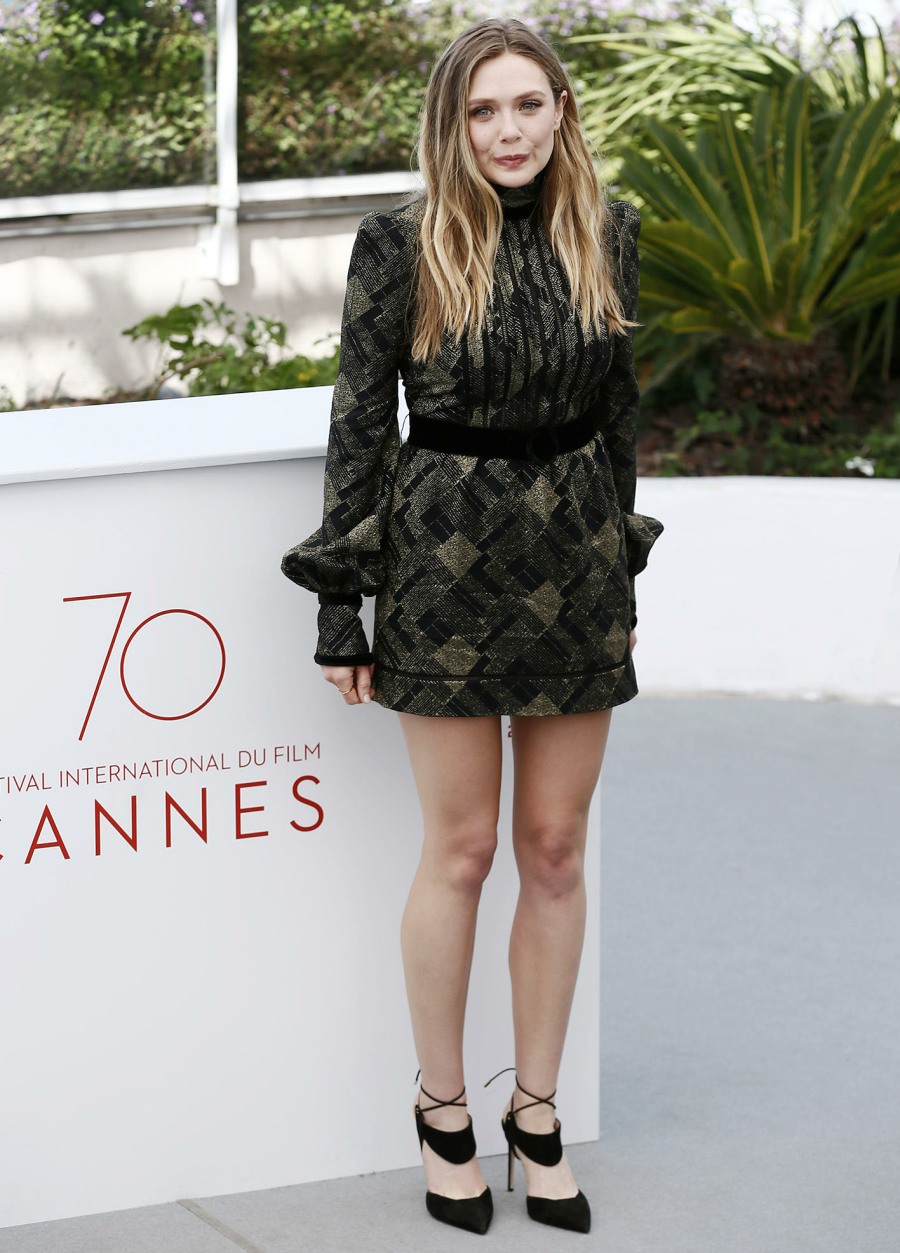
Here’s Olsen’s photocall look. This is Marc Jacobs and I’m meh on it.
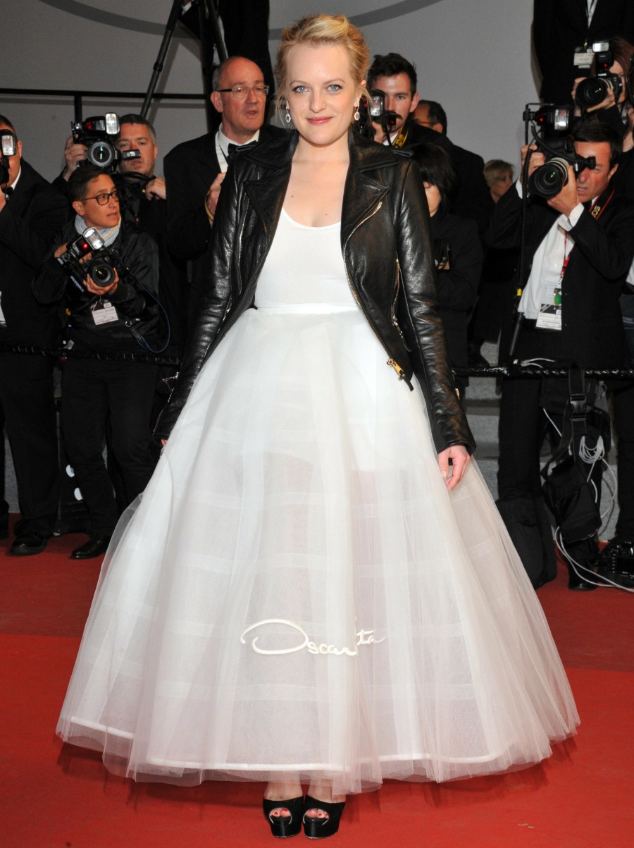
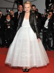
My vote for worst dressed of Cannes might be Elisabeth Moss. She wore this Oscar de la Renta ensemble to the premiere of The Square. WHY? Just no. She’s such a talented actress and you know that she enjoys fashion and styling. Why did they do this to her?
Did someone ask for an explosion at the Ruffle Factory? This is Araya A. Hargate in Zuhair Murad. I love the color and I don’t mind the giant puffy dress. This is why people come to Cannes: to wear giant puffball dresses that make them look like they’re being eaten alive by Ruffle Bacteria.
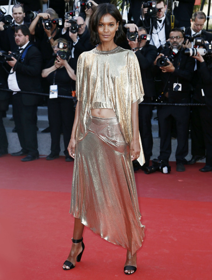
Liya Kebede in Paco Rabanne. I enjoy a metallic dress and I don’t mind if it’s gold. I also like Liya Kedebe. But… this is not very good, right? This is more of a cute party ensemble rather than a dress for the red carpet of Cannes. Plus, I don’t think gold is her color. A silver or maybe even a bronze would have looked better.
Photos courtesy of WENN, Getty.

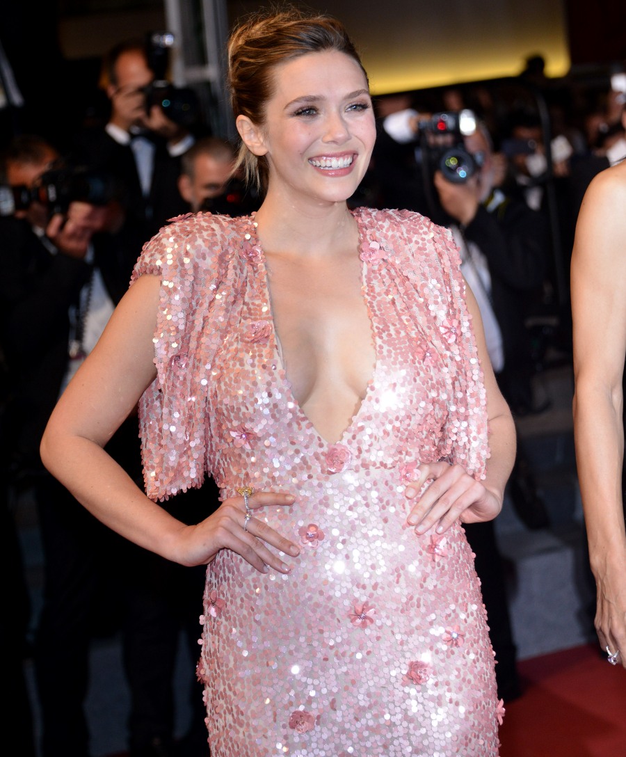



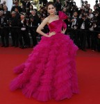





I disagree with Elizabeth’s dress being a home run. Minus the deep-v nothing is sexy about it. The shimmering barbie pink is cloying. And the bad tailoring plus sequin and flower appliques make her look lumpy, when she’s very slim and has no lumps. Her hair and makeup are beautiful though.
+1 unflattering . Love the short Marc Jacobs on her though.
Agreed — YES to the M. J. mini dress, HIDEOUS to the pink one.
+1000. She looks boxy and frumpy, plus, the colour is an abomination.
Add me to the “no” list.
Yeah, it’s a definite nope from me. Too matronly. Maybe without the atrocious sleeves, and in a forest green.
Yep. If this is the sexiest Olsen has ever looked, that does not bode well. I honestly thought she had gained about 20 pounds, which isn’t bad, just different. That’s a terrible, terrible dress.
She obviously feels good wearing it, other than that it’s hideous. I wish that deep vee would die a painful death, and the rest of the dress looks like something Nora Desmond would have worn.
I like the way that all three Olsen sisters dress. They have their own point of view and they stick to it, which is great as not everyone needs to follow trends.
The only issue I have is Liya’s make-up or lack there of. She looks sick here. I know she loves a minimalist look but she could have tried harder with the hair and make-up. I like that she wore this outfit. She stands out even more.
There were so many dresses in the Oscar de la Renta show for her to choose from and she chose the plainest one. The leather jacket does nothing to help it either. Everything about this look is a failure.
Dang Elizabeth! I generally like her style and while the pink isn’t my color I’m not mad at the dress.
Exactly. She looks healthy and energetic.
Maybe it’s my age, but I don’t like the open-cleavage look. So distracting. Close that up a little more and the dress is lovely.
I like the fabric of Olsen’s but it’s not a flattering cut on her and she doesn’t seem comfortable in it.
Did these women forget to look in the mirror?
Did anyone else think she was standing next to Meghan Markle in the 2nd picture? I had to do a double take.
Olsen’s pink dress is actually disgusting, plus does nothing for her at all. I’m confused as to how this look is vampy in any way. Her photocall dress is much better for her (the pattern is really cool and understated, bit 70s/art deco-y?)), and her whole look there is 100x more ‘vampy’.
Elisabeth Moss’s ensemble would have worked if the jacket were shrunken, the top of the dress was tighter and elongated, and the bottom was shortened to above her ankle. Also, if that logo is actually on the dress and not on the photo, yuck. Logos are tacky as hell, especially on formal wear.