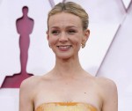
I didn’t really have any fashion expectations for Oscar-nominated Best Actress Carey Mulligan. The last time she did an awards season, it was 2010 and I still remember how twee she went with her fashion and styling. More than a decade later, she’s married to Marcus Mumford, she’s a mom and she seemed pretty pleased with Promising Young Woman. She really worked to promote it, and she even engaged in some Oscar campaigning. But even then, I wasn’t expecting THIS moment, where she went Full Oscar in a bold, gold Valentino gown with a bandeau top. This feels so out of character for her! But I like that she went for it, and honestly, she pulled it off? This gown was a big moment on a somewhat scattered red carpet and Valentino got the shade of gold right. This is the perfect tone/hue for a white woman with blonde hair. If they had gone a shade lighter, they would have washed her out. A shade darker and it would have been too jarring. I also love that she’s happy enough to bring her husband Marcus Mumford out as her date! It’s nice to see them do a red carpet together.
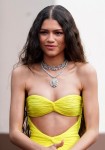
Zendaya also got a Valentino bandeau-top dress, although hers seemed more like a party dress than an Oscar gown. Nice stuff: Zendaya is really beautiful and young, which means she can make some weird fashion look cool; the color is beautiful and bold; you could tell that she liked her look a lot. Bad stuff: this IS more of a party dress than an Oscar dress, and I think the actual design and construction of the dress is kind of terrible. If she had changed into this for the Vanity Fair Oscar party, it would have been fine. But for the Oscars? Nah.
Photos courtesy of Avalon Red, Backgrid.

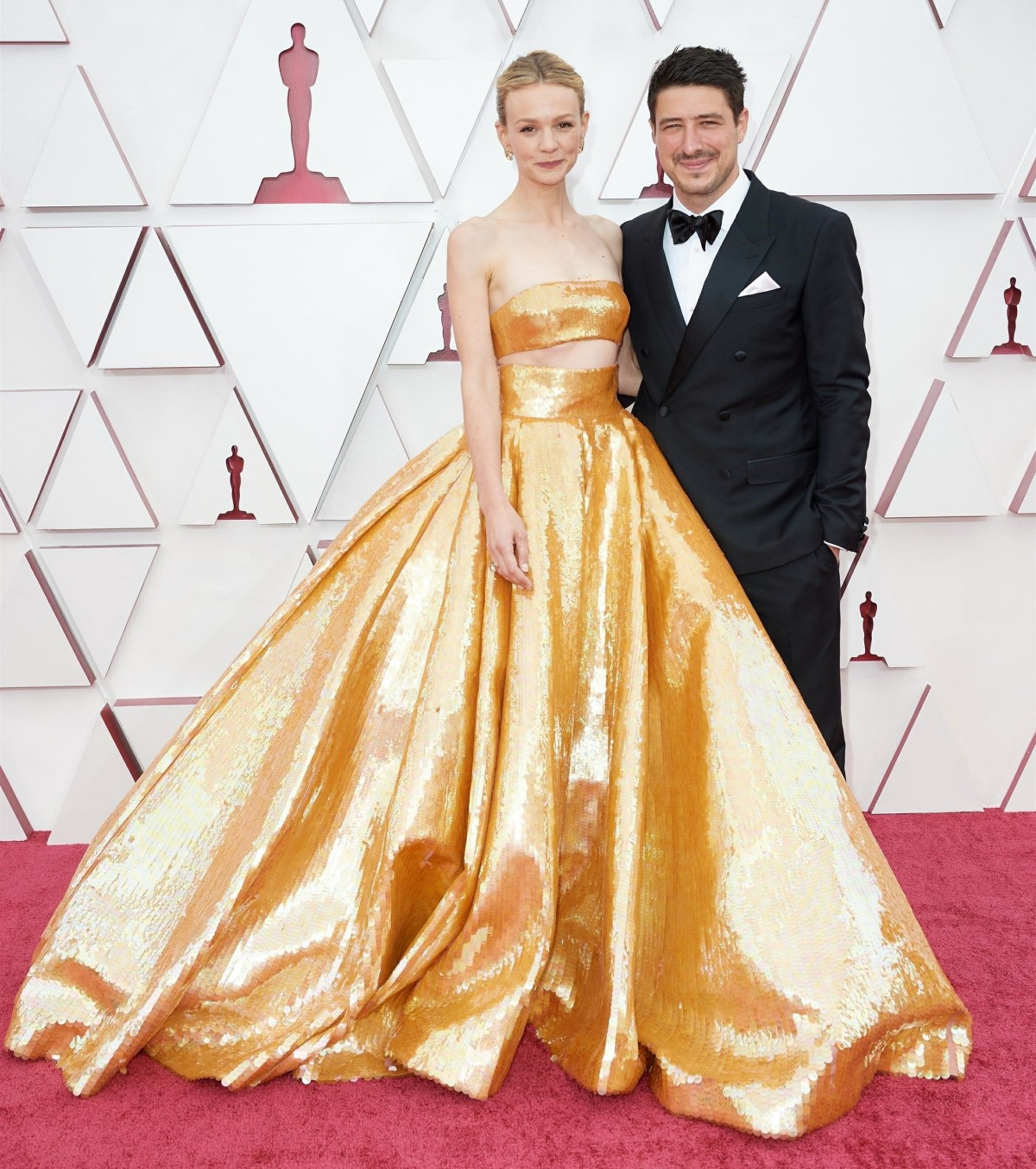
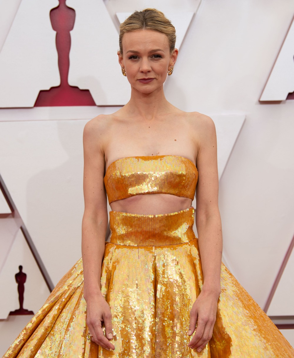
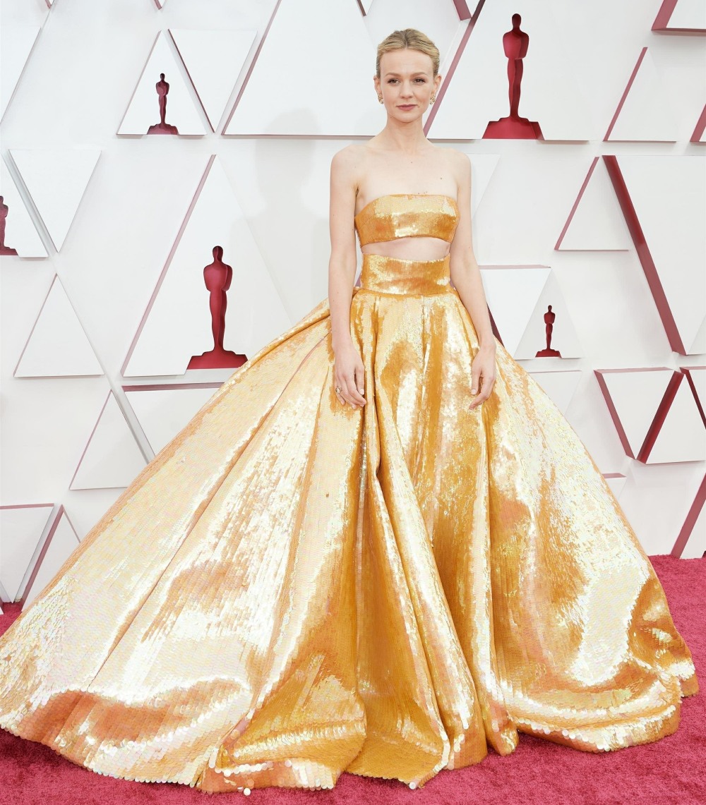

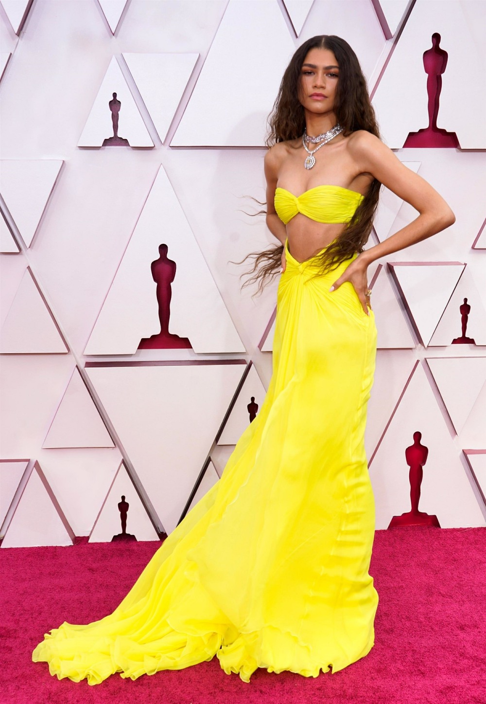


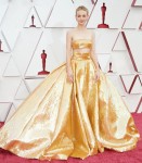

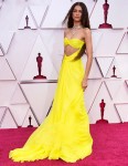



I thought Carey was the best of the night. LOVE that gown and she looks gorgeous. Zendaya – a rare miss last night.
My feelings exactly on both gowns.
I think it’s the first time I have been disappointed by Zendaya’s fashion. It feels kind of cheap.
This post makes me feel like upside down day, because I LOVE Carey but her fashion is quite hit or miss and she dresses older than she is – she looks lovely in this though.
On the other hand, Zendaya almost never gets it wrong and I hate this. The colour combined with fabric and cut (too much stomach exposed) look so cheap, and the heavy jewellery isn’t helping. Z usually makes anything look expensive, so I’d hate to see what anyone else wearing this would look like! She looks like she’s about to head to a bougie party at the beach and couldn’t be bothered to change for the Oscars.
I saw a picture on Twitter that it’s a copy/homage to a dress Cher worn the Oscars long ago.
Same. I like that Carey went for it. Why not?
Zendaya never misses but this just looked odd. Like it was put on backwards or something. Rare miss.
Agree, rare miss. This may be the first thing she’s ever worn that I don’t like. It’s too bad because her styling was perfect and I like the color of the dress. I just don’t get that cut. It cheapens the dress.
Both of these dresses were awful. No style. Yeech!
I love Carey’s gown…that skirt!! She looked great.
Zendaya looked like she was wearing a “Little Mermaid” dress. Didn’t care for it. She can wear a potato sack and look amazing, so I don’t know why a stylist/designer would do this to her.
I’m not digging the bandeau tops, but TBT, I also don’t care for cut-outs. Both styles take away from the formality of the pieces- Zendaya’s especially looks beachy for a red carpet, but the color is a knock out on her.
NSSButterfly, I agree with you. I do think the cut out makes the dresses more casual. Maybe it’s my age, but I keep thinking Carey gown would have been smashing without the cutout. Zendaya’s would have been better without the cutout, but I don’t like the fabric.
I love Carey’s dress. It’s fun and the color is stunning.
I usually love Z’s red carpet fashion, but the fit is horrible on this dress. The color is amazing, but the bust area is way too low. The cups are on her ribs, and it throws off the whole look, IMO. Her make-up is off, too. The heavy brows and the hair together kind of way her down. I think it would have looked better if her glorious face was celebrated more by the look.
They’re beautiful women, beautiful gowns, but they both looked uncomfortable. That’s why these gowns have be gone gowns for a good long while
I was surprisingly disappointed in zendaya’s dress. I think if she maybe went for a gold/ yellow instead of a bright yellow it could have worked?
They both like variations of trendy prom dresses, it was disappointing to see on the red carpet
They do!! I never looked at them that way, but you are spot on!!
So are cut outs back because I’m still traumatised from cut out swimwear of the early 10s?
Side note:
As a recovered eating disordered lass it makes me so sad to see the continued need / expectation / drive for women in the public eye to be so small. I understand it from the pressures and need to be young and relevant but I dream of a day that these standards no longer exist.
Same, which is one of the reasons I’ve loved seeing Emerald Fennell on all the red carpets. I don’t know if she’s plus size or just appears that way next to all the waifs, and I know she’s now pregnant, but it’s just so nice to see someone a bit more accessible.
I think, unfortunately, she’s ‘normal’ sized (and by normal I mean like an American 8-12-so smaller than the average person) and looks ‘big’ in comparison.
The camera really does add 10 pounds and I cannot begin to imagine how truly frail/tiny some of these women look in real life.
I feel the same about the cut outs – it’s to pressure women, mostly young women, to be a certain size, similar to crop tops. Yes we see your size 0 waiste, thanks.
Not a fan of the cut outs, but I am a fan of voluminous ballgowns and skirts.
The bright yellow gown was not good. A miss as far as I am concerned.
Same, I’d have loved Carey’s dress even more without the (seemingly totally unnecessary) cutout.
I would too, I love the gold sparkliness of it and the big ball gown shape, but not the cut out.
That’s probably one of the only things I’ve ever seen Zendaya not look good in. She is stunning, but that gown is not appealing, and she does not look comfortable in it.
Lose the cutout and make it in a jewel tone for Mulligan.
I think Zendaya’s dress would have been magnificent with a low, drapey front. Too bikini-esque as it is.
Love the yellow! Zendaya looked like a disco mermaid haired queen. Since she wasn’t a nominee and is only 24, i actually wasn’t mad at this outfit. There wasn’t much to look at that was fun at this years oscars though. The men turned it out more than the women.
I liked her look too. It’s not too serious, but gives us just enough when the wind hits where I’m like, “Yes, goddess!”
Carey’s look was terrible to me. Like I just hated it. Maybe if the waistband was smaller?
same, I was a fan of both these yellow/gold numbers.
Yep, my first thought was mermaid sitting on a rock. A very beautiful mermaid. The cutout seemed to work with the vibe. Carey’s – maybe I would have liked it more with a simple bustier with a straight top in a different colour or fabric with the giant golden skirt. I think it was dramatic and modern, but just not flattering.
Yes, total mermaid look! I’d be a little bit afraid of slippage, but she looks very beautiful. I like Carey’s dress a lot too. I would have given her a less severe hairdo, but it still works.
Yeah, I might feel differently if she was nominated, but it looks great to me!
Not a fan of the bare midriffs
Same, said as much above. It just takes the formality out of the gown.
A rare miss for Zendaya for me. And think Carey’s persona is too low key for that outfit.
I commented on Twitter last night that I am always a sucker for a metallic gown and Mulligan’s was no exception. I really liked it and I think Zendaya looked beautiful and perfect for her age. I do think both dresses would have been fine without the cutouts, too.
Zendaya was a win for me. Gorgeous.
Yeah I love the yellow dress, the necklace and whole styling vibe from zendaya.
Same. She looks fantastic.
Same, happy to join the minority lol I love the callback to Cher.
I liked both of their dresses. If I had to choose, I would pick Carey because I love ballgown style dresses.
LOVE the gold gown! The yellow looks like it’s on backwards because of how it wraps around the waist. Z still looks gorgeous though.
I just want to say, I’ve had a very prominent wrinkle across my forehead since I was 16 because I’m constantly animating with my eyebrows, but in the past few years (I’m 37 now) it’s gotten so bad I’m actually contemplating botox because I hate it in pictures so much. I’ve done drugstore creams to le mer, spent insane amounts of money and I’m so over it. In a very weird way, seeing these pics of mulligan make me slightly more accepting. I really appreciate that yes, she’s young, but she’s not messing with her face. Some of the comments on this are so sad, but for me, someone who literally can’t bear to be in pics anymore, I’m going to try and take a page out of her book.
never mind
I don’t like either dress but they both look fabulous because young, slender beautiful. Youth is wonderful.
They look like swimsuits gone awry. Not a fan.
Carey’s was my favorite! There was something I didn’t LOVE about Zendaya’s but the mermaid look was cool. She pulled it off well.
These two were my favorite looks of the night! They look gorgeous and I like the cutouts.
The giant gold gown is beautiful, Carey is also beautiful — in that first close up photo she looks emaciated.
Zendaya is stunning but that dress looks like it’s on backwards.
@SURELYNOT Carey IS emaciated! I don’t think people realize how THIN these women are. Carey is 5’5-6 and under 115 lbs. the struggle to maintain that size 0 look must be exhausting. I actually feel for her. She’s thinner after 2 kids than she was at 18. Same goes for Michelle Pfeifer, Kelly Ripa, seen them all in person. None of them take in more than 600 -700 calories a day. Hence why their skin is so taught across their face. Plastic surgeons do encourage these super thin actresses to just gain 15 lbs to avoid face lifts
I recall seeing Carey in person when she was promoting My Education at TIFF and I do not recall her being so emaciated. She was obviously fit at the time, but the prominent clavicles just wasn’t something that was so obvious then.
I liked Carey’s dress but not her hair and makeup. The drama all stopped at the neck.
Agree. Hair and makeup aged her in a bad way. Seriously, that makeup is awful on Carey. She usually looks extremely pretty so this was a very weird miss for her.
I didn’t mind Carey’s gown, but her styling was terrible. The flat hair and the neutral make up didn’t balance out the dress. She looked tired and washed out, and the dress was wearing her.
I don’t think either dress did them any favours. Both stunning women in the wrong frocks. That said, Carey’s doesn’t look that well made to me and Zendaya’s dress colour wouldn’t look good on most people. IMO….
Love them both, big no on both dresses. Zendaya’s is actually fairly ok. I usually look forward to her fashion game, but not this time. Carey’s looked awful last night in motion (interviews, etc.) She’s too fair to wear that color and I don’t like this type of getup (as my grandfather used to say).
This is a dress Rihanna would wear to the Music award shows or the Met Gala. This dress doesn’t suit Zendaya. I love the yellow color of the dress.
Zendaya was a very unexpected miss to me last night. She’s usually impeccably dressed with a strong eye for fashion. Kind of a shame because that’s a big night to fall down on fashion-wise. It was very Real Housewivey to me.
Carey’s dress was a lovely color, though I’m not sure I’m a fan of the bandeau style. My bigger complaint was with her makeup. I wish they’d gone bolder on it. I feel like a red lip would have made her features pop more with that rich gold.
Agree with everyone that Zendaya’s look is disappointing. This dress looks like something I’d see one of the girls in my neighborhood wear to prom.
Carey looks fabulous, though I wish her dress was just a *tad* shorter.
The men at my family dinner were drooling over Zendaya, party dress or not.
She looked great, but it was not sparkly, maybe?
Both dresses are stunners, especially Carey’s. Just breathtaking!!!
I like the top of Carey’s dress but that giant skirt is a no, it looks like she’s hiding someone underneath. As for Zendaya, meh she’s young enough to pull it off but it does seem a tad to informal for the Oscars.
Cutouts in evening gowns are tacky.
Zendaya put her dress on backwards. Or her head is on backwards. Somebody put her pieces together wrong.
I think Carey looks great, but I wish her hair was just a *little* more floofy up top or looser, more softened around her temples. This look is so severe with that dress.
Severe, thats the word i was looking for. Carey is so talented and i love her film work such badass characters but yes she looked too severe IMO
I like Zendaya, but this is an inappropriate dress for the Oscars, no matter who is wearing it. This isn’t the MTV awards. This is a classy event and this was a not-so-classy dress.
That color looks great on Z. Carey looks like the dress is wearing her, not the other way around.
Ordinarily I love Zendaya’s vibe but bandeaus are so unattractive even she can’t pull this off.
Both of these dresses are very eye catching. But to be frank, I think bandeau/strapless generally looks better on a more voluptuous shape.
Maybe for a different red carpet, not the Oscars. However both women wear the dresses beautifully. Commented above not a fan of the cut out.
I like the dress, but the gold does not go well with her fair skin tone. It would look fierce on Spencer or Bassette though!
lol, Zendaya’s spider sense told her not to get dressed up for this anti-climactic, bait and switch ceremony: and she was right.
I think both dresses are blah!!! Don’t like either one of them.