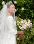
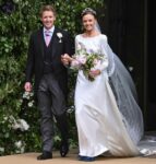
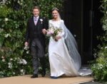
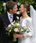
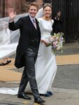
Here are more photos from the Duke of Westminster’s Friday wedding. Hugh Grosvenor married Olivia Henson in Chester, England. This was supposed to be the social event of the year, the wedding of one of the richest and most eligible men in the country. And the whole thing just looked… rather budget, right? I’ll be nice – Hugh and Olivia seemed genuinely happy and I’m sure the bride loved her dress. But this satin was a poor choice for a modern wedding dress, especially since Olivia knew she was being photographed by the national and international media! It looks like a cheap knockoff wedding gown you would find in a flea market. The blue clunky shoes were not working either.
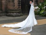
So, let’s talk about the cardboard or plywood or whatever it was. Olivia and Hugh were married at Chester Cathedral and it looks like the Grosvenors or the church decided to be especially accommodating to Olivia’s dress, so some kind of barely elevated “runway” was put down outside of the cathedral. Some suggested it was done so that Olivia’s dress and veil wouldn’t snag on anything. But… it genuinely looked as if the church threw down some cardboard sheets outside for a woman marrying a billionaire! Did no one think this through? Did no one ask “hey, that elevated platform isn’t beige, right? It doesn’t look like cheap plywood, right?” These are the same people (not Hugh, I’m talking about the class of people) who looked down their noses at Meghan Markle for being hyper-organized about her wedding planning. Meghan’s wedding photos were gorgeous – Olivia and Hugh looked like they were standing on discarded pizza boxes. There’s already been talk about how the platform was for wheelchair access… but that makes no sense given the layout of the entrance? Even if there’s a legitimate argument to be made about accessibility, once again, there were ways to make a temporary platform which didn’t look like raw plywood.
What else? Climate activists turned up at the wedding too. The Just Stop Oil activists “sprayed powder paint from orange fire extinguishers into the air from the crowds of wellwishers outside” of the church when Hugh and Olivia exited. Police quickly diffused the situation and the activists were booed by the crowd.
The wedding reception was held at Hugh’s 11,000-acre home Eaton Hall and there was a “no phones” policy in place. According to Hello Mag’s sources, the food was good, “the burrata was exceptional,” and there was a bicycle with a little ice cream freezer, where any guest could pick up an ice cream treat at any time. They had a full orchestra and a huge fireworks display. It sounds like they put all of the money into the reception and not the actual wedding ceremony.
Photos courtesy of Cover Images.
- The Wedding of Hugh Grosvenor, the Duke Of Westminster and Olivia Henson at Chester Cathedral Where: Chester, United Kingdom When: 07 Jun 2024 Credit: PA Images/INSTARimages **NORTH AMERICA RIGHTS ONLY**
- The Wedding of Hugh Grosvenor, the Duke Of Westminster and Olivia Henson at Chester Cathedral Featuring: Olivia Henson Where: Chester, United Kingdom When: 07 Jun 2024 Credit: Cover Images
- The Wedding of Hugh Grosvenor, the Duke Of Westminster and Olivia Henson at Chester Cathedral Featuring: Olivia Henson Where: Chester, United Kingdom When: 07 Jun 2024 Credit: Cover Images
- The Wedding of Hugh Grosvenor, the Duke Of Westminster and Olivia Henson at Chester Cathedral Featuring: Hugh Grosvenor, the Duke Of Westminster, Olivia Henson Where: Chester, United Kingdom When: 07 Jun 2024 Credit: Cover Images
- The Wedding of Hugh Grosvenor, the Duke Of Westminster and Olivia Henson at Chester Cathedral Featuring: Hugh Grosvenor, the Duke Of Westminster, Olivia Henson Where: Chester, United Kingdom When: 07 Jun 2024 Credit: Cover Images
- The Wedding of Hugh Grosvenor, the Duke Of Westminster and Olivia Henson at Chester Cathedral Featuring: Hugh Grosvenor, the Duke Of Westminster, Olivia Henson Where: Chester, United Kingdom When: 07 Jun 2024 Credit: Cover Images
- The Wedding of Hugh Grosvenor, the Duke Of Westminster and Olivia Henson at Chester Cathedral Featuring: Hugh Grosvenor, the Duke Of Westminster, Olivia Henson Where: Chester, United Kingdom When: 07 Jun 2024 Credit: Cover Images
- The Wedding of Hugh Grosvenor, the Duke Of Westminster and Olivia Henson at Chester Cathedral Featuring: Hugh Grosvenor, the Duke Of Westminster, Olivia Henson Where: Chester, United Kingdom When: 07 Jun 2024 Credit: Cover Images
- The Wedding of Hugh Grosvenor, the Duke Of Westminster and Olivia Henson at Chester Cathedral Featuring: Hugh Grosvenor, the Duke Of Westminster, Olivia Henson Where: Chester, United Kingdom When: 07 Jun 2024 Credit: Cover Images
- The Wedding of Hugh Grosvenor, the Duke Of Westminster and Olivia Henson at Chester Cathedral Featuring: Hugh Grosvenor, the Duke Of Westminster, Olivia Henson Where: Chester, United Kingdom When: 07 Jun 2024 Credit: Cover Images
- Wedding of Hugh Grosvenor, the Duke of Westminster to Olivia Henson at Chester Cathedral. Featuring: Hugh Grosvenor the Duke of Westminster and Olivia Henson Where: Chester, United Kingdom When: 07 Jun 2024 Credit: PA Images/INSTARimages **NORTH AMERICA RIGHTS ONLY**
- The Duke of Westminster marries Olivia Henson at Chester Cathedral Featuring: Hugh Grosvenor, the Duke Of Westminster, Olivia Henson Where: Chester, United Kingdom When: 07 Jun 2024 Credit: John Rainford/Cover Images **NOT AVAILABLE FOR PUBLICATION IN THE UK**


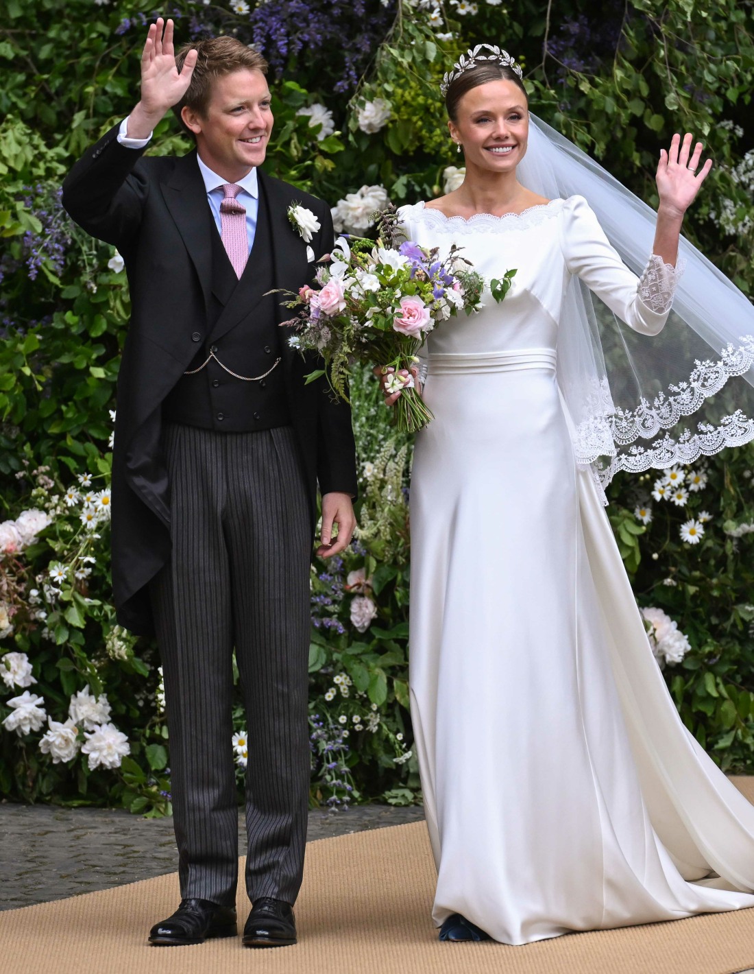
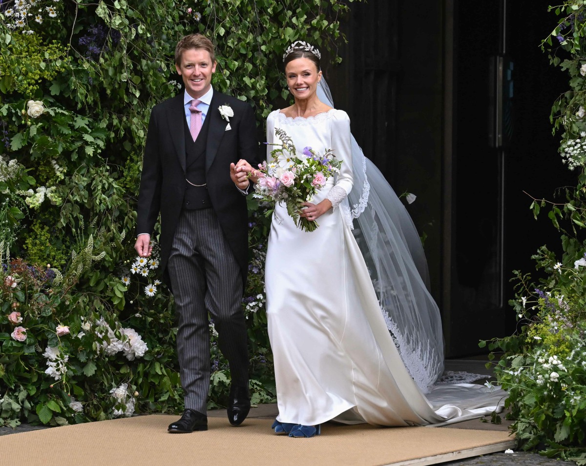
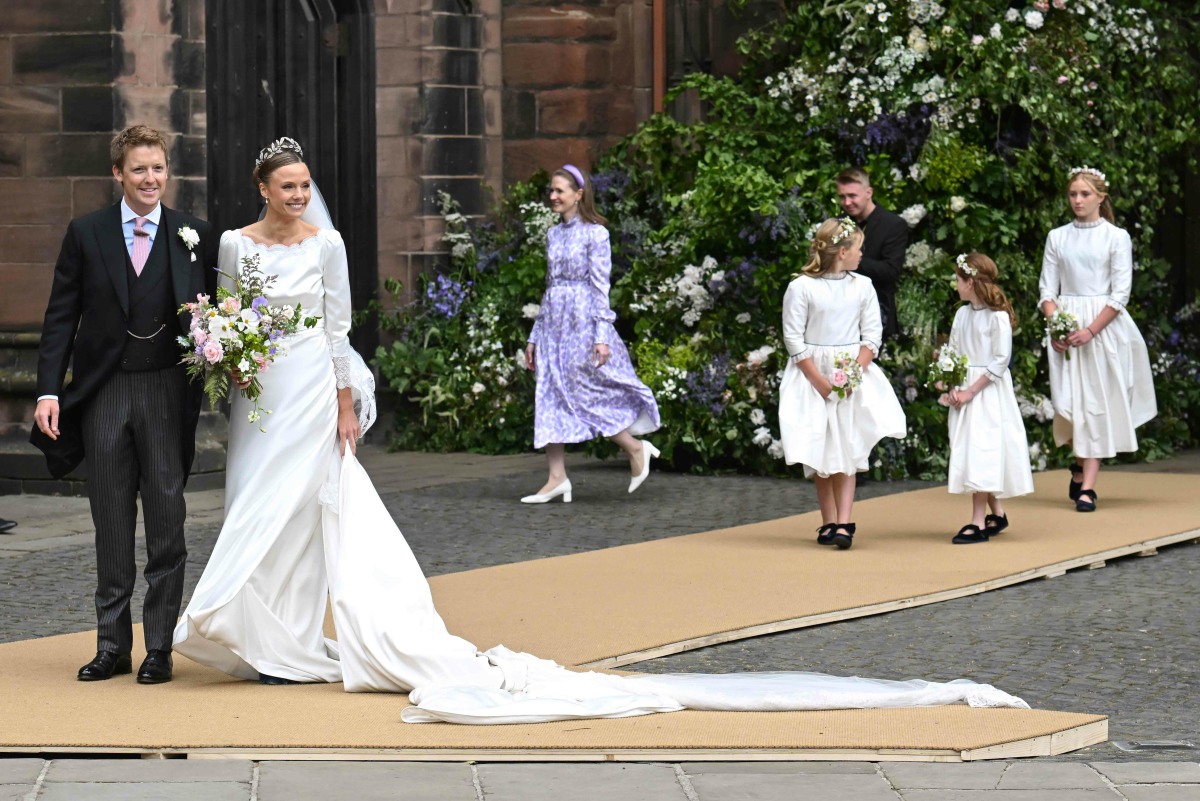
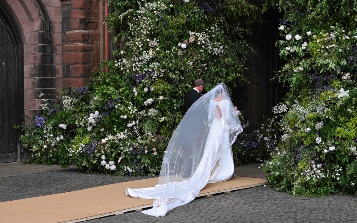


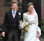
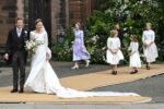
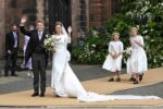
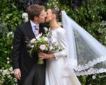




The lady in 1980s lavender floral hell in the background looks so unfortunate.
She’s the wedding dress designer, I haven’t had coffee yet so can’t recall her name.
That explains a lot. 😳
I have a completely different take on her outfit now that I know she’s the designer and not an auntie or friend, when I thought she was a tragic fashion victim. As the designer working the wedding, she is certainly not going to overshadow the bride. It’s an appropriate spring pattern and color palette, and the fact that it is not overly flattering is a feature, not a bug. She looks comfortable, able to function and appropriate.
I would argue that she overshadowed the bride a lot. You don’t always pull focus by looking better than the bride.
You can make excuses for the dress, but not the shoes. They were hideous.
She certainly overshadows the bride by looking like she time-travelled from the 80s. There’s something off about the wedding dress’ structure. The fabric looks cheap… The kind that suffers from static… Or maybe the stitches/thread/needle were not the right ones. (I also loathe scalloped anything , that might explain it).
If she chose clunky shoes bc of the walking, she could have picked a lighter shade of blue and matched it to the flowers. The bouquet itself is impeccable and I happen to like her headsuit. She certainly looks rough for 23, but yet again… She’s the one marrying one of the richest men in GB.
I thought she looked nice in her dress. The blue shoes may have been the something blue but they were ugly. I would have gone with a nice pump not velvet blue shoes.
@Susan Collins me too! I was surprised at the sniping about the dress and her skin. I think she looks gorgeous, including the dress and the keyhole detail. I do love me a velvet shoe, it must be said. When I saw some commentary on his ex, who I’d never heard of and can’t remember her name, there’s clearly some background I don’t know adding to opinions. 🤷🏻♀️I’m a sucker for a lovely wedding and a happy couple and to each their own. The wind made for compelling photos also with her veil flowing dramatically. Many happy returns to the couple.
To be clear, I was talking about the wedding gown designer’s ensemble, not the bride’s.
@Tuesday, yes and apologies for going to the MOTG. You have a good point. I do think she was trying to be subtle, like others have said. I also agree that the whole Alice Band dress thing for weddings is “unfortunate.”
If she was a costume designer for an 80s themed movie, she would have nailed it. I can’t believe Olivia chose her to design her wedding dress. The flower girl dresses look like I made them based on a youtube tutorial the night before. She could have ordered nicer stuff from wish.
That hairband…I hate hairbands on grown women. She reminds me of Sophie Thompson’s character in Four Weddings and a Funeral – all flowery dresses and hairbands.
I’ve never gotten the hairband thing—outside of tennis or golf…
And her shoes! I didn’t realize they still made shoes like that!
My mum had that exact dress in the 80s and it came from Laura Ashley.
I was thinking it was really cool of her to fly in all the way from 1986 to attend.
They could have at least thrown a carpet over that plywood…
I liked the back of her dress but the front of it reminds me of something 1920’s. But maybe that was the point? She wanted something that looked vintage? I absolutely hate the shoes. But it’s her day i guess.
The flowers at the entrance look lovely
Her shoes are my favorite part of her ensemble!
I like them too but I don’t think they went with the dress. Maybe a lighter blue would have been better?
I think the chunky heels were a good choice given the cobblestone pavements. Even with the terrible walkway, she still needed to get in and out of the car, and if it were wet, thinner heels would have been very treacherous.
Hard agree – her shoes were FABULOUS and the colour was gorgeous! The cheeky take on ‘something blue’ and so much better than some dyed to match situation, and dark enough to be fully intentional. Hopefully she is as fun as these shoes!
I get that the shoes were her ‘something blue’, and they are cute, but they’re too chunky to go with this dress, and they’re velvet – a winter/fall material. Between this, the material of the dress, the poorly executed runway, this all looks amateur hour.
So I apologise in advance for this comment because I know it’s super pedantic. And of course it doesn’t matter.
But a whole bunch of times I’ve seen comments here from American posters talking about how a certain colour or certain fabric is only for a particular season, and obviously it’s not the case here but it’s usually in the context of “that photo must be fake because that colour can only be worn in these months.”
I don’t think Americans necessarily grasp that the whole entire concept of colours/fabrics being for particular seasons is EXTREMELY American, it’s a concept that literally does not exist in some other countries. I don’t mean that other countries have different rules about what colour to wear in what season, I mean the whole concept doesn’t exist.
I remember watching the film Serial Mom when I was younger, and it had a whole plot line about a woman wearing white after something called Labour Day, and absolutely no one in Britain understood what that meant, because why on earth wouldn’t you wear white all year round? Why wouldn’t you wear any colour you like all year round? Only wear certain colours at certain times of the year, that’s crazy!
Sorry I know it’s pedantic. Just it comes up here all the time, and I think it’s important to say that it’s a super super American cultural custom that just doesn’t exist as a concept at all in the UK. We dress for the weather of course (ish – unless you’re a postie or a young Northen woman!) but all colours and all fabrics are considered perfectly fine for all 12 months of the year. The very idea that there are colours or fabrics you only wear in spring or summer would just completely bewilder most Brits because we just have never heard of that USA custom.
@SamuelWhiskers, it’s just white shoes that used to be not worn after Labor Day in certain circles. I don’t think anyone really cares anymore. I don’t know because the only white shoes I have are sneakers! 🤣
SamuelWhiskers, that’s an interesting perspective. I think the arbitrary deadlines for certain colors are starting to be eroded in the US. There seemed to be quite the dos and don’ts when I was younger that really don’t seem to make the rounds any longer. I have to admit that I didn’t know that satin wouldn’t be worn this time of year. That’s a new one on me–satin seems a logical choice for a wedding gown as does most other fabrics. Bride’s choice!
I really like her dress and I think the shoes show a bit of whimsey. As long as she’s happy with everything, then I’m happy for her.
I will say that the two of them look really happy. I hope for them a long and happy life together.
If you zoom in, there was carpet on the plywood! They beige color did absolutely nothing for the wedding photos: it is not a standard wedding color, it didn’t jive with the wedding attire, nor did it highlight the “forest” of greenery and flowers at the church entrance. Maybe it’s an inside reference to a sandy beach??
What? There was carpet on the plywood? Lordy. It actually makes me mad for her. The church and flower arch at the entrance was gorgeous. And yet in the pictures all we see is plywood…or carpet covered plywood😂. It really takes away from what could’ve been absolutely lovely pictures. They’re still lovely pictures. But the plywood really is hard to unsee.
I honestly didn’t even notice the flowers because I was too stuck on that plywood monstrosity! There’s no way it’s for accessibility with a huge step down on every visible edge. The step is no better that the apparent entrance to the church.
That carpeted platform is baffling and an eyesore. The raw edges and visible wood underneath that’s supporting the plywood is a hot mess.
The wedding planner needs to chose a different line of work. Or maybe the slovenly dressed aristocrats just wanted to show that whether in dress or wedding entryways, they are an ugly, mismatched mess and they laugh in our commoner faces about the idea that things should look neat and not distract from the purpose of the day 🤷🏽♀️
I thought it was meant to mimic burlap for the farm country feel.
It looks like country-house style sisal was put down but the edges! Good grief! Supposedly the cobblestones in front of the church are old and uneven so maybe it was a super thoughtful gesture for the all the guests in their spiked-heel Aquazzuras? Giant FAIL.
Beige carpet to cover beige plywood for a beige aristo wedding 😂 Red carpet would have been a much better and obvious choice.
Minimum, wrapping the carpet around the edges would have been an improvement but why didn’t they line the walkway with flowers or greenery, even just where they were taking photos at the entrance? It would have looked magical!
Yesss, if they just lined it with greens and flowers similar to the entrance arrangent, even the beige cover would have looked so much better. The wedding palnner could have worked something out with the florist even on a few hours notice.
That would have looked great.
With the uneven cobblestones I get the idea and I can see this looking great as sketches ahead of time but someone should have looked at this as it was built and thought on their feet to make it look good. I’m sure they paid ££££££ to a company to arrange all this and they did not get value for money.
If you zoom in really close it actually looks like Berber carpeting on top of the plywood.
I’ve been to several weddings that were considerably nicer looking than this one. Maybe the reception was great? But the vibe here and the guests all look super average to me. The bride looks happy, which is the best part, but this would not be considered the wedding of the year or even month in the US. People with money and “titles” are truly nothing special. Many creative people would have done a much nicer job with the budget they no doubt had.
There was carpet on top of the plywood but someone should have stood back at bit and they would have realised how rough the edges looked? It did look like someone had rushed down to B&Q with a trailer that morning? Because of that ramp you don’t really notice that floral arch which was huge and amazing.
A different color carpet like green or even red would have looked better but whoever put it together should have extended the carpet to cover the sides and front facing portion. Such a shame really because as you said, the floral arch is beautiful and really deserved to be the star.
Perhaps they thought that green or red carpet would be too much but that beige colour makes it look very cheap.
We’ve been renovating our new apartment, so I now know more about flooring than I ever imagined I would. There are some very convincing high-end vinyl “cobblestone” tiles out there (with the cobbled texture, but not the dress-snagging roughness of stone) that would work perfectly for exactly this sort of thing.
@Cathy, yes the floral arch at the entrance to the Cathedral was utterly stunning. As is the £10,000 worth of floral displays Hugh Grosvenor, Duke of Westminster, paid to have dotted all around our little city of Chester. Both the floral arch and the flower displays are staying up all through the summer for Cestrians and visitors alike to enjoy.
More money than taste.
Maybe you never need to learn when you inherit billions, so you always do what was done. So you keep repeating the same ghastly choices. Because, money.
It’s all bad. The wedding, fireworks are terrible for so many reasons, the awful shoes, the billions he doesn’t pay taxes on or inheritance tax, the land he “owns” that could house so many. It’s all so awful.
More money than taste, when all that could help so many. Abolish it all.
Thank you! And why would anyone want fireworks 🎆 at their wedding? I guess they just did it because they can.
They just cancelled the annual fourth fireworks in my hometown due to fire risk and I am so sad. I am going to have to go 12 miles west to the coast to see them this year, as I will really really miss them. So yeah, if i owned the sort of land he has I would adore them for my wedding. It’s only once (hopefully) and presumably it would be done by professionals to minimize risk.
Harry and Meghan had fireworks. Don’t remember if WanK did.
Yes, more money than taste. More money than sense. They all seem to have that issue.
🎯
I don’t think the dress looks cheap, and I actually like the blue shoes but OMG old pizza boxes is spot on- dying!!! Should’ve hired Megan’s people, babes!
Should’ve hired Meghan’s people😂. Or just Meghan. More and more, we’re seeing how much jealousy there must’ve been over Meghan’s innate good taste. I’m sorry but she puts the royals and a lot of the aristos to shame. Agree @sas, I thought the bride looked good and the shoes were a cute touch. Would I have made the choices of lace, boob darts and plywood? No. But overall, she looked lovely imo. The wedding guest fashion, however, is a whole other story.
Agree I think I recall reading here it was silk crepe? So, every expensive. But there can be silk satin, so it gets confusing.
But at any rate silk crepe is expensive! I can understand why they needed a walkway if it was possibly going to rain, because water can stain silk.
But I also think I see a fake cobblestone walkway in one of the other photos when they are leaving the church and it looks a lot better than the sisal topped plywood.
On the plus side no one will ever forget the blue suede shoes and plywod gang way, i wonder if she was a fan of Elvis ?
Or she’s a fan of the British band, Suede?
they’re velvet
The “ramp” has no slant to allow a wheelchair onto it. In fact it’s raised a couple inches above both the cobblestones and diagonal paving stones, so it would become more difficult or even impossible for an occupied wheelchair.
The ramp looks unfinished and is a huge focus on the pics. Maybe the front entrance is unequal, thought it might rain and they didn’t want the water puddles to ruin the bride’s dress? The wind was terrible, the paint women chose really a crual time to voice their convictions… this couple have all the money in the world, so her dress and everything like the food, flowers, must really be a reflection of what they must really like or value.
I don’t mind the dress. The bodice doesn’t fit right, but it might be that she lost weight after the last fitting. The plywood platform looks very last minute. I can’t imagine somebody planned that.
Oof, I hate the dress, I agree with another commenter that the walkway looks like a bunch of pizza boxes lined up, the bride’s hair/makeup also aged her imo. Maybe this is the aristo way and poor me just doesn’t get it.
The hairstyle is not just aging but very unflattering. Same with the eyebrows.
I’m guessing that Hugh paid for that platform not the church. What church is going to put out expenses for somebody’s wedding? I don’t understand why couldn’t they put down the carpet on the ground instead of the plyboard platform? Was Meghan hyper-organized or did she and Harry just insist that they be involved in the wedding planning? I get the impression that the Palace were accustomed to the aides doing all the wedding planning and they didn’t like Harry and Meghan wanted to have a say in the plans.
Thank you, THIS. Harry and Meghan wanted to plan their wedding or at the very least, have a say in the organisation (we can appreciate this even more now that we’ve seen how incompetent those KP and BP people are). The only thing which was “hyper-organized” was the sense of outrage from said incompetent staff because they weren’t given free rein to make it cheap, gaudy and tacky so that their media mouthpieces could criticise everything even more afterwards.
Remember how they claimed that Meghan’s wedding dress would have lots of see-through lace and bling and she turned up in a simple and sophisticated and timeless dress instead?
Yes, one of the Brit tabloid printed Megan would wear a bling-to-the-nineth Ralph & Russo dress. (R&R folded in 2021.)
I thought most brides want a say in planning her wedding.
I mean that’s where I’d throw my money too if I was getting married- I’m pretty sure that all anyone remembers about any wedding is that the ceremony wasn’t too long, there was or wasn’t an open bar, and the food was good. I think she looks pretty! And I loved her shoes.
Same. Put money towards the reception. Honestly, it all looks pretty good except the plywood.
Agreed. Man I am so glad I am a nobody. I would hate to read what people would have had to say about my wedding dress and the ceremony etc!
This. All of this. American weddings have generally become over-the-top and lavish, and put alot of people without the means into deep debt. Once the bride and groom are happy, everything else is talk. At this point, I don’t even hate the beige walkway, the photos of the veil caught in the wind were beautiful.
I sort of want to love the dress because I like the silhouette which is reminiscent as many have said of Meghan’s wedding dress (plus not overly lacy like K’s) and I think the veil is gorgeous but it just comes off as an Edwardian nightie. Something about the obvious seam, the lack of a good petticoat (can I still use that word) the lace around the neck and sleeves and the high waist band thingy. Unlike others I think the shoes completely detract from the dress and looked particularly bad side on when she was striding out from the car. Overall disappointing given the resources at hand.
Blue shoes were a thing a decade or so ago, after Carrie wore them in SATC I believe. They can be gorgeous, those peacock blue silk shoes.
But these shoes, including the bridesmaids, were clunky and heavy looking. Almost winter like.
Still, I thought it was overall beautiful mostly because of how happy they both looked.
Looks like the bride wanted a dress like Meghan’s only tweaked to her liking — at the waist, the boatneck collar, and back. The style and fabric weren’t impressive, but the bride looked very happy. (I like Meghan’s minimalist dress much more because it makes such an elegant and classy statement…the fabric is exquisite and luxurious too.) I loved how the veil looked when extended over the train of the dress. The shoes could have been a hit without the gigantic bows and clod-hopping heels. Again, the bride looked radiant and happy, which is the most thing important on her wedding day.
Gonna guess that plywood was an ‘after thought’ for women in heels and elderly members of the family.
It was likely cobbled together at the last moment and they went for a neutral coloured carpet instead of a red one, which would look pretentious or other colour that would draw focus away from the Bride & Groom.
However ironically we are now talking about how horrible and cheap it looks.
Aristos are pretty clueless at times.
Honestly, the colour grey was right there … blend into the stone rather than introduce a new, distracting colour! If they had used grey carpet and tapered it down over the edges of the plywood, nobody would have even noticed it.
Perfect
I just googled her age. She is 31. I thought she was 43! Am I the only one who thinks she looks way older?
Love her shoes. They don’t match her gown, but I still love that whimsical touch.
No, you’re not the only one. Her hair and makeup was not flattering and I don’t understand how someone with that much money ended up with a high school dance team bun with the tiara.
And 90s eyebrows.
As a makeup artist, I questioned whether she was even wearing makeup. At the very least, I would have done a better job on the undereye concealer and filled in her brows.
You’re not the only one. Her makeup is making her look older and her hair is too severe. I’m sure the dress was very expensive but I’m sorry it does look cheap. That plywood is awful. The lady in lavender with the matching lavender headband reminds me of some of the wedding guests in four weddings and a funeral, and how long ago did that movie come out?
I posted the same above — she’s dressed like the character Sophie Thompson played.
Agree, the professional figure skater hairdo was a mistake. She needs more softness around her forehead.
Yes, that’s who I was thinking of! “I do solemnly declare, that I know not of any lawful impediment why I, Lydia JANE Hibbott, cannot be jonned in matrimony to Bernard Jeffrey szah szah Delaney” lol
Exactly. Her forehead is very big and wide. My eyes keep going to her forehead and not the tiara. She would have looked so much prettier if the hair had been softer and framed her face to bring balance between the top and bottom half of her face.
With all the hype about this being wedding of the century, the expectations were very high. Weddings are hideously expensive as it is and this one especially so. And the photos are plastered everywhere so people are inevitably going to scrutinise..I was expecting something really spectacular but instead, I feel it’s a shame she wasn’t styled in a more flattering way. I don’t think they got the best professionals for the job. A good makeup artist could have done more to minimise the under eye wrinkles. The blue heels are way too chunky. The cardboard plywood.
I think Meghan has set the bar too high for everyone. She really has a great taste.
It’s the crumpled ties (on Hughie, his groomsman and even William) that drive me nuts.
The aristo’s attempts at “effortless”-everything, especially when it comes to clothes and hair, can look cheap and boring at times.
Hm.. I liked the simplicity of the dress and thought the shoes were a great touch.
Rich English folk tend to dress in ways that are “ interesting “, I think. It’s a style they like, apparently. A frumpy well tailored look.
The frump is real with these folks. I do think English tailors make beautiful suits for men, but for really good clothes for women, it’s Paris, not London. (Well — there are an handful of exceptions, like McQueen used to be.) These people aren’t shopping at Dior like Meghan.
I do like her shoes but they are so wrong for spring.
The frump is real with these folks🎯. I swear there was a period of time in the 90s or early aughts when I thought Brit girls were dressing super cool. But this current vibe is not my jam.
The flower girl outfits are tragic. Their shoes are so clunky and look terrible with the white dresses.
I really like the bride’s shoes on their own, but they look terrible with her dress. Surely they could have found other blue shoes that would not have detracted from her look.
“The flower girl outfits are tragic”
Please note: the flowers girls are NOT WEARING TIGHTS!
Not wearing tights AND their dresses were ill-fitting. Pleased me to no end!
Hopefully there were no mean girls around to make the bride cry this time.
IKR? Why clunky black shoes? Dainty silver ones would have looked great.
So was her tiara the mood board inspiration for Keeny’s tin foil tiara ?
It seems like it. Kinda crazy. Does she have inspo for every major aristocratic family?
Hahaaa!!! Only her tiara was the right size and proportion, Kate’s was overdone and looked like something you’d pick up at a costume store.
@MY3CENTS, thinking the same thing.
Did the bride hire a professional wedding planner? If she didn’t, she should have done so. If she did, fire whoever planned this.
His outfit is giving young Montgomery Burns.
A friend who’s a wedding planner told me it’s not that uncommon to have a raised walkway like this for older venues, but typically you’d pull the carpet over the edges and install some border on it, so the guests wouldn’t realize they were walking on plywood.
To be charitable, maybe this was a last minute addition and they didn’t have time to finish it?
That was my thought, but Grosvesnor’s bank account wouldn’t have blinked had the landscaper lined-up that runway with plant pots to hide the rough edges. It’d only took a click to place an order.
I’m liking all of this — especially the tiara and the flowers.
During my lifetime, weddings have shifted from being very personal events, celebrating a couple within a community, to pageants— often more focused on the social media presentations than on the actual experiences. Although I get that very rich people and very socially connected people have always had more options, at some point, many reach a point where they’re secure enough that they only need to please themselves.
I hope that this couple had exactly the wedding that they wanted: filled with the results of multiple meaningful-to-them decisions, surrounded by guests who actually know them and wish them well.
Probably the only glitch is that they might have preferred to avoid the press completely.
And if they had actually been able to avoid the press, their guest list might have been slightly different.
I paid attention out of curiosity, since this wedding has been so hyped up by the British media I expect so much more. It was all rather bland and dreary, but the Brit’s seem to love bland and dreary 🤷🏻♀️. I can’t make sense of it.
No way she’s 31… even he looks sun damaged. There must be something about the ozone layer there causing so much premature aging
It isn’t just sun. Alcohol consumption also accelerates biological aging. I think, the drinking culture there makes them age faster especially when you don’t properly take care of your skin.
Someone on Twitter said they live in Chester and have been to that cathedral and that the cobblestones at the entrance are awful to walk on, even with flats let alone heels. The plywood bit must have been added to keep the couple safe. Can you imagine the press if she had slipped or God forbid, fallen?
Love the tiara and veil combo but whoever gave her such a comb back in the front did her no favors, I think she’d have looked better with a softer front.
Best wishes to them, they looked very happy. And good luck with her new MIL, there was one shot of her walking into the church that had the worst RBF I’ve seen in a while.
With the cathedral near the family estate, assume that the Grosvenor family have attended at least a few services there (& perhaps a formal occasion or two). At least the older sisters would know of the cobblestone / footwear issues to be addressed. I can’t imagine it escaped anyone who has ever planned or attended a country wedding. All the more so w/ the bride making her shoes a feature/flash point of her wedding ensemble.
The bride is very pretty. The fabric of her dress looked cheap like a polyester Sears slip, the weight and drape of the silk satin wasn’t right. The blue of the shoes was pretty, but the design proportions for the bow and block heel were amateurish and awful. The walkway covering was a damn mess.
There’s just something really… off… about the bride’s styling? There are multiple elements that are fighting rather than blending harmoniously. For example:
1) The dress isn’t awful– it’s not my taste, but it’s vintage-y and sort of blandly pretty. It’s light and delicate though, and with that fabric and the lace details, everything else about the styling should lean softer/more romantic/vintage.
2) The extremely severe hair clashes with the vintage-looking dress and veil, detracts from that rather beautiful tiara, and makes the bride look older than her age. Someone really did her wrong with that hair!
3) The dress + veil + tiara don’t make sense together. It was really bothering me, and I realized that if you just took the lace off the dress cuffs/collar and minimized the lace edging on the veil, you’d end up with something much nicer.
4) The shoes by themselves are fine, but they are MUCH too heavy (in material, shape, etc.) for this dress.
Also, it’s funny that they spent tens of thousands of dollars on all the flowers but left the raw edges of the walkway showing! A strip of laurel garland or something similar along the edges of the platform would have taken care of it. No attention to detail… but I guess when you’re born into money, that kind of thing doesn’t really matter!
This aristo is so reach he doesn’t give a shite about the plywood look. Old money never does. I’ve been in some old money houses in NE and they all have threadbare rugs, ancient kitchens etc. #InterestOnly as they say. Albeit Hughie has much more interest coming in than most – he’s not out to impress anyone.
She seems happy with whatever. She is a beautiful women – will age well with that bone structure. I pretty much like any wedding dress. The shoes, I consider daring and cute.
I’m not buying the protection against snags theory. Seems to me all that plywood & rough edges coupled with the wind would only increase the possibility of snags. As for wheelchair access, what does the cathedral ordinarily do? Are they putting this thing out & taking it away each & every time there’s a service? Easing the way to walking on cobblestone? These aristo ladies are used to that in their ancient cities. Whatever the reason for it, they cheaped out.
Think of all the shit Meghan got for the bridesmaid’s dress and shoes. Is this the norm. Those poor girls. Looks like something from 1970s K-Mart.
And Olivia’s dress is not much better. Maybe Hugh is one of those billionaires on paper only.
Meghan’s dress was so lovely and I will forever think she had lost tons of weight under all the stress Jason Knauf, her Dad and Catherine caused her the months leading up to her wedding.
Her face is giving Queen Letizia vibes—although the Queen of Spain is much older.
The groom’s older sister, Lady Edwina Snow, has done a lot of good work for prisoners and penal reform. She’s married to historian Dan Snow. His mother, now the Dowager Duchess of Westminster, made very decent public remarks when she had breast cancer. His late father also revealed his struggle with depression to the public.
The current Duke of Westminster’s grandmother, Lady Zia, was a great personal friend to the Queen.
Tragic. They could have at the very least added some trim around that thing.
Wow, I have a weird number of opinions on the wedding of these 2 strangers, but that’s not going to stop me from sharing them!
1) they look really happy, so that’s nice
2) her shoes are my favorite part, I love a blue shoe at a wedding, but I think if you’re doing blue shoes then you should tie it into the flowers to make it cohesive and deliberate, rather than scattershot
3) the flowers on their own are also very pretty!
4) the dress isn’t to my taste but she wears it beautifully
5) my biggest objection is her hair, which I think looks a little severe, but then my taste tends to run more towards romantic and soft rather than restrained and sleek, which leads me to
5A) maybe she had to have sleek hair because of the tiara? Oh to live a life where one has tiara problems…
Re: the shoes, velvet is an odd choice for late spring. I like the colour but the fabric, which makes the shoes look bulkier, was an odd choice.
Oh my! That is horrendous.
This is not a modern wedding dress. This looks like something Rose Nyland would’ve gotten married in.
It has been mentioned here before but it’s very common in aristo circles to not want to appear to have put much thought or effort into appearance/appearances. This comes up when Camilla’s makeup is mentioned and think of the pic of Rose at the now infamous pics of her and Kate at the same event. Rose looked a bit undone in a way, hair back and pretty but not done done like a little natural flyaway here and there. Contrast to Meghan who does everything a little more done and with such intention and then contrast with Kate who tries so hard to look perfect. This aesthetic of I look quirky, fine and genuinely don’t care about others impression of me is the norm in these old money circles.
“And there was a bicycle with a little ice cream freezer where any guest could pick up an ice cream treat…”
A company event seems more extravagant when they treat all their employees for a big buffet lunch on site with all you can eat ice cream.
The plywood was definitely an eye sore. Maybe put at least a nice carpet on top of it if they don’t want to spend so much. These aristocrats are all stagnant in the 21st century, many of them cash poor – it’s just been a historical fact.