From over here, it often feels like Spain’s King Felipe and Queen Letizia are doing modern royalty the way it should be done. They aren’t disappearing for months at a time, they’re seen working and attending events constantly, they work with charities and patronages which they care about deeply and they’ve raised two kind princesses. I’ve seen a lot about how the Spanish people aren’t crazy about the Spanish royal family, so maybe that’s the difference – a deeply critical press has kept Felipe and Letizia on their toes this whole time.
This year, Letizia and Felipe celebrated their 20th wedding anniversary, and Felipe celebrated ten years on the Spanish throne, following his father’s scandal-ridden abdication. To mark the occasions, Letizia and Felipe posed separately (!!) for Annie Leibovitz, in portraits which have been published by Vogue Espana. I could tell that these photos were taken by Leibovitz (derogatory). In the past ten years or so, Annie has lost the ability to properly light her subjects. The portraits were taken in the Royal Palace’s Gasparini Hall. These are the first formal portraits taken of Felipe & Letizia since 2020.
Fashion notes: Letizia wore an archival gown by Cristóbal Balenciaga and she paired it with Queen Ena’s Diamond Riviere necklace and diamond drop earrings. I’ve seen some criticism and comments that Letizia looks like she’s on the cover of a romance novel. I agree – it’s giving soap opera more than anything. It’s definitely weird that Letizia and Felipe didn’t pose together, right?
Photos courtesy of Vogue Spain, Backgrid.
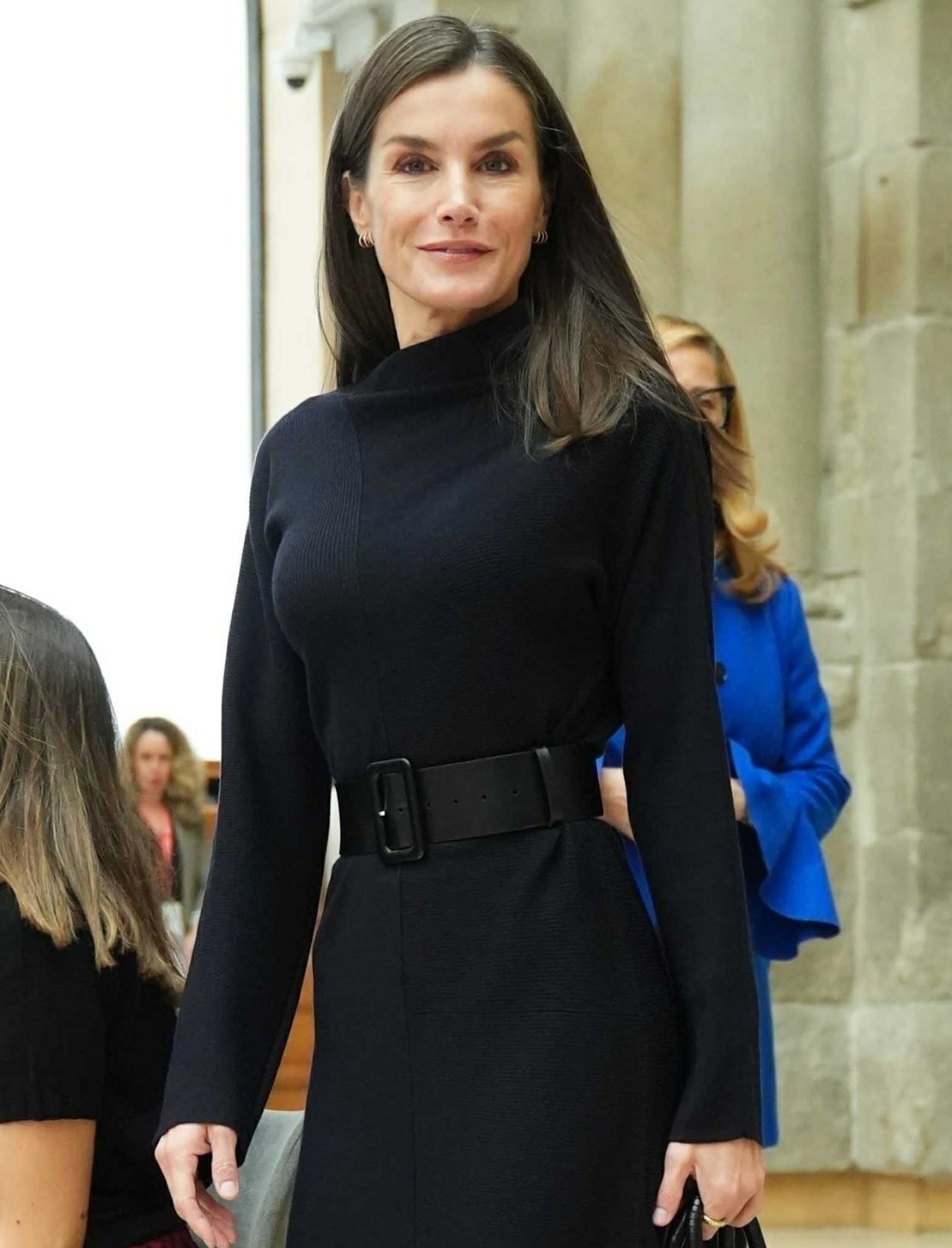
- Madrid, SPAIN – Queen Letizia of Spain attends the Commemoration event of the 25th Anniversary of the Aequitas Foundation at Prado Museum. Pictured: Queen Letizia Ortiz BACKGRID USA 14 NOVEMBER 2024 USA: +1 310 798 9111 / usasales@backgrid.com UK: +44 208 344 2007 / uksales@backgrid.com *UK Clients – Pictures Containing Children Please Pixelate Face Prior To Publication*
- Madrid, SPAIN – Queen Letizia of Spain attends the Commemoration event of the 25th Anniversary of the Aequitas Foundation at Prado Museum. Pictured: Queen Letizia Ortiz BACKGRID USA 14 NOVEMBER 2024 USA: +1 310 798 9111 / usasales@backgrid.com UK: +44 208 344 2007 / uksales@backgrid.com *UK Clients – Pictures Containing Children Please Pixelate Face Prior To Publication*


Wonder who footed the massive bill. If it was the taxpayers, I bet they aren’t happy with the monarchy.
I read a royalty blog (for the jewelry – it’s called The Court Jeweller), and their piece said that the portraits were commissioned by the Bank of Spain.
I read that too and wondered if that was why there are two separate photos – the space for hanging them had clearly been pre determined. Who remembers when Annie asked QE2 to take her crown off and got a very short retort from HM?
Maybe Annie doesn’t like her royal subjects to look too regal.
I read they are the new official state portraits, hence the king and queen have a portrait each, not one together. Apparently the look was “old oil portrait” with the bad lighting.
I think they both looked good, Letizia certainly looks younger than Kate in her PoW photo and portrait, where she was hardly recognisable.
Taxpayers ppay Bank of Spain, so yes we’re not happy about this mess.
I actually love the pictures of Letizia. Yes the dress and necklace are dramatic but she’s the Queen of Spain, she can be a little dramatic.
I would love the picture of Felipe but it is just too dark. Annie what were you doing?!!?
she looks amazing and that dress is absolutely incredible.
She looks great! I heard there are two separate portraits because it’s supposed to be a call back to an old-school diptych.
She looks like a MFing QUEEN. He, on the other hand, looks terrible.
My theory is that Annie is trying to dispel the racist rumors. “See, it’s not just black people! I can’t properly light people of ALL races!!”
And there’s a chandelier right next to Felipe’s head! Turn it on, Annie! Has she developed an eyesight problem as she aged? Like, who was it, Van Gogh?
Rare miss by the spainsh royal. The Spain is going through so much with the flood and economy. How out of touch these people to pose like this. I thought leti was savvy in terms of pr and along with ex king is again investigated for tax fraud.
I’m not Spanish and yet I thought the same. So soon after the muddy pelting and even more floods after that catastrophy, it’s insensitive nd awful timing.
The Bank of Spain commissioned the portraits.
But aren’t royals out of touch by definition? Being royal in itself means being above other people. I feel like either we accept royals as being crownwearing rich people that live in huge palaces, or we just get rid of them alltogethet. What does a down to earth royal look like?
I agree. These are pretty much standard royal portraits–in the palace, with all the art & historical furniture, gowned & diamonded to the max (gah, making up words now, but that necklace is something else!).
🎯
The photos were shot before the flood in Valencia and not paid by the taxpayers.
Felipe and Letizia had been to Valencia recently for the second time and were greeted warmly, no mud slingers. They took a lot of time to talk to people and, as far as I heard, their warmth and attention was very appreciated.
Spain’s GDP in growing by 3’1% in 2024, highest rate among big Western economies.
Wow Felipe just disappears into the background… very bad lighting indeed.
They should ask for their money back. Both are bad but his is atrocious.
Letizia seems photoshoped. But the king looks natural. Letizia never used to show her white hair. But they are cleary visible (they may be light brown hair became white after adding filters). Then the edges around her hair looks soft and neat. This is not natural.
Natural light is coming from her back. So her face would naturally have the shadow. But it is bright. If they used soft light, then the glossy floor must reflect it. This is completely photoshoped.
Letizia started showing her grey hair during the pandemic. I remember bc my then bf and I got set apart during lockdowns. The first time that I refused to facetime bc I had spotted a few greys and was undecided about using box coloring, he was like ‘Oh, never mind, I’m sure you look beautiful… Besides, Queen Letizia is in your same situation, and she’s not afraid of showing her greys to the king and the world’.
I dislike his more largely for the lighting/how flat it looks and also there’s a weird angle . If I paid for a photoshoot and got this back I would not be happy.
Hers don’t look AS bad to me but I’m very underwhelmed. If you told me the full length one was a promo shot for something trashy on netflix I’d believe you.
Plus is NOW really the time to release these? Way to look out of touch with what your people are suffering. It has a whiff of ‘this will cheer the peasants up’.
I think if you line them up with Felipe’s portrait on the left and Letizia’s portrait on the right, it will look like they were photographed together and the whole picture sliced up the middle? Look how the chair lines up in the bottom right of Felipe’s pic and the bottom left of Letizia’s pic. They both look good, but Felipe’s especially is way too dark.
The timing of this badly lit 😱 uber expensive propaganda…is British Royalty style bad….does ANYONE read ANY rooms…ANYMORE?
Right?? Last thing I remember is that they were pelted with mud by survivors of the disasterous floods. This their next move?? It’s Peg and Keen level tonedeaf. Plus the pictures are not good at all. Like they are trying to save on the electricity bill of the palace.
The photos were commissioned by the Bank of Spain and taken in February. I have no idea why they decided to release them now.
The portraits were taken back in February, 2024, and were commissioned by The Bank of Spain to celebrate Philippe’s 10th anniversary.
If you put the two portraits side by side, they line up into one portrait, and the lighting makes sense.
I happen to think these portraits are gorgeous. MUCH better than the crap that Chuck and Cams sent out a few months ago.
As far as the timing of releasing the photos right after the mud slinging event, yeah. Not great.
I agree. I love them. Leticia looks amazing. Felipe…regal and handsome. Timing is horrible after the floods. Should have waited until the end of the year,
Annie is never escaping those rumors, though.
I love the photos. Felipe’s photo >>>>>Charles blood photo.
Oh, Annie.
And poor Felipe.
At least Leti looks somewhat better lit than Felipe, but that’s not saying much. It’s so sad that Vogue/Condé Nast aren’t using a younger, preferably Spanish photographer who knows their job, who knows how to properly stage a set. There are so many rooms and halls in El Pardo that are either more iconic or more intimate than Salón de Gasparini. And SdG looks nice when properly lit.
https://www.patrimonionacional.es/visita/palacio-real-de-madrid/espacios/salon-de-gasparini
It’s a bit strange they didn’t pose together but I’m sure Vogue/AL had their reasons.
Thanks so much for those pictures, Nanea. Some of those rooms are stunningly beautiful.
Lighting issues and feelings about royalty aside, that Filipe is a tall drink of water.
He really is. He’s what I would picture the king looking like reading fairy tales growing up. Now that I am a grown up myself, I just want to congratulate Leitzia.
Perhaps it is because the Spanish people have the right sense to understand monarchy shouldn’t exist.
Mostly I’d just like people to start using some different photographers. Bc Annie is not it for me. I get that she’s revered but nah. Although I do enjoy the telenovela vibes the lighting is meh. Same as it was for zendaya and many others. Beautiful subjects that are not being served well by her photography imo.
The Portraits were commissioned by the Bank of Spain. They’re were not for their personal collection. Btw, Annie Leibovitz needs to retire and letter the younger generation get these gigs. She’s not a good photographer.
I don’t mind the lighting, gives a moody vibe. But given the moody vibe the Spanish people have been giving these two especially after the floods in the south, the timing is bad.
But the King and queen may have had little to do with the timing given the photos were taken in February – there may well be a reason for the timing, but whatever it is unlikely to be the fault of P&L
Jc, she looks like Albert Grimaldi’s twin with that expression in the photo with the belted black knit dress.
There is a third portrait of the Governor of the Bank of Spain. I agree that Letizia looks like the heroine of a romance novel. Is Leibovitz just over rated? Seems like F and L were just caught in a bad timeline since the portraits were not their own commission. I understand that the monarchy itself is not popular in Spain. I’ve always read that Letizia is disliked, but don’t know the reason. Seems that they are both doing the best they can, and their daughter looks like she will be competent in her role if she gets to be the Queen someday.
I agree about the darkness of Felipe’s lighting, and there’s also too much ceiling with barely any space at both of their feet.
I love these, they are moody and very Spanish imo. I also think they are both gorgeous!