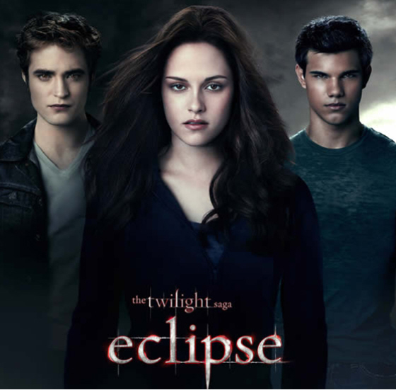
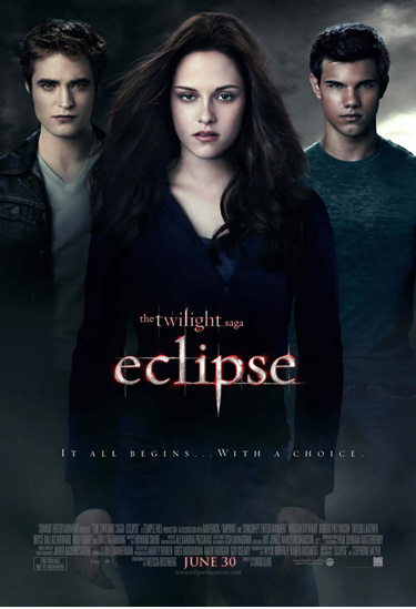
I mentioned this in the links yesterday, but the situation is becoming so funny, I just had to write it up. So this is the new poster for Eclipse, the third Twihard extravaganza. It is not getting very good reviews, to say the least. I kind of see the point in getting so worked up over how bad it is – I mean, this is a poster for people who put style over substance and story (cough cough Twihards cough). They just want a good poster of Sparkles looking brooding and sexy and dashing, not squished, constipated, weepy, fey and grey. Let the boy sparkle, for goodness sake! IT’S HIS NAME. Agent Bedhead refers to the poster as a “limp dick” effort, and Pajiba compiled the epic reviews thus far. Here’s a taste:
Kyle Buchanan at Movieline:
New Eclipse Poster Reveals Most Awkward Threesome Ever […] Did Taylor Lautner just get back from a Caribbean vacation or something? Dude is like John Boehner-level tan.Russ Fischer at /Film:
Apparently, this is a movie about gloomy, intense stares and making choices. And I thought the issue of pregnancy wasn’t going to crop up until the final chapter, Breaking Dawn.Col. Hans Longshanks at Screen Junkies:
The new one-sheet for Twilight: Eclipse just hit and the cast couldn’t look more apathetic about it. I believe the point here is to convey that the actors Twihards cream over will also be in this film. The marketing gurus probably figured they could have given the characters assh-les for eyes and it wouldn’t make a difference at the box office.Devin Faraci at CHUD.com:
What is Twilight Saga: Eclipse about? Don’t look to this poster for any clues – it seems to be about a trio of people hanging out in the fog. I don’t know that this is the most generic, uninteresting, unevocative poster of all time, but it’s surely close. Like, right in the top three.Mark at I Watch Stuff:
Which male dead-eyed stare will the female vacant stare choose??? I can’t wait! This is the best Comatose Sadie Hawkins Day ever! Yay!Mike Sampson at JoBlo.com:
As you might imagine it features three heavily Photoshopped stars just standing around. Looking at you. Gazing into your soul. It is quite possibly one of the worst posters I have ever seen. But that will not stop you from squealing when you see it (whether that is in disgust or excitement remains up to you).Ray DeRousse at Obsessed with Film:
The newest poster for the upcoming Eclipse film shows almost no imagination, emotion, energy, or thought. The poster, like the others in the series, simply has some or all of the characters standing there, expressionless, as they stare back at the camera. How creative! The team behind this masterpiece clearly spent many hours rearranging photographs of the leads in Photoshop to come up with such a bold visual statement. They have a long career ahead of them advertising coffins.
This sh-t is hilarious. It’s like a national tragedy: “Today we are all c-ckblocked Twihards.” Sidenote: I would love to see that poster. I mean, sure, the poster sucks. But people are taking it to the next f-cking level with their disappointment. God, I love Twihards. And I especially love Twihards masking as adult entertainment journalists who get psychically c-ckblocked by a bad poster. Hilarity!
By the way, this was the Eclipse teaser poster… like, so much better! They should have just stayed with this sparkly bitch:
Eclipse posters courtesy of Agent Bedhead.


I’m so glad I’ve never seen any of these pathetic movies. I still think Pattinson looks like he has Down Syndrome.
I just love that you call him Sparkly.
What a horrendous actor….
Kirsten Stewart eyes are hypnotizing (not in a good way). If I stare at her eyes for too long I seriously feel like I am falling asleep. That girl has boredom written all over her face and those dead eyes of hers.
Wow- harsh Jillian.
Did anyone used to squish the faces of their Barbie/Ken dolls? Cuz that’s what Taylor-whats-his-face-with-the-tan looks like to me. A squished face Malibu Ken doll I dropped in vaseline.
And chickie has dead eyes. Like Lindsay Lohan dead eyes.
As for Sparkles… Well, he could use some Dulcolax. “It doesn’t MAKE you go. It makes going EASIER.”
K.Stew looks like Lieghton Meester in that picture. And I KNOW I spelled it wrong!
I think Robert Pattinson is pretty good looking…when he’s NOT playing Sparkles. I don’t like the dead look.
I don’t even care aboout these movies, but DAMN. That is one bad poster.
Is that seriously the best shot of Stewart they had? Even for someone (rightly) accused of being wooden and expressionless…. Now she looks like a wooden and expressionless girl who has just been heavily sedated and then hit in the back of the head with a blunt object.
Taylor has a great tan!
Zelda – more like she hit a blunt and it went straight to the head and now shes heavily sedated
It is so over-photoshopped that it looks pathetic.
lmao @ OMJ! I think of that every damn time I see Lautner’s face! Drives me nuts. I almost wonder how he can see with such a beetled browline.
When I saw RPattz on that Harry Potter movie, I thought, why in hell did they use a 25-year-old actor for this? And he looked younger than he does now. I think it’s the Cro-Magnon brow.
I must base my visual assessment of men through their browline. I wonder what that says about me … lol
What’s wrong with it? Movie posters should hint at the storyline or action in the movie, and since Eclipse has neither of these, I find it a very appropriate poster. Also, the poster clearly displays the acting ranges of the leads so no one should be surprised that they paid $10 for a two-hour vacant stare contest.
At least Pattinson looks like he took a bath… or maybe they photoshopped him a clean look…
gg:
I’ve often felt the same way about Lautner. Too cavemanish (is that a word) for my liking…:)
Wow, those three are just hideous. And R.Pattz look horrible from the front, like…worse than ususal. And the other boy has a scrunched-in face like an inbred dog.
@Dingles
ahahahahahahahhaha
I still find Pattinson hot,though. I’d find a fun way to get that vacant stare off his face, given the opportunity…
It looks like something found on Deviant Art.
LMAO at Dingles! But, to be fair, I think it has layers. Like, it shows the storylines of the movie, true. But the expressions on the actors’ faces show what the average, non-Twihard will look like after seeing this movie. You know, boredom mixed with a little “this hurt my soul” tears.
change her hair to blond, give Lautner a ‘fro and then change the title to “The Mod Squad”.
Jesus, Jillian…nasty much?
The books were such vanilla crap so I wont be seeing the movie.
I never even saw one movie although I may go to see the last one simply because I want to see how they romantically make the vampire bite the umbilical cord and rip her stomach open with his teeth. I will go just so I can see the little girls faces.
Thanks for the laugh Kaiser. Mark at I Watch Stuff made me laugh the hardest. I’ll say one thing for the whole Twilight thing – love it or hate it, it’s been the source of some pretty hilarious internet snark.