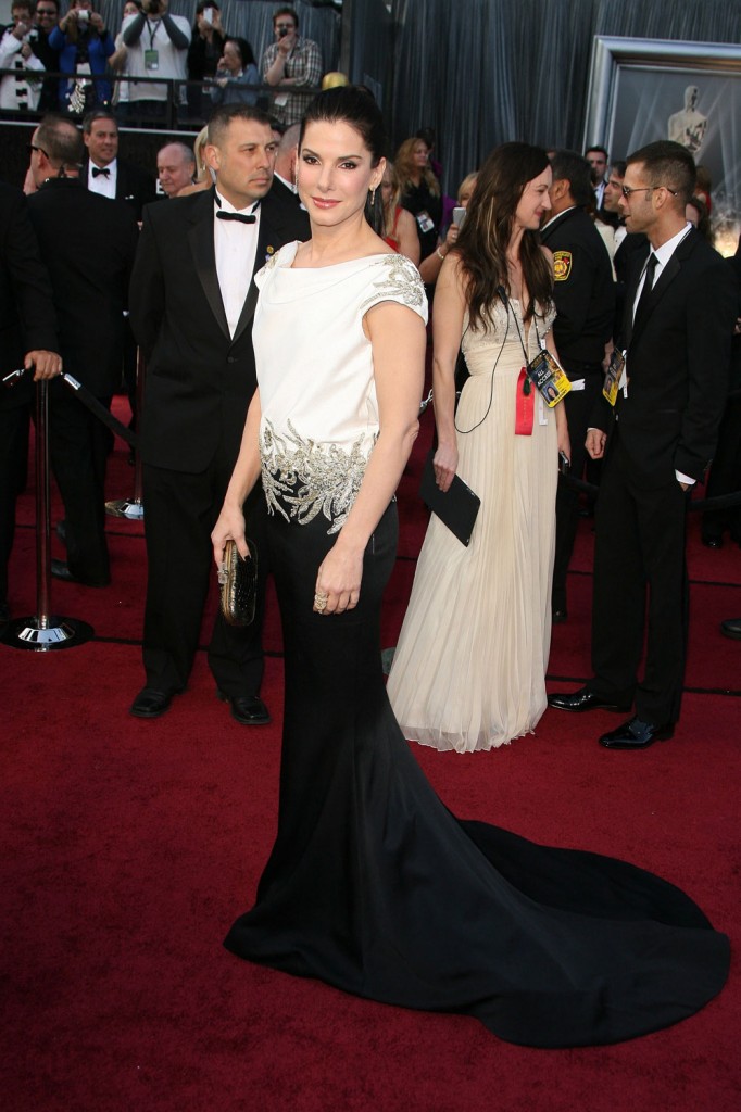
I’m glad that so few women were wearing Marchesa last night, although I would have wished Marchesa on Stacy Keibler, you know? Her bronze shiny number was Marchesa of course and Kaiser will be covering that in its full glory soon. Also in Marchesa was poor Sandra Bullock, in a black and white number that looks like two pieces from different dresses stuck together with some silver coral duct tape. Sandra was stunning in Marchesa in 2010 when she won the Best Actress Oscar, but the designer let her down this time. This dress not pretty, it’s not particularly flattering and it’s not tailored for her at all. It just kind of hung there like a limp excuse for a fancy dress. It had a draped back and a fishtail too. It was like a bunch of different ideas for a dress jammed together into one confusing whole.
Plus, I know I’m going to get heat for this because even when things look obvious to me others will disagree, but her face looked very frozen to me. Maybe it was partially the effect of her ponytail, but Sandra looked pulled tight. It’s probably just some fillers and maybe light Botox. At one point when she was talking to ABC’s Louise Rowe I noticed that she was able to crinkle her forehead, though. She told Louise that the dress was her first choice, one she should have rethought in my opinion. “Usually you find one [gown] and you make your way to others and you come back to your original choice.”
When she was presenting the award for Best Foreign Language film, which went to Iran’s A Separation, Sandra claimed she would read the nominees in Chinese, but she actually spoke German. Her late mother was German. It was one of several presenting gags that fell flat last night.
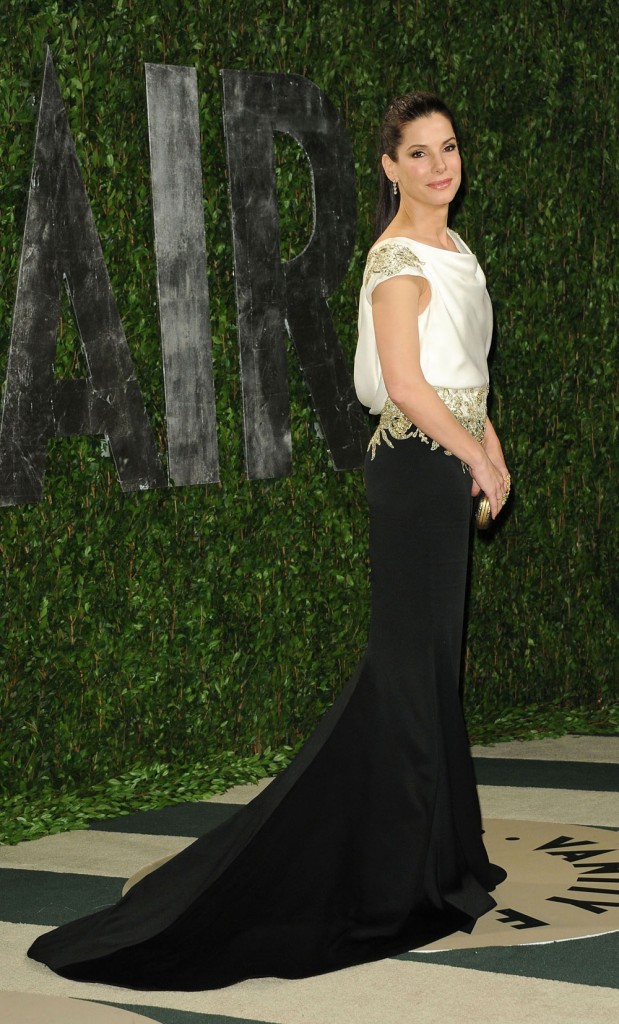
I’ll say something nice – her dress looked better at the VF Oscar Party. Maybe it needs to be lit correctly.
Photo credit: Fayes Vision/WENN.com and Fame Flynet

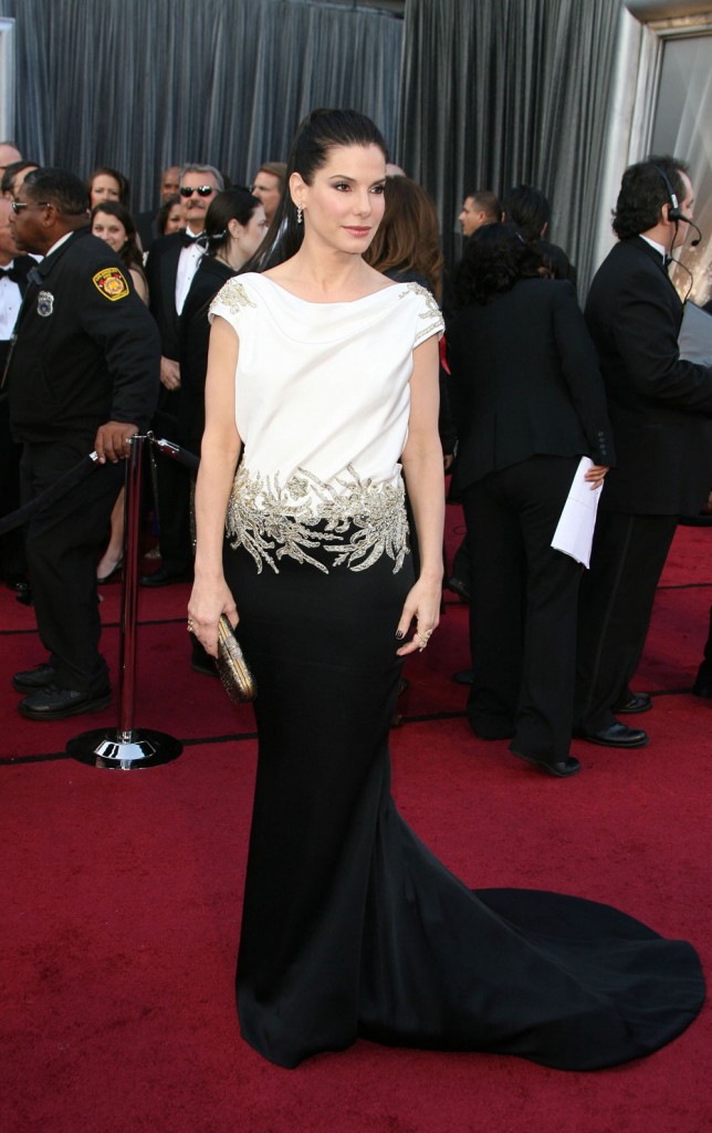
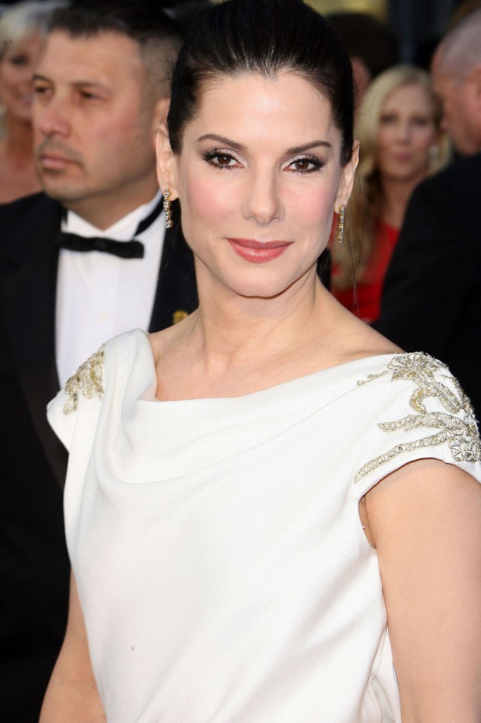
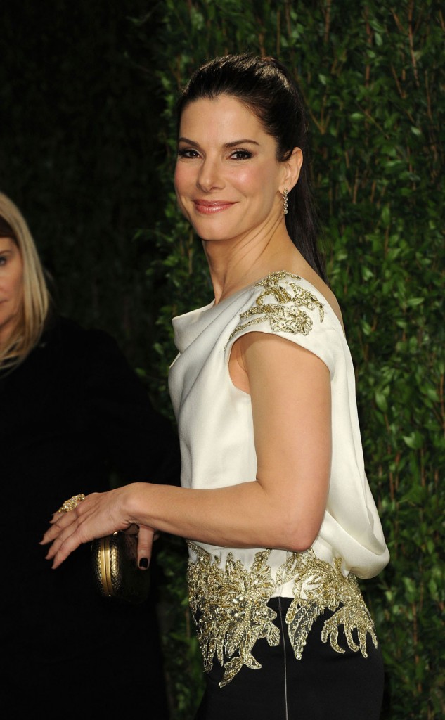
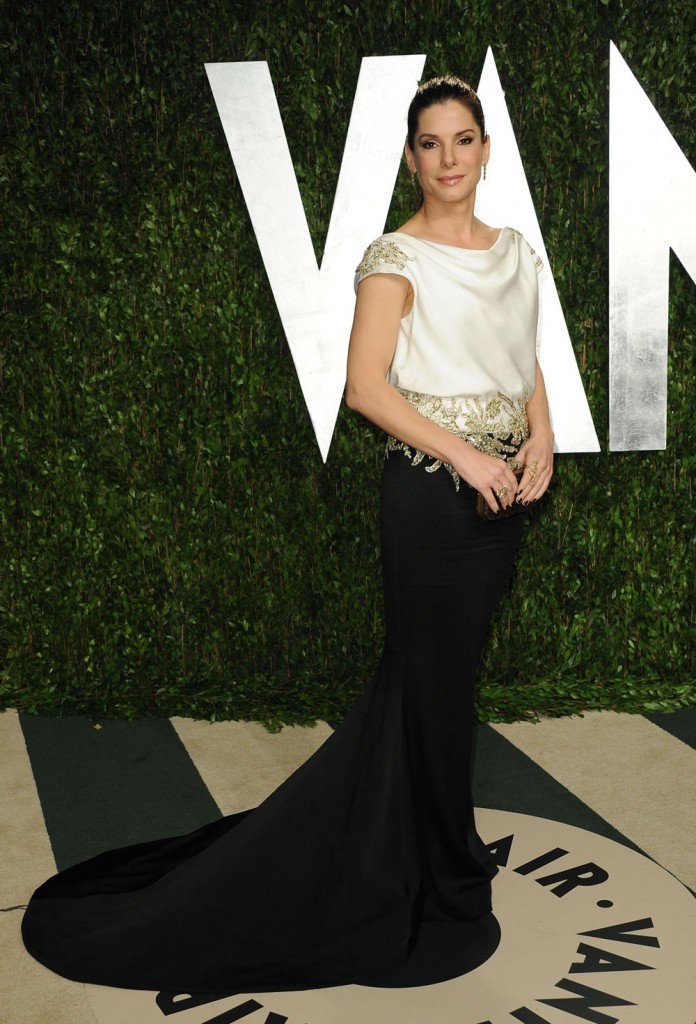
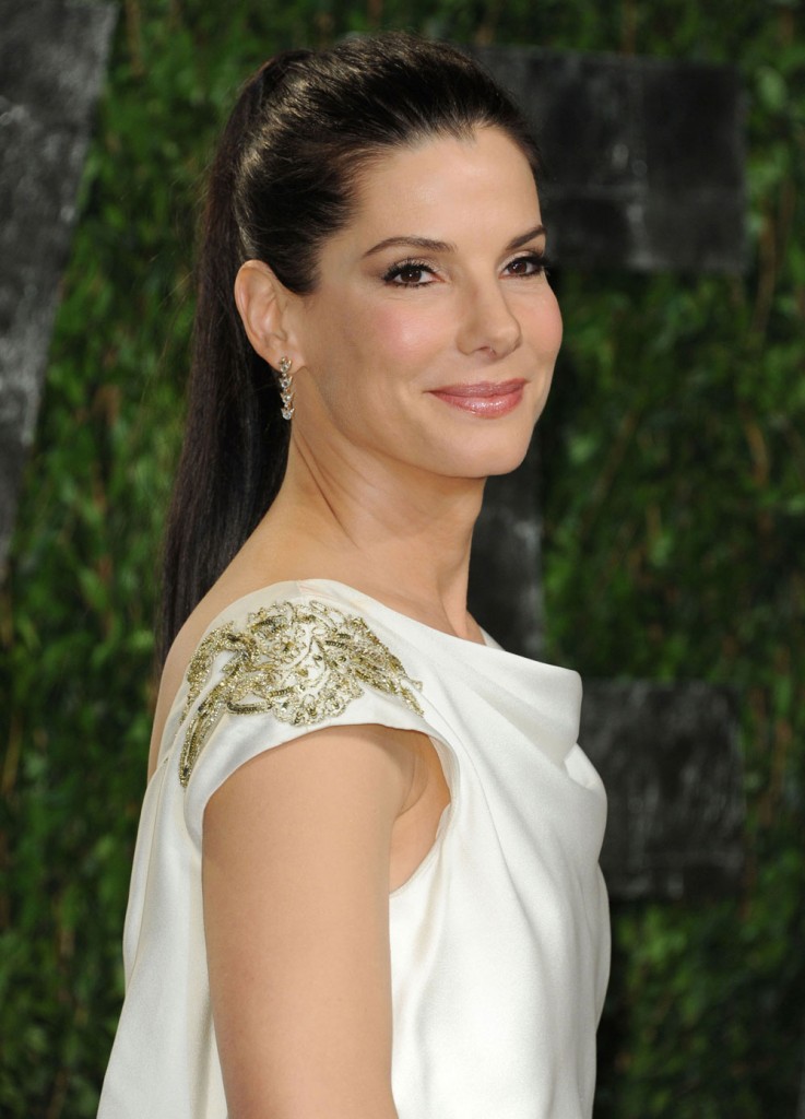
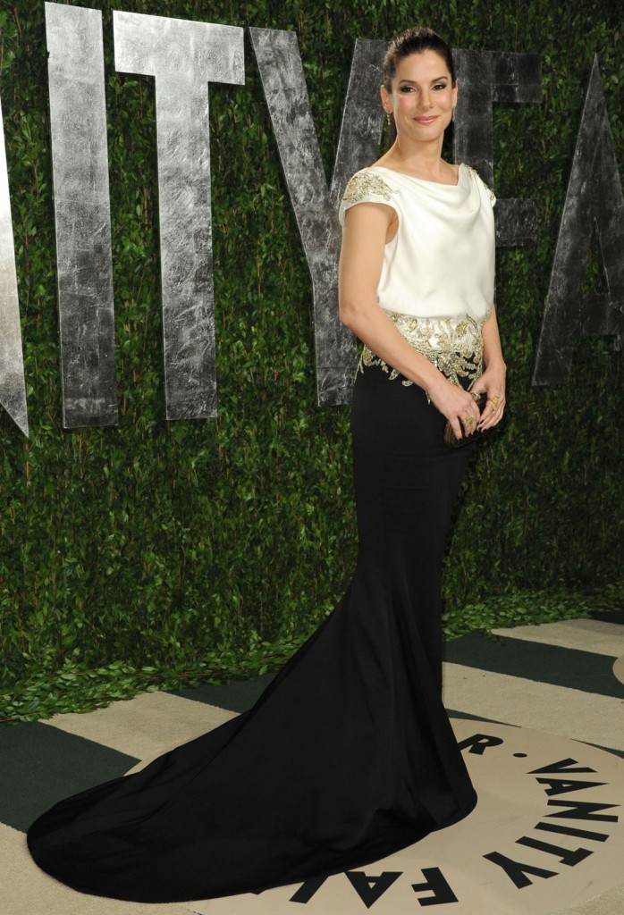


i’m not sure what this dress was going for, but the top looked like an over-sized white t-shirt. ugh.
LOL! It DOES look like an oversized T-shirt.
A DROOPY oversized tshirt.
I would have liked the dress a lot more without the fishtail and removing the embellishments on the shoulders. Other than that, I found it pretty and beautifully modest.
At least she didn’t have her tits hanging out nor a split up almost to her nether region.
And I’m just a wee burnt out seeing constant strapless numbers every time there’s an event.
Sandra’s dress was a nice change of pace.
I’m probably the only one but I like.
There’s me, too! I thought it was cool to have such sumptuous fabric, fishtail and beading appliqué, and then a slight casual feel in the top.
I get tired of the standard ‘swimsuit fit’ in the bodice.
Must still be a hard event for her, remembering a wonderful night in her career and personal life, right before it all blew up a week later.
Her dress is fabulous. Love the draping in the back. Beautiful and so different from all the rest.
I’m torn. I do like it, and I love the neckline, but it does kind of look like a sack. Its a little too baggy at the waist.
The silver stuff looks like cheap applique work. If the accents had been in black to match the skirt, I might have liked it; if the draping had been looser, it might have been elegant, but the material’s too thick. It just looks like it’s too big up top.
But every time I see Sandra Bullock on the red carpet, all I can think is that she isn’t made for glamour. I mean that nicely. Some women look stunning in no makeup, with jeans and a t-shirt, and just seem awkward when they try to dress it up. She’s one of them. She always looks like a kid playing in mum’s makeup kit.
i like it, but I agree, it definitely needed some editing. her makeup is gorge
Makeup is great, not in love with the dress.
Damn. This is bad. I want Sandra to look stunning cause I love her, but this is just all wrong. The fitting of the dress, but mostly her face. What is she doing to herself? She looks so stiff and matronly, that make-up is way too heavy for her.
I agree, & her face definitely looks like she’s been jackin’ with it (which is not good). I love Sandra, & hope she gets a better stylist for next year’s show.
Yes, her eyes are more curved upwards like (ugh) Kate Gosselin after her botox. Dress looks beautiful from the side, but in the view from the front, the silver embellishment makes her waist look wider than it is, there is no indent there, she is straight up and down. The top portion would have been better fitted, she has the upper body to pull that off.
Stunningly awful
The top should have been either more baggy or more fitted. It just looks wrong here. I would love to see the dress from the back. Sandra looks a bit dead in the eyes here – she looks like she is phoning it in. And I LIKE her as much as I don’t like Goop – but compare the two. Goop glowed, Sandra looked like she just wanted to disappear. Her makeup needed to be more striking and that severe hair did her facial features no favours.
I can’t believe that of all the dresses that were available to her, this is what she picked as a 1st choice. I was ready to bet that something happened to her first choice dress at the last minute and she got stuck with this one, and not enough time to have it tailored.
When i saw her i was so disappointed, i don’t hate the dress but i hate it on her! she has a rocking body and i think that gown is hiding all her strong features and the top part especially looks sloppy and cheap..
it’s hideous
Meh
She looks happy. As in, genuinely happy.
I think she looks pained with a fake politician’s smile plastered on her face.
Don’t like the dress at all, and the bottom eyeliner color looks odd.
Not at all her best look.
Ugly dress aside, I thought her face looked jacked almost beyond recognition. I couldn’t believe it. Too bad because she is naturally so pretty. Last night there was nothing natural looking about her.
Sandra is so heavily botoxed, has anyone else noticed?
There has been some recent work for sure- she had no animation to her face, and it just looked “pulled back” and the pony tail didn’t help.
I agree – in the photos from the VF party, the dress looks better. You can see what they were trying for – the drape at the back is nice. I don’t understand the two-tone. If it was a single color, the silver beading might not look so tacked on.
Her make-up & hairstyle made her look very severe. Could be the old plastic surgery and botchulism as well.
I will give her points for age-appropriateness, but she was almost dressed too old.
I understand the back draping, but it doesn’t fit in the front and the waist.
The smiling photos are old school Sandra. She needs to do that more often as she looks too severe otherwise.
LOVE her, HATE the dress.
Is it just me, or do her eyes convey sadness? I can’t be bothered to comment on the dress because I just want to give her a hug. I hope I’m wrong though.
I can’t imagine what types of triggers the Oscars would stirr up for her.
She looked beautiful, but like you, wanted to give her a hug.
I bet it truly will be a few more years before she can really enjoy the Oscars again.
I was thinking that same thing. Her eyes are really sad.
worst dressed of the night.
Did anyone see her crying when Meryl won? It was so sweet!
Since the whole JJ thing, her eyes have never looked the same to me. It’s so sad, but I really think something inside of her just died. If only you could prosecute someone for that type of betrayal.
She has had some work done, you can tell it around the eyes. Her forehead is super smooth, so she’s been hitting the botox too. Her dress, I’m not feeling it. It looks like a remake of an 80’s dress.
Those photos actually make the dress look better than it is. It was even worse when she walked out and was standing at the podium. The way the top fit and the sleves were somakward. She looked like a linebacker.
I wish it was more fitted, then I’d have liked it more. She’s got a great figure – show it off!
I love her, but everything’s looking a bit…tight. No more whatever she’s doing.
Love the back of the dress the front was too oversize it should have been fitted.
I don’t know if this makes sense, but I think that’s the kind of dress that looks much better in person than in photos. It looks like really beautiful silk, which would glow, and move really well. Photos can’t capture that. And while it looks bad as an all-over shot, I think it probably looks lovely close-to, because the focus is different; her back looks good, her arms and shoulders, and the skirt would be a lot less obviously a mismatch looking down at it. It would look a subtle contrast. I often get that feeling when I’ve seen people look really great in something at a party or event, that looks nothing much at all when the photos are posted up.
I hated the gold detail. It looked cheap plus it was putting so much focus on her stomach and not in a good way.
Ok, overall I think it works. But Marchesa always looks a little cheap to me. She really gets a lot of big names to wear her designs though *puzzled*.
I really like the idea of this dress. I’ll bet in sketches it was breathtaking. Seems to me that the failure is in the execution. The tailoring is either bad or non-existent so that’s poor execution of the designer’s side. Sandra’s severely pulled back hair is doing her no favors so that part is Sandra’s failure. I do think that with the proper tailoring and a hairstyle that doesn’t look like it’s painful, the dress would’ve been beauiful.
I think its very classy – maybe Sandra should take up dressing others at award events. My opinion.
I saw similar dress on a mother of the bride a few weeks ago. I would have liked to see her in another styled dress. She is still young and beautiful, wear something more youthful
Sandra looked lovely, happy, and relaxed. Good for her!
The hair doesn’t seem to go with the dress. Long and loose would have been better.
I agree – I thought her face looked tight, too. I don’t think it was only the ponytail either. I also did not care for the dress. Didn’t like the gold filigree stuff around the hips.
I liked it. I think I would have made it a column but other than that…I can’t believe I like a Marchesa dress.
marchesa looks like cheap pageant wear. can’t make a silk purse out of a sow’s ear; i don’t care who georgina is married to. (shudder to think of anyone loving up a weinstein)
and what is with wearing a ponytail to the oscars? couldn’t loop the end up and pretend to care? even a braid would have been some sort of effort.
yeah, she’s wrecking her face. shame.
It looks like a Grandma prom dress. It doesn’t fit on top and makes her look boxy, which she isn’t.
Total fail on the part of the dress, sorry to say.
She looks like Michael Jackson.
Terrible and she is WAY to overbotoxed. The overbotox combined with the ponytail made her look like an alien.
Sandra, Botox is not your friend.
I didn’t like this dress at all. Awful and not flattering. I also thought her face looked weird, like tweaked too tight weird.
The dress is pretty but the upper part was one size to big on her, it was too loose.
why is no one talking about her obvious brow lift and/or botox??
she looks so pulled! it’s aging her.
They did a pull away to her when the winners of a documentary award were speaking – the one about the plastic surgeon working in Pakistan doing awesome work on helping women who have been disfigured by acid burns. They panned to Sandy and she looked like a wax figure she has had so much work done. It put it completely into perspective for me.
Love Sandra, but way too OVER-filled. We’re talking Restylane, Radiesse, etc. The Botox only holds the lines back. The chipmunk cheek look is from the filler. Just a bit too much, but otherwise, some appropriate volume is needed for celebs over 40. The dress? Definitely matronly.
I liked the dress
I liked this dress, but I am seeing that it looked good until is either slipped down or was pulled down. Like, the white seems like it should be a bit “fuller” or looser, then where the embellishment is it cinches, and then the black is all fitted. And it sometimes looked like that, but other times it just looked stretched out. The overall idea of the dress I really love, but it just doesn’t seem like a dress that can be moved too much or else it just flattens out and is no longer flattering. From straight-on, even when it wasn’t at its best, it was still nice, though.
Ugggh. Hated the top looking from the front. Loved it from the back.
She should have walked in backwards.
I love love love Sandy… but the dress isn’t flattering, and she’s so pretty, and normally has very good taste in fashions. Sorry, this one missed.
Glad I’m not the only one who noticed how “taut” Sandra’s face is looking these days. She’s got total Joan Rivers Syndrome going on with her eyes. I had respect for her for not succumbing to the Hollywood BS, but I guess no one is exempt. Maybe it’s just a tight ponytail, but my instincts tell me it’s a whole lot more…too bad.
It feels a bit somber on her.