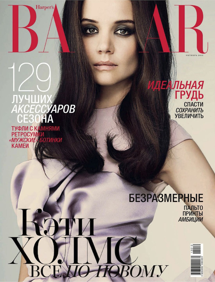
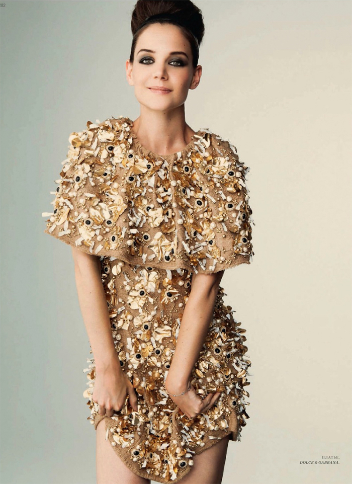
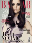
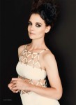
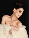
Katie Holmes covers the October issue of Harper’s Bazaar Russia, and Us Weekly is hilariously calling this Katie Holmes v. 3.0. Honestly? The photoshoot inside the magazine is very pretty, but the cover is awful. Katie looks very photoshopped here and her cheeks look very hollow. Plus, her nose looks kind of different than usual, and that hair looks like it was painted into the picture. Why did they do this to her and make it the cover shot? She looks much better in the below picture, right? Cute Joey Potter is almost back!
Otherwise, the clothes are cute, and Katie looks like she’s getting back to her old self again. Katie’s been laying low since her NYFW debut of the slightly improved Holmes & Yang line, but there’s been a bit of amusing news about her concerning an advance screening invite to The Master. The Weinstein Co. tried to summon her for their own publicity purposes, and Katie politely declined. Can you blame her?
Glowing reviews and powerhouse performances from Joaquin Phoenix, Philip Seymour Hoffman and Amy Adams have made Paul Thomas Anderson’s The Master a hot ticket among actors and industry operatives — with the exception of Tom Cruise’s ex-wife Katie Holmes.
Celebrity spotters tell us that Andrew Garfield and Emma Stone, Jason Sudeikis, Steve Martin, Sam Rockwell, and filmmakers Spike Jonze and Quentin Tarantino are among the famous faces who’ve caught the movie during its limited release in New York and Los Angeles. Susan Sarandon was also in the crowd at the film’s 70-millimeter screening at the Ziegfeld Theater on Sept. 11.On Sept. 16, “One Tree Hill” actress Sophia Bush tweeted: “If you don’t go see The Master, there is officially no chance we’ll ever [be] friends. What. A. Movie! Brilliant performances.”
That same day, Hello I Must Be Going cast member Melanie Lynskey tweeted “Joaquin Phoenix’s performance in The Master makes me want to quit acting, keep acting, destroy things, kiss his face, cry for a day.”
One interesting footnote to the high celebrity demand to see The Master: A source close to the Sept. 11 Ziegfeld screening says Katie Holmes was invited to screening but sent her regrets. Her spokeswoman Leslie Sloane did not respond to Movieline’s request for comment on speculation that Holmes did not attend because her appearance would have created a media feeding frenzy that could have riled her ex-husband, Scientologist actor Tom Cruise.
[From Movieline]
I think Katie played it safe by not attending The Master because you know the media would have been all over that. Beyond the fact that Tom might have thrown a hissy fit about her attendance, I think it’s just a case of “too soon” where Katie’s enjoyment of the movie would be concerned. I mean, she just checked out of a six-year nightmare during which she was securely under the thumb of the unhinged, lift-wearing midget himself. Then there was the whole matter of seeing her face on a Vanity Fair cover that contained a detailed account of Tom’s wife audition process. Maybe a few years down the road, Katie will be able to Netflix The Master, but right now? Give the girl a break.
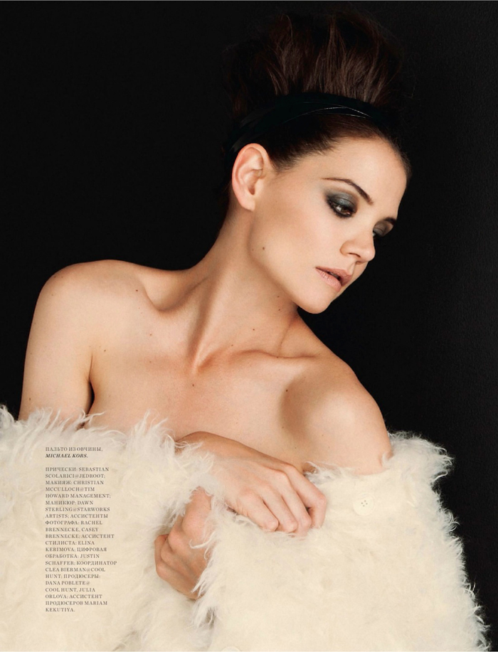
Now let’s get back to this photoshoot. Katie looks adventurous and happy in some of these photos. I also love those smoky eyes and wish I could wear that kind of makeup without feeling overdone.
Photos courtesy of Harper’s Bazaar Russia

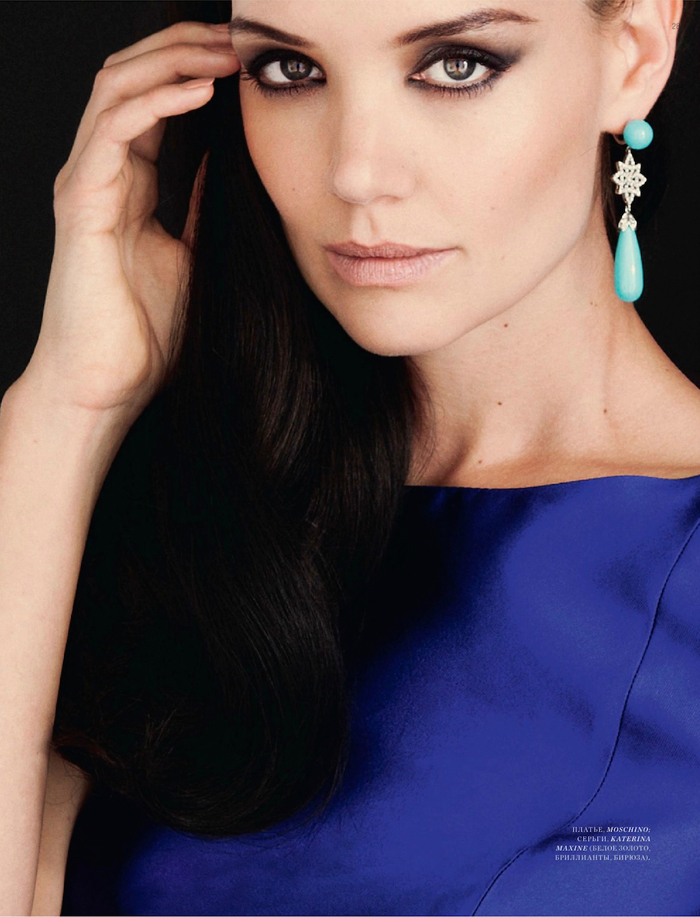

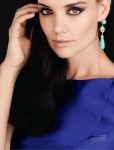


yes, the cover is very “Disturbing Behavior” but I think she looks good in all the other pictures, blue is a good color for her..
The main problem with the cover is too much smoky eye. The ‘shopping doesn’t help, but the problem is they just went way overboard on the black eyeshadow. It’s not her look – and really anyone would look like a zombie with that much black eyeshadow.
Wow, she really looks gorgeous with her hair up. It really accentuates her face.
I agree, the cover is awful, but the last two pictures are beautiful.
Are those freckles? Why can’t they photoshop those out?
Her eyes have always been her best feature. Good that they are coming alive now.
photoshop has gone too far. there is nothing wrong with freckles ffs.
Freckles are pretty and youthful.
I think it’s great they weren’t shopped out!!! She’s a real person
Lol it’s not the 19th century. (Freckles! Gasp!) 😀
Katie Holmes is really beautiful. I love this shoot. I have to agree about the cover. I thought it was Mila Kunis at first glance.
I’m with everyone else. The cover make her look like some starving refugee from one of those warring countries… ^^”
But beautiful in the others, of course.
She looks gorgeous, but very Eastern European in these shots. They have a slightly different idea of styling and beauty than the West. We tend to like everyone more “natural”. I noticed this when I was in Russia for a month.
Meh. She looks like she needed a good sleep in the first picture.
I love her hair up! She looks stunning. Her makeup is great too.
As for The Master – ugh can you imagine the panic attacks that could induce in someone who just escaped? No way would I go.
I never really pictured her as a model, but she looks good in these shots.
That last photo was gorgeous.
Beautiful woman! I agree the cover is not the best. I wish she do more movies or tv shows. She might not be the most talented actress but she is nice watching.
*tiny voice* I don’t thinks she looks bad on the cover. I kind of like that Eastern European look for her. (Of course I get that she’s photoshopped but I think they just hollowed out her cheeks and exaggerated her eyes a little. She seems recognizable to me. I do wonder about the hair, though, because hers never looks shiny and full like that.)
Love the other pics, too.
She looks a bit like Cheryl Cole here.
Also, I’m quite familiar with Harper’s, but BA__AR? Do they always do this with their covers?
That was the first thing I noticed. Formatting fail.
beautiful makeup and love the updo
Why did they cut her head??
I do not understand what the fascination is with her. To me, her eyes look completely vacant. There is nothing behind them. Next…
Wow, aside from the cover all the other pictures are fabulous!!! She’s really beautiful, oh and that where she smiles is my favourite of course 🙂
Chapstick, Katie?
WORD!
In the top foto she has so much forehead it wouldn’t even fit on the page!
She’s very beautiful, but something about the drab colors in this shoot aren’t especially flattering.
She looks like Duchess Kate in the last picture.
She’s so beautiful–I wish she’d cut her hair short again though, in a bob.
This was her best look, methinks…
http://static.becomegorgeous.com/gallery/pictures/katieholmesbambiawards.jpg
Robotic or not she is beautiful. But yeah not much going on behind those eyes.
im not getting the whole “divorce = cover-girl tour”. why the heck is she doing covers everywhere? I’m no Tom-fan, but her big publicity push seems over the top & kinda uncool to me. they’re both weird.
PS: i LOVE the shot of her in the gold dress! great styling & she looks cute
Cover shoots for magazines are done in advance so these were done before she got her divorce.
I love this photoshoot – although I agree she looks photoshopped to hell on the cover. BTW – doesn’t the dress on the cover look like the exact same dress the bridesmaids wore in the movie “Bridesmaids”???
Im pretty sure this was all part of the master plan/contract…she now becomes a wanna be “Victoria Beckham” after her “pretend marriage”. I wish she would have stayed Katie with all her cheesy young cute movies she did, she was adorable. Now so serious and aristocratic…I still love her jeans she wears and I like her for some stupid reason. Even with her fug booties and ill fitting skirts.
She looks starved in the cover shot. Russian Bazaar would have been wiser to use either the gold dress or blue dress shot as the cover photo.
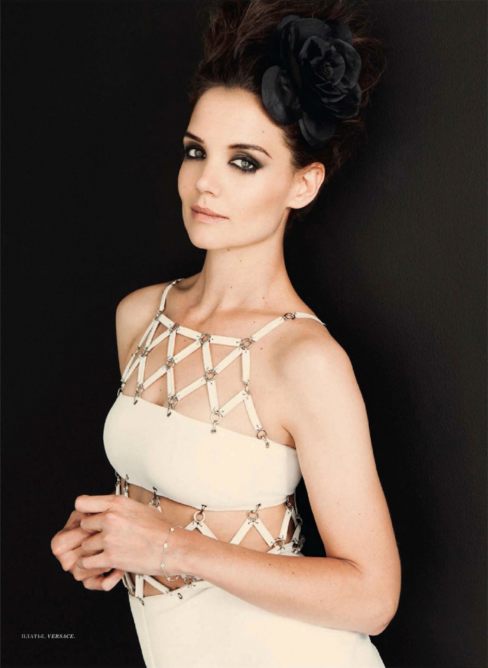
The pic of her in the white thing is weirding me out. It looks like her left eye is like…melting at the corner or something. What the hell?
EDIT – I should clarify I mean the first white thing. Not the wool/fur/whatever crap.
The other shots were better than the cover but I don’t like the eye makeup otherwise she’s lovely.
i wouldn’t call katie holmes “lovely”. i’ve never been that impressed by her looks and everything about her seems bland and milquetoast. i will say she looks cute in some of the photos here.
Very photoshopped and VERY Russian. It looks like a Russian magazine styled her, because they did.
she’s not robotic in my view; it’s stylistic for this context.
She looks great in all of those photos. I also like the fact that in real life she dresses like a normal person and is a loving mother.