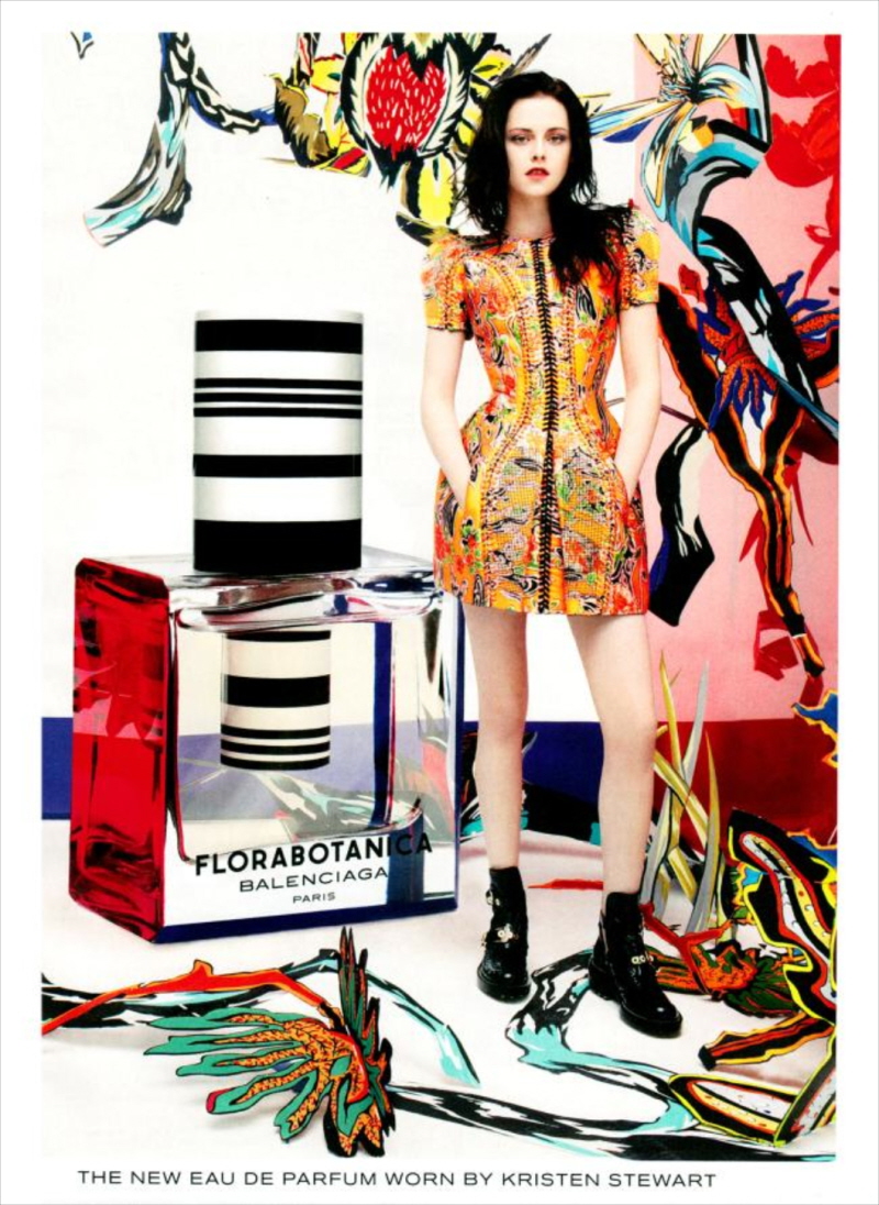
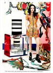
Back in May of this year, I was surprised to learn that Kristen Stewart had managed to eye-roll and lip-bite her way into a second Balenciaga ad campaign. This (the header photo) is the first image we have from the second Florabotanica perfume campaign. Well… it’s much better than the images from her first campaign. Remember those? She looked awful, tired, pale, bedraggled and worse in those. At least she looks moderately put together in this one, and they made an effort to make the ad look interesting.
It’s worth discussing how in the world Kristen managed to wrangle a second ad campaign, considering I thought she brought little to nothing to the Balenciaga table. The first ads were awful, and whenever Kristen tried to talk up the brand, she ended up fidgeting and walking out of the room. Whenever she wore Balenciaga on the red carpet, she sulked and slumped and the outfits always looked awful. Surely Balenciaga could find someone else who better represents the brand?
Also, in an interesting turn of events, Kristen’s champion at Balenciaga, Nicolas Ghesquiere, was pushed out earlier this year. He was replaced by Alexander Wang, who is BFFs with Liberty Ross. Wang even had Liberty on his runway last fall, immediately following Kristen’s affair with Liberty’s then-husband. Granted, most of these fashion houses keep everything compartmentalized – one person is in charge of the perfume line, one person (Wang) in charge of the fashion. But still… it’s got to be awkward. Awkward like Kristen.
Here are Kristen’s old, terrible ads:
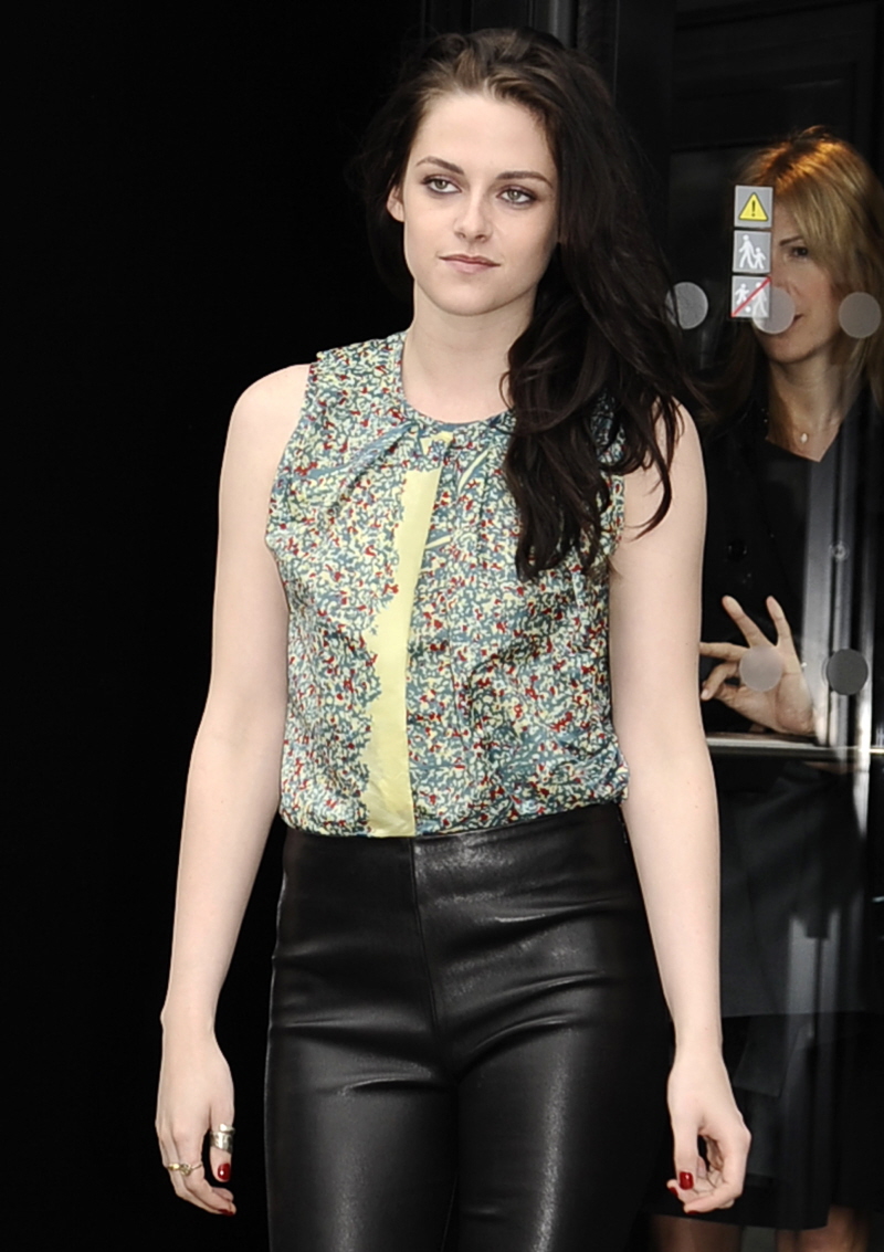
Some older photos of Kristen wearing Balenciaga:
Ads courtesy of Balenciaga.






It’s horrible and it reminds me of those tumblr posts where garlands of roses, not laurel, are superimposed around the heads of random hot men. Ick.
That tumblr image just made me lol. Anyway, even though it still looks bad, at least this one WILL be enticing to some. Alot of people dig that awkward/dark/slightlygoth/depressing look and I think she pulls that off a little (not a great compliment, but I’m just saying this one does appeal to a small niche of people)
It’s probably won’t appeal to them once they sell the perfume. The way they advertise it and the way it smells are totally out of sync, plus it smells really generic and kind of harsh. But maybe it’s just me
FLOWER KINGS~!
Still can’t close her mouth, I see.
This was my first thought!
Girl really needs to breath through her nose.
+1 My first thought as well.
She probably lied about lying and can’t stand the perfume – and because of that breathes through her mouth 😉 Haha!
That f-cking chin!
It’s all I see. Why the hell do people insist that manface is pretty, she is depressing.
I know she is not well liked but I don’t see her with a manly chin. Her jaw is very small. I think you need to look again.
I don’t get the chin comments either.She has a strong jaw like many other gorgeous actresses.But there’s a lot of bias.I think she has a very pretty face.The ads are boring.
Her chin is in perfect harmony with her face. Actually, she has a very pretty face, beautiful skin. I wish she had the personality to match for no matter how pretty you are if you have a lousy attitude, it makes you ugly.
Agree. She’s ugly inside and out.
I agree on the chin. Looks like she’s pushing it forward or something. The open mouth doesn’t help either.
The girl does have a whole lot of chin.
In that first photo, in the ad, the editing was awful. Her mouth looks awkward, I can’t put my finger on it, they made it appear like her jaw juts out. She’s a pretty woman, but looks better in the shots where she poses herself with her mouth closed. This opened mouth thing on everyone is so clichéd at this point and it’s just not flattering on everyone.
I actually prefer the other ads.
Me too. Especially the first one.
I like the new ad, I like the perfume and I think she looks very pretty.
She still can’t act or carry off high-end designer clothing though! And those SHOES…
it’s not horrible, better than last years ad
I like it too. It’s kind of eerie and she looks gorgeous. However I would never in a million years buy that perfume. I guess they’re counting on twihards to buy it?
I just don’t understand why they’d choose those photos to advertise anything. She looks annoyed, bored, over it all. It’s not an intriguing kind of annoyed either. There’s no fire. She’s just like “okay, let’s get this shit over with”.
For the life of me i don’t understand comments about her looking annoyed bored or tired when it comes to her ads.
I get that those are the default adjectives to describe Kristen but it’s not relevant in regards to this ad.
Kstew reminds me of the Gibson Girl with out the bouffant.
Honestly, to me that’s how she looks. It has nothing to do with who she is. She’s looking far to the side, and slightly up. Her mouth is down turned. That’s what a lot of people look like when they’re bored or annoyed.
I don’t get it either. She ‘s a pretty girl, I honestly don’t get the criticism over her looks. Also she wears the clothes, she doesn’t design or sew them. No one could make that odd color block skirt look good. Her teeth are fine, they fit her and thank goodness she hasn’t fixed them like a lot of actresses who have gotten those godawful veneers. Olivia Wilde had a man jaw as does Emma Stone, yet I hardly see that said about them here.
Erinn,
I agree with you. She’s looks flat. No charisma from the photos. Nada!
I think it’s very poor editing. It’s difficult to believe that she couldn’t have looked better in another image. She looks good on the red carpet photos below it.
Ugh! Why is she always hunched? Looks like she is carrying some invisible heavy bag on her back.
She’s carrying the burden of all the teenaged girls who love their greasy hair, ugly backward caps, smelly chucks, and older married men. It’s daunting.
This is a photo shoot. The photographer or stylist poses the model. The model does not select her own poses.
I get that she is a sloucher on her own time. But in this case, she was posed that way. Can’t blame her for that.
Minus the forward-thrusting jaw, I really love the image.
It’s not great, but it’s a definite improvement over last year’s corpsey ads. I’m really shocked they kept her around, though. She didn’t seem to do much for the brand.
She was extremely unprepared for that live interview. Had absolutely nothing interesting to say nor could she talk up the brand.
I am with those that are calling for closed mouths in photoshoot, especially KStew’s slack jawed open mouth with her big teeth on display.
As I remember, it was the interviewer who was terribly unprepared. She had no good questions to ask and even botched up the twitter/email questions supplied by numerous fans by admitting she received thousands of questions but managed to only ask Kristen a scant few. At one point, while Kristen was patiently waiting for a question from the interviewer to no avail, she ended up filling the dead air space with a cute anecdote about her friendship with Nicholas G.
@mimi
Yes, Miss Stewart does not bear all the blame for that horrible interview, however she is 50% responsible because it’s obvious that she was totally unprepared. I don’t know who was responsible for making sure she was good to go but that person seems to have done nothing. Both women came off as unprofessional. Hopefully Miss Stewart has hired some new help.
It would appear that way, but apparently the perfume did really well. That’s what they care about in the end. If the brand had bombed, she’d have been out. Since it was a success, she stays.
Welcome to the business world.
The perfume sold well? I’m halfway shocked by that. I love the original Balenciaga perfume–I believe Charlotte Gainsbourg did that campaign–but Florabotanica actually smelled like a combination of birds and cheap cologne after it sat on my skin a couple minutes. I guess to each their own. Or maybe it was blindly snapped up by Twihards?
Not bad….last year was horrible….
This girl seems a little rough to be the face of such an esteemed, upscale brand. Gap, maybe, but certainly not blaenciaga for goodness sake!
IKR? I’ve seen so many pics of Kristen with greasy hair, torn clothes, her middle finger up and a cig hanging out of her mouth that it’s hard for me to buy her as a face of Balenciaga. She’s just not a fashion girl. She looks nice on red carpets, but she usually ruins it a few minutes in by raking her hands through her hair and putting on ratty sneakers.
The airbrushing of her large chin is so obvious in the print ads compared to how she looks in real life.
I am very excited to see what Alexander Wang does at Balenciaga- they desperately needed that change.
His first showing was pretty underwhelming, tbh. Balenciaga has been laying pretty low overall. I think there’s a lot of internal retrenching going on.
At the corporate level, there have been a ton of issues with Balenciaga.
She looks nice in the new ad! The flower thing is weird, but that’s on Balenciaga, not her.
I didn’t like the first ads, but compared to this picture, they were so much better. Her chin is jutting out. Who decided to put this shot out? She does photograph well. When was this taken? I wonder if Balenciaga is just looking to dump her. Does anyone know how long her contract with them was for?
the flowers look really bad, but she looks pretty.
There is just nothing they can do to make that perfume bottle not look godawfully tacky, I don’t know why they insist on plonking it in every picture. The new one would have been halfway decent/striking without it. Agree about the open mouth/slackjaw look not being her best though. Stupid fashion photographers.
“I don’t know why they insist on plonking it in every picture”
Um…because that’s what they’re selling?
Er, not all perfume ads have the bottle in them actually…
It would be rare for a perfume ad not to show the bottle, for either men’s or women’s fragrance. It’s pretty much an industry standard.
Balenciaga shows their bottle. They did for the Charlotte G ads as well.
Actually the Florabotanica bottle won a prestigious award for its outstanding design recently. The perfume has also won other notable awards. It also sold very well when Kristen became the spokesperson for it. I saw the Florabotanica displays in the perfume departments of a few upscale department stores and they were all very attractive and eye catching. I happen to like the bottle design and the scent of the perfume.
Glad you enjoy it, I reserve the right to not appreciate or covet its design despite it winning plaudits…sheesh.
The ad is pretty but unremarkable.
It helps that Kristen/Balenciage haven’t over saturated the market with advertisement.
Also since Kstew is very causal in her everyday life it’s always a pleasent surprise when she’s “glammed” up.
As for last years ads the “problem” with them was that they weren’t pretty.
I think the new ad is so much better than the old ones. I like it, she has a beautiful face.
I’m confused about her eye colour. They’re blue in the last picture and brown in the others. She has naturally blue eyes doesn’t she?, so why the colour change?
Shemhas green eyes.
I like this better than the last one.
There is nothing interesting about her face. And she lacks presence (and personality).
What’s funny is that the perfume won a packaging award, along with a few others, at some well known international cosmetic event that was covered by several fashion blogs. I like KStew, but I thought last years ads were awful so that surprised me. They kept her on because the perfume sold well—money matters more than anything else.
A lot better than last year’s, and I think she looks very pretty in it… but I don’t know, all these perfume ads start to look alike to me. The only campaign that ever really sticks to mind is the one Nicole Kidman did for Chanel, as Satine. Or maybe not Satine exactly, but the Moulin-Rouge inspired one. All other ads sort of blur together.
Dead eyes make me want to buy stuff!
WHY IS HER MOUTH OPEN???FK
If it’s true that “the eyes are the windows to the soul”, then this woman is soulless.
Her eyes are absolutely blank. No expression. Nothing.
1. You clearly know little about fashion. Wang as has been WIDELY reported is in charge of the entire Balenciaga line. (including the perfume). He worked with Kristen on the ad. Not to mention there is this amazing thing called a contract. Ad in Florabotanica and their campaign won perfume of the year.
2. Liberty herself said they weren’t friends. That he called her to work together for 1 show.
2a. And Wang is known for stunt casting.
3. I’ve actually read quiet a few of the write ups on Stewart’s ad and yours is the only negative and nasty review. Which is shocking considering you hard core fap to Pattinson.
But at the end of the day haters gonna hate. And she’s getting richer while you are a sad house wife so jealous of her you cannot see straight. But thanks for the laughs. I needed them at the end of the wk. 😉
Um, I agree with your points but you could have last out that last little bit girl. Relax. However, you are correct in 1-3. The perfume sold and the perfume sold extremely well and won some awards, so of course they aren’t going to dump her. Business is business.
I actually like the ad, except for one part. Why is her head at that *precise* angle? It doesn’t bring anything to the ad itself, and to my eye looks too *manufactured*. There are many better ways to tie the bottle and the model visually.
this woman has no life inside her. As for the campaign, first one looks like something from the 90s, second one like whatever. I like perfume’s bottle, curious about the smell, but the name is kind of crappy and that interview was one of the most awkward interviews I have seen a celebrity promoting something on a high-end level do. It was not a matter of being unprepared but completely not giving a crap, besides one of the acting chops is being able to improvise, right?
#rabbitteeth
I think this ad much better than the last. She looks really lovely here – if there is one compliment I could give Kristen it’s that she is extremely photogenic.
On a side note, I alternate between Coco Mademoiselle and Florabotanica, it’s a beautiful scent.
Now I can be grumpy all the time and lash out at the papz and especially the fanz too!! 🙂
I don’t mind the new ad photo. She looks beautiful.