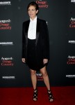
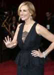
I had blocked this from my memory, but in the past year, Julia Roberts wore Givenchy to two major events. She wore this terrible half-tuxedo Givenchy to the premiere of August: Osage County and then she wore this awful black lace monstrosity to the Oscars earlier this year. Considering that “Givenchy” is synonymous with “passive-aggressive crap from Riccardo Tisci” these days, there was some concern as to why Julia choose Givenchy for two major events. Turns out, she was positioning herself for an ad campaign!
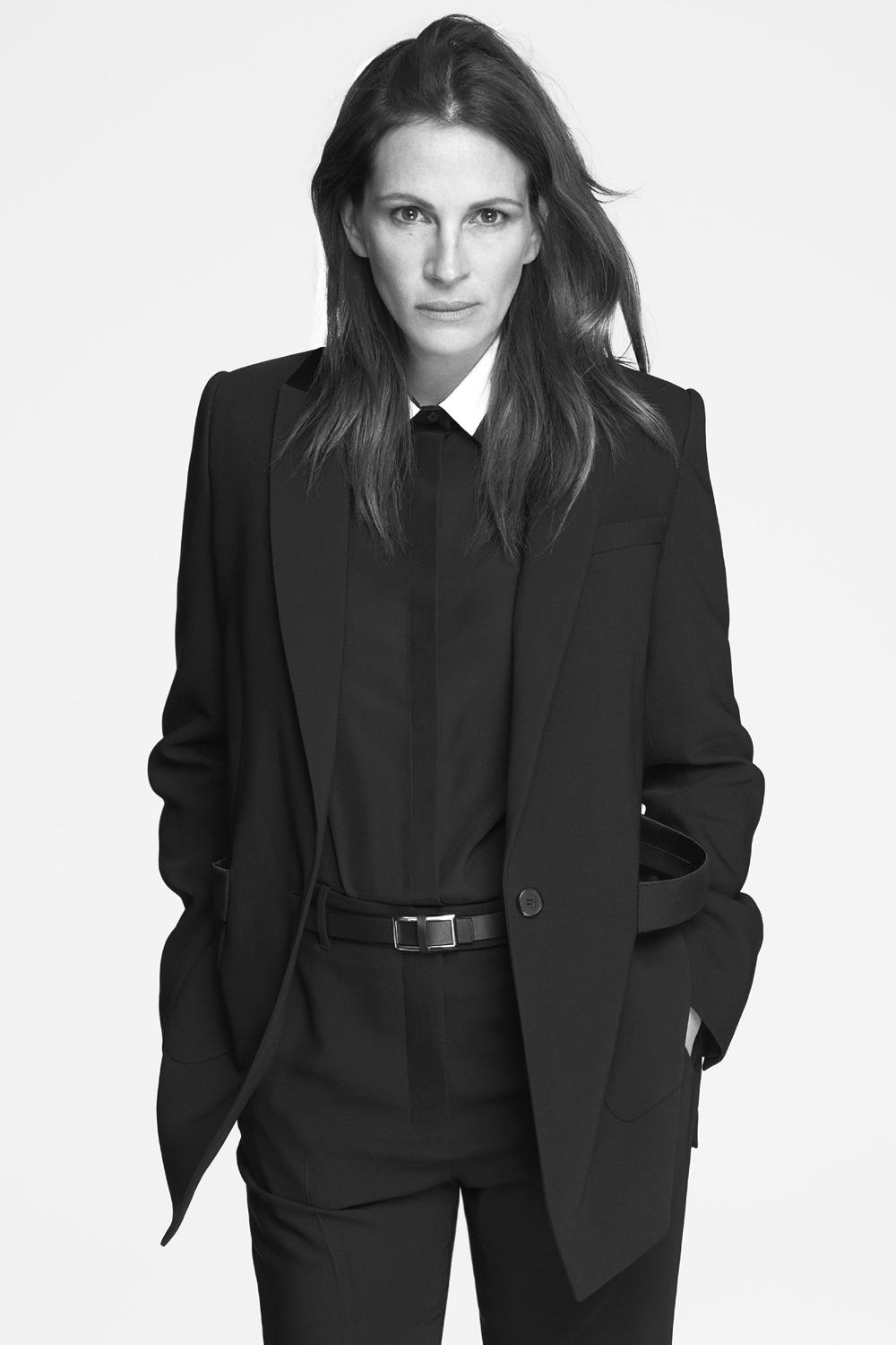
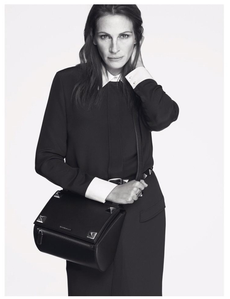
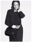
Julia is the new face of Givenchy. Which is nonsensical to me – Tisci has been trying to take the label to a younger audience and Julia will not help there. I’m including the three new images from Julia’s campaign in this post. Very… minimalist. The images are striking, for sure, but that’s mostly because it’s Julia rather than the clothes. When Julia’s campaign was announced yesterday, they also did an interview with Yahoo. No, let me rephrase that – Tisci did an interview and then Julia deigned to speak about why she would ever agree to this. Here are some highlights from the interviews:
Why Tisci chose Julia: “Julia was my first choice for a few reasons; I think that she represents such a mature woman. With each campaign for Givenchy, I’m always trying to make a difference. A lot of people see Givenchy as only “haute couture,” or only “street and urban.” For me, Julia is many things. She has this strength as an actress, but she’s also this beautiful American woman. She’s a big star, but she’s not a paparazzi or a blog monster. It’s going to be my tenth year at Givenchy in March, so I wanted to represent the woman who is more mature, beautiful, talented, but also unpretentious.
Julia on meeting Riccardo: “It’s funny because I had never met him before our first day together shooting the campaign. I was so nervous, and I was expecting this very kind of chic man in a suit and a white shirt and a tie. I come walking in and there’s this good-looking man in a plaid flannel shirt and some work boots. I’m like, “This is Riccardo?” He’s so sweet. He’s in an industry that I find very intimidating and elusive—just like the good-looking girl in high school. The whole fashion industry is that to me. And then you meet these people who are so kind, love what they do, and are very interested in the personal aspects of it. You know, the way you look, it’s so personal. Riccardo put me very much at ease. And Mert and Marcus are just the most fun people to spend a day with.
Julia on the Givenchy clothes: “Well, they were so beautiful, and they’re all so impeccable. Trends and I never shall meet; I just can’t quite pull it off! That’s why I love a suit. That’s why I love impeccable tailoring and really perfect fabrics. He did it all. That black, flowy blouse? It’s heaven on a hanger. It’s like a piece of artwork.
Julia’s style rules: “Well, the corny ones are the true ones. When you’re comfortable and you feel good in what you’re wearing, you’re going to look good. If you’re wearing something that’s so contrived and you look like a trussed up Thanksgiving turkey, you’re not going to look your best. For me, the older I get, the more I realize there are some major errors people make when it comes to what’s appropriate for their age.
Why she’s not on social media: “Social media would just be another thing that I’d neglect. There just aren’t enough hours in the day….For me, it’s a daily impossibility. I just have to approach it with a sense of effort and humor because by 11 o’clock, there are 17 things that I have not, will not, and cannot get accomplished during the course of the day. Especially for working moms, there’s so much pressure to do it all and be it all and have it all, and I think the best thing to do is to give ourselves a break and say, let’s put forth our best efforts. As long as everyone is tucked in, happy and healthy at the end of the night, we’ve crossed the finish line.
When Tisci called Julia “unpretentious,” I actually snort-laughed. Sure, dude. Whatever you say! So, do you think Julia signed on for this ad campaign because Tisci asked and she thought, “Eh, why not?” Or do you think she did it for the money? I doubt it! She’s not poor and she doesn’t need this. I think she just did it for the hell of it.
Julia also says she’s become obsessed with mahjong, which amused me. I play mahjong online and I love it! It’s actually a great game to just play when you have some free time, because it’s easy to put away and not think about. You know? Like, some games are obsession-bait, like you just want to play them for hours. Online mahjong is just something fun to do occasionally.
Photos courtesy of WENN, Givenchy ad photos courtesy of Mert & Marcus for Givenchy.





Meh. At least is not a Kardashian.
true that.
I feel like that’s who they were hinting at with “she’s not a paparazzi or a blog monster” and “trussed up like a Thanksgiving turkey.”
lucy2 — that’s exactly where my mind went
Looks like a pissed off dude
Yes – that’s it exactly!!!
haggard and angry male, i guess it is a look
Love the direction they had Julia go in this shoot!
Me too! She’s got interesting bone structure, and I personally like androgynous fashion.
I vote depressed
this.
she just wished my out to the cornfield
“She’s not a paparazzi or blog monster.” Snort….. Bitch can throw serious shade can’t he?
That’s all I came to say… it’s like “yeah I have to deal with You-know-who but it’s not voluntarily, y’know”
Quoting dlisted about why Tisci didn’t get a Kardashian for his campaign:
‘ Maybe Riccardo is punishing his boo Kanye West for something (“Did you let your wife wear my leather leggings? THEN WHY IS THE ASS ALL STRETCHED OUT???“
Still giggling since i read it last night 🙂
I will admit I may be biased because off my dislike of Julia Roberts but they seem terribly bland, they don’t seem to pop.
I find her face boring. And I just don’t like her features. Nose and lips especially.
She looks like Vigo the Carpathian from Ghostbusters.
Lol! I actually was thinking she looks like Lucy Liu in two of the shots.
Not a good look – like she’s morphing into a butch lesbian with crooked nostrils and bad hair. Why do they have to make people unattractive to sell clothes? This ad campaign certainly doesn’t make me want to go out and buy these outfits.
Well, I think the majority of consumers can’t buy a Givenchy outfit anyway. Those who can are probably more “high fashion” anyway and tend to be into stuff like that has less mass market appeal. High end labels usually make the majority of their $ on the sale of accessories (bags, sunglasses, etc.) to the mass market. So, the idea is to try to make the ad still seem high end and unattainable (hence the clothes) while bringing in the mass market appeal (Julia Roberts and, note the bag) and still getting the attention of the people who would actually buy the clothes.
I do disagree with this. The “mass” of women have always been inspired by very glamorous fashion icons, whether Audrey Hepburn in Chanel or Grace Kelly hawking Dior perfume–and all the stylized, “high end” ads that went with that aesthetic. The same was true during the age of the 80s Supermodel–those standards of beauty were seen as an inspiration for all women, high end and “low” (or mass, if you will), not something “unattainable” to the point of being unmarketable to the most women. I would argue that ALL women wish to see glamorous fashion advertisements and models. This business of “make ’em look like slobs to sell to the slobs” is a bit—well, insulting, is it not.
What we have here is the promotion of androgyny, for reasons that need no introduction
+1
If a campaign doesn’t sell clothes, why does it exist? She looks awful and has developed a reputation to match.
To get the mass market to buy the accessories! As I said, that’s where most high end brands make all of their money. They need to seem unattainable so us riff raff will keep buying their cheapest items (like an $800 bag or a $400 pair of sunglasses) to feel like we have a slice of luxury or that we somehow belong!
The clothing really doesn’t make that much of a profit most of the time. Most of the time you see people photographed in it (not just celebs but magazine editors, etc.), they’ve been given it for free. These days, it’s generally all about marketing to the mass consumer, who can only afford to purchase the accessories (and and for most of the mass market, accessory prices are still stretch, which reinforces the luxury aspect) THe only reason why the mass market pays that much for accessories is because of the high end branding.
It’s a pretty well-supported notion; here’s a more articulate summary: http://tinyurl.com/nzzkw6h
I think this is a major fail…unless you want to look like a high-fashion Hutterite.
homely as ever
+1. My thoughts since FOREVER! And I had to laugh when Tisci describes her as “SUCH a MATURE woman”! Yep. An old lady in some old lady clothes.
He must have looked up People covers from the 1989-93 era to come up with his ‘mature’ selection. As if she wasn’t the headline grabber of her day.
Yikes. Terrible.
I bet her husband, Danny, receives these faces a lot from her. These campaign photos probably make him shutter.
I have suspected for some time that she is getting ready to put her hot little Danny out to pasture soon. Maybe in a couple of years, once the children are older.
Was she ever cool? If she was, then I missed that phase.
She should get down on her knees and thank the Goddess every morning that she’s been able to have a career, because she’s not that attractive or talented. And, by all accounts, she’s disagreeable and conceited.
These photos make me think he must hate her. She looks terrible. As for Mahjong, my husband is obsessed with playing it on his tablet. I’m more of a word game and cards girl. Give me Skip-Bo and Word Wow and I’m a happy camper.
I’m thinking I need to try Mahjong, my two obsessions are Scrabble and Euchre. Euchre is one of those ones where it’s easy to walk away and forget about it.
I’m guessing Miss Julia isn’t thrilled being chose for being “mature.” Because we all know mature means old, and the bloom has left the petal. Worry not Julia, you’ll always have that Oscar night where you were so totally into yourself that you forgot you brought Benjamin with you…or that you were so into your feelings that you totally forgot Kiefer on the wedding thing you planned and were with Jason Patrick whom you soon forgot, or lest us not forget poor Vera, and your ever so tasteful tee shirts humiliating her…won’t even bring up the dead sister you bullied..or your brother Eric whose daughter you fought to take away from him. Let bygones be bygones. Merry Christmas Julia, you’re a real sweetheart.
Dayum!!!
You know what Ginger…truth be told. She was one of the first anointed American Sweethearts and plain and simple, she’s not. She says she doesn’t bother with social media…lol. Had it been around in her day, her star would have been tarnished greatly. Remember Stinker Bell. If Steven Spielberg adds to the fray, you know we were talking about a not so nice person.
HAHAHAHAHAH Nailed it!
It wasn’t on the ballot, but I vote equine.
Not happening.
Everyone needs to stop being so pissed. She looks great! Nothing flashy, no butt cheeks. Breath of fresh air. And I’m glad they took someone who’s older.
Actually, me too. I think she looks great. I also like the tailoring on the clothes.
Thanks! The backlash is insane.
I thought she was Bruce Jenner with his new do in the header image. Yeesh.
Should have used Julia’s pic to promote the movie Cake.
She is looking more and more like Lyle Lovett.
She was married to him for a short time, remember that?
prairiechick: LOL!!!!
something nice . . . they photographed her looking down, which minimizes the nostrils that are Julia Roberts.
Something else nice…her hair looks healthy.
I think she looked like my mom’s pilgrim salt and pepper shakers. I
I will say this, as unflattering as that horrible suit is, her figure looks gorgeous. She looks slender and strong, like she works out but doesn’t pay too much attention to her diet.
When Julia doesn’t smile, she is just not a Pretty Woman… (seriously, she’s manly looking).
That’s a very rude and hurtful thing to say. Women are women, no matter what they look like.
@Kaiser Which mahjong do you play? i played the free Yahoo version for a while, but it doesn’t play well with Mac.
Horrible! And she thinks she’s a “supermodel” now? Blasphemy!
These ads show the true Julia, he said. So that means she’s truly angry, unkempt, and bland? Sounds about right.
Even if I would buy something from Givenchy, after seeing these ads, it would make me change my mind to never touch the brand again.
I am not feeling her. Isn’t there someone younger and fresh who could do this? Not a Jenner certainly but there has to be someone out there better. Julia is just so middle aged and doesn’t have anything that looks young and vibrant any more. She just looks like such a bitch that screams all the time.
yes, like GiGi (Yolanda Foster’s daughter) or somebody else…ANYBODY else!
I can’t believe people argue that there is no place in Hollywood for older women, and then we have people on this thread hopping mad that they didn’t pick anyone younger. And that she looks unkempt and bland, when other times, everyone wants celebrities to look more realistic.
You just can’t win. She looks great. Normal, but fierce. And I’m so happy she’s all covered up, instead of a blown-up sex doll.
+1 Kaya!
I would have preferred Julianne Moore. She would have brought it.
Not keen on her or the pics, it’s not her age- I’m older than she is- but someone like Kristen Scott Thomas or Helen mirren, or various chic mature french actresses are classier.
Perhaps Riccardo is going to design t-shirts with b!tchy slogans. Perfect to wear under a navy blazer.
Makes sense now!
Whenever I think of Givenchy I remember Hubert de G”s fabulous designs, and his equally fabulous muse, Audrey Hepburn. Both were effortlessly sophisticated, ageless, joyful and beautiful. Now with Tisci running the label, I know that every time I see a hot mess on a red carpet it will turn out to be a new Givenchy. Why can’t he put his own name on his awful “creations” instead of carpet bagging onto a genius? So somehow it seems appropriate that he would pick the bedraggled, depressing and ever snarky JR to put in the AH spot.
She looks a bit too lean and wolfish. Not feeling it.
Horrible.
I like these shots (esp the second one) and I usually don’t like non-smiling Julia. And I know she’s probably very difficult in real life but I love her way of describing a successful day – that is what’s important. Unfortunately, the simple act of saying good night to happy and healthy children, snug and safe in their beds, is something that too many parents don’t get to do (for various reasons). I try to remind myself of how lucky I am on that front when I get stressed or depressed about other life challenges.
More like scary…
She looks thinner than she has in a long time. I think that’s why her face looks so…wolfish? LOL as someone else commented. I like the first picture, as androgynous and depressed as she looks in it. And I’m no Julia lover by any means. But this pic does seem to bring out the real her, doesn’t i? And that’s what a good photographer does.
I’m sorry but she looks like she is channeling Ichabod Crane.
-_- No!
Julia Roberts is the new resting bitchface of Givenchy.