I want to do nothing else today other than talk about Lily Allen and David Harbour’s Brooklyn home. They recently did an Open Door video for Architectural Digest and I am obsessed. It’s perfect from the jump because David, who has done an OD video before, is such a great host on these things. But the townhouse is amazing. The décor is not my style , save for the closets, so I didn’t pick up any tips, but I still love everything about it. I have questions, though, so meet me below:
Forgive me, but I want to walk room by room. I like the kitchen and I love that Lily got to design her dream. Long and narrow isn’t my favorite space to cook in, but I get they had to work with the existing floorplan. There’s so much counter space! And you’d get your steps in running from one end to the other fetching what you needed. I can’t do open shelves that’s en vogue right now. I need a solid cupboard door to hide my mess. Also, I’m not a bench seat person for tables, but I know they are very popular for kitchens.
The garden room makes me swoon. I love everything about it, no notes. Again, exactly the opposite of my style but I wish I was friends with the Allen-Harbours so I could hang out there. It really felt like I was going through a nice little garden. I could make that double-sided couch work for me, though.
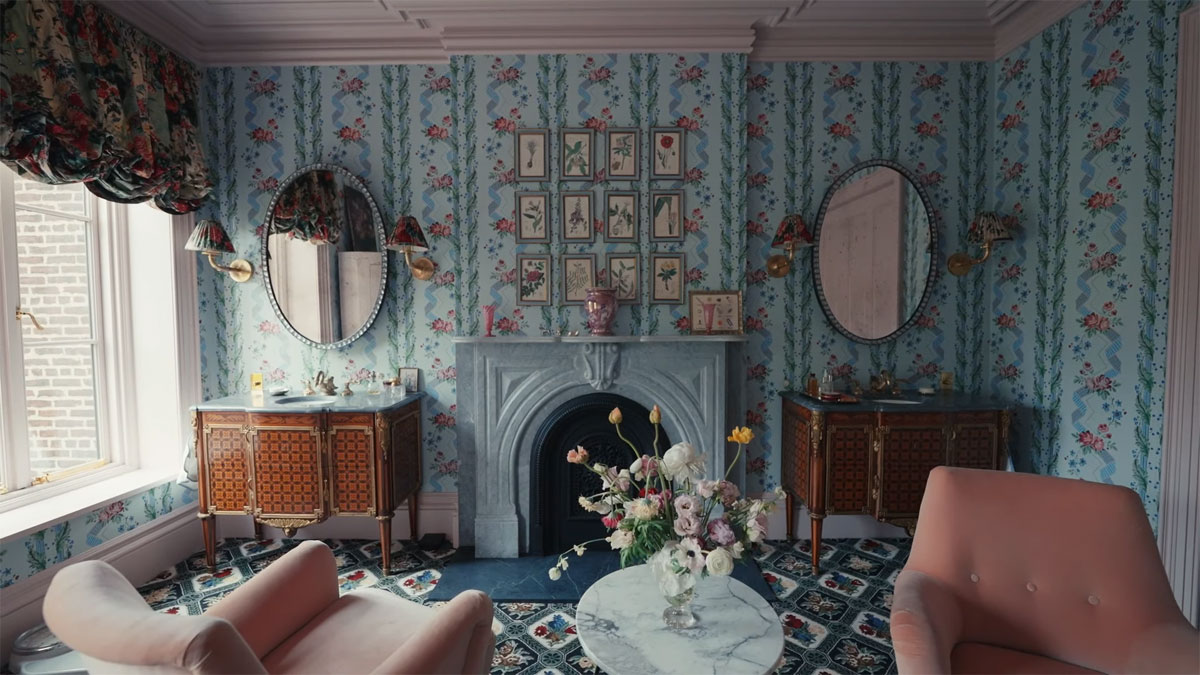
The Swan Bathroom confused me. It was impressive, certainly. But would they actually hang out there? I love the sitting chairs and the commodes had stunning inlay, but the only place I ever really want to be in a bathroom is in the bathtub. I can’t see going up there to read in a chair. I don’t have an issue with the carpet. I know people don’t like carpeted baths but I was a kid in the 70s. At least it’s not shag, right? The fridge is a lot. I understand the idea of a refrigerator in the bathroom but that size? I wish they’d opened it to show us what was in it. David said it was his dream but why? Listen, I love a good, long bath but even I don’t stay in so long I need to replenish my lemonade halfway through. A fireplace, though – that I can get on board with.
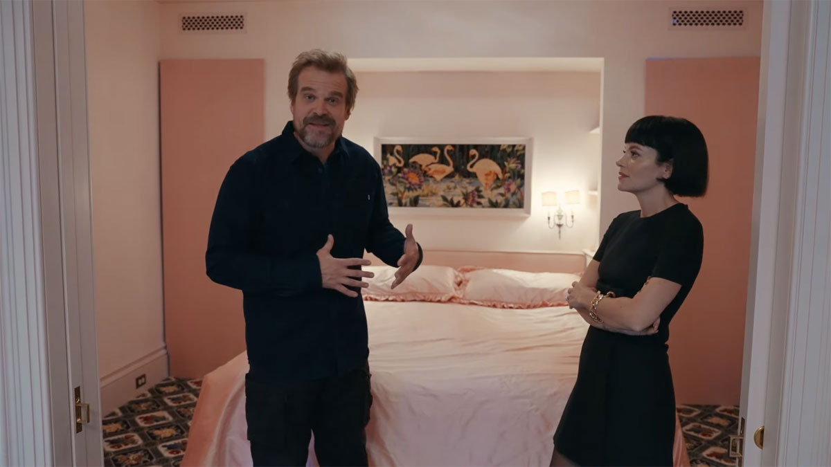
I actually dig the simplistic bedroom. I generally use a bedroom for two activities so I don’t need a lot of room. My husband would be on board for windowless for the same sensory deprivation tank feel as David. I would miss the natural air, though. Those closets, though *faints*
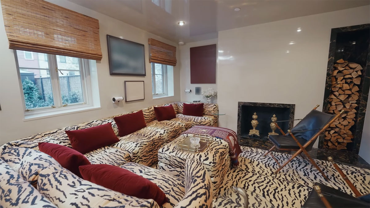
I’m not crazy about anything on the ground level, including the sauna or cold plunge, but it’s just a me thing. Maybe the leather chairs in the media room, they were nice. The main thing I came away with is that Lily and David are a lovely couple. They’re so connected and I adore that their home is a balance of both of them, with things from their pasts and compromise in every room. I might save this video for whenever I need a pick-me-up. Also, I’m absolutely adding, “No, no – don’t mess with that. That’s my moment” to my lexicon (minute 3:00).
Photo credit: Screenshots from YouTube and JPI Studios/Avalon


When we got the keys to our house, one of the first things that we did was to rip the carpets off the bathroom and downstairs loo. It was previously owned by an elderly widow and her style was just dark wood. The house needed a lot of work to be updated but it was the only one that fit our budget in the area that we like so we made do with it. We ripped up all the carpets on the house and took off the wood that was boarded on the walls. Carpets on bathrooms and loos are just ick, no matter how you look at it.
So unhygienic. Mold, bacteria, fecal matter…🤢
Hahaha I grew up in the 70’s with goldenrod colored shag carpet in the bathroom. Never again !
Love her hair – she looks great! A cute couple.
Maybe the Bathroom with the carpet was originally a primary bedroom with a fireplace and bath? The carpet in the bedroom seems to be the same carpet in the bedroom “cubby”
Either way as someone with no style I admire that they definitely have a distinct style that I think overall actually works.
Certainly part of it is retrofitting a modern facility into a building that was likely constructed before such amenities existed; so while I think it’s neat to have a fireplace in the bathroom, carpeting is a big no. I do see it matches the carpeting in the bedroom, which appears to be the same size & shape as the bathroom, but still. I had never even seen carpeting in a bathroom until I visited a friend’s father-in-law. I just found that so odd & yes, unsanitary, to say the least.
I love their bathroom so much! It’s the first time in my life I have seen a bathroom that just looks like a really pretty room, the bathroom part is secondary to, “I would love to hang out in that room.”
Saying something nice, I admire that they really went for it and were bold with their choices…..that said some of these choices would make me want to cry in person lol the bedroom and bathroom with those busy, contrasting prints? Gives me anxiety just looking at it. I’ll have to ask my therapist about why that is, but it’s true! I would take Kim Ks home over this every day and twice on Sunday.
Too busy for me too! I grew up in a home that was like a colonial antique store – tasteful. . . But stuff everywhere. When we first restored our home – my mom was like – At last! My child has a streak of rebellion.😃
The bathroom is basically the bedroom with a bathtub in the middle. Overall the place is nice but I loved his other apartment more.
I would live in his old apartment – I loved the light and the bookshelves and the plants and even the candelabra spa bathroom (not my taste, but would certainly making bathing an event). This house is way too busy for me and I really don’t like any of it, but I do enjoy their relationship and how well suited they are for each other. I’m wishing them all the best!
The townhouse is nice but I fell in love with the design of the bathroom for David’s studio apartment.
I’m planning on (hopefully) purchasing a house later this year and I want to remodel the bathroom to resemble what he had.
https://i.pinimg.com/originals/3b/e4/ee/3be4ee67ad0d62191957ffc60b5f1d0f.jpg
Just be careful with antique brass fixtures. They are hard to match. Just completed a bath renov using antique brass. Love the look but not everything matched. Ended up mixing metals (brushed nickel and brass). So if you want to match make sure everything comes from the same supplier.
Thanks for the tip! I’ll keep that in mind.
Oh, wow, that is nice.
So I have a thought about the seating and fridge in the bathroom. As someone with small, peasant -sized bathrooms (laugh), when I want to do my nails or soak my feet in one of those foot rub things, there’s never quite the right set up for that. Downstairs in the den? Sure but then I have to fill it in the bathroom and lug it to a room with a comfy chair. Ready to empty the foot rub? Lugging it back to a bathroom. I can think of a bunch of grooming/self-care related things/reasons beyond a bath that would make me want to hang in a cozy bathroom!
Same- in my old house when we were contemplating reno we were going to put a freestanding tub in a windowed nook in the massive primary bedroom. It feels v English country manor and so decadent to not shove a bathtub into tiled walls…
And I feel the same about all those grooming activities. It wd be so nice to have a Terry upholstered chair upon which to sit as I apply all my lotions!
I didn’t watch the video, so I didn’t realize that white thing standing in the bathroom was a fridge! I thought at first it might be some ultra-modern shower that didn’t use water but sound-waves or something (you never know with rich people). Or maybe one of those cryo-treatment boxes, where they take you down below freezing for a few minutes. Or, sorry for the Woody Allen reference, but it sort of reminds me of the orgasmatron.
I have a slipper style tub in the corner of our bedroom with a small bookshelf and a chair nearby. There are 2
large windows and I look up from my book and watch the deer in the meadow. It’s one of my favorite things. Although right now in-between hip surgery 1 and 2, I am not using it at all. It’s too deep. Hoping that changes! If not, I guess I will convert to upstairs laundry.
I’m sure they spent a lot of money on this but some of the rooms are just so tacky and cheap looking- the bedroom is giving me cheap motel vibes and the media room just nooo.
That bedspread and some of these other details legit are my grandma’s late 1970s midwestern farmhouse aesthetic… Like, it’s giving 1970s motel and prairie maxi dress, not sophistication. I see what they were going for, but there are so many ways to make things feel Parisian without power clashing… I’m a minimalist though and all those florals hurt my eyeballs. And the pink ruffles… just no, not unless you’re a tween girl in the 80s. I like them both but I don’t really ever love Lily’s taste/even her red carpet style has a history of being questionable and not in a cool, adventurous way. In a ‘her stylist must hate her’ kind of way.
I kind of love the tiger couch and bathroom fridge. And I love Dave and Lily together. Was just listening to her first album yesterday.
It’s just a little too ornate for me. The garden room is stunning though! I live in a historic Tudor (exterior) with a decidedly Petit Trianon inspired interior. I just can’t handle prints everywhere.
Is no one talking about the sauna and cold plunge sheds in the back yard with all those windows looking down on you? Presumably you’d be in a robe, but still.
As to the bathroom, it always amazes me in high end NYC apartment video tours how much floor space is “wasted” on bathrooms. There are tiny closets and a bathroom for every bedroom. Having a bathroom where the toilet is in a closet and the tub room becomes a more useable space.
Also, with all those open shelves and fabrics in the kitchen, the exhaust over the stove must be incredibly powerful. I’d like a video with the housekeeper about how all of this is actually maintained.
I hated that ruffled curtain around the island.
I wouldnt do carpets in my bathroom, but I love his bathroom! I dont think we should call it a bathroom, it’s more like a room where you could take a bath. We didnt see the toilet and shower, maybe its really tucked away/closed off and wont affect the carpet that much? But the idea that I could hide in the bathtoom and be in this beautiful decor + fridge, without having to sit in the bowl for an hour to get away from the world and without getting antsy feet, would be wonderful. Light the fire.
I love this because you can tell they love it. This is not a place designed to just to look good for magazine covers or with “resale value” in mind or done by a trendy designer with lots of shiplap everywhere, it’s theirs and they did exactly what they want and that just makes me happy.
I do really like that blue wallpaper too.
I just don’t see why anyone wants such a big bathroom, seems a waste of space to me.
Lots of color and many patterns, too much for my taste.
Very 1970’s to have carpet in a bathroom, I’d yank that right away.
I love me a big bathroom. I’d utilize the space differently, but big bathrooms are the bomb dot com. Room for a garden tub and lots of shelves and oooooo …. counter space and little towel pantries.
We always had linoleum bathroom floors in the 70s. I guess we weren’t posh or groovy or with-it or whatever! 😉
I love the green room with the florals. And I love how much interest David took in designing the house. A big, burly guy wanting swan faucets is so charming to me. My husband does not care, he just wants me to be happy, and while I’m glad I don’t have to argue about stuff, I still want his opinion bc it’s his house too.
I’d rather have a towel warmer than a fridge in the bathroom.
They seemed like kind of an odd couple, but from the video they’re really in tune with each other and he keeps her giggling. Very sweet.
Carpet and chairs and a tub without a shower stall around it are very, very British. I see that in British architectural magazines all the time. I’ve even stayed at my uncle’s house in England and they had a bathroom like that. Not as fancy, but tub, carpet, and chair.
Also, the embroidery of sexually transmitted diseases made me laugh.
I’ve never found him particularly attractive, now I do.
The garden room is amazing and overall I love that they have absolutely gone with what they love. So many rich people interiors end up looking a bit bland (and I mean way before we get to Kim K soulless emptiness).
The only thing missing was a look inside the fridge!
That tiger carpeting on the stairs is some Elvis level tacky.
And, OMG, it’s on everything. ELVIS has NOT left this building.
I have the biggest crush on this dude. He is a tall sexy daddy. Sorry I couldn’t help myself.
He is a sexy beast.
I want that kitchen. Not the open shelves, but everything else in that kitchen.
It’s really well laid out, given the constraints of the building. Brownstones like theirs are usually 20-25 feet wide, and you lose at least a foot of usable space to exterior walls, beams to support the upper floors, space for plumbing/electric lines, etc.
I saw the video the other day, really like the idea of light reflecting tiles in the kitchen, wish I knew about those when I was redoing my kitchen. Also like the idea of wallpaper but would keep it to the half bath or laundry room. According to a designer on YouTube, wallpaper is in, dark colors are in.
It feels like everyone now lives in Brooklyn.
I love it. He reminds me of my oldest son…his mannerisms and humor and that he’s bougie. He’s an oxymoron lol. They both are. Him and his florals and swans are hilarious. The wallpaper alone is a fortune (although not my particular taste). That kitchen is awesome. And yes, I’m adopting, ‘My moment,’ as well. Because the people and things and memories we love are compromised of moments suspended in time.
😻😻
I love these Open Door features and I’ve noticed that the US and British homes featured are very different in their aesthetics which is interesting to me as a Brit. I much prefer the British ones – Sienna Miller’s cottage, Rita Ora’s house, this one, they just seem more homely and lived in to me. Generally speaking, the US celebrity homes seem very impersonal and rather samey.
It’s clear that Lily (and perhaps her kids) was the driving force behind this decor – it’s so different to David’s apartment and so, for want of a better word, girly.
Wow! Everything about this place is the opposite of my style (except maybe the kitchen), but this somehow works and I love it for them. It’s too busy & chaotic for me but appreciate the work that goes into the mixing of patterns like that.
I imagine if you regularly have “teams” of people coming to help you get ready for events an open bathroom like that with extra seating comes in handy.
Omg I just hate it so much. Carpet in a bathroom? No. That bedroom with those pink shiny sheets? No. Stop it. The garden room reminds me of our living room growing up, where my mom basically threw gaudy (and overpriced) wallpaper, endless floral accents and Ethan Allen furniture together for one giant patterned nightmare of mints, greens and assorted shades of pink.
But, I love seeing those two together – they look like they have a lot of fun and seem super delightful.
Carpeting in a bathroom is disgusting and just 70s bad taste. Just install underfloor heating. Overall It’s very 40s glamour auntie, with the wall paper and leopard prints. Lot going in visually. Don’t dislike it.
Oy!
I can’t say that I’m a fan. It’s the home an eccentric old grandma would have.
Not feeling it, sad to say.
But them as a couple are absolutely adorable!
1. I love them together. They’re adorable.
2. OMG THEIR CAT!!
Cat??? Now I have to watch!
All those patterns were making me twitchy even in a photo but I will watch for a cat!
That cat was adorable! Worth it!
Will admit I didn’t dislike the decor. It, surprisingly, worked better in motion than a static picture. There was more blending of colors/patterns as the camera moved around. It’s not MY style but it worked. Loved the kitchen!
Thank you for mentioning the kitty as I’m glad I watched the video.